16 Ago 2017 Displaying geographic data in OBIEE
1. What is geographic data?
The main goal of Business intelligence is to transform raw data into meaningful and useful information for the purpose of enabling more effective operational insights, as well as more tactical decision-making. The nature and character of this raw data can be very heterogeneous, ranging from structured data of orders originating from transactional databases to unstructured data coming from clients´ Twitter feeds. Today, I want to focus on one specific data type: geographic data.
The term ‘geographic’ neither refers to the way data is stored, nor its source. Instead, it denotes a functional characteristic, meaning data can be somehow positioned on the Earth. More precisely, geographic data can be defined as data with an implicit or explicit association with a location relative to the Earth, either a point, a line or a polygon. In the following images you can see a clear example of how important is to show geographic data properly. While it is very difficult to see a clear pattern on the bar chart, the map displays a much clearer picture. Indeed, it turns out we are visualising the latitude of each region of Spain. The conclusion is that, as I like to say, showing geographic data without a map means losing information.
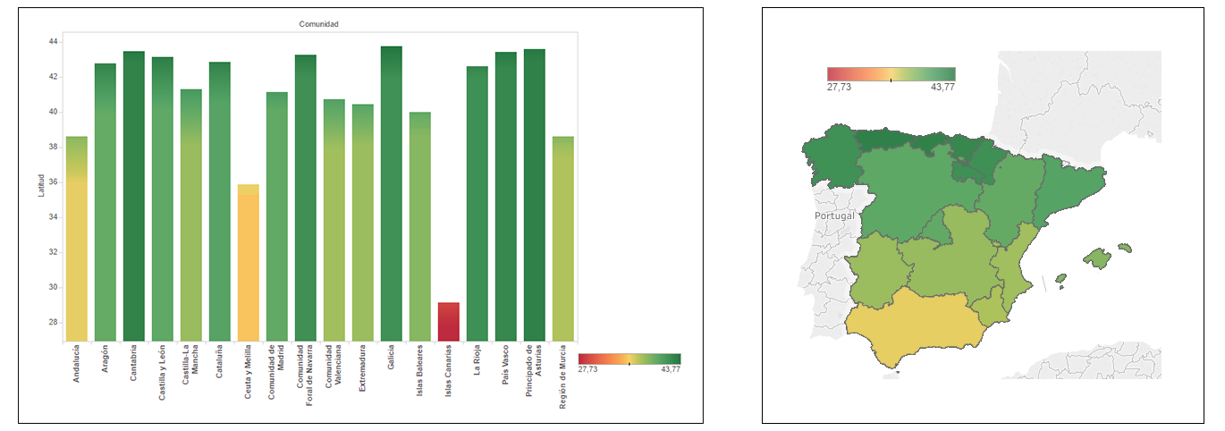 |
Figure 1: Comparison bar chart – map |
As you might know, most organisations have some geographic data among their data sets. It can be points with a client’s location or an event’s situation, lines representing streets or railways, or polygons with the shape of countries or some other customised regions. Geographic data is usually present, and hence, it has to be properly displayed in order to get useful insights and information from it.
2. Geographic Visualisations Components
When creating geographic visualisations, that is, maps with data on the top, three pieces or components are needed:
| • | Background map: which is the map displayed on the bottom. It can be either an online map (Google Maps, Bing, TomTom, etc.), or an on-premise map (e.g. HERE or OpenStreetMaps) which was previously designed and stored. As you can see on the images below, the visual experience of an online map is hardly achievable with an on-premise one. |
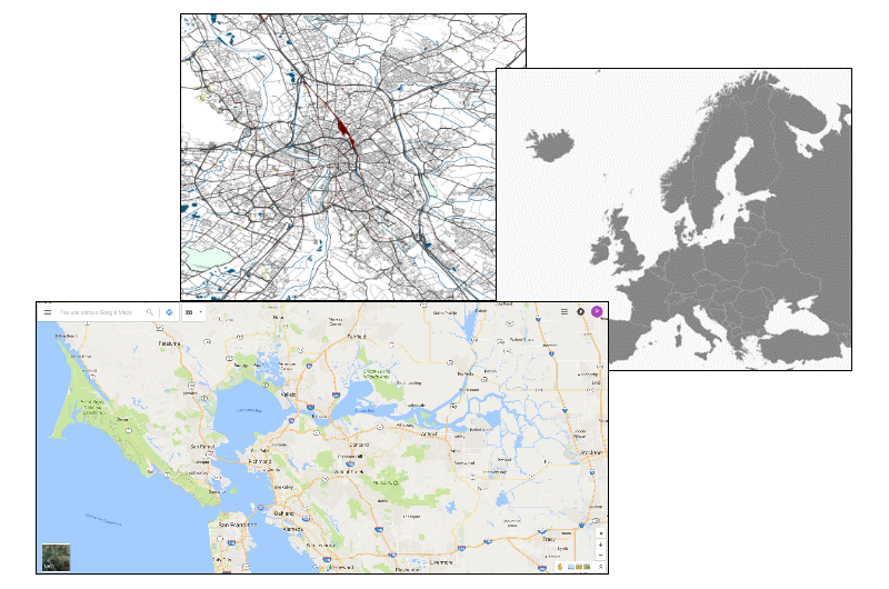 | |
Figure 2: Examples background maps | |
| • | Data layers: which are composed by a shape (a point, a line or a polygon) and data objects (measures and attributes). The critical issue is which shapes are identified by the visualisation tool and which are not. Geocodes comprised of latitude/longitude coordinates are usually identifiable as points, but not literal addresses. For polygons, only main administrative areas are usually recognised, while custom areas will have to be manually introduced. |
| • | High-end geographic information system (high-end GIS): which is the software that matches the background map with the data layers, renders the map and includes some extra spatial functionalities. Some examples of high-end GIS are Oracle MapViewer (for OBIEE), Tableau (already built-in) or libraries such as Google Maps JavaScript API, Leaflet or Kendo. |
3. Creating Geographic Visualisations in OBIEE12c
When working with OBIEE12c, we have three main options to implement some nice geographic visualisations:
| • | Oracle MapViewer with online or on-premise maps:Developing OBIEE built-in maps using the Map View analysis type, which is specially designed to display several map visualisations such as Color Fill Map, Bubble Map or Pie Graph Map. The background map can be either some online map like Oracle eLocation if you have Internet connectivity or a customised offline one. The MapViewer toolkit for OBIEE and the Oracle Spatial option for Oracle database are necessary. The pros are that no third party is involved in the solution, nor is any code needed. On the other side, the amount of visualisations is limited and requires the configuration of layers and background maps. |
| • | On-premise library with online or on-premise maps: Another solution is developing maps using a library on-premise, such as Leaflet or Kendo, together with a customised on-premise map, for a 100% offline solution, or with an online map. Remember, OBIEE allows you to run JavaScript code using Narrative View analyses. In this case, the pros are no extra Oracle tools needed, higher visualisation features and options, and no Internet required. However, the development and maintenance cost increases significantly. |
| • | Google Maps JavaScript API: The last main solution is developing maps using the Google Maps JS API (or some other geographic API). Again, we use Narrative View analyses to run the JavaScript code on OBIEE, but in this case you also need to enable cross-site scripting from the API to OBIEE server. The pros are increased user experience and better visualisation features, while some drawbacks are dependency on third parties and higher development cost. |
In short, each solution has its pros and cons. For this reason, doing an analysis of the users requirements, the system limitations and the maintenance and development cost is a must before starting with the development.
4. Developing Geographic Visualisations with Google Maps JS API
In this section, we explore the possibilities of developing geographic visualisations in OBIEE12c using Google Maps JavaScript API. Specifically, we show three different dashboards, each with one map and several extra functionalities developed with HTML, CSS and JavaScript, such as the title and some navigation buttons. The first one is a heat map colouring the area of towns by some measure. It also includes several background map styles, a legend with the minimum and maximum value of the measure, and a tooltip with some specific attributes and measures. Moreover, the traditional Google buttons can be configured. In this case the Street View button is hidden and only the zooming buttons are shown.
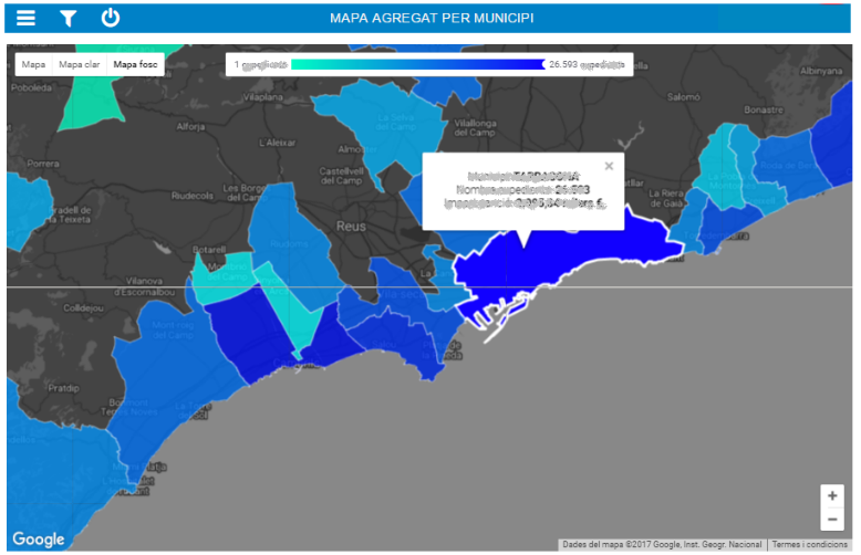 |
Figure 3: Developing Geographic Visualisations with Google Maps JS API – Dashboard 1 |
The next dashboard shows a heat map with a similar look and feel to the previous one. This one also incorporates a label with the number of points requested, which is very important to control due to performance issues. It is a perfect way to identify geographical patterns on the localisation of events.
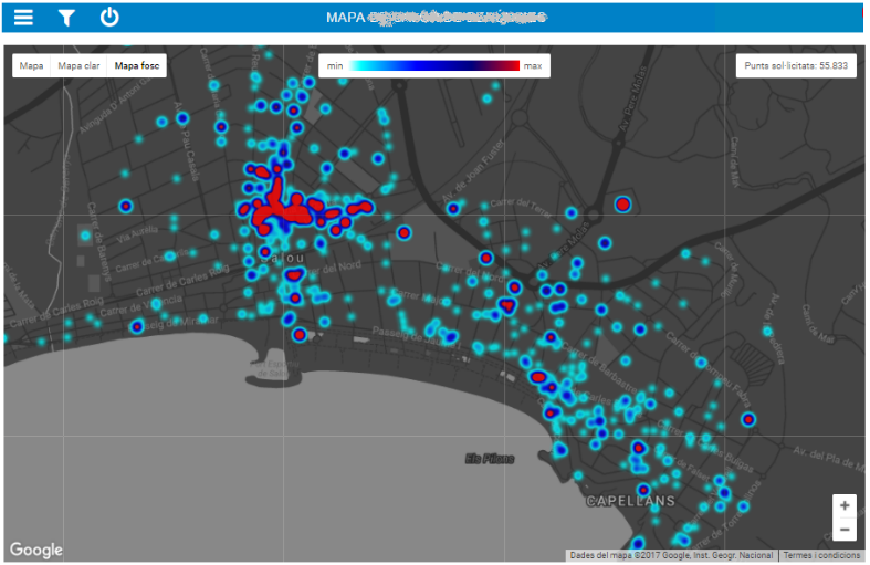 |
Figure 4: Developing Geographic Visualisations with Google Maps JS API – Dashbaord 2 |
The last one shows a markers map which uses specific icons to represent different values of a category. Also, a legend with the descriptions of the icons used can be shown or hidden by clicking on the information button. This is a great manner of introducing another dimension on a geographical analysis.
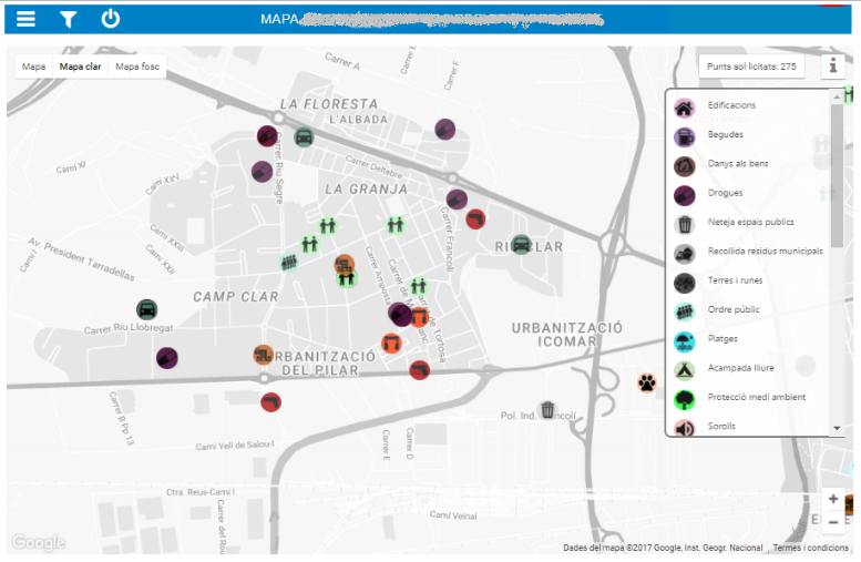 |
Figure 5: Developing Geographic Visualisations with Google Maps JS API – Dashbaord 3 |
Obviously, the complexity of the code depends on the characteristics of the map itself such as the type of map, the utilisation of custom geometrics or markers, the amount of auxiliary elements such as legends and tooltips, or the level of customisation of the background map. However, when working with OBIEE, there is another complexity element to take into account: The insertion of this code into the narrative view structure.
Conclusions
Although this article gives a more general overview of several topics related to the big world of geographic data, we can still get some conclusions from what has been said. First and most importantly, if you have geographic data, remember to draw a map! Moreover, we have talked about the main components you need to create a geographical analysis, and the technical options to implement it in OBIEE. Finally we have shown some nice dashboards using Google Maps API.
Click here if you would you like to know more about displaying geographic data in OBIEE and the services we offer!