01 May 2019 Key Influencers visualization
1. Objective of Key Influencers
1.1. Introduction
The Key Influencers visual is the first Power BI visual that uses AI (Artificial Intelligence); it uses machine learning to reason over your data and extract insights from it, helping you to understand the factors that drive the metrics you are interested in. Once you have picked the KPI you want to analyse, the Key Influencers visualization will figure out which values of which fields drive or influence your metric.
So basically, Key Influencers is of great use when we want to:
- See which factors impact the metrics being analysed.
- Contrast the relative of these factors.
1.2. Add visualization
To be able to use this visualization you first have to add it the Power BI desktop. To do so, go to: File; Options and Settings; Options; Preview Features; Key Influencers visual; Restart Power BI desktop and the widget will appear with the rest of the visuals.
2. Create a Key Influencers visual
2.1. Use guide – step by step
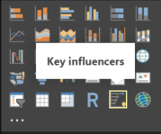
- First of all, open the visualization you have added previously.

Figure 1: Image representing the visualization widget.
- Drag the metric field to the Analyze bucket. Bear in mind that this metric cannot be a continuous field, so it has to be a categorical field: the field shouldn’t include too many categories (two or three) to help the algorithm calculations. Increasing the number of categories would mean having less observations per category, which makes it harder for the visualization to find patterns in the data.
- Next, drag the fields that you think could influence the field we want to analyse into the Explain By box. There’s no limit to the fields you can add here.
- Then, at the top of your visualization, select what category you would like to analyse. Choose from the dropdown filter and the results shown will be for that specific category.
2.2. Features
Once these steps have been followed, we will see some information in the visualization. Let’s explain what this information means.
The visualization divides in two tabs at the top left: the Key Influencers tab and the Top Segments tab.
2.2.1. Key Influencers tab
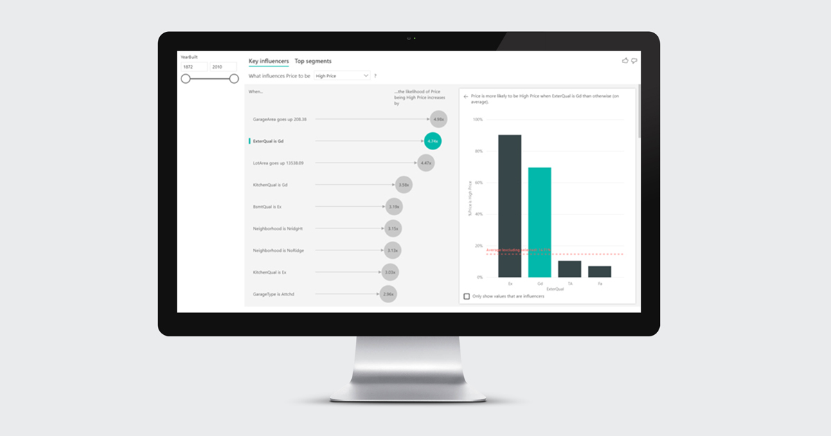
This tab is divided in two. The left pane shows the info of the fields that affect the result of the category that’s being analyzed: the most influencing categories will be shown, from the most to the least, together with a number, representing how much that category increases the likeliness of the analyzed category to be that value.
In the graph on the right, you can see the percentage that the analyzed category represents out of the total of another category, shown in order from the highest percentage to the lowest. Interestingly, the category that represents the highest percentage of all doesn’t mean it influences the result the most. The reason behind this is the visualization also takes into consideration the number of data points when finding influencers, so it’s possible not to have enough data to determine whether it has truly found a pattern with that amount of data.
You can also select the “Only show values that are influencers” checkbox at the bottom right to filter the visual with only the significant categories.
Let’s look at house prices as an example and try to understand what influences the price. The field to analyze is Price, which contains three categories: High Price, Normal Price and Low Price. Some of the factors that can influence the result are the quality of the exterior materials of the house, the size of the house, the size of the garage, the garden area, the neighborhood, etc.
- Interpreting categorical key influencers:
To understand the information that the categorical key influencers provide, let’s check out the example below: the ExterQual field informs us of the exterior material quality of the house – the visual shows that if the exterior quality is Gd (good) then it’s more likely that the price of the house is high. This is an example of what we explained previously: we can see there’s a category (Ex means excellent quality) that shows a higher percentage of the houses being high-priced, because from all the houses that have excellent quality external materials, there’s a higher percentage with a high price. It’s not the category that affects the most, which means there are not enough data points to consider it an influencer.
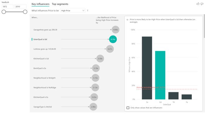
Figure 2: Example of a categorical key influencer.
- Interpreting continuous key influencers:
We can also analyze fields which are continuous, not only categorical. A scatterplot will show the effect of this field versus the analyzed category and we can see in the example below how the %Price increases when the garage area does too; it shows the trend line (red dotted line) to highlight the slope. The information it gives us is that for every time the garage area increases 208.38 square feet, on average, the likelihood of having a high price increases 4.98 times. We can conclude that this value (208.38) is the standard deviation of the garage area.
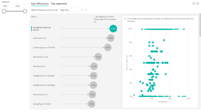
Figure 3: Example of a continuous key influencer.
2.2.2. Top Segments tab
The other view of the visual is top segments. This view lets you see different segments of data points that fall into the topic you are analysing, so basically you can see the aggrupation of a combination of factors that impact the result.
You can first see the distribution of the different segments that have been found by Power BI. As you can observe in the following example, three segments have been found: each of these segments represents a certain amount of data and they are sorted from the highest percentage to the least. The size of the bubble represents the count of data points in that segment.
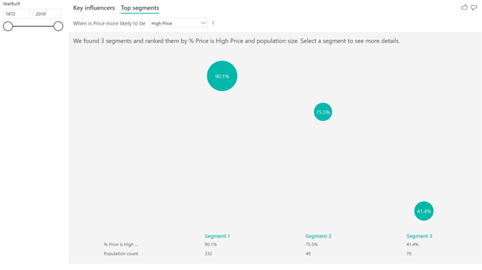
Figure 4: Representation of an example of top segments.
Selecting a bubble drills into the details of that segment, giving the details of the common denominator in that segment, effectively which categories represent that segment. In this case, for example, the garage area is bigger than 420 square feet, the lot area is greater than 8637 square feet, the kitchen quality is not TA and the ExterQual in not TA. We can also see that in this segment 90.1% of the prices are high. It also informs of the amount of data that is used for that segment, in this case 332 data points which represent 22.7% of the total amount of data.
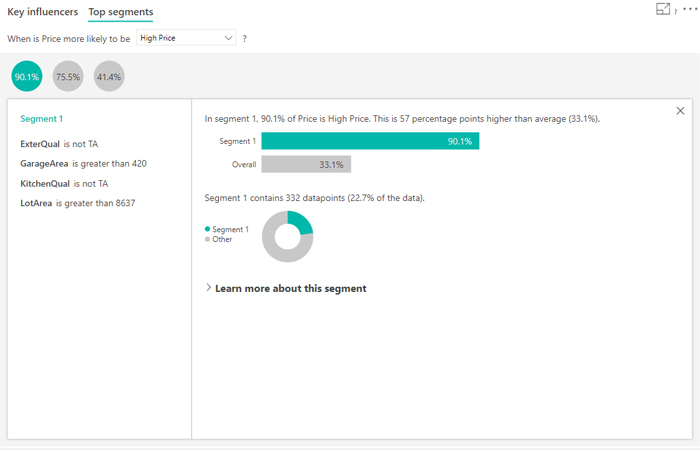
Figure 5: Information shown when clicking on a top segment bubble.
2.2.3. Interacting with other visuals
Another feature that this visualization offers is the possibility of adding a filter/slicer to the report that filters the visualization. For example, you can add a time filter which indicates if the pricing of the houses has varied depending on the range of years.
3. How does it work?
3.1. Find key influencers
This AI visualization uses ML.NET to run a logistic regression to calculate the key influencers. ML.NET is a machine-learning framework built for .NET developers. A logistic regression is a statistical model that compares different groups to each other, analysing how the houses which are High Price differ from the other categories (Normal Price and Low Price).
The logistic regression searches for patterns in the data, looking for how houses with a High Price are different from the others; it also takes into consideration how many data points are present. These data points may appear to greatly influence the result, but as there are so few of them they don’t infer. A statistical test (Wald) is used to determine whether a factor is considered an influencer. The visual uses a p-value of 0.05 to determine the threshold.
3.2. Find top segments
The aim of the segments is to find interesting subgroups using ML.NET. The decision tree takes each explanatory factor and tries to reason which factor will give it the best split. Once the decision tree makes a split it takes that subgroup of data and tries to figure out the next best split just for that data. After each split it also considers whether it has enough data points for this to be a representative group to infer a pattern from, or whether it could just be an anomaly in the data, and therefore not a real segment. (Another statistical test is applied to check for the statistical significance of the split condition, with p-value of 0.05).
Once the decision tree finishes running, it takes all the splits (security comments, large enterprise) and creates Power BI filters. This combination of filters is packaged up as a segment in the visual.
Conclusions
In conclusion, we can say this is a very useful tool from Microsoft Power BI allowing us to use and extract insights that we would not be able see otherwise. This information can later be processed with the objective to improve business. It’s great to have another powerful machine-learning tool that can be used so easily.
If you have any questions or comments about machine learning and AI, feel free to get in touch with us here at ClearPeaks.