27 May 2026 Oracle Analytics Server 2026 Release Highlights
Oracle Analytics Server (OAS) 2026 has just been released, delivering enhancements that expand how you model, analyse, and visualise data. This release is a continuation of Oracle’s strategy of aligning on‑premises analytics capabilities with the innovations introduced in Oracle Analytics Cloud (OAC), whilst also bringing new functionality that will be particularly valuable for customers running OAS environments.
Many of the improvements included in OAS 2026 were first introduced in OAC and have already been covered in our OAC update posts (which you can find here). With this release, those cloud‑proven capabilities are now available on‑premises, narrowing the gap between both platforms in terms of performance and flexibility, and opening a smoother path from raw data to actionable insights.
In this article, we’ll focus on three main areas: the expansion of AI‑assisted analytics for faster and more intuitive insight discovery, refinements to reporting and visualisation that improve usability and analytical speed, and enhancements in the Semantic Modeler and data preparation tools. Together, these updates will help you to simplify your analytical workflows, improve data management, and extract value from data more efficiently, all without the need for deep technical knowledge or machine‑learning skills.
Before we start, here are some links if you want to know more about the Oracle on-premises solution:
New and Enhanced AI and ML Features
Analyse Images and Videos with OCI Vision AI
You can analyse images and videos in Oracle Analytics with pretrained models from OCI Vision AI. These models can detect objects, faces, or text, and can also classify visual content without building or training a special model. This feature is especially useful when working with unstructured content, such as product images, scanned documents, photographs, or videos; this type of content can now be transformed into data that can later be analysed in datasets, reports, and visualisations. For a complete step-by-step explanation, read our blog post where we explain how to analyse images and videos using OCI Vision AI.
Explain Workbook Calculations
The Explain feature can now be applied to calculations created directly within a workbook, rather than only to dataset columns. This gives you deeper insight into your calculations, helping you to understand behaviour, identify the variables with the greatest influence on the results, and access automatically recommended visualisations. For more details and a practical example, take a look at this section of a previous blog post, Explain applied to workbook calculations.
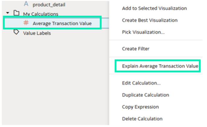
Figure 1: The Explain Calculation Feature
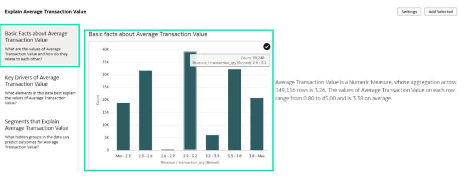
Figure 2: Basic Facts about the Calculation
Similarity Analysis between Records
Oracle Analytics also offers the option to perform Similarity Analysis on datasets; this feature allows you to compare one specific record with the rest of the dataset to find the most similar or most different records, using vector models. This is useful in situations where exact filters are not enough to identify records with similar behaviour or characteristics. The analysis returns a similarity score, which helps you to understand which records are closer to or further away from the reference element. For a more detailed explanation and a setup guide, consult our blog post about similarity analysis in Oracle Analytics.
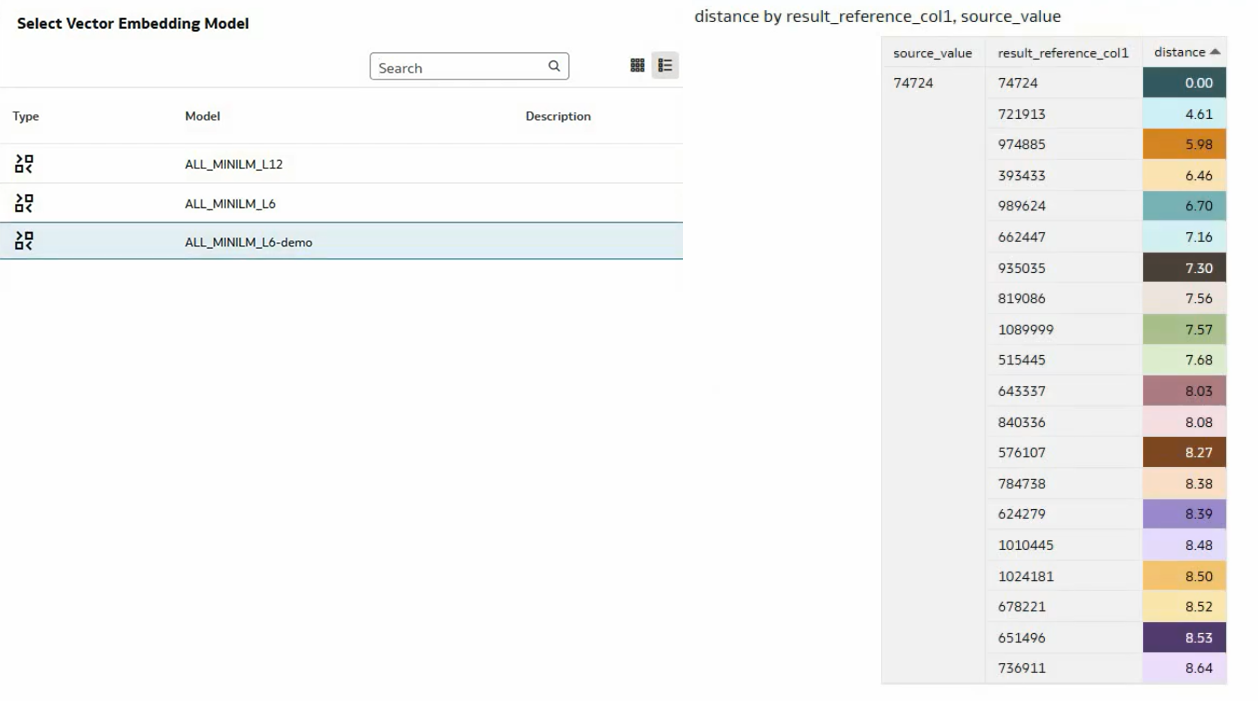
Figure 3: Vector Embedding Models and a Similarity Analysis Report
Language Narrative Visualisation
Language Narrative is a feature that automatically creates written summaries from your charts: instead of analysing the data manually, it presents the main insights in natural language.
To start using this visualisation, bear in mind that Language Narrative is just another chart type. You can duplicate an existing chart (in our case, a pie chart) and change its type to Language Narrative. (Just go to the Grammar panel and select this visualisation type). After that, it will automatically generate a summary with the most important insights from the chart:
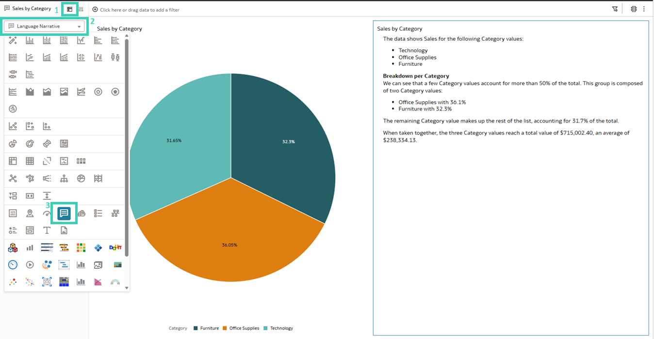
Figure 4: Creating a Language Narrative visualisation
You can use this feature with any chart. It helps you to quickly identify key patterns such as peaks, drops, or seasonality in an easy, intuitive way.
The narrative also reacts to filters in your workbook. For example, if you have a pie chart and select one segment (right-click and choose the Keep Selected option), the text will update based on that selection:
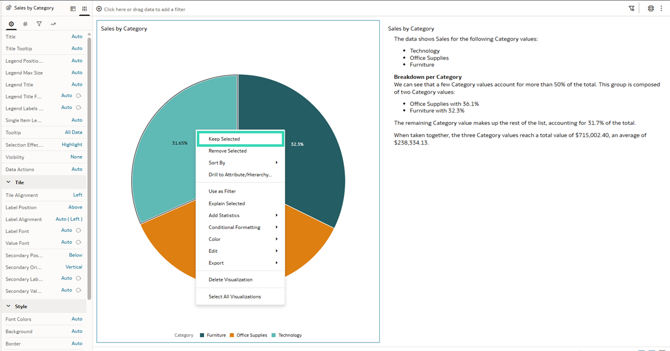
Figure 5: Narrative visualisation with the Keep Selected option
This visualisation includes several customisation options. Firstly, you can control the level of detail in the text with a slicer (currently set to 7). Secondly, the writing tone can be adjusted (factual, casual, or business) depending on the context. Finally, you can select the language and modify certain formatting settings to suit your preferences:
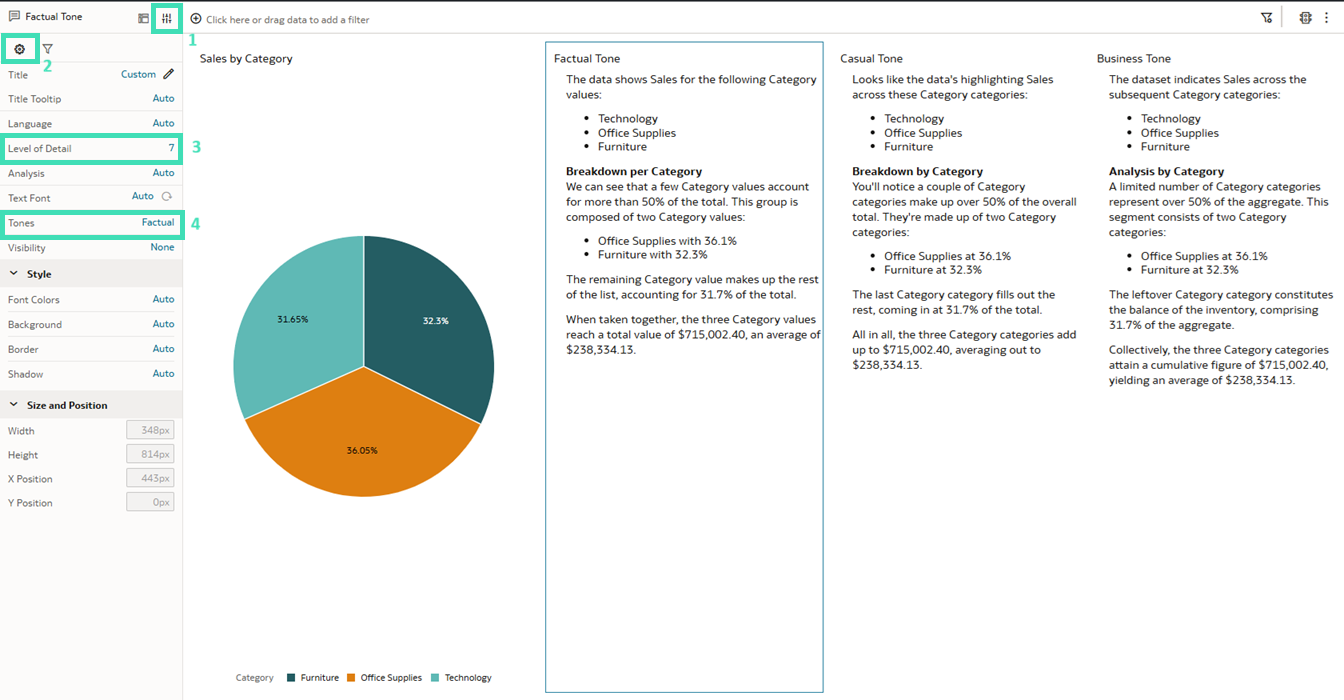
Figure 6: Customisation options for tone and text detail
In practice, this feature makes it easier to understand data and can turn charts into simple explanations, so you can see what’s happening and make better decisions.
Prophet Forecasting Model for Time-Based Predictions
A forecast is a way to predict future numerical values based on historical data over time. In simple terms, it looks at how your data has behaved in the past and then uses that information to estimate what may happen next. By analysing past trends, patterns, and changes, it can provide a useful indication of possible future outcomes.
To generate a forecast, Oracle Analytics requires two key elements: a time dimension, such as days, weeks, or months, and a numerical measure, such as sales, revenue, or temperature. The time dimension shows how values evolve, whilst the measure represents the value to be predicted. Sufficient historical data is also essential, as the model needs enough past information to identify meaningful patterns and produce more reliable predictions.
In our example, the Forecast feature is applied to a line chart: right-click on the chart, go to the Add Statistics option, and then select Forecast. By default, the system selects the Seasonal ARIMA model:
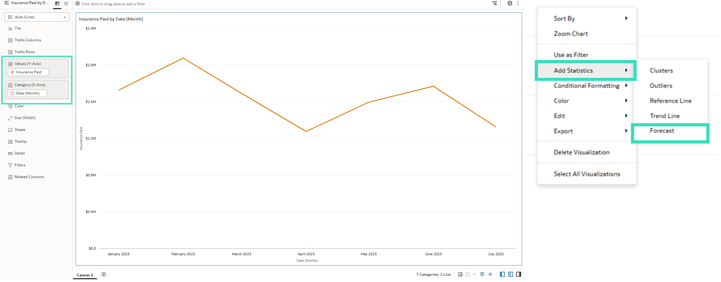
Figure 7: How to add a Forecast to a line chart
As we can see, Oracle offers different forecasting models: Seasonal ARIMA, ARIMA, ETS, and Prophet, each designed for different data types and scenarios (see the model documentation for more details).
Prophet is used to predict numerical values over time, especially with complex datasets. It works well with long time series, multiple seasonal patterns, missing values, and unusual events, making it a flexible and powerful option.
You can select different forecasting models, compare the results, and choose the one that best fits your data:
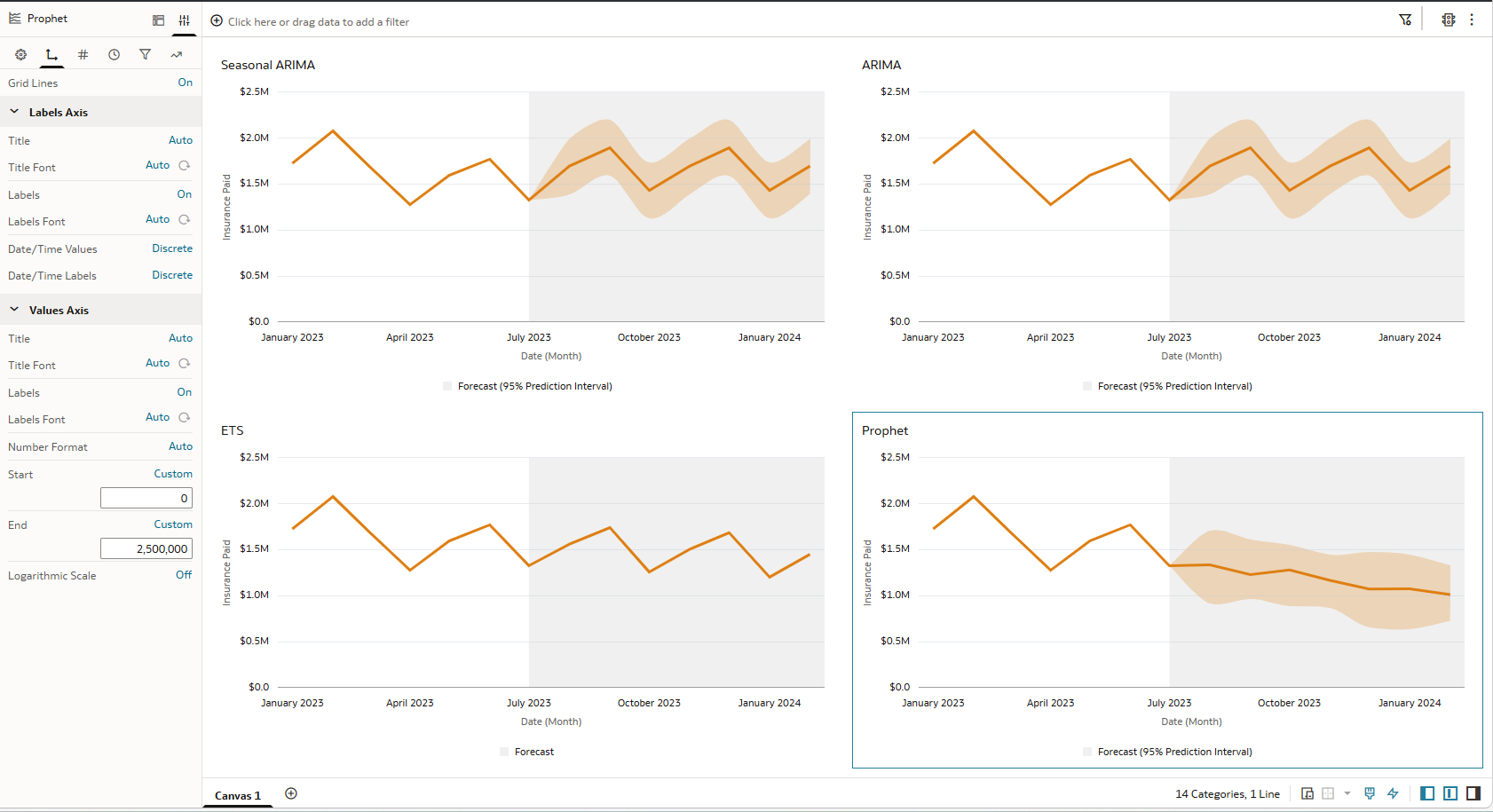
Figure 8: Comparison of different models and axis value configurations
Additionally, you can configure the axis values (start and end) in the Statistics section, which helps you to adjust how the forecast is displayed on the chart. Another important feature is that you can define how many future periods you want to forecast.
Semantic Modeler Enhancements
Model Data from Oracle Analytic Views
Oracle Analytic Views can now be used as a data source for semantic models. These database objects provide an abstraction layer over the underlying tables, defining measures, dimensions, hierarchies, and calculations that can be reused in the semantic layer:
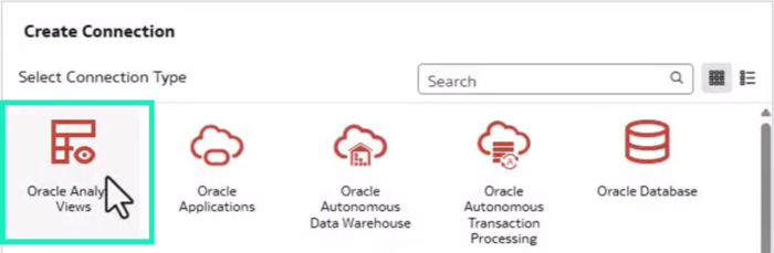
Figure 9: Create Connection to Oracle Analytic Views
For a detailed guide on how to configure the connection and the Semantic Modeler for Oracle Analytic Views, see our OAC January 2026 Update Highlights blog article.
Sort Columns Alphabetically in Semantic Modeler
This new function allows you to reorder the columns of any logical or presentation table alphabetically for consistency and ease of use:

Figure 10: Reorder Columns Alphabetically
Perform Updates Across Multiple Semantic Model Objects
This enhancement lets you edit object tags or application role permissions of multiple objects at once, using the Bulk Edit options, saving time and effort whilst ensuring consistency across the semantic model.
The Bulk Tag Edit option lets you add or remove any specific tag from the selected objects, whilst Bulk Permission Edit allows you to select any role and configure the permissions to be granted to the selected objects:
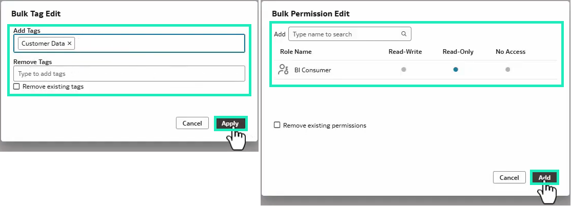
Figure 11: Bulk Edit options windows
Create Custom Consistency Check Rules in a Semantic Model
Now you can create custom consistency check rules in a semantic model, offering more flexibility to validate models according to your own modelling standards and requirements.
When creating a new rule, you can configure several settings, including the rule name, error number, category, violation message, and description. The most important element, however, is the JSONPATH Query, which defines the JSONPath syntax used to identify whether the rule has been violated:
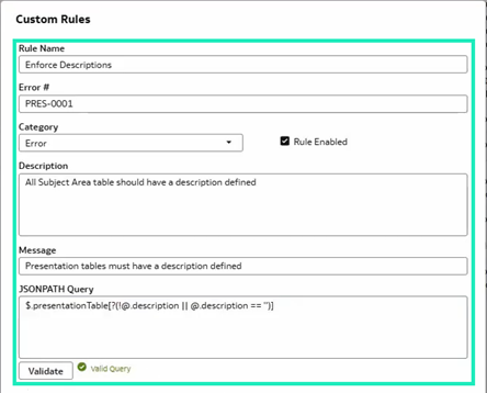
Figure 12: Custom Rule configuration window
Individual rules can be enabled or disabled at any time, and any enabled custom rules are included when a consistency check is run.
Visualisation Enhancements
Access Contextual Insights from the Tooltip Toolbar
Speed matters when exploring data, especially in today’s analytics environments. OAS 2026 introduces the ability to access contextual insights quickly by using the Explain Selected option directly from the tooltip toolbar.
Contextual Insights is an automated feature within Oracle Analytics that uncovers hidden trends and patterns. It compares a selected data point against the rest of the dataset to identify drivers, anomalies, and correlations that might not be visible in a standard chart.
By clicking on a specific data point, the Explain Selected functionality is displayed. Instead of having to manually build several new charts to understand a spike or a dip, Oracle Analytics generates supporting visualisations automatically, enabling faster analysis without leaving the visualisation.
Let’s see how to generate insights. Imagine that you’re looking at a report on Donation Value by Primary Focus Area. You notice a significant spike in one area and want to understand what is driving it. By right-clicking and selecting Explain Selected, the system doesn’t just give you a generic summary, but performs a deep-dive analysis against other attributes in your dataset.
As you can see in the screenshots below, the engine highlights the Top Differences by Resource Type, showing a significant gap where certain resources, such as Technology or Supplies, are performing very differently when compared to the rest of your data.
You can add the visualisations to your canvas by clicking the + icon and build a fuller picture of why certain donation areas are more successful than others:
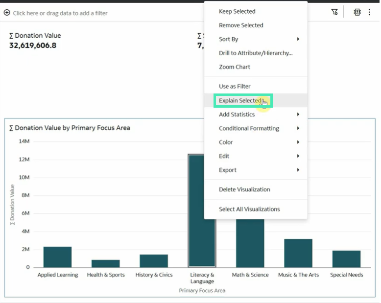
Figure 13: Right-click on the column bar and select Explain Selected from the menu
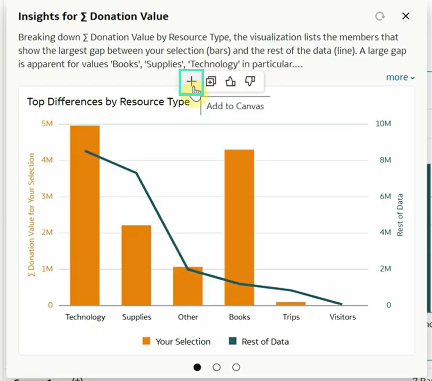
Figure 14: Automatically generated insights with the option to add them to your canvas
The analysis doesn’t stop at a single dimension. By selecting the dots beneath the visualisation, you can access a second key driver: Top Differences by Secondary Focus Subject.
This insight helps you to understand the secondary story behind the data. A high donation value, for example, may not be driven only by the primary focus, but also by a specific secondary subject, such as Literacy or Environmental Science, attracting a different donor demographic. By revealing these additional layers, OAS 2026 helps you to move beyond seeing what happened and towards understanding which factors contributed to the result.
If the initial results do not provide the insight you need, click on the Find new insights link to explore additional visualisations and patterns in your data:
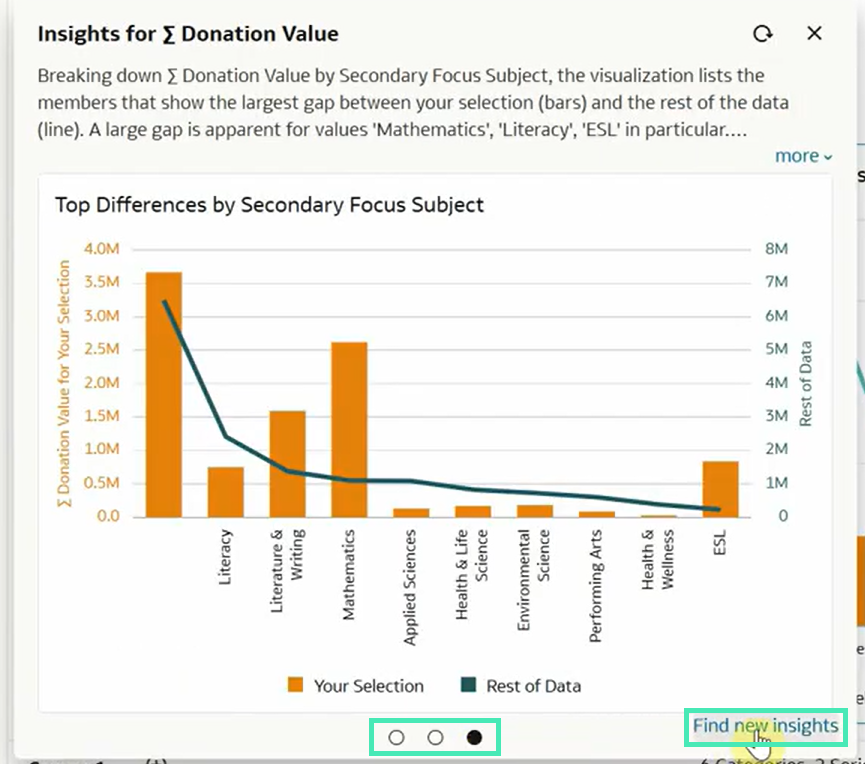
Figure 15: How to explore more insight options
Smarter Filtering with Limit Values By
The Limit Values By feature was first introduced in the 2024 edition of Oracle Analytics to help you to manage how different filters interact with one another. After improvements in the 2025 edition, the new 2026 release enhances this feature further.
A common issue in data exploration is that filters can return empty results, disrupting the flow of analysis. To prevent this, OAS can limit the values shown in one filter based on selections made in another. For example, if you select California in a State filter, a City filter on the same canvas will update to show only Californian cities, keeping your analysis focused.
Whilst this automatic cascading is often helpful, there are cases where you might want a filter to keep a broader, independent view. For example, when analysing performance in a specific city, you may still want your Product Category filter to show every category the company offers, including those not sold in that location.
In OAS 2026, you can decouple these interactions. By adjusting the Limit Values By property to None for a specific filter and unchecking the influencing dimensions under the Filter tab in the Properties panel, you can ensure that certain lists remain independent.
As a result, even when your dashboard is filtered to a single city, your Category list remains complete. This gives you better control, allowing you to use context-aware filters where they are useful and broader filters where a global view is needed.
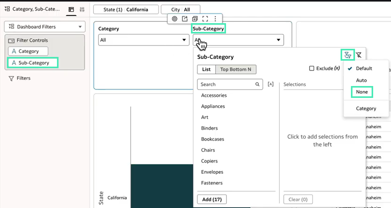
Figure 16: Unlinking the Sub-Category filter from geographical selections
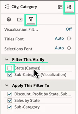
Figure 17: In the Filter tab, uncheck the State (Canvas) option under the Filter This Viz By section
Create and Save Multiple Personalised Workbook States
This new feature allows you to save specific workbook states, including applied filters, so you don’t need to apply the same filters every time you open the workbook.
This is managed from the Workbook State menu, where three options are available.
- Apply State allows you to switch between available workbook states. By default, Original State and Last State are available. Original State is the version defined by the workbook author, whilst Last State reflects the most recent changes made to the workbook.
- Save State allows you to save the workbook state at a specific point, creating a custom state that can then be selected later.
- Manage State allows you to set the default state for the workbook.
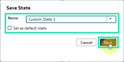
Figure 18: Creating a custom Workbook State
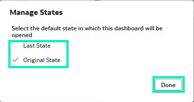
Figure 19: Setting the default Workbook State
New and Enhanced Charts
Advanced Mapping and Dynamic Lines
Building on the dynamic line map layer functionality first seen in the OAC May 2025 release, OAS 2026 now supports curved and bi-directional lines and directional arrows on map layers. This is particularly useful for logistics and flow analysis, allowing you to visualise movement between locations with more sophisticated geometry support. You can now download system map layers as JSON files, modify them, then upload them again as custom layers, providing greater flexibility when adapting map layers to your spatial data requirements.
The Gauge Visualisation Suite
Gauge visualisations are now more complete in OAS 2026. We previously covered the launch of circular gauges in our OAC March 2025 post and linear gauges in our OAC May 2025 post, but this release brings the gauge family together with clearer formatting and improved labelling.
OAS supports four gauge types: Semi-Circular, Circular, Horizontal Bar, and Vertical Bar. In OAS 2026, formatting properties are aligned across these types, and one of the most useful additions is the ability to define how range labels are displayed.
Let’s see how to configure your gauge range. Within the gauge properties, you can move away from the automatic settings and define the values and labels yourself:
- Custom Limits: In Start and End, you can switch from Auto to Custom to enter your own baseline and target values.
- Range Label Control: By clicking on Range Labels, you can choose how much detail is shown:
- Start/End: shows only the boundary values you defined.
- All: shows range values at equal intervals along the gauge, providing a more detailed scale.
- None: keeps the gauge face clear of numbers.
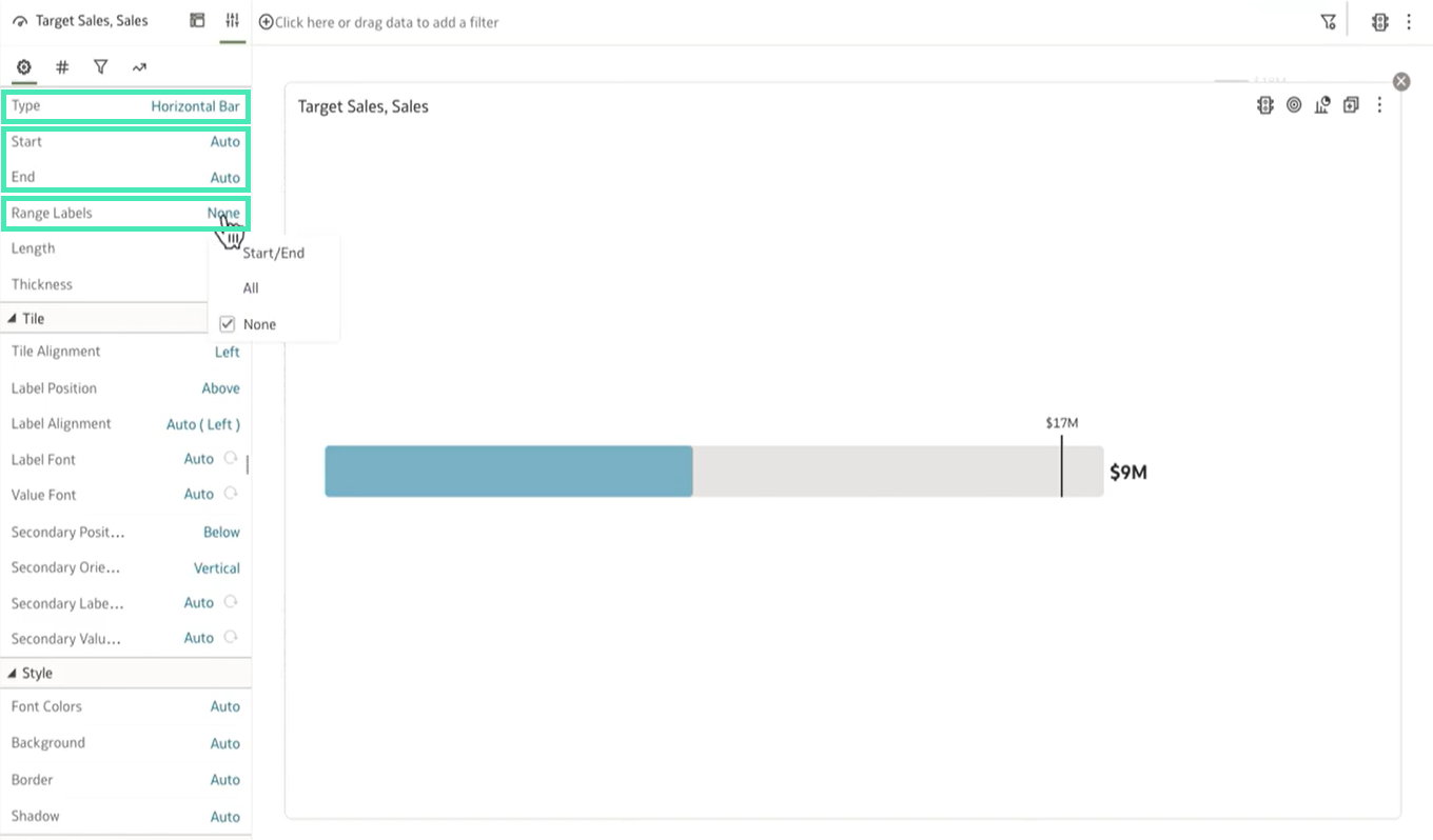
Figure 20: Configuring Gauge Properties
Mekko Charts for Market Analysis
Previously highlighted in our OAC September 2025 post, Mekko Charts (or Marimekko charts) are now a standard part of the OAS charting library. These charts use stacked bars where the width of each column is determined by a second measure, allowing you to compare two dimensions of data, such as market share and total market size, in a single visual.
In the example below, the chart compares Product Category by Customer Segment. Each column shows how profit is distributed across Furniture, Office Supplies, and Technology, whilst the width of the column reflects Sales. This makes it easier to see not only which product categories contribute most within each segment, but also which customer segments represent the largest sales volume:
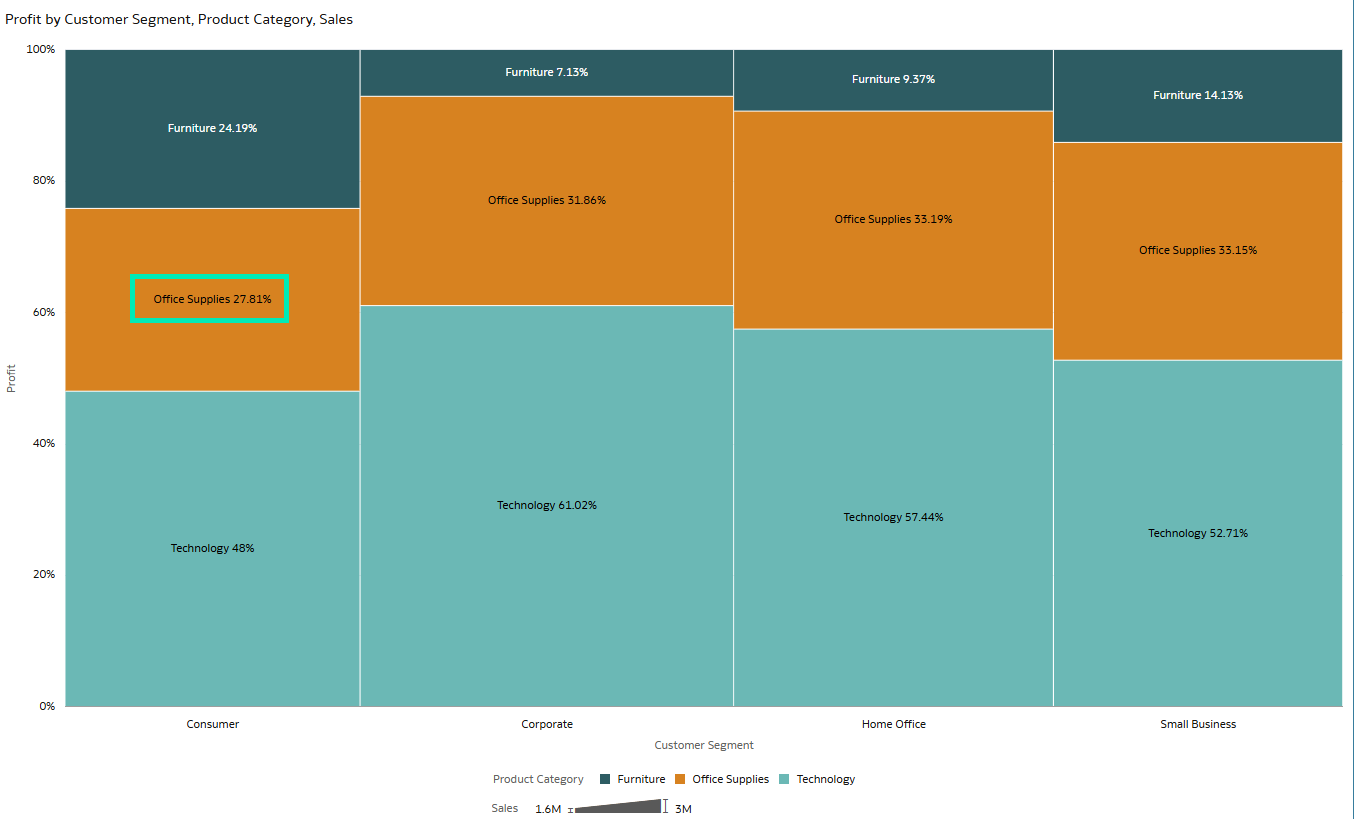
Figure 21: A Mekko Chart
Dataset and Data Flow Enhancements
Filter Data Based on Columns in Multiple Tables
You can now define dataset-level filters that affect the data before it is used in a workbook. These filters can use columns from any table within the dataset, allowing you to apply more realistic constraints before analysis begins:
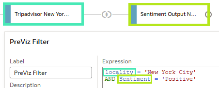
Figure 22: Dataset Filter Expression
Add Column Descriptions to Generated Datasets
Another enhancement to datasets is the ability to add column descriptions. This improves data governance and helps you to understand the meaning of a column by hovering over it in a workbook. You can explore this feature and dataset-level filters in more detail in our OAC September 2025 Update Highlights.
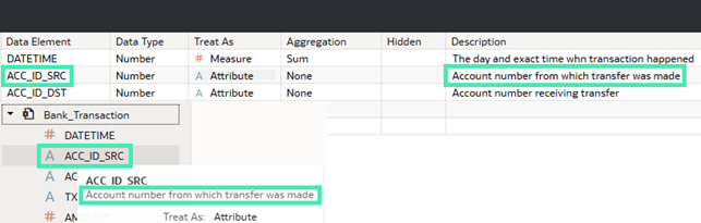
Figure 23: Column Description and Workbook View
Update the Database Connection for Individual Tables Within a Dataset
The last dataset-related improvement we’ll highlight is the ability to update the connection for an individual table within a dataset. This feature was already covered in depth in our OAC July 2025 Update Highlights post. Its main benefit is that it simplifies the process of updating table connections whilst helping to ensure that any related reports remain functional:
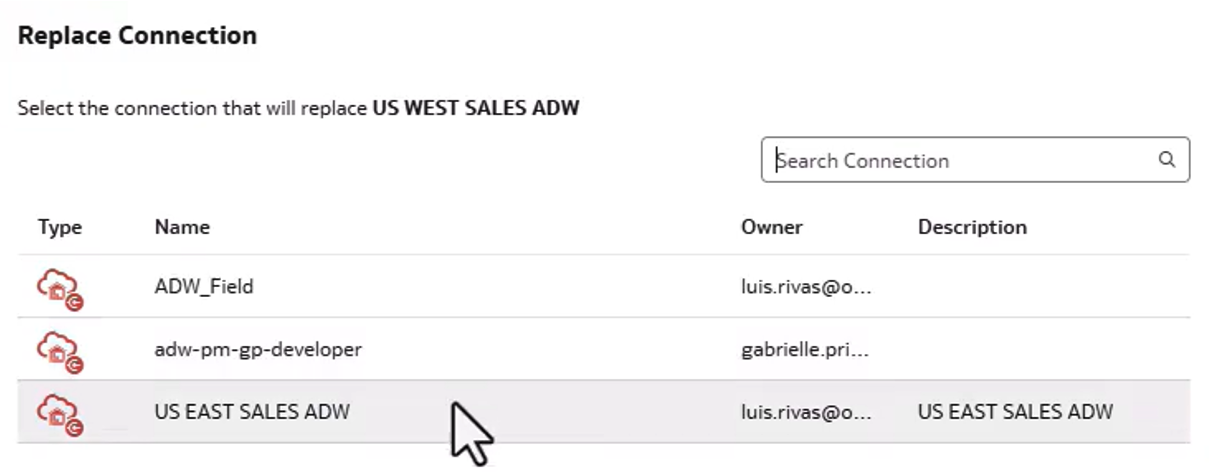
Figure 24: Replace Connection Menu
Enhanced Data Flow Designer
OAS 2026 also enhances the Designer interface, with new node colours based on function and two separate layouts for easier navigation:
- The Compact layout displays inputs and data sources closer to where they are used in the data flow, making it easier to see exactly where a data source has been added.
- The Expanded layout displays all the inputs and data sources on the far-left side of the screen, which is useful when you need to see all the data sources included in the data flow.
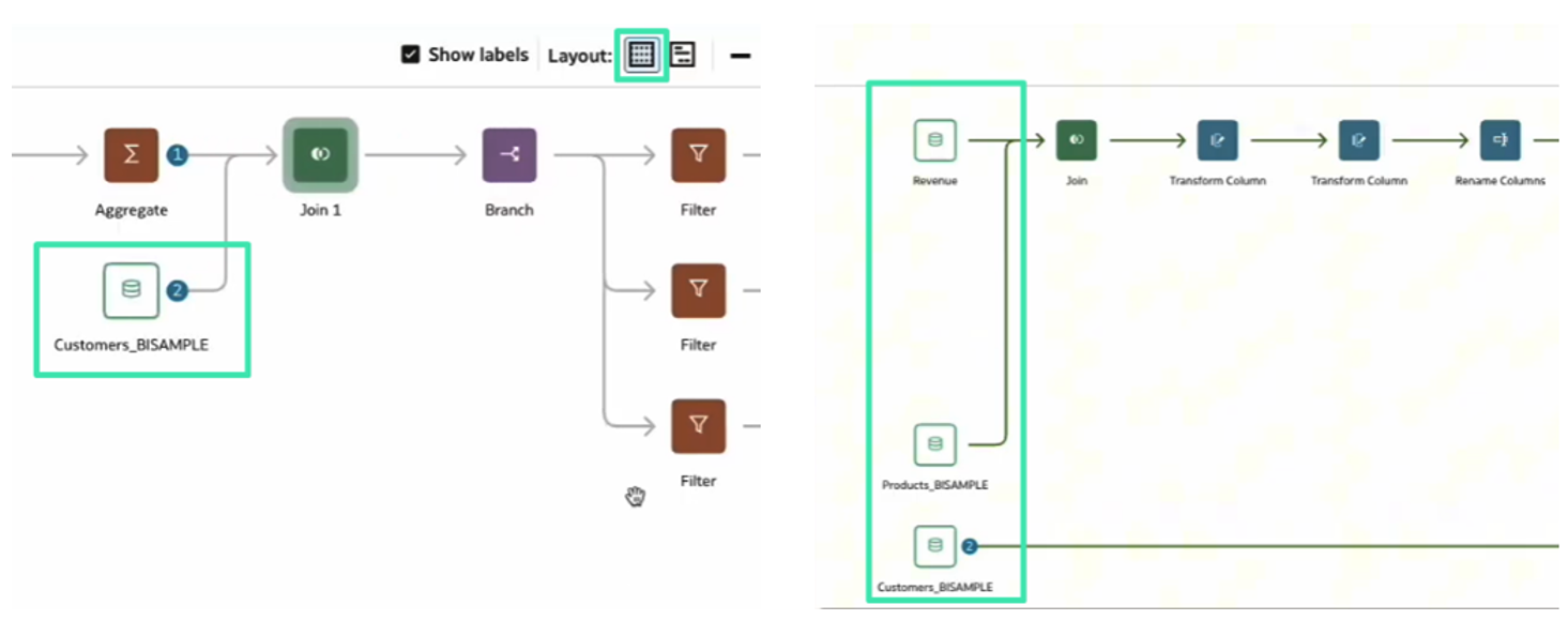
Figure 25: Compact layout view versus Expanded layout view
Conclusion
The Oracle Analytics Server 2026 release includes a wide range of features aimed at expanding reporting capabilities, improving day-to-day data preparation, strengthening semantic modelling workflows, and bringing more AI-assisted functionality into the analysis experience. We’ve covered the most relevant updates, but there are many other additions worth exploring. These include improved flexibility in data actions, new controls for pivot and table visualisations, date-based logic for conditional formatting and parameters, selection steps in workbooks, enhanced parameter formatting, and the ability to add subject areas to data flows, amongst others.
Administration has also been improved, making OAS more accessible and configurable. Updates include a new search bar in the Console, a more user-friendly Roles and Permissions page, new privileges to control who can configure datasets to preload data from subject areas or manage connections to OCI Object Storage, and the ability to create custom Landing Pages and assign them to specific users or roles. These changes make it easier to tailor OAS to different user groups and manage the platform more efficiently over time.
Here at ClearPeaks, our dedicated team of Oracle experts closely follows and adapts to Oracle Analytics updates, both Oracle Analytics Server and Oracle Analytics Cloud. If you’re planning to adopt, upgrade, or want to get more value from Oracle Analytics, contact us and we’ll help you to make the most of the platform.