01 Jul 2026 Oracle Analytics Cloud May 2026 Update Highlights
Oracle continues enhancing Oracle Analytics Cloud (OAC) with features that make it easier for users to explore data, gain insights, and get answers faster. The May 2026 update continues Oracle’s focus on AI, bringing new capabilities that help users to interact with analytics in a more natural, contextual way.
Beyond AI, this release also includes a number of useful updates across visualisation, mapping, and semantic modelling. New charting options, preview improvements to natural language search, expanded geospatial capabilities, and updates to the Semantic Modeler all contribute to a more streamlined analytics experience. In this blog post, we’ll take a closer look at some of the key features in this release and see what they mean for both business users and developers.
Natural Language Search (Preview)
Oracle Analytics now includes a new search feature that allows users to interact with the platform using natural language as well as traditional keywords. This means that you can now easily search for content and ask questions about the data, such as, “Find recent workbooks related to inventory performance” or “Which regions are underperforming against forecast this quarter?”
This makes information easier to access, reduces the need to know the exact names of objects or dashboards, and speeds up insight discovery.
To use this new feature, we first need to index a dataset. These are the steps to follow:
- Select a dataset on your Home page or Data page.
- Hover over the dataset, click on Actions, then on Inspect.
- Click on the Search tab.
- On the Settings tab, click on the Index Dataset For drop-down menu and select an option.
- Click on the Languages field and select the language you want to use to produce the dataset index.
- Set the Indexing Schedule.
- Click on Save.
- Click on Run Now to index your dataset immediately.
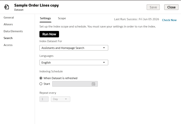
Figure 01: Indexing a dataset
Once we have indexed the dataset, we go to the Home page and can now use natural language to generate a visualisation:
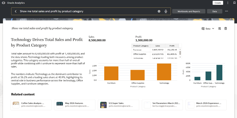
Figure 02: A visualisation generated using natural language processing
Bind Workbook Parameters to AI Agent Filters
The new release allows users to link workbook parameters to filters used by an AI Agent (check out our OAC January 2026 Highlights post to learn more about AI Agents). Once this association has been configured, the selected values are automatically applied to all queries and responses generated by the AI Assistant. This ensures that AI responses stay aligned with the user’s analytical context, removing the need to specify the same filters in every interaction.
First, we need to create an AI Agent associated with a workbook. To do this, in the main menu, click on Create, then on AI Agent:
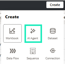
Figure 03: Creating an AI Agent
Then we link it to the dataset used by the workbook in which we want to use the AI Agent:
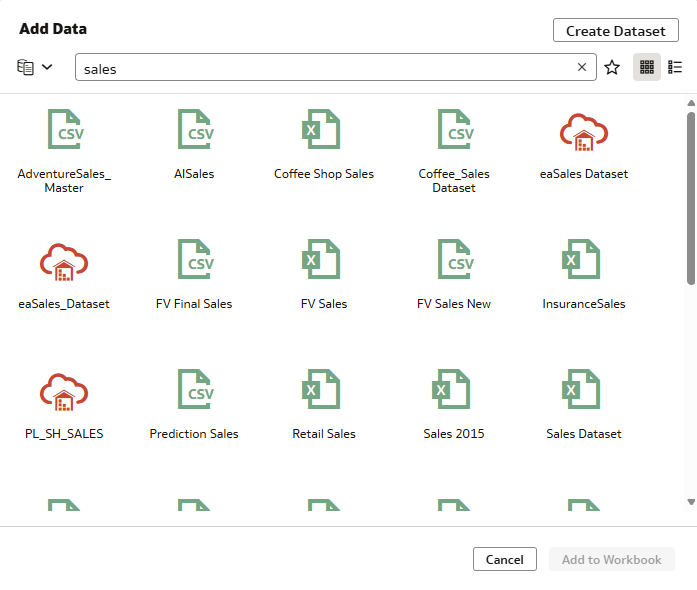
Figure 04: Connecting the AI Agent to a dataset
Once created, we open the workbook, and as we can see in this example, a filter has been applied to the region:
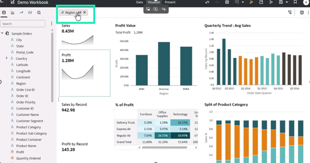
Figure 05: A report showing all regions before applying a specific filter
Let’s switch to the Present mode and link the agent we created earlier to the workbook:
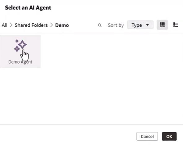
Figure 06: Selecting the AI Agent to use in the workbook
The following step is to link the filter used in the workbook to the agent:
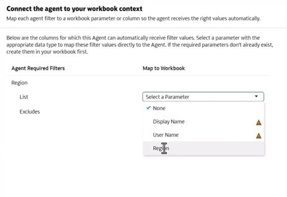
Figure 07: Applying the same filter from the workbook to the AI Agent
Now we save the workbook and open the AI Assistant; we can ask for specific information, such as “Show sales by region”, and the agent will apply the same filter we configured earlier:
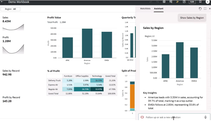
Figure 08: Results from the AI Assistant using the same filter as the workbook
Next, we change the filter in the workbook and filter by the “Americas” region:
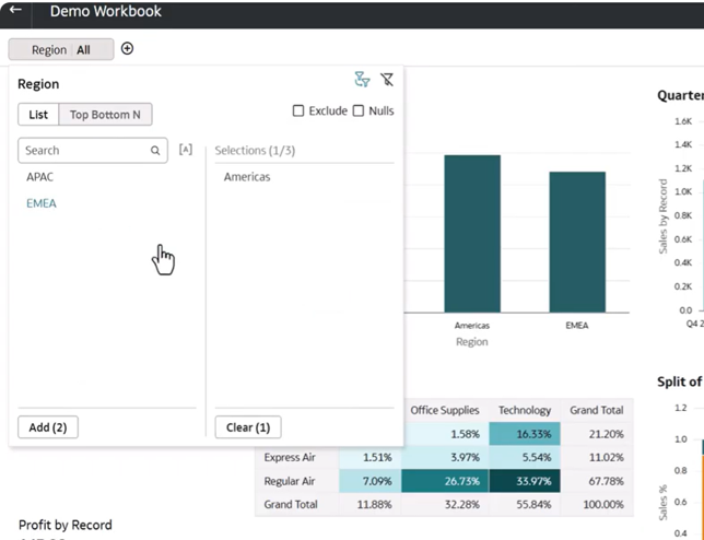
Figure 09: Changing the workbook filter
Now we can ask the AI Assistant again to show us information, such as “Show the top 10 products by sales”, and we see that it applies the same filter we defined in the previous step:
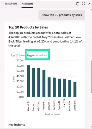
Figure 10: AI Assistant results with the new filter applied to the workbook
Compare Trends Over Time
With the May 2026 updates, users can easily make comparisons in reports using a template for time-series calculations to see how measures change over time.
Imagine we have a report showing sales and profit on a monthly and annual basis. The first step is to create a time series calculation, so right-click on My Calculations and select Create Time Series Calculation from the context menu:
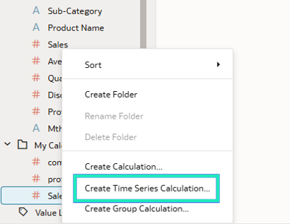
Figure 11: Create Time Series Calculation
In this example we’re going to calculate total sales for the current year. After clicking on the option shown above, name the calculation “Sales YTD”, then configure the following settings:
- Calculation: Period To Date
- Measure: Sales
- Time Interval: Year
OAC will automatically generate the expression that calculates this new field, as shown below:
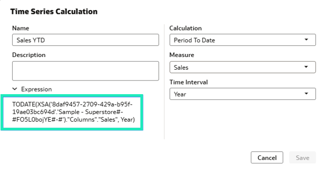
Figure 12: The auto-generated expression
Next, we add our calculated field to the report and can see how it calculates the total sales, based on the settings we defined:
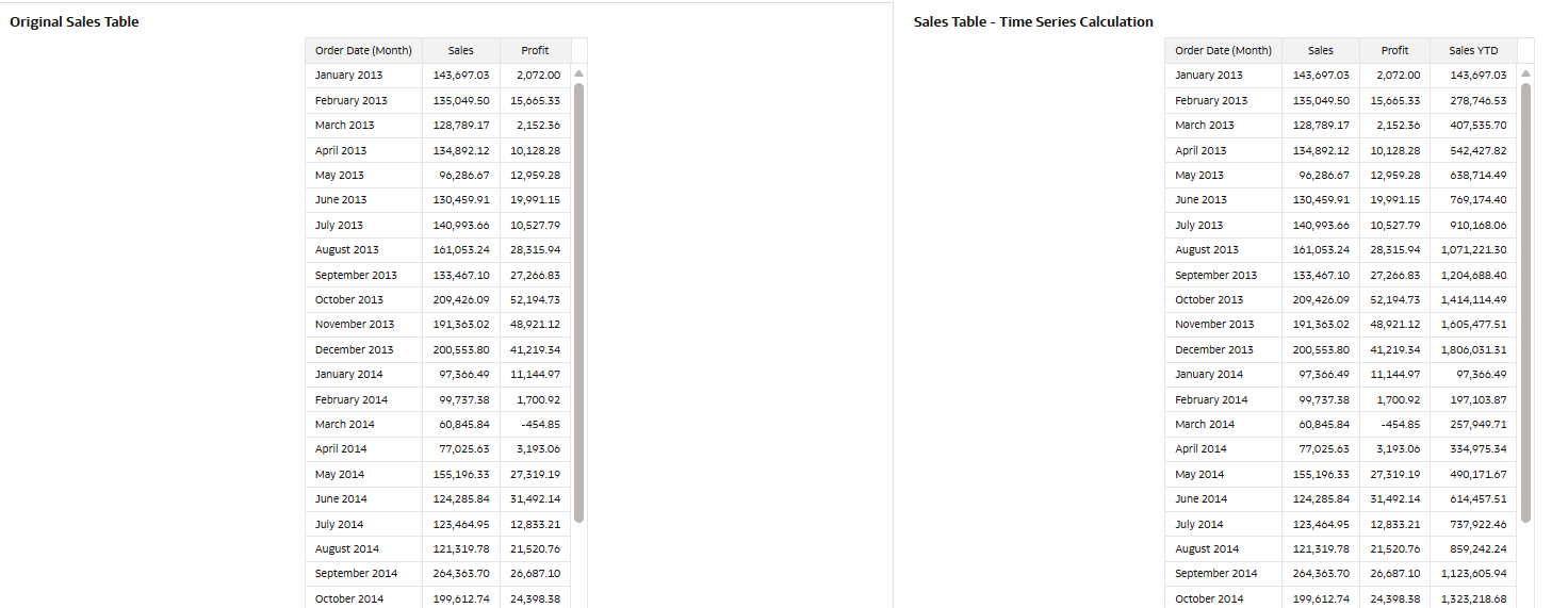
Figure 13: Adding the auto-generated field to the report
Create Range Charts and Embed Iframe Visualisations
Three new visualisations that allow you to represent ranges of values within a category (Range Bar, Horizontal Range, and Range Area) have also been included in this release, making it easier to analyse variations, differences, and dispersions between data groups, thus providing a more comprehensive view than traditional charts based on a single value.
To create a range chart, open a new canvas and select Range Bar from the Settings panel:
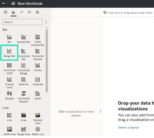
Figure 14: Selecting the Range Bar option
The fields used to define these comparisons are Start Range and End Range:
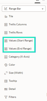
Figure 15: Configuration parameters
For instance, we want to see the range of maximum and minimum temperatures over time for some cities, so we configure the parameters to obtain that comparison:
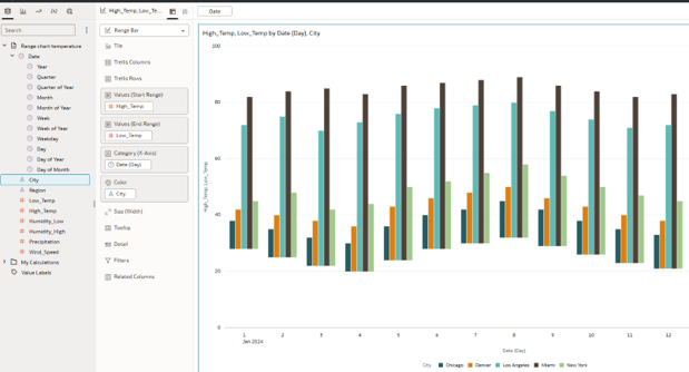
Figure 16: Comparison of maximum and minimum temperatures by city
Another useful enhancement is the ability to embed external content directly within a workbook canvas, allowing users to provide additional context or supporting information without leaving Oracle Analytics. In this example, we’ll extend the previous report by embedding an Oracle documentation page that explains the feature in more detail.
To do this, simply add an iframe visualisation to the workbook canvas and specify the URL you want to display. The external content will then be rendered directly within the workbook canvas, creating a smooth, informative user experience:
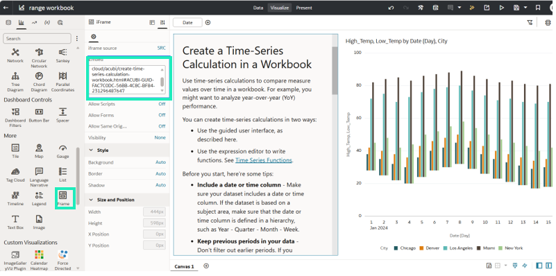
Figure 17: Inserting a URL into a workbook canvas
Formatting Options for Visualisation Titles
Another new feature is the ability to apply formatting and multi-line text to customise visualisation titles. To do this in our report from the previous example, we double-click on the title to open the text settings:
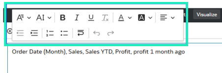
Figure 18: Text settings
This is how we changed the text formatting for the visualisation title with the options provided by the new feature:
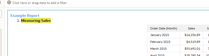
Figure 19: Example of formatted text
Configure the Zoom Level for Map Layer Transitions
Users can now specify the zoom level at which each layer is displayed in map visualisations, giving them greater control over exploration. Aggregated data is displayed at lower zoom levels, and as the user zooms in, more detailed layers are revealed.
For example, a map might initially display data by country, and as the user zooms in, it reveals information by state and then by city, both improving the map’s readability and allowing users to explore the data progressively, moving from a summary to a more detailed view:
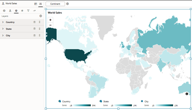
Figure 20: A report showing information by country
By default, map layers use automatic settings to determine when they should be displayed. However, the new Custom option lets you set the minimum and maximum zoom levels at which each layer will be visible.
For example, you can configure the countries layer to appear between zoom levels 0 and 3, the states or regions layer between 3 and 5, and the cities layer between 5 and 10. This way, the level of detail displayed adapts progressively as the user zooms in.
Additionally, this option displays an indicator showing the current zoom level, making it easier to configure the best ranges for each layer and helping to create a more intuitive navigation experience:
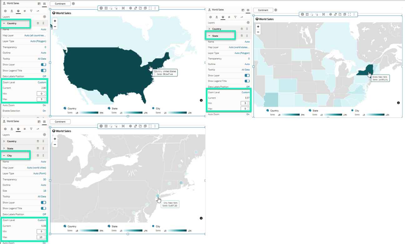
Figure 21: Zoom settings for the country, state, and city layers
Resolve Consistency Check Issues with A Single Click in Semantic Modeler
The new release also introduces an option to fix certain errors detected during a semantic model validation with a single click. It automates the resolution of common configuration issues, reducing manual effort to maintain model consistency.
Issues that can be corrected automatically include unnecessary spaces in presentation objects, discrepancies in column names, and incorrect settings for total levels in hierarchies.
First, open a semantic model and run a consistency check to see if there are any errors:
Figure 22: Running a consistency check on a semantic model
In this example, we see that there are nine issues, and three of them have the Autofix option:
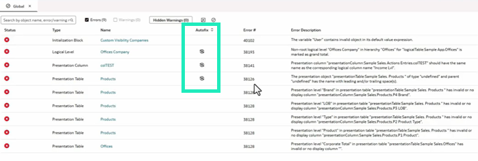
Figure 23: Issues detected with the Autofix option
This means that Semantic Modeler can resolve these issues automatically; we click on the Autofix button for each issue:
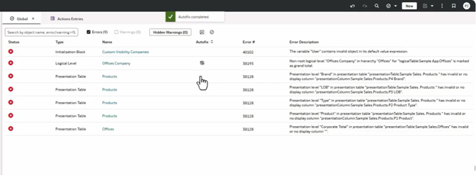
Figure 24: Running Autofix on each issue
Once those issues have been resolved, we run the consistency check again:
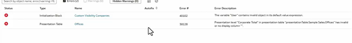
Figure 25: Issues remaining after using Autofix
As we can see, in addition to the three issues resolved using Autofix, other issues have also been resolved, since they depended on those initial three.
Geometry Column Support in Datasets (Preview)
As a preview feature, geometry columns can now be included in datasets, enabling the native use of spatial data within the platform.
This means that these fields can be used directly in data-driven map layers, as well as in spatial calculations, without the need for additional transformations.
First, an administrator must enable the geometry data type for your Oracle Analytics environment.
- On the Home page, click on the Navigator, and then on Console.
- Click on System Settings.
- Click on Preview and turn on Enable Geometry Data Type.
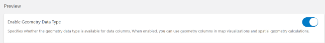
Figure 26: Enable Geometry Data Type
To visualise shapes from a geometry column, you need a dataset that contains geometry data. In Oracle Analytics, this geometry data can come from an Oracle database column using the SDO.Geometry data type, or from a CSV file containing geometry data in Well-Known Text (WKT) format.
- On the Home page, click on Create and then on Workbook.
- In the Add Data dialog, click on a dataset with a geometry column, then on Add to Workbook.
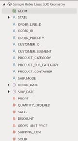
Figure 27: A dataset with a geometry column
Once the dataset has been added to your workbook, you can simply drag and drop the geometry column onto the Visualize canvas to start creating visualisations, as described in the next section.
Visualising Geometry Column Data
In the Data panel, locate the geometry column and drag it to the Visualize canvas to start building a visualisation:
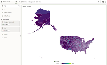
Figure 28: A visualisation using a geometry column
By default, the map visualisation renders without any background map layer, and if necessary, we can overlay the map shape on a background map layer:
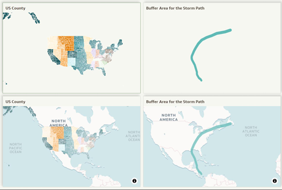
Figure 29: Comparison between default geometry display and geometry overlaid on a background map layer
Conclusion
In this post, we’ve focused on selected updates from the Oracle Analytics Cloud May 2026 update, which delivers a set of enhancements that further strengthens the platform’s capabilities across data visualisation, user experience, AI, and semantic modelling.
On the analytics and dashboarding side, this release enhances data exploration and visualisation by introducing improved trend comparisons, range charts, the ability to embed external content in workbook canvases, richer visualisation titles, and more personalisation options such as map zoom configuration.
From an AI, data modelling, and administration perspective, Oracle expands its augmented analytics capabilities with preview natural language search and question-answering in workbooks, tighter integration between AI Agents and workbook parameters, improved usability and governance through the one-click resolution of Semantic Modeler consistency issues, and preview support for geometry columns in datasets.
The release also changes the sentiment-analysis path: the Analyze Sentiment data-flow node is now deprecated, and new sentiment-analysis use cases should use OCI AI Language instead.
Here at ClearPeaks, we’ll continue to monitor and analyse each OAC release to help you to understand and benefit from its new functionalities. If you would like to see how these features could be applied to your environment, do reach out to our dedicated team of Oracle experts.