28 Jun 2019 Data Insights with Microsoft Graph
Microsoft are famous for their tools which help people to work more efficiently and to increase their productivity. With their cloud services, Office 365 and Azure, Microsoft are collecting massive amount of usage data, and during the last two years they have focused on developing ways to analyse this data and to give customers the ability to use it.
In the last Microsoft Ignite 2018 (September 24-28 in Orlando) and Microsoft Build 2019 (May 6-8 in Seattle) conferences, the IT giant shared some insights into their customers: they want to be more agile, to do digital transformations, and to keep their companies competitive in the future. Based on this, MS came to 3 main conclusions:
- 50% of transformations fail because human behaviour doesn’t change.
- Companies that focus on culture are 5x more likely to succeed in their digital transformations.
- Collaboration data from everyday work can change the culture from soft to hard science (from an idea to something measurable).
They also gave examples of some customer problems:
- One had problems with attrition. After analysis, their data revealed that the most engaged employees have regular 1:1 meetings with their managers. After tackling this issue, they started to have more frequent 1:1 meetings, and their attrition rate got proportionally lower; as a result the customer has now managed to lower attrition by 50%.
- Another had a big issue with inefficient and non-essential meetings. After data analysis, they were able to give each employee 23 days back per year that had formerly been dedicated to meetings.
The issues mentioned above can be tackled with Microsoft MyAnalytics and Workplace Analytics, but before showing some examples of these products, let’s first take a look at how to access Microsoft usage data.
1. Microsoft Graph
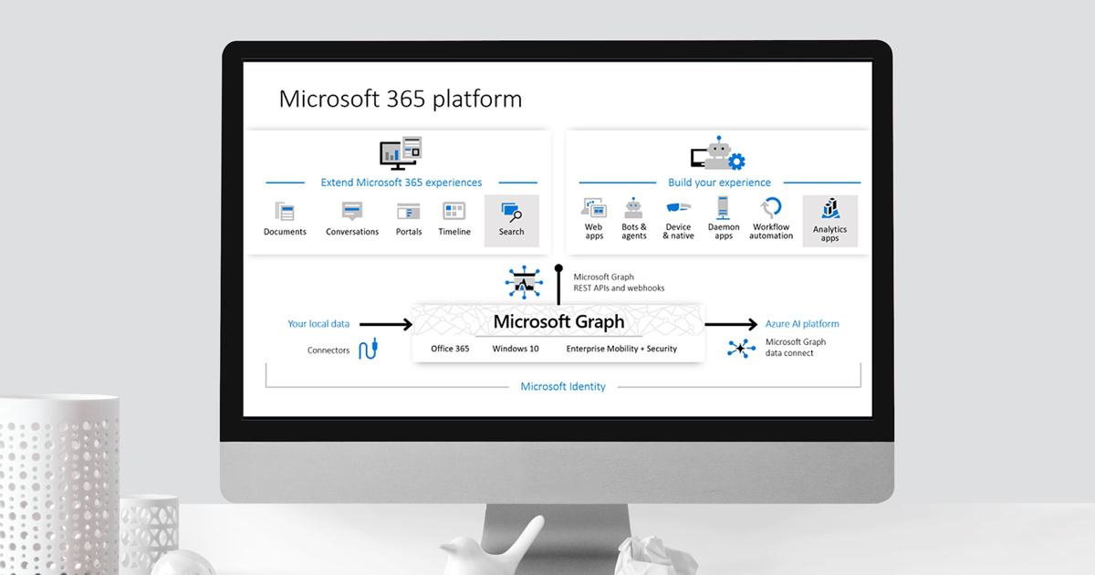
Microsoft Graph was initially released in 2015 as a platform to connect all Microsoft products – Office 365, Windows, SharePoint, Azure, etc. – to offer a better user experience across the product range, so, for instance, when you upload a file to one of the products it’s accessible in all other Microsoft products, connected through the cloud.
During the last few years they have enriched that accessibility, by adding AI on top of the data, providing a set of tools to access data on Microsoft Graph at scale, while allowing administrators granular consent and full control over their Microsoft Graph data; Data Connect streamlines the delivery of this data to Microsoft Azure. They have built various connectors for Azure, Power BI, and perhaps most importantly, they have created REST API.
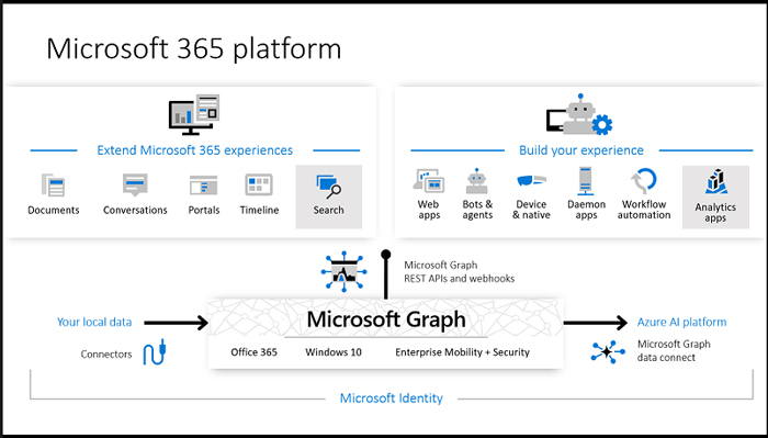
Figure 1: https://docs.microsoft.com/en-us/graph/overview
Microsoft Graph API creates a powerful way to empower your existing applications, web apps, bots and agents. You can create customized intelligent applications powered on usage data in your company to boost productivity or create powerful insights like the ones mentioned before, and tackle any problems. Let’s briefly check out REST API. There is one great endpoint where you can find a demo and reach all sample data examples, but also thanks to SSO you can instantly access your own data!
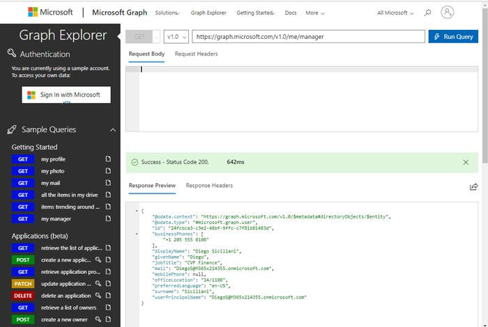
Figure 2: https://developer.microsoft.com/en-us/graph/graph-explorer#
In the picture above, you can see the intuitive design for the REST API demo: you can test your query by pasting it directly in the bar, or you can find sample queries to start to discover all its capabilities. As a response from API you’ll get a well-formatted JSON, which you can parse in your applications. In the next picture, you can see all the sample areas for which you can get data instantly:
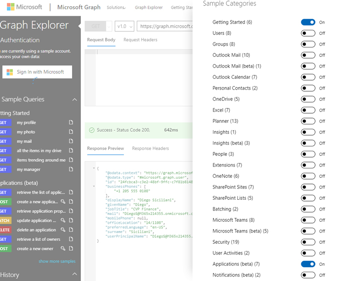
Figure 3: https://developer.microsoft.com/en-us/graph/graph-explorer#
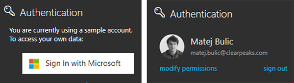
You can see in the top left corner that you are using a sample account. To access your own, thanks to Microsoft Graph and Microsoft Identity, you can sign in quickly with just 2 clicks and start exploring your own data.
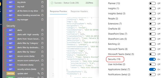
Based on the data we get from REST API, we can easily analyse it, for example, by loading endpoints in Power BI. Let’s take an example from security data: first, our user needs to have permission for the security section so we can enable sample queries to get predefined security alerts, as you can observe in the picture below:
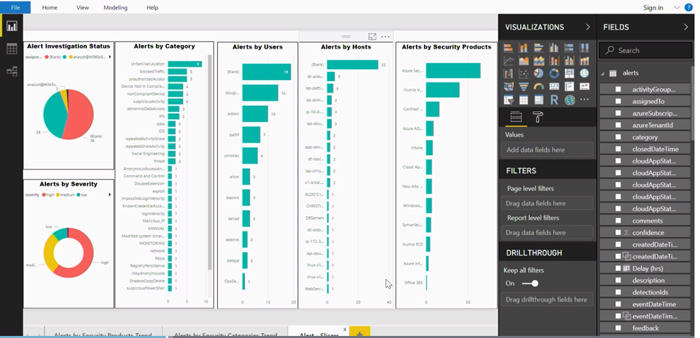
We can quickly create a security dashboard, where you can see all the threats you are facing in your organization, and all the suspicious activities in categories like malware blocked, vulnerable open remote access, confidential files transferred, and many other predefined categories that Microsoft Graph data provides. This is just one of the hundreds of customized apps and dashboards that can be created.
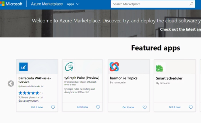
There are also premade Microsoft Graph data connect apps on Azure Marketplace that you can use, like tyGraph Pulse, an Office 365 reporting analytics solution that provides a robust and focused set of reports covering key Office 365 workloads.
2. MyAnalytics
Based on the premise we saw at the beginning of the article (that it’s difficult to change human behaviour), Microsoft created MyAnalytics to tackle that issue. MyAnalytics is one of the Microsoft 365 personal productivity dashboards, and it’s available for customers who have MyAnalytics as part of the E5 plan, as an add-on to E1 and E3. Using Microsoft Graph data and AI can give you statistics and insights on how you’ve spent time over the past month, insights about your work habits, AI-driven suggestions to improve your focus time, etc.
The main categories of the dashboard are:
- Focus shows you how much you have focused on your tasks, and gives you options to book your focus time, so you don’t get interrupted, etc.
- Wellbeing shows you how much you have been disconnected in your off-work hours. It reminds you to take a break during work hours, etc.
- Network shows you how many people you have been interacting with, and lists your top collaborators; you can create a list of important people who you need to keep updating, or some clients you need to focus on, etc.
- Collaboration shows you how well you are collaborating, how much time you have spent on sending emails, chats and calls, etc.
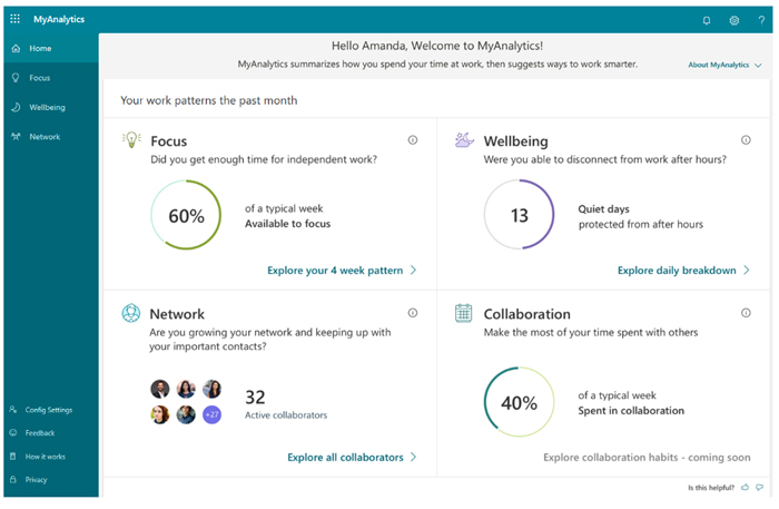
Figure 4: https://docs.microsoft.com/en-GB/workplace-analytics/myanalytics/use/dashboard-2
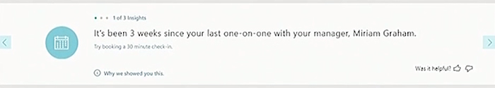
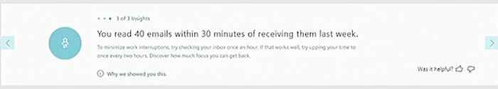
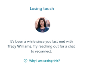
Besides statistical info, there are also some powerful insight examples:
- Reminds you that you should have a 1:1 meeting with your manager:
- Tells you that you checked too many emails in a short time, which means you’re lacking time to focus, or that you just read too many emails too quickly, so maybe you should go back and process them again.
- Reminds you to keep in touch with important contacts:
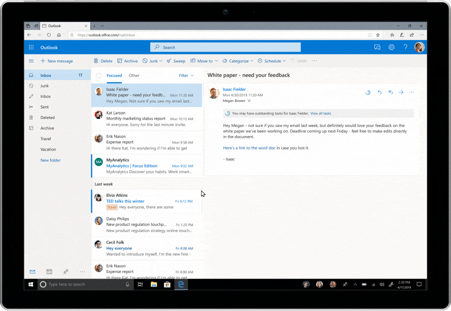
There is also an add-on for Outlook giving you more useful insights, for example, using natural language processing to discover some of the tasks in your emails and then directly book some focus time to carry out these tasks. An example gif below:
![]()
![]()
3. Workplace Analytics
Unlike MyAnalytics, Workplace Analytics gives you insights at a higher level, into how groups collaborate across the organization, thus helping you to make more effective business decisions.
Week in the life shows you a summary of day-to-day collaboration in the organization. It shows you an analysis of meetings and email hours per team, so you can identify the team with the highest activity.
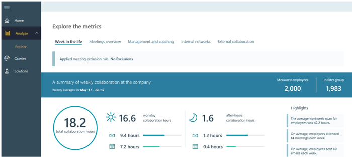
Figure 6: https://docs.microsoft.com/en-gb/workplace-analytics/use/explore-metrics-week-in-the-life
Meetings overview shows you a summary of meeting norms within your organization. You can get metrics like low-quality meetings (derived from redundant meetings, conflict scheduled meetings, meetings with too many participants or multitasking meetings).
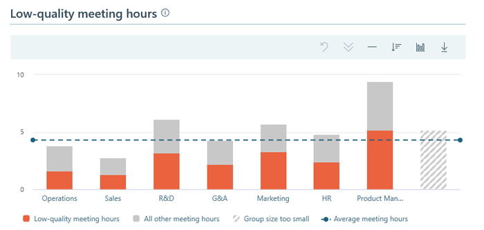
Figure 7: https://docs.microsoft.com/en-gb/workplace-analytics/use/explore-metrics-meetings-overview
Management and coaching shows you a summary of collaboration between leaders, managers and employees. As mentioned, it can track time spent with the direct manager, so you can see how many hours were spent per team on 1:1 meetings.
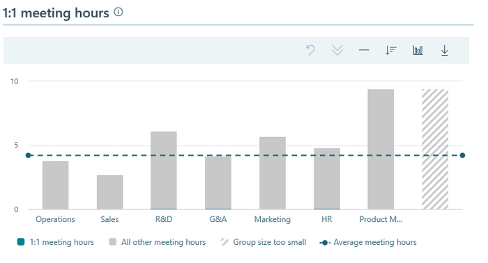
Figure 8: https://docs.microsoft.com/en-gb/workplace-analytics/use/explore-metrics-management-and-coaching
Internal networks show network connections between different people exclusively within the company, for example, between the sales department and the human resources department.
External collaboration shows a summary of employee network patterns with people outside the company. You can discover who your most contacted clients are and if your important clients are receiving enough attention.
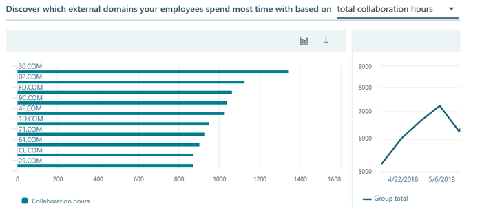
Figure 9: https://docs.microsoft.com/en-gb/workplace-analytics/use/explore-metrics-external-collaboration
As well as the Workplace Analytics page, you can find links to directly connect some of the prebuilt dashboards to your Power BI:
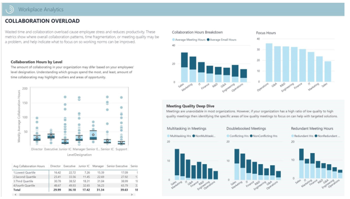
Figure 10: Power BI templates in Workplace Analytics
4. Privacy
One of the questions you will probably be asking yourself is “what about data privacy?” Microsoft give you full compatibility with their security features:
- All data is handled within Microsoft 365 Trust Boundary.
- Full support for GDPR compliance.
- Customers have complete control over data aggregation, usage and access.
- Workplace Analytics only uses header-level metadata.
- MyAnalytics is personal and private and only the user has access to their insights.
Conclusion
Microsoft keep giving us innovative productivity tools, and most importantly they are opening their tools to developers, so you can customize your own applications and dashboards to empower your growth. If you need help with setting up your own Microsoft data environment or if you want to have your highly-personalized dashboards based on Microsoft Graph data, please contact us!