30 Ene 2024 Oracle Analytics Cloud New Year Release Highlights – January 2024
Welcome to the first Oracle Analytics Cloud (OAC) blog post of 2024, full of exciting updates and innovative features to improve the Oracle data journey for developers and business users alike! This year, we’re committed to comprehensively covering every OAC and Oracle Analytics Server (OAS) release, explaining the key features and enhancements highlighted by our team of experts, so don’t forget to subscribe to get the latest insights.
This time there are lots of improvements across different aspects of the tool, so join us as we explore the highlights of the Oracle Analytics Cloud January 2024 Update!
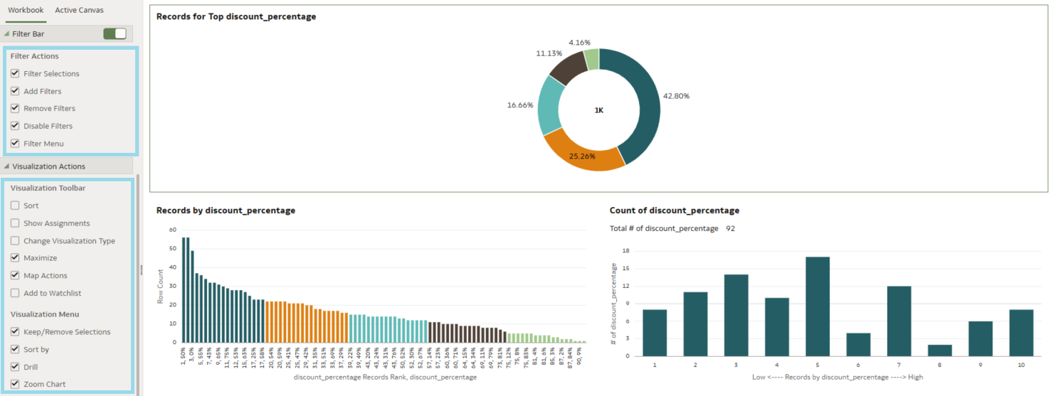
1. Zoom Control for Dashboards
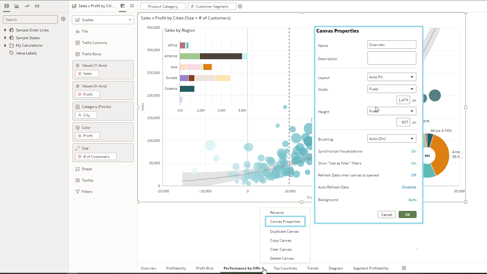
A significant user experience improvement in OAC is the newly introduced zoom control for each dashboard canvas, although currently this functionality is not available for all canvas types. It is designed to improve accessibility for users with visual impairments, as well as catering to common situations like video calls, where screen sharing and zooming in on graphs and visuals are essential for clear communication. This integrated tool simplifies these scenarios, making presentations more accessible and engaging.
Setting it up is straightforward: open the Canvas Properties window and adjust the Height and Width settings from Grow or Screen to a fixed value, as demonstrated in the image below:
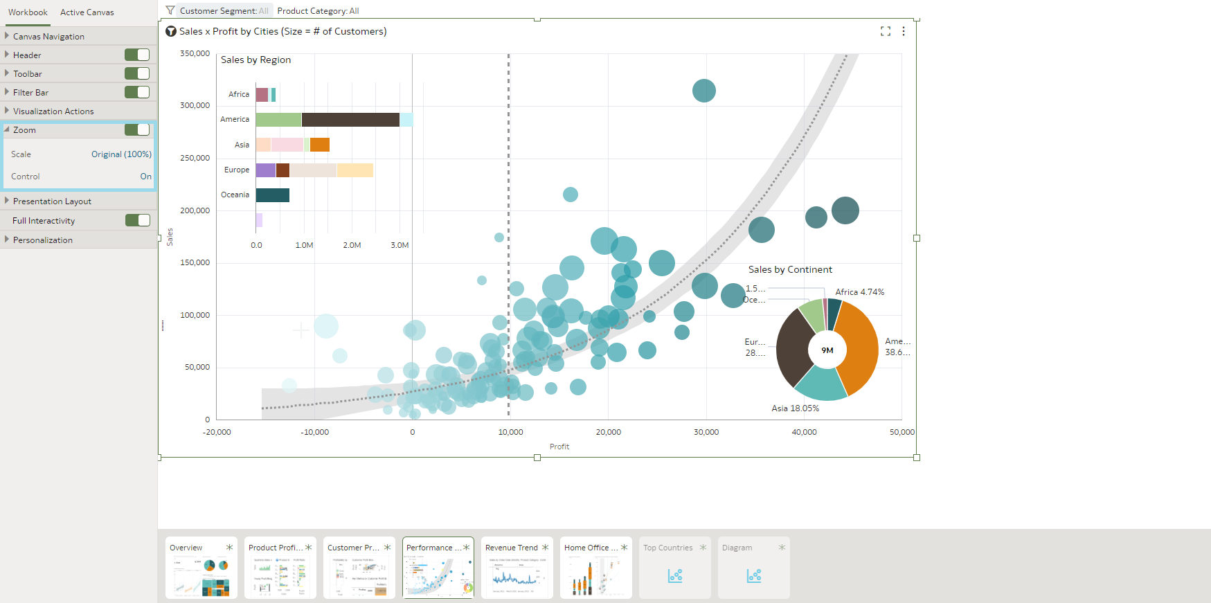
Continuing to the Presentation Layer and Workbook settings, you’ll find the Zoom options. The first setting allows you to establish the default zoom level, while the second option enables you to grant or restrict user access to this feature:
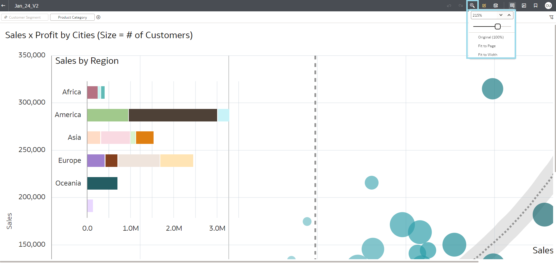
On moving to the user view, the zoom option becomes accessible, offering an extensive range, scaling up to 500%. Additionally, it includes convenient features like Fit to Page and Fit to Width, enhancing the user experience and the adaptability of the display:
2. Data Flows: Data merging by column name
Over recent years, OAC has evolved significantly as an ETL cloud tool, particularly in Data Flows. At ClearPeaks, we have been integrating it extensively into our projects, so we’re excited to see such innovative features that fully leverage its capabilities. This is where you can find them:
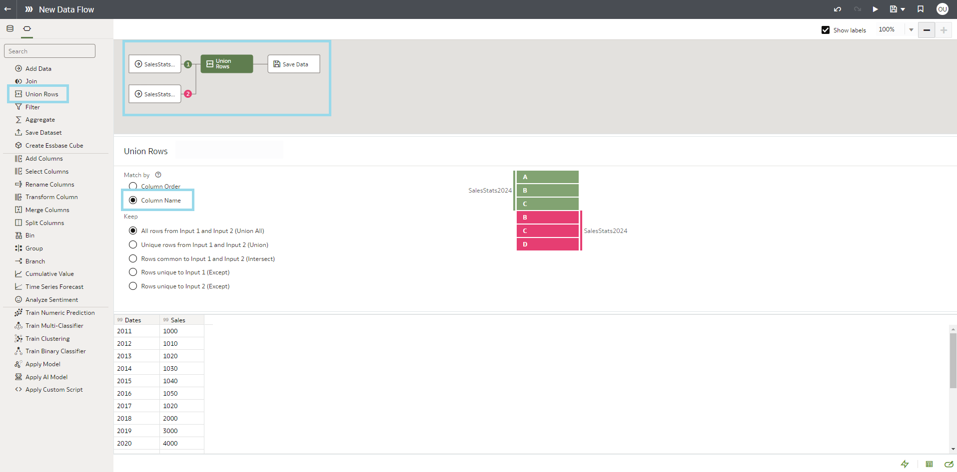
In this release, a significant enhancement for developers is the introduction of the ability to union merge tables based on column names. Within the Union object settings, simply select Match By column name, and the system will automatically identify and merge columns that share the same name and type. Previously, an additional step was required to ensure the specific column order, but this process has now been streamlined for greater efficiency:
This is an important feature for anyone planning to use Data Flows in this release.
3. Exporting Table Data to Excel format
Another notable feature we’d like to highlight is the ability to export table data to Excel format, since Excel is still a widely used data analysis tool across numerous organisations. Integrating this feature into OAC offers several benefits, such as enabling data sharing with users who lack access to the tool itself as well as facilitating data manipulation beyond its native capabilities.
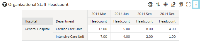
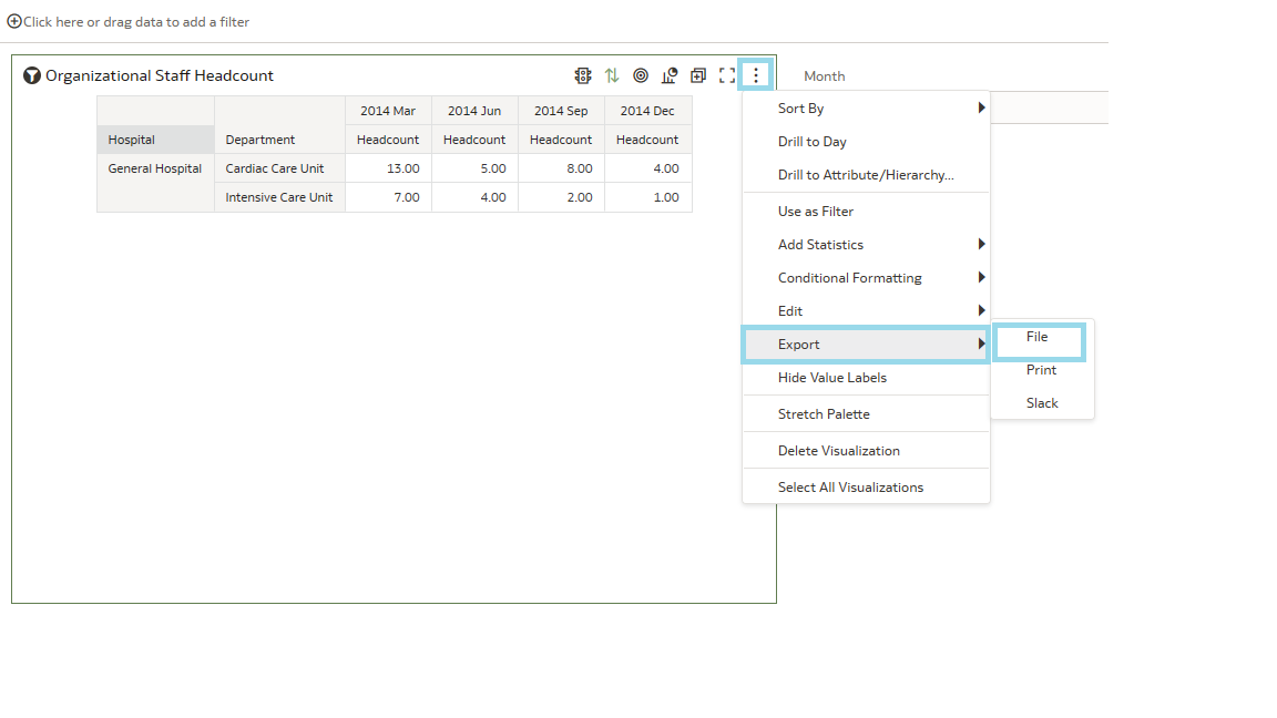
This feature was initially introduced last year in a preview phase and is now available globally and will surely see a lot of use. To export data, select a table or pivot table visualisation and specify the formatting style; remember to save these settings. Then access the three-dot menu at the top right of the visualisation, choose Export, and then File One:
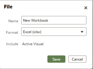
Now a new panel will appear, where you specify the desired name and format for the export, in this case Excel (.xlsx). After saving, a prompt will appear to rename the file and select the download format:
4. User Calculations for Parameter Generation
In this latest release, Oracle has enabled the use of custom calculations for generating parameters. This development unlocks a wealth of possibilities and synergies, offering enhanced personalisation for your dashboards. Oracle has recently been focusing on refining parameters, with each update bringing improvements. You can take a look at our previous blog post OAC Update Nov-23 for more tips about parameters!
First, let’s make sure the calculated column is correctly configured and accessible, as shown below:
Then move to the Parameter Manager tab and open the Create Parameter option. If you’re starting afresh, this section will be empty, although in the screenshot you can see there are already some created parameters. Notice how you can create various types of parameters:
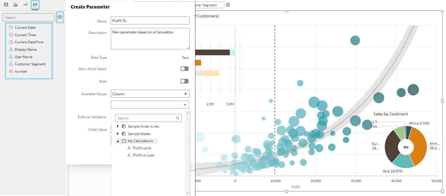
On opening the Create Parameter option, a menu appears where you must specify that the parameter values are sourced from an existing column. A notable addition in this update is the inclusion of the My Calculations folder in the subsequent drop-down menu. Another significant enhancement within the same menu is the Enforce Validations option, which displays the value as a list control, thus offering a more user-friendly experience.
These enhancements mark a significant upgrade for parameters, and it will be interesting to see how developers leverage them to their fullest potential.
5. Maps: Customising Colours in Regions and Point Layers, Adjusting Line Thickness, and Simplifying Map Styling
Oracle Analytics has introduced a novel feature that allows users to adjust the colour of the regions and modify the thickness of the lines on the maps, providing greater control and customisation options. A new default setting has also been implemented for the style of regions and border lines, applicable when not specifically customised by the user. This update significantly elevates the level of personalisation available for map styling.
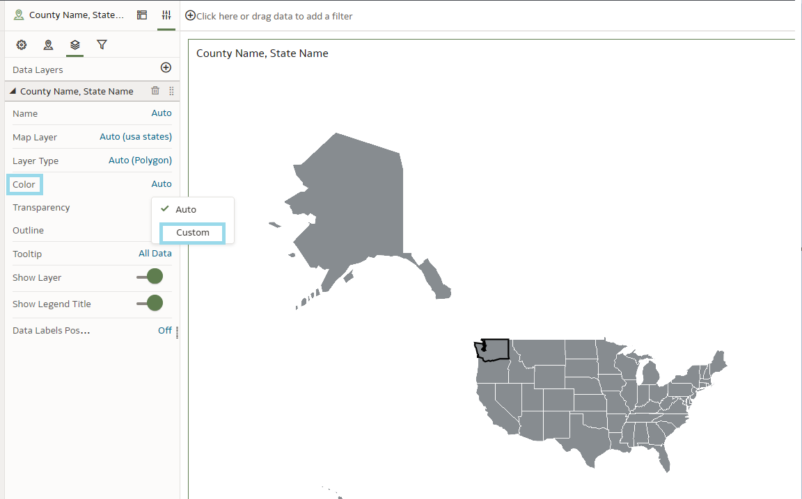
To change the colour of a region on a map, go to the Configuration menu, then the Layers section, select the Color option, and click on Custom:
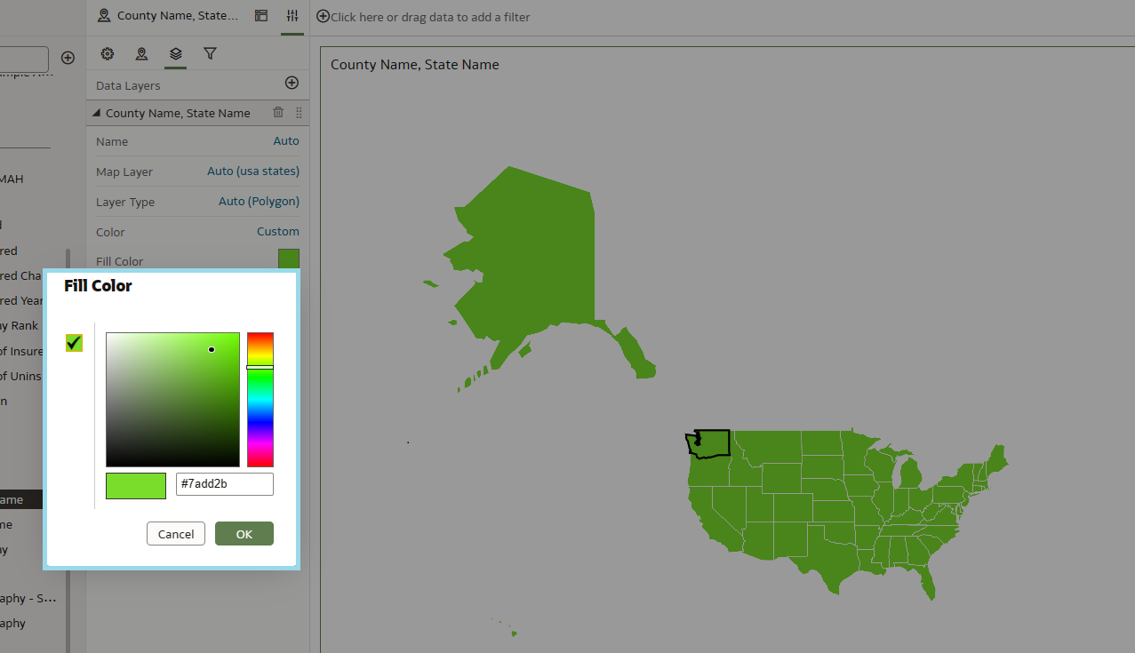
Selecting this option will allow you to choose the colour you want:
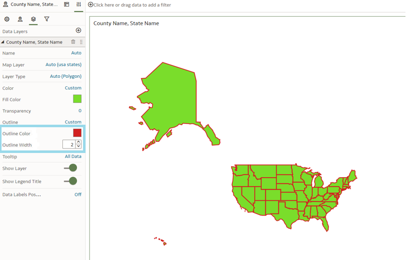
As mentioned above, you can also change the thickness of the lines of the map. In the same window, select the Outline option, and then Custom:
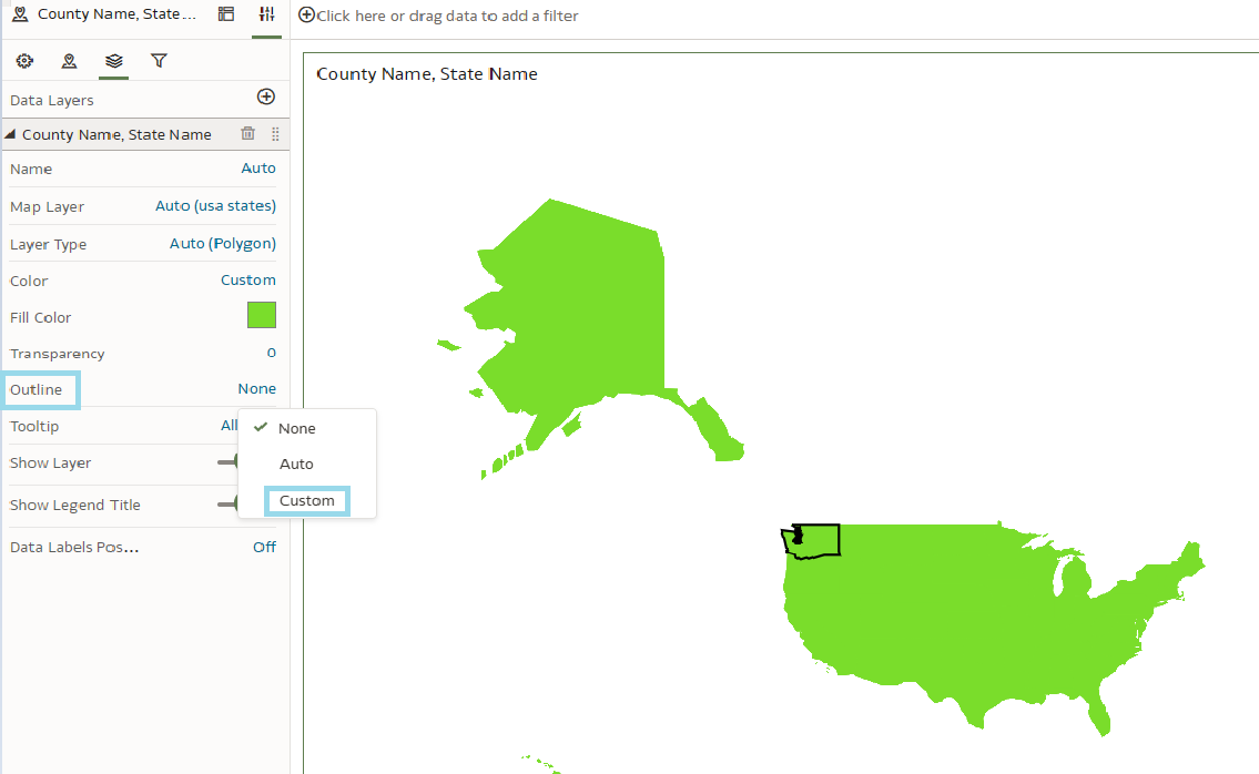
Now you can customise the colour and line thickness as you wish:
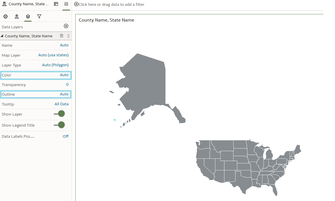
If you don’t want to modify these parameters, Oracle Analytics configures them by default:
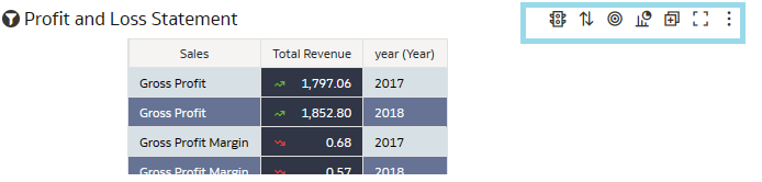
6. Annotate Workbook Data with Icons and Emojis
Conditional Formatting is a long-standing staple, extensively covered by the ClearPeaks team through its various enhancements over the years. We have delved into aspects such as Conditional Formatting and Rule Blending, Conditional Formatting on Maps, and Conditional Formatting updates. Oracle Analytics has recently revised this feature, enabling the application of conditional decoration icons or emojis to specific columns in table visualisations, which creates a more visually engaging column and offers a clearer understanding of the data:
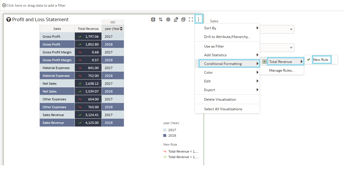
Once you’ve got the table that you want to modify, go to the Manage Conditional Formatting Rules option at the top left, near the Menu:
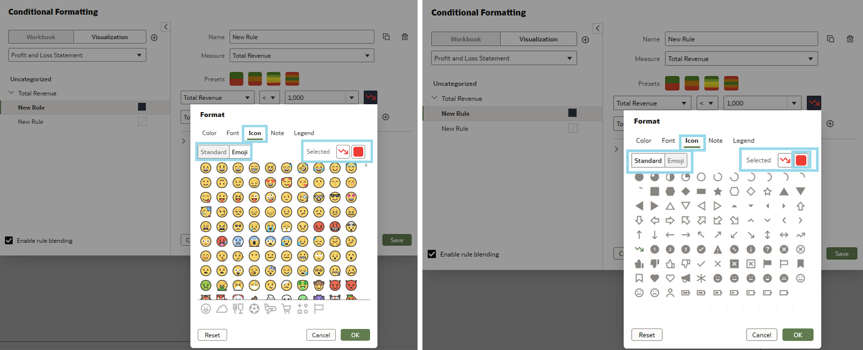
First select the measure you want to work with, then establish the desired condition. By clicking just to the left of the condition, you’ll access a panel where various settings can be adjusted: colour, font, icons, and more. In this section, not only can you find emoticons, but you also have the option to customise them, like by assigning a specific colour:
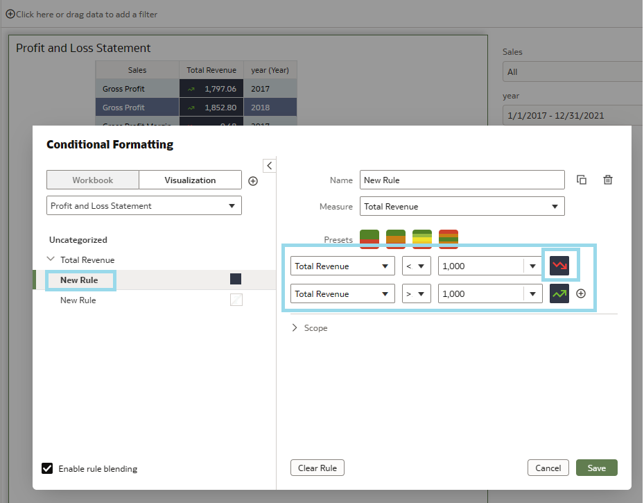
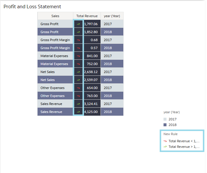
After implementing your customisations, the result should look like the image below. The chosen emoticon for our scenario is the increase and decrease icon, which we have coloured green and red to make it more representative:
After selecting the format, click on Save and the icons will appear. If they don´t, go to the menu button and select Conditional Formatting, then select the Conditional column and mark the column you modified:
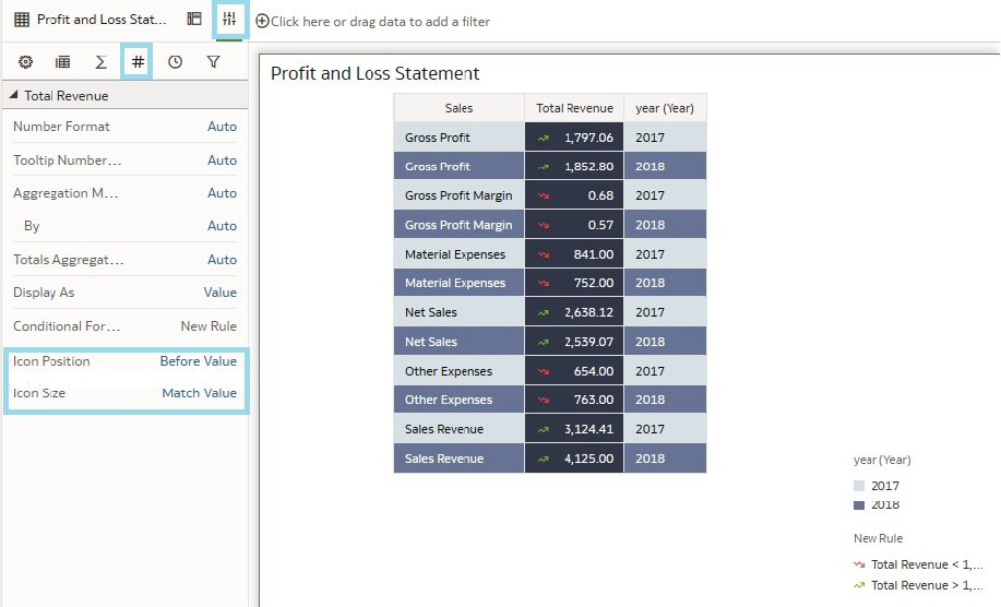
In addition, this latest update introduces the ability to customise the precise placement of the icon – whether to position it to the right or left of the value, or to display only the icon. To achieve this, navigate to the Properties button at the top right and select Values (#). Then locate the Conditional column and proceed to the Icon Position section:
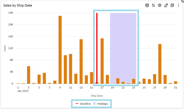
7. Reference Lines for Time-Based Category Columns
To enhance the readability of category columns with a time axis, Oracle has introduced the option to add reference lines. Like the feature previously available for measures, reference lines are particularly useful for marking significant dates or periods, such as project deadlines or holidays.
To use this feature, first ensure you have a visualisation with a date column to which the reference line can be applied, then add the feature by navigating to Properties -> Analytics -> Add Statistics -> Reference Line:
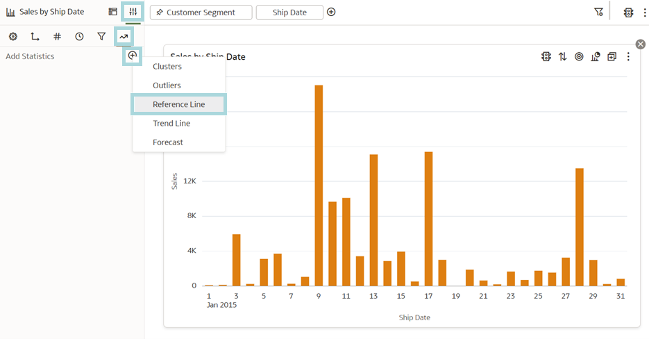
Choose your date column as a reference:
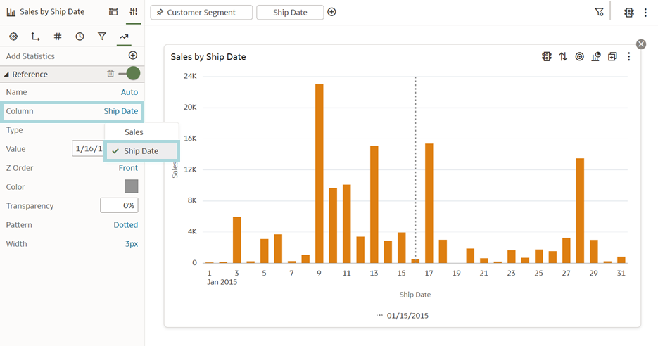
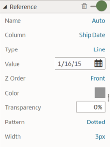
The name of the reference line displayed on the graph can be changed. By selecting the Type option, you can showcase a period by changing the Type to Band, then specifying two dates. The Z Order option allows you to position the line either in front of or behind the data bars. What’s more, you can also modify the colour, transparency, pattern and width of the reference line:
With the right settings, you can make your graph look something like this:
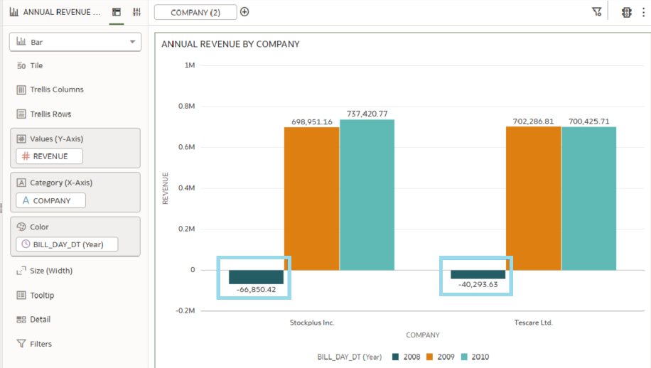
8. Format Negative Y-Axis Values
Another interesting new feature is the ability to display negative values on the y-axis in graphs, significantly improving the visual interpretation of the data.
Previously, representing negative values in graphs could be complex, as these values were located below the x-axis, making them difficult to interpret visually. Now, with the ability to present them directly on the y-axis, the interpretation and understanding of these values become much simpler, leading to a clearer and more accurate representation of the data.
This upgrade, particularly the direct display of negative values on the y-axis, is a substantial enhancement in visual data analysis.
As illustrated in the graph below, negative data within the workbook is now prominently displayed on the y-axis, facilitating a more efficient analysis:
9. Customising Workbook and Canvas Header/Visualisation Toolbar and Menu Options
Previously, when designing a flow for a slideshow, the header bar of the workbook was displayed by default. The recent update now allows you to show or hide this header bar. Additionally, users can select a specific name to be displayed as the header and also choose the formatting of the text:
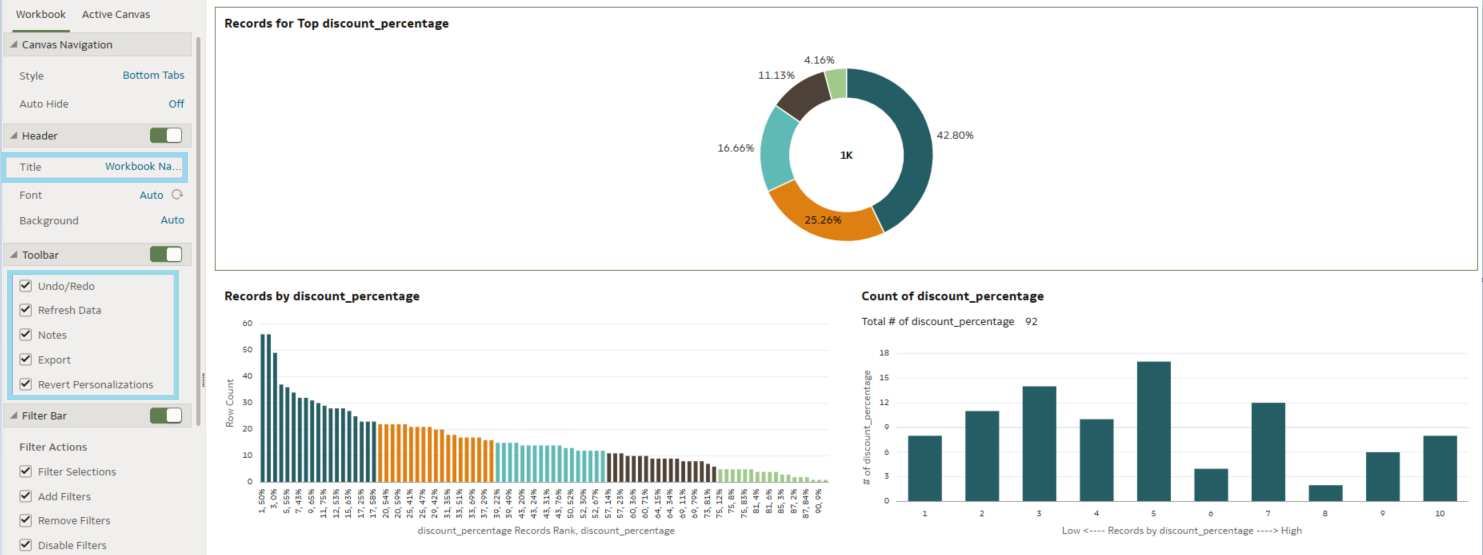
You can also configure the Presentation Filters and customise them, as well as choose different actions when displaying the workbook:
10. Personalising Workbook Filter Values
Oracle has introduced an innovative approach to saving workbooks. In the past, when viewing visualisations from the user interface without entering the Workbook Editing mode, actions like using filters were not saved when you closed the workbook. This is no longer the case, and now all modifications made in the UI are automatically saved on closing:
Previously, the result of this action was like this:

Now it’s like this:
However, if you don’t want to save these changes, there are various ways to revert them to their original state.
- The first method involves manually reversing the changes by clicking on the button located in the top left corner.

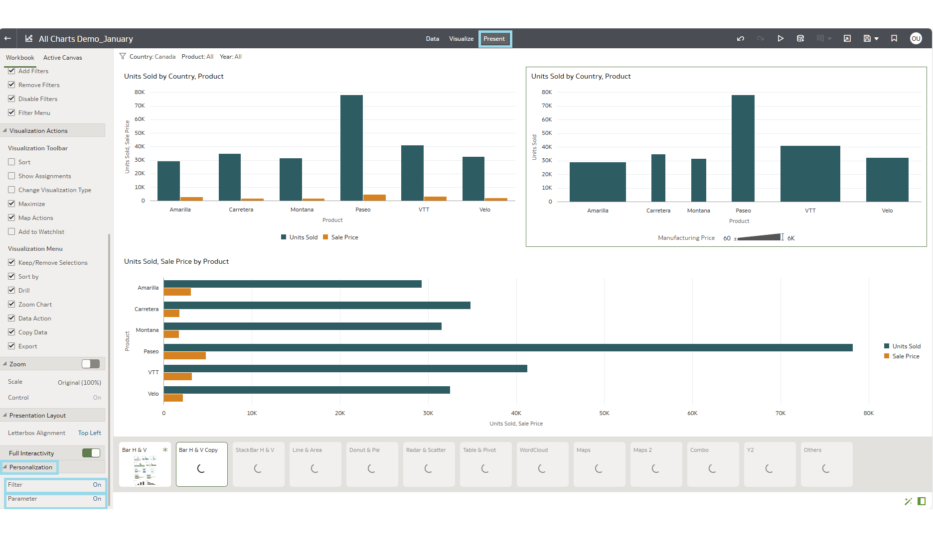
- The second method involves deactivating the previously mentioned function. To do this, go to the Present button situated at the top centre of the Workbook. On activating this, a new panel will emerge where you adjust the Personalization Set both the filter and parameter settings to Off:


Deprecated and Desupported Features
Oracle has announced a list of features that will be desupported in this release: Albany fonts, previously used in analyses, dashboards, and pixel-perfect reports, have been replaced by Go Noto and are no longer available. The BI Composer Wizard has been fully replaced by Workbooks, offering more options and a greater ease of use for both users and developers. While some readers may not remember this OBIEE analysis-generating tool, those who do use it will need to transition to the new pathway Oracle has created for this purpose. In the Classic view of Oracle Cloud Analytics, certain dashboard themes, including Fuse, Skyros, SkyrosCloud, blafp, and FusionFX, will be discontinued and new dashboards will default to using Redwood. The Manage Favorites feature has been deprecated and will now appear in an unstructured list under the Favorites menu.
Conclusion
OAC’s first update of 2024 has introduced a substantial amount of new content, focusing on enhancing the experience for both users and developers. The update has effectively enhanced the use of existing tools and introduced options that are sure to be well-received. While the inclusion of emojis stands out as the most visually striking improvement, the addition of map personalisation options is equally significant and should not be overlooked.
This could be the moment to re-evaluate our current approach to map setups, since the introduction of new reference lines and bands will encourage more users to explore statistical options in creating visualisations. Moreover, the revamped approach to Workbook settings marks a significant step forward in improving the overall user experience.
Our team here at ClearPeaks is ready to assist you in exploring the full potential of the latest OAC features. Whether you need a detailed walkthrough of what’s new, tips on how to best apply them to your data, or you just have some questions, our experts are only a message away. Reach out to us today to unlock the full power of OAC and transform your analytics into a visual narrative that brings your data to life!