
11 Jun 2014 Oracle MAD Key Features
In 2013, mobile devices passed PCs to be most common Web access tools. Through 2014, JavaScript performance will push HTML5 and the browser as a mainstream application developer environment and by 2015, over 80% of handsets in mature markets will be smart phones. On the other hand connection speeds are increasing, local storage is losing importance and cloud computing is getting more importance every day.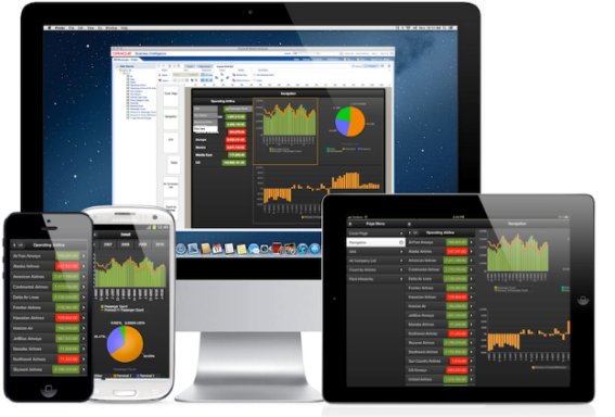 Under these facts, don’t you think it’s the right time to start thinking on how to move your BI platform to the mobile world? In this blog we’ll review some of the relevant features of the Oracle Business Intelligence Mobile App Designer (MAD), a component from Oracle BI Foundation Suite developed to deal with mobile devices. Don’t panic! Despite the name we will not get MAD using it. As you will see it is a very simple tool and provides excellent results even for non-expert users. In the first part of this blog post we’ll review some visualization techniques introduced in Oracle BI MAD: navigation list, tile & accordion layouts (which are the most striking ones) and a new type of filters. If you are used to Oracle BI EE reporting, you might find them quite interesting. In the second part of the blog post we’ll focus on some other interesting features: plugins, subscriptions and links.
1. Visualization Features
As a dashboard designer you’ll have to consider some specific aspects related to mobile devices: The screen is smaller than a regular monitor, and graphics and data must fit into the screen.
On the other side, navigation is different than using a mouse. Oracle MAD was developed considering that. Based on HTML5, it includes enhanced visualization of charts, with transitions and animations that allow us to show data in a different way than a classical BI tool, as we will see below.
1.1 Navigation list
Navigation pages enable you to define a navigable set of filters that you can use to filter the data visualized on the page.
The navigation area of the page contains a hierarchy of dimensions that you tap through to drive the display on the detail side of the page; you can see successively more refined sets of data, or navigate up and down the hierarchical filters to see the subset of data that interests you.
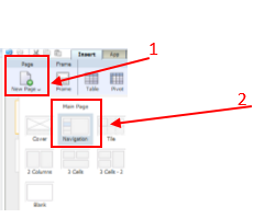
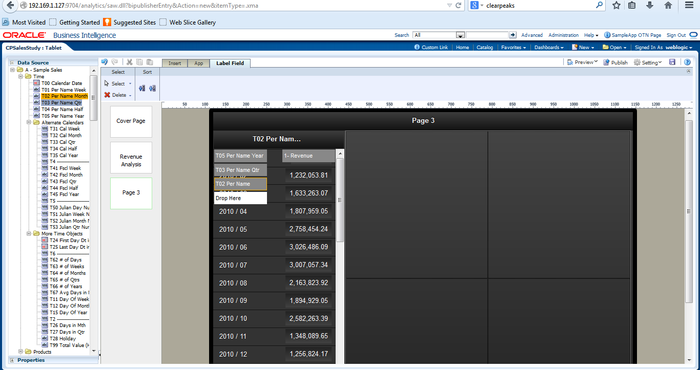
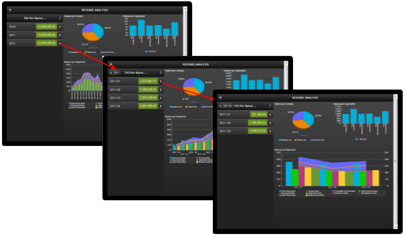
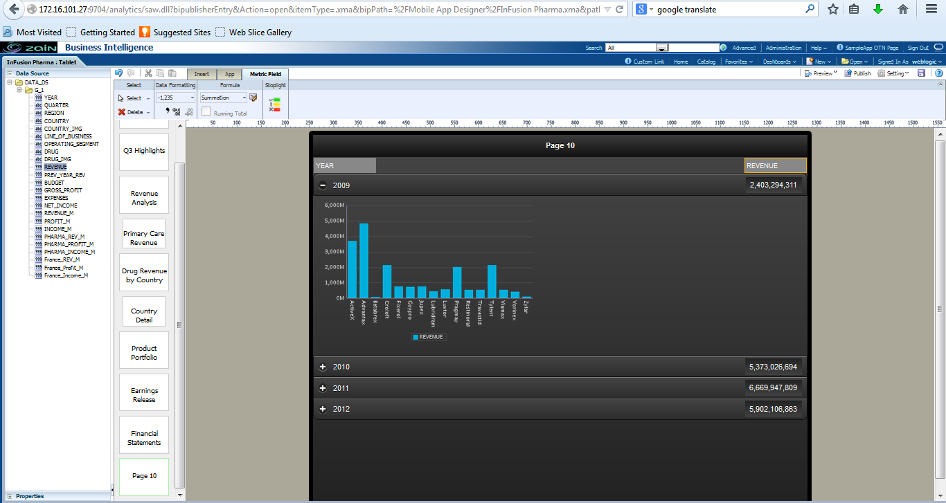
Additionally, you can also give a conditional format into the navigation pane, so it is easier to drill into the hierarchy of interest. The navigation pane is available through the new page editor menu. In the next sample we’ll set a navigation list to analyze the revenue by period, drilling from Year to Month, just with a few steps:
Select New Page to add a navigation pane:
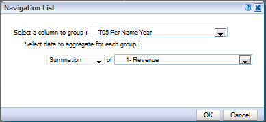
In the navigation List we select the top level in the time hierarchy (YEAR) and the aggregation type Summation for the revenue metric.
Next, we add the Quarter and Month in the navigation hierarchy to be able to drill to the lower level.
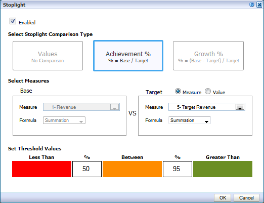
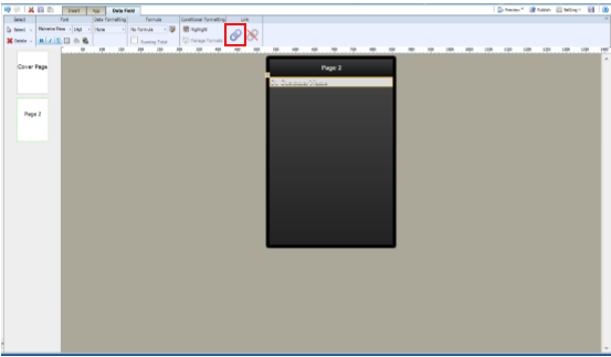
Then we can set a conditional formatting for the revenue metric, based on the target revenue metric by clicking first the revenue text box, and then Edit spotlight button, to set up the thresholds
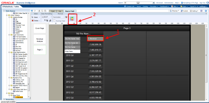
In the spotlight editor, we set up the conditions based on user defined thresholds, and the target revenue measure.
Once we have configured the navigation list we can proceed to add some charts into the layout, and we will be able to check the data at different levels of the hierarchy just tapping on the desired level in the navigation pane.
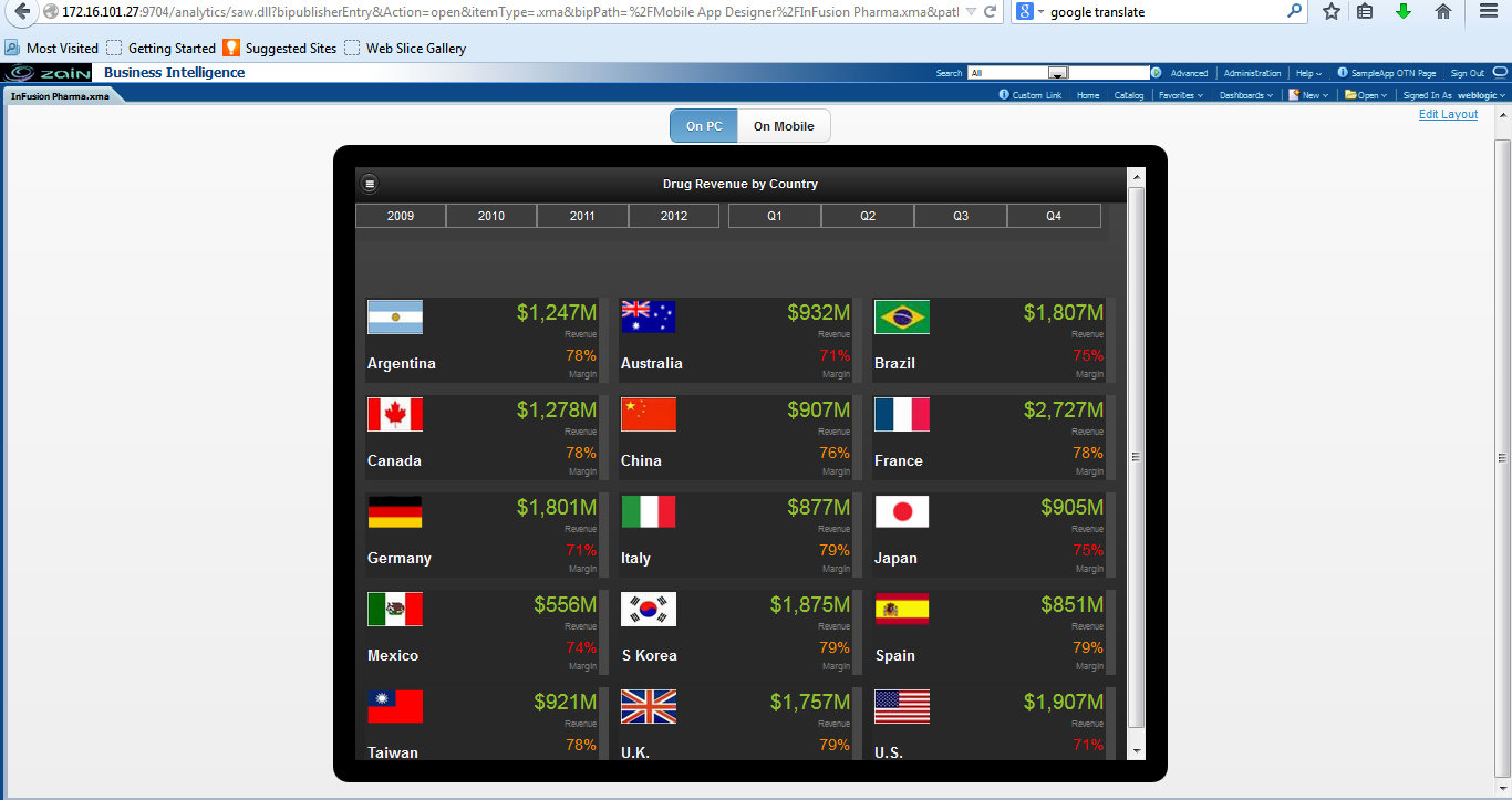
1.2 Tile and Accordion Layout
Tile pages provide a scrollable grid of cells, each containing identical components that are repeated for a specific field in your data. You can use tile pages to provide an instant view of a key measure across a specific dimension. This view not only provides a complete picture within each cell, but also enables an at-a-glance comparison across the data set.
You can further enhance the visual impact of the values represented in each cell by creating stoplight formatting to highlight cells whose results fall outside the range of specific threshold values. In the following image you can check the look and feel of the tile layout.
Accordion Layout allows to view data in a set of elements that we can expand vertically; it also allows to set a metric for each element in the dimension and conditional format in a similar way to the navigation pages.
To create it, just select new tile or accordion layout and give your custom format.

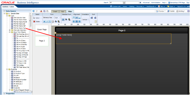
1.3 Filters
MAD allow to add filters to the layout, these filters are simply added to the layout in the insert tab in the menu bar, and will display values which we can tap to filter the data within the page.
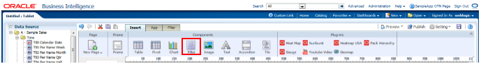
Just click on filter and add it to the layout, once added, drag and drop an object from the data source into it.
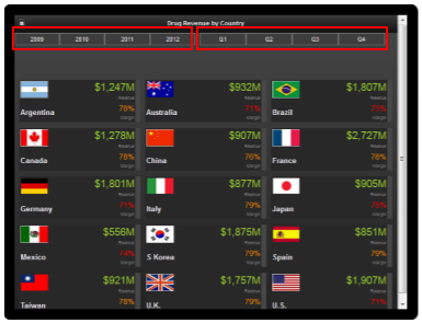
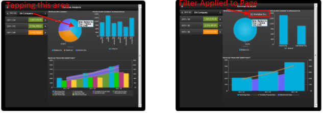
Notice the top bar in the image above, where you can see years and quarters, acts as a filter to the all values in the layout. Charts can be used as filters as well by tapping data into one chart. For example, we may want to filter a bar chart just to have the values that we have tapped in another chart. As you will see in the following images, once you tap a graph, a text box appears showing that data has been filtered to show just the values for the object you tapped.
2. Other Features
2.1 Plugins
A great feature of Oracle MAD is that allows us to code Java Script plugins enabling to customize the BI App at your own desire. Some plugins are built-in with the installation, such as geomaps. But you can also create your own custom plugins.
To make a plugin available you just need to copy the code (plugin_name.js) into the BI publisher plugins directory. It will appear in the Plugins toolbar. Once the plugin is available you just have to drag and drop it into the layout. Let’s see some of the plugins you can add to your mobile app:
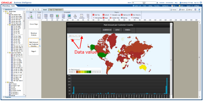
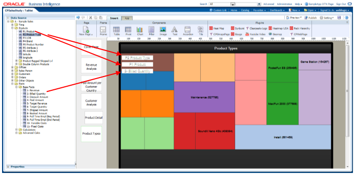
Another interesting plugin is the heat map, which shows rectangular areas and the value for a metric. We just need to add two levels of hierarchy and a metric value. It is also zoomed in when tapped the rectangular area, to see the details.In the screenshot above we drop the geomap plugin into the layout, together with the country dimension into the region box and a metric (in this case paid amount) into the value box.
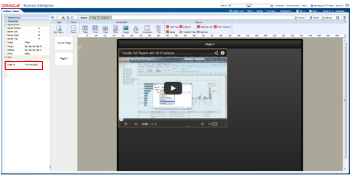
Other less sophisticated, but effective as well is the following YouTube plugin that allows us to include a video in our mobile app.
2.2 Links
The Link button it’s a really cool feature included in Oracle BI Mad. As you might be guessing you can include a link in your report to a web page, but also you can send an e-mail, make a call or send a text message. On your mobile App just click on the link button
And then select the type of link you want to set
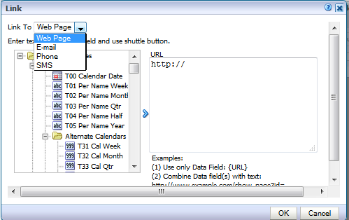
As you can see for a Phone App there are 4 kind of links: web page, email, Phone and SMS. To create the link you can enter a data field value (from the list of fields on the left screen), a static value or both.
2.3 Displaying the app
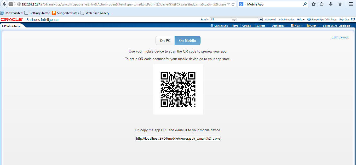
Oracle BI MAD has an built-in emulator that allows us to see how the mobile app will look like. You can test the app at any time going to the emulator and selecting on PC. To test it into a physical device just click preview and click on Mobile. The page will show a QR that we can scan with our device to run the app, or the URL of the app we can connect to.
Once you display your app into the physical device, you may realize that layouts may not display identically as they were into the emulator. In order to avoid that, you just have to use the in build templates or use frame objects to set the display properly.
2.4 Subscriptions
The distribution of the mobile apps to the users is easily managed with the Apps library. As a developer you can publish a new app in the library once is it finished and ready to be distributed. As a consumer, in the mobile device, you can choose the apps you want to subscribe. By doing that, when the mobile App is updated, you are notified a new version is available. The apps you are subscribed to, appear in the My Apps Library folder.
Conclusions
Oracle BI MAD allows you to create mobile BI apps quickly offering very good results in a short period of time. It’s based on HTML5 technology, so it works on most mobiles devices, including Android, iOS, Blackberry and Windows phone operating systems, either phones or tablets. The designer offers you multiple options to get enhanced visualizations of your data with an easy navigation, tap driven. And there is no need to install any app on the devices, as the app is web browser based. The subscription is controlled by the Oracle Business Intelligence App Store. If you want to get more information about Oracle BI MAD contact us or leave a comment below this post!