03 Aug 2018 Tableau 2018.2: New features
Last Monday, July 30th, Tableau launched their 2018.2 version, full of interesting new features. Of course, the most talked-about and anticipated is the possibility to develop your own dashboard components through the new dashboard extensions.
As dashboard extensions have their own documentation which requires hours of study and practice to become an expert, we want to focus on another of the new features, and we are sure that it will enable us to create new, powerful analyses: spatial join.
Let’s take a look at the new features included in the Tableau 2018.2 version before seeing a spatial join practical case.
1. Tableau 2018.2: New features
Below are all the new features found in 2018.2:
1.1. Install and Deploy Tableau
- Tableau Services Manager
- Mobile updates
- Backgrounder job admin tools
- Tableau Bridge improvements
1.2. Connect to and Prepare Data
- Data performance improvements
- Web authoring data connectivity improvements
- Geocoding update
- Nested sorting
- ISO-8601 standard weeks
1.3. Design Views and Analyse Data
- Automatic mobile layouts
- Negative values on log axis
- Transparent filters, highlighters, and parameters
- Dashboard grids
- Spatial join
1.4. Publish Data Sources and Workbooks
- Downgrade workbook improvements
- Web authoring improvements
1.5. Share and Collaborate
- Commenting improvements
- Dashboard extensions
2. Spatial Join
As we said in our article about the new features of the 10.4 version, Tableau has supported spatial files since Tableau 10.2. In this new version, Tableau goes even further and enables us to join data using only its location, without any shared dimension.
This is possible thanks to the Intersect function, the new kind of join that Tableau has included in their relationships. Using spatial join, you can join an A dataset that shares any spatial relationship with a B dataset.
In the following exercise, we are going to create a dashboard to help entrepreneurs that want to start a business in Barcelona. They will be able to check what the business/neighbourhood population ratio is, shown on a map.
2.1. Adding the data sources
Since our datasets are geojson files, we are using the spatial file connector to add both.
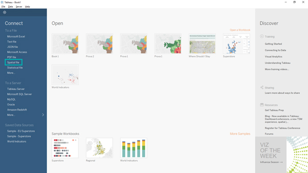
Figure 1: Spatial File Connector
The first dataset is a polygon spatial file, with information about every neighbourhood population.
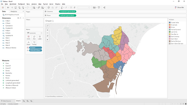
Figure 2: Polygon Spatial File
The second dataset is a point spatial file, with information about businesses in Barcelona.
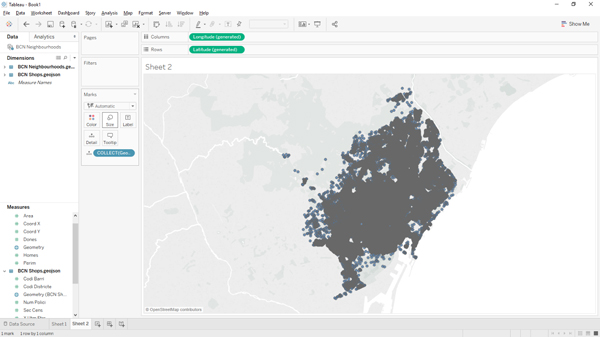
Figure 3: Point Spatial File
2.2. Joining the two datasets
Once we have added the second dataset, an incorrect join between them is created. We have to change that join and select the Intersect join, as you can see in the image below.
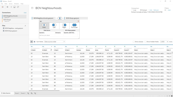
Figure 4: Joining the two datasets
2.3. Preparing the measures
The next step is to prepare the measures to be used for our analysis:
- The number of businesses
- The number of people
- The businesses / people ratio
It is easy to create the number of businesses, since we have a row for each one: we just need to create a Count measure.
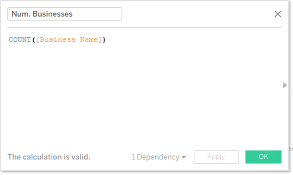
Figure 5: Number of businesses measure
We need a measure showing the number of people as well, but this measure is not as easy to create as the one above, due to the fact that the information about the population in each neighbourhood is replicated for each business in the join; this is solved by dividing the number of people by the number of businesses.
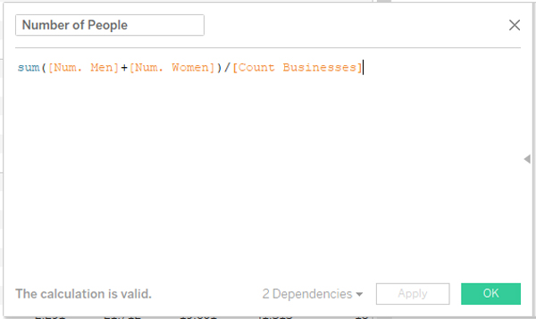
Figure 6: People per business measure
Finally, in order to draw a map showing the people / business density, we need to create a measure with this ratio.
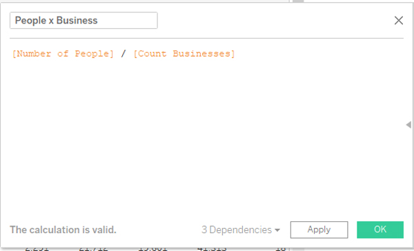
Figure 7: Number of people measure
2.4. Drawing the map
Now we can draw a map with the neighbourhoods coloured according to the ratio by dragging and dropping the Geometry measure from the Neighbourhoods data source into the sheet, the People x Business measure into the colour zone, and the Neighbourhood dimension into the detail zone.
Follow these steps:
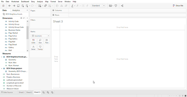
Figure 8: Adding the Geographical measure
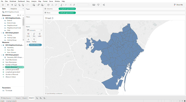
Figure 9: Adding the Neighbourhood Code dimension
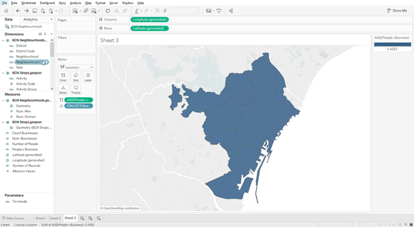
Figure 10: Colouring by ratio
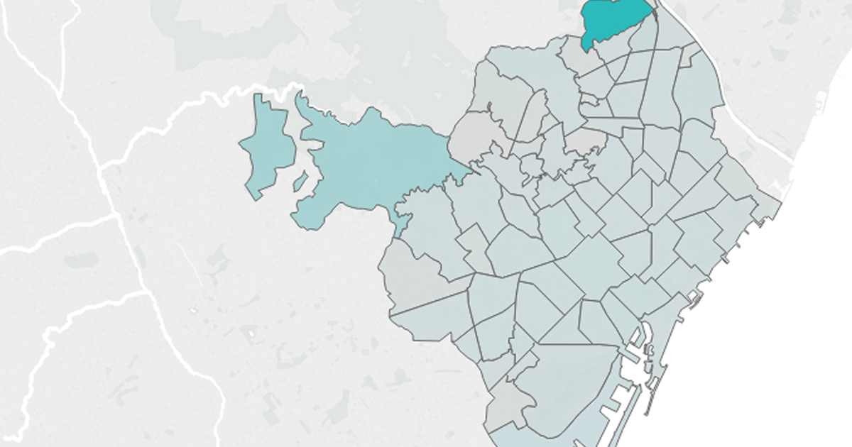
2.5. Dashboard example
We have created a map using two data sources without any relationship between them except location. With a bit of imagination, we could create a dashboard like this one.
Conclusion
Mixing data from different sources using just their spatial information is a powerful possibility that allows us to create lots of analyses, but there are many other new features in Tableau 2018.2. You can see them all on the official Tableau website.
At ClearPeaks we are experts in Tableau, always on the ball with the latest features and working on enhanced visualizations. If you need more information about Tableau or about how we can help you, don’t hesitate to contact us.