29 May 2013 Bullet Graph in Tableau
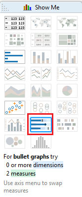
In this post I am going to introduce one of the most interesting graphs that we can find in Tableau, the Bullet Graph. It was created by Stephen Few and its goal is replace the gauges (i.e. the typical speedometer) because these ones waste a lot of space in the dashboards and sometimes they are difficult to understand. The bullet graph is designed to display the comparation between two measures, for instance Revenue and Budget Revenue. Also we can set-up different qualitative measures ranges to measure the KPI performance, defining when the measure is on-track or not. To create this graph, go to the Show Me button (note that we need two different measures to start using it).
In this example, we have two measures: Revenue and Budget Revenue for different year periods. The goal is to compare actual and budget revenue and also assign different ranges: good, regular or bad. Choosing two measures and one dimension and selecting the Bullet Graph type, Tableau will display the following chart:
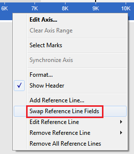
The blue bar should be the Revenue but Tableau has chosen Budget Revenue, and the black line should be the Budget Revenue because it is the target metric by year. To swap the bars, right click on the Axis and select the option Swap Reference Line Fields. Now, the values are in the correct position for our analysis.
You can analyze taking a quick look if the revenue is close to the estimated budget by year.
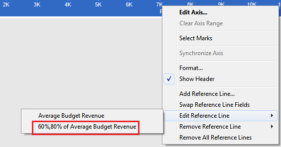
This graph also allows us to determine different quantitative ranges to measure KPI performance. In order to do that, right-click on the Axis and choose Edit Reference Line> 60%, 80% of Average Budget Revenue.
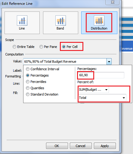
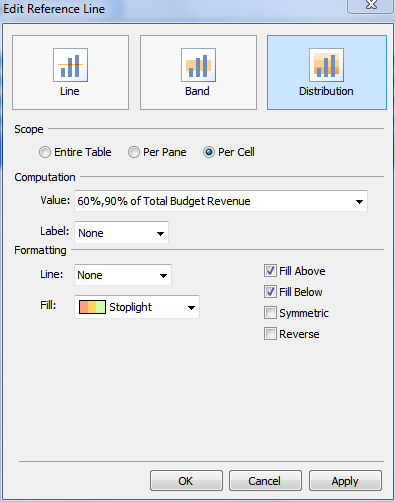
In the dialog box, select Distribution and Scope Per Cell. In the Computation area, you will set up the percentages that you want (in this example we want to show the reference line as percent of the Total of Budget Revenue and set percentages to 60 and 90)
Let’s apply a fill color to the Reference Line, for instance a Stoplight fill.
There are many other options to apply to the graph, for intance you might reverse the colors of the Stoplight assuming you want to show Expenses instead of Revenues. Also you have the choice to show the labels of the different percentages as you see in the graph below.
In 2012 you can easily see that actual revenue (blue bar) is in range 60%-90% of budget (in the yellow area). In 2011 actual revenue is bigger than budget and it is in the green area because it is bigger than 90% of budget revenue. To conclude the article, I want to highlight the power of this type of chart that provides a simple and complete analysis between different measures. Using bullet graph instead of gauges will save a lot of space in your dashboards improving your visualization.
