05 Ago 2026 Oracle Analytics Cloud July 2026 Update Highlights
Oracle continues to enhance Oracle Analytics Cloud (OAC) with features that make it easier for users to explore data, generate insights, and get answers quickly. The July 2026 release focuses on reusability, redefining team collaboration, and expanding AI capabilities directly into data preparation and natural language search.
As well as these updates, this release introduces a wide range of practical enhancements across visualisation formatting, filter control, and data action interactivity. New capabilities such as Shared Objects across workbooks, embedded data bars in grid views, and fine-tuned visualisation filter interactions all contribute to a more streamlined and efficient analytics experience. In this post, we’ll take a closer look at the key features and what they mean for both business users and developers.
Shared Objects: Filter Groups, Calculations, and Data Actions
As analytics environments grow, maintaining consistency across multiple dashboards and reports can become a challenge. In this release, Oracle has introduced Shared Objects, allowing developers to save and reuse key visualisation assets, such as filter groups, calculations, and data actions, across different workbooks. By centralising these definitions, teams can eliminate duplicate development work, prevent logic discrepancies, and ensure that key business metrics and navigation paths remain consistent across the organisation.
Shared Objects are scoped specifically to the underlying dataset or subject area in which they are created. They are only available to workbooks connected to that same dataset or subject area, rather than across all workbooks in your tenant.
For dataset-based Shared Objects, users must have Read-Write or Full Control permissions on the dataset; dataset owners can manage these access rights via the dataset inspection settings.
Creating Shared Filter Groups and Calculations
To create shared filter groups and calculations from a workbook:
- In the left pane, expand the dataset or subject area you are working with.
- Right-click on the Shared Objects folder and select Create Filter Group or Create Calculation:
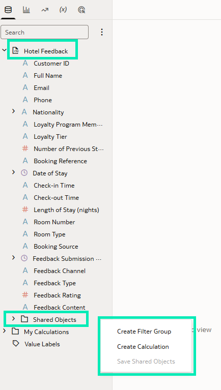
Figure 01: Create Filter Group and Create Calculation options
- Configure your object:
- For Filter Groups: Enter a Label and Description, click on the + icon, and add the required filter conditions:
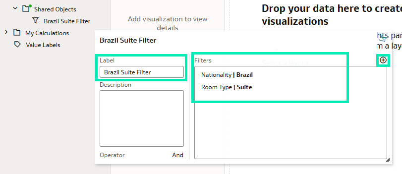
Figure 02: Create Filter Group
- For Calculations: Enter a Name and Description, then write your expression in the formula editor:
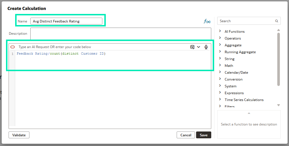
Figure 03: Create Calculation
Once created, a green dot appears next to the Shared Objects folder and each newly created object; this green dot indicates unsaved local changes:
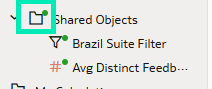
Figure 04: Unsaved changes
Unsaved objects are not available to other workbooks until they are published. To publish your objects and make them available to other workbooks using the same dataset or subject area, right-click on the Shared Objects folder and select Save Shared Objects:
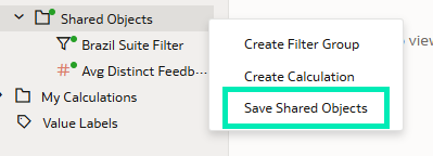
Figure 05: Save Shared Objects
Creating Shared Data Actions
This release also allows data actions to be shared across workbooks:
- Open Actions in the left-hand pane.
- Click on the + icon to define your action (e.g., URL navigation or canvas jump):
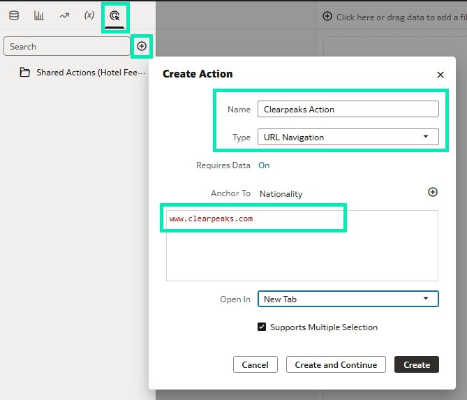
Figure 06: Actions pane
- Drag and drop the newly created action into the Shared Actions
- Right-click on the Shared Actions folder and then select Save Shared Objects to publish it:
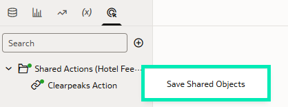
Figure 07: Save Shared Objects
Shared objects are linked dynamically to the relevant dataset or subject area. If a user with appropriate permissions updates a shared filter, calculation, or data action and saves it, the change is automatically reflected in all workbooks using that shared object.
To restrict who can modify shared objects, the dataset owner can adjust access controls:
- Right-click on the dataset and then select Inspect:
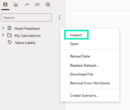
Figure 08: Inspect option
- Navigate to the Access
- Assign Full Control, Read-Write, or Read-Only permissions to specific users or roles:
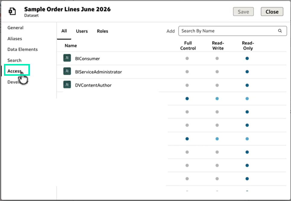
Figure 09: Access tab: roles and user permissions
Display Table and Pivot Data Bars with Enhanced Formatting Options
This feature integrates visual bars directly into tables and pivot tables, instantly transforming raw measures into visual indicators whilst preserving row-level detail.
Imagine analysing data about orders in a pivot table with the aim of evaluating sales and profit across product categories and subcategories. With this new feature, you can embed 100% data bars directly inside your data cells. This adds a clean visual layer alongside your numbers, bridging the gap between raw data and visuals. By displaying fixed-length bars where the coloured fill represents the value as a percentage of a set range, comparing numeric measures is more intuitive and easier to understand.
Here is what the initial visualisation looks like using the existing OAC features, before applying the new functionality:
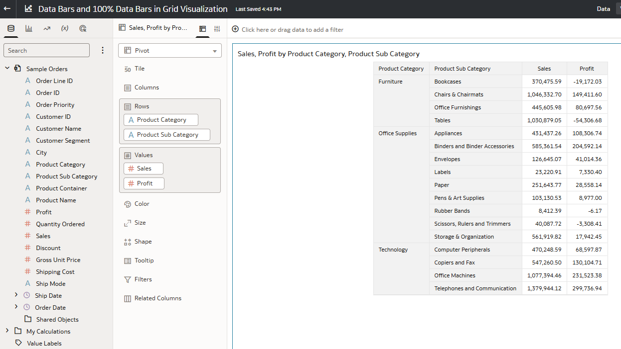
Figure 10: Initial visualisation
To add a 100% data bar:
- Click on the table or pivot table visualisation and go to Properties.
- Open the Edge Labels
- Select the measure that you want to enhance (in this case, Sales).
- Go to the Chart property and select 100% Bar:
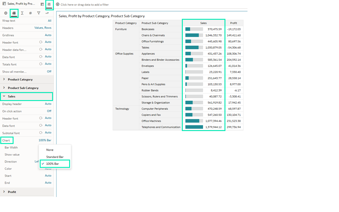
Figure 11: Sales measure 100% bar chart
You can personalise the standard bar or the 100% bar with the following properties:
- Bar Width: Specifies the width of a 100% Bar.
- Show Value: Specifies whether and where the numeric value is displayed.
- Direction: Specifies the direction in which the bar is displayed.
- Color: Specifies the colour of the data bar.
- Start: Specifies the starting value used to calculate the data bar length.
- End: Specifies the ending value used to calculate the data bar length.
Let’s add a standard bar to the Profit measure following the same steps as before, and then adjust the properties for both Sales and Profit:
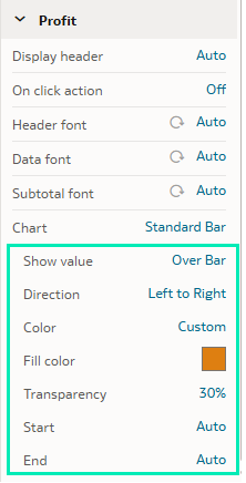
Figure 12: Standard bar chart properties
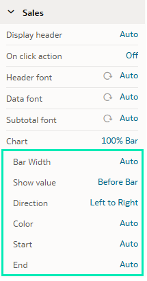
Figure 13: 100% bar chart properties
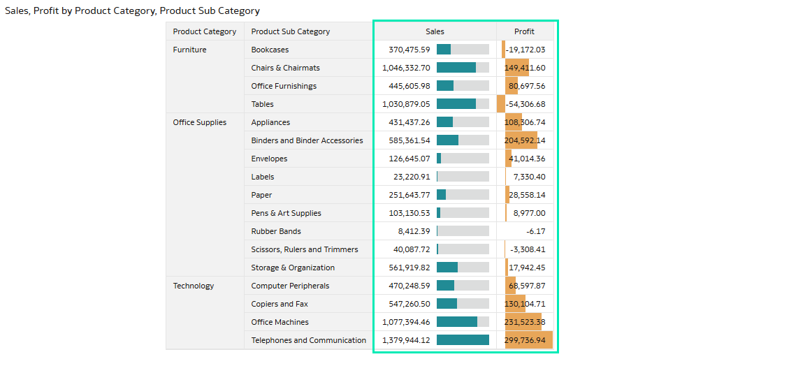
Figure 14: Final pivot table
This feature enhances readability by adding visual context to numeric values, enabling faster comparisons, easier pattern recognition, and more efficient data analysis whilst preserving precise values.
Fine-Tune Filter Interactions
This update also enhances filter interactions, giving you greater control over how filters affect individual visualisations and the values available within dashboard filters.
Let’s see how the new Filter This Viz By works. Imagine you have a sales analysis report that lets you filter by City and Product Category, but you want one chart to continue showing the overall sales trend, unaffected by the local filters applied to the rest of the dashboard. To configure this:
- Select a visualisation to see its properties:
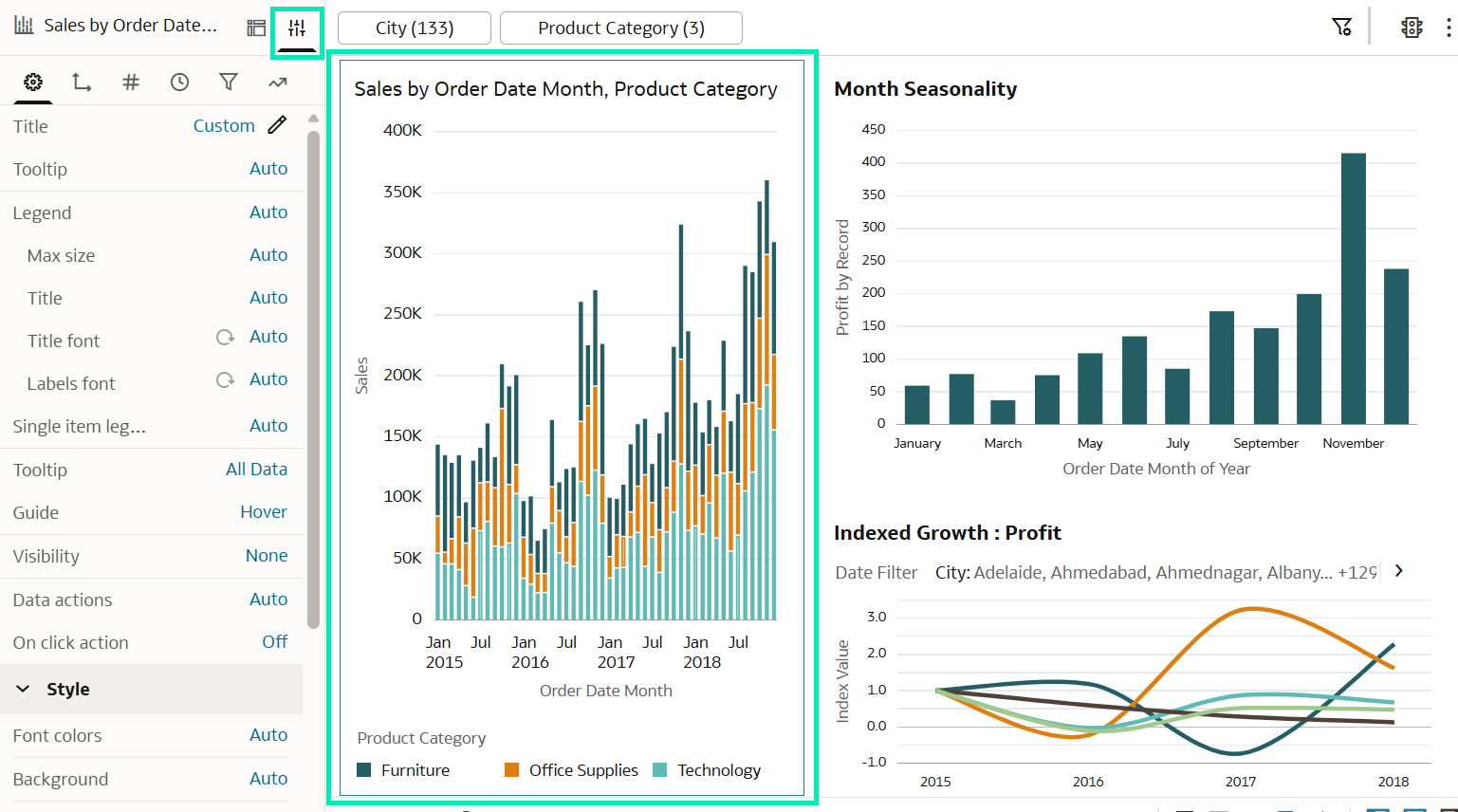
Figure 15: Visualisation Properties pane
- Go to Filter Settings:
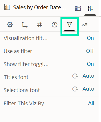
Figure 16: Filter Settings
- Click on Filter This Viz By and then Custom to select which filters affect the data shown in this visualisation. Select None if you don’t want any filters to affect it:
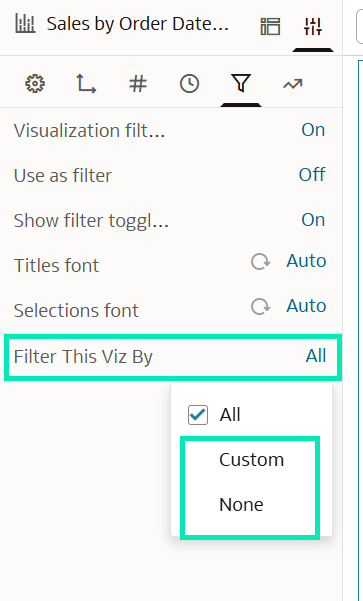
Figure 17: Filter This Viz By options
In this example, we want the visualisation to ignore the Product Category filter and continue showing the overall sales picture. To achieve this, select Custom and deselect Product Category:
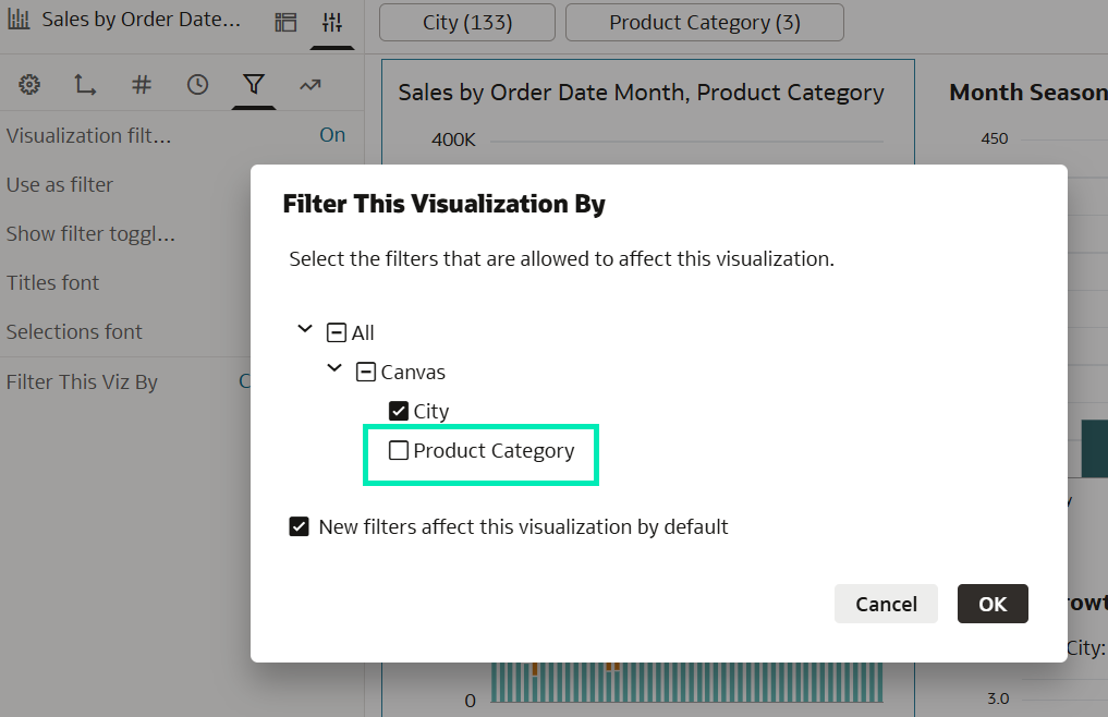
Figure 18: Pane to select which filters will affect the visualisation
Now, whenever you interact with the excluded filters, this specific visualisation remains unchanged, preserving your global perspective whilst the rest of the dashboard dynamically updates:
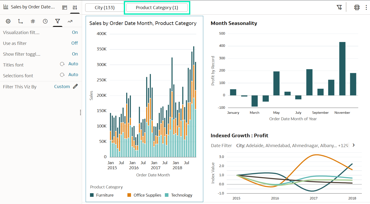
Figure 19: The visualisation on the left remains unchanged after Product Category filtering
Next, let’s see how the enhanced Limit Values settings work and the benefits they bring to report design. Whilst Filter This Viz By allows you to control which filters affect the data shown in a visualisation, the Limit Values settings allow you to control which filters elsewhere on the canvas limit the values available within a particular filter.
Imagine we want a Product Sub Category filter that always shows all the product subcategories, regardless of the Product Category selections. To get this result, we do the following:
- Add the new filter and click on the Limit Values button:
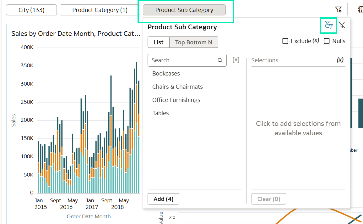
Figure 20: Product Sub Category filter panel
- Make sure that only the filters you want to affect the values shown in this filter are selected:
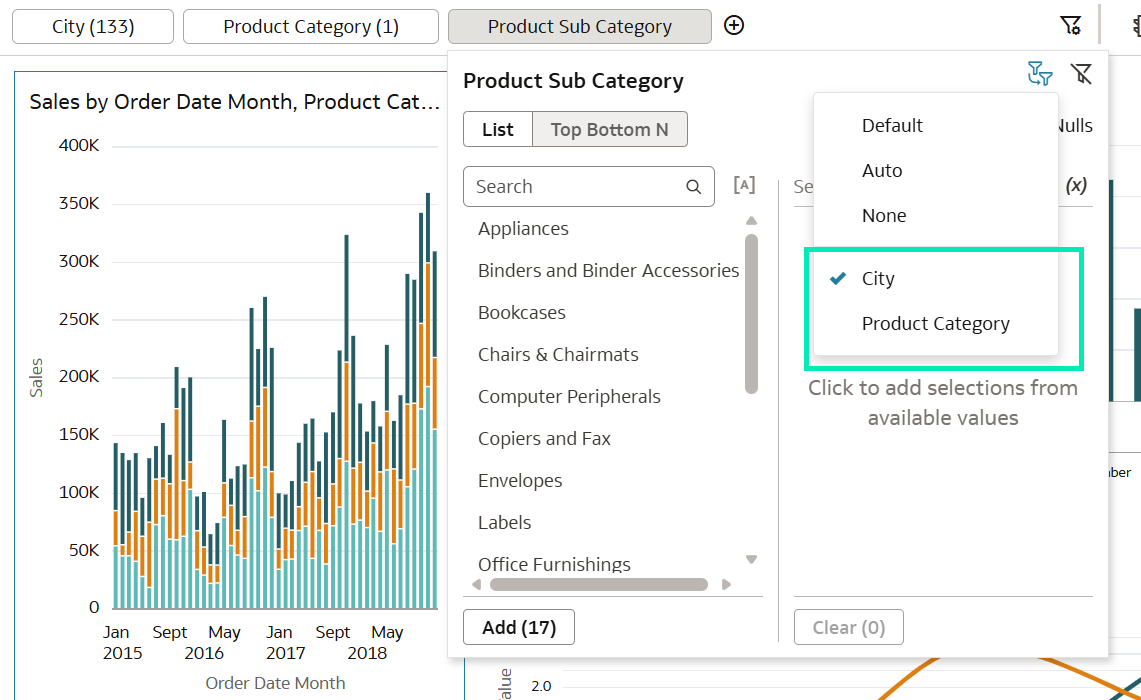
Figure 21: Limit Values Settings panel
- Now you can add a chart that always shows the profit per Product Sub Category without depending on what Product Categories are being filtered in the canvas. First, add the new chart:
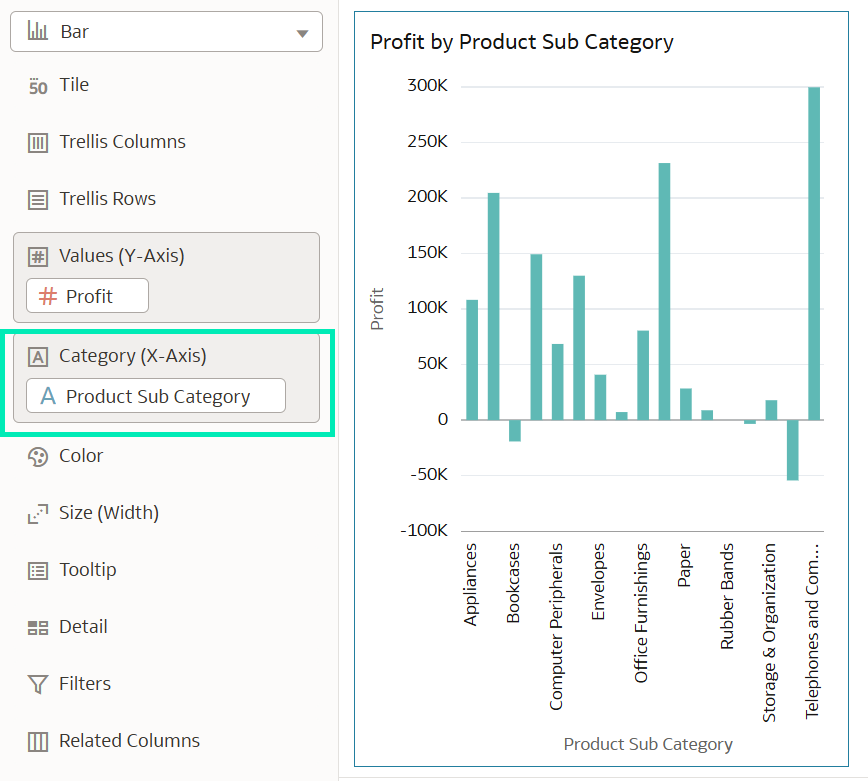
Figure 22: Profit by Product Sub Category chart
- Next, make the chart independent of the Product Category Go to Filter This Viz By and deselect the Product Category filter. The visualisation will then ignore this filter, whether it is applied through the canvas filter bar or through interactive cross-filtering from linked visualisations. Internal drill-down interactions will continue to work whilst these filter boundaries remain in place:
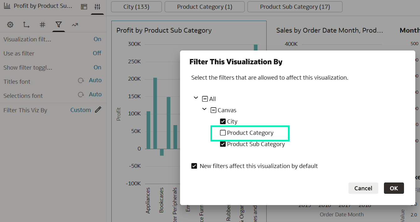
Figure 23: Filter This Viz By screen
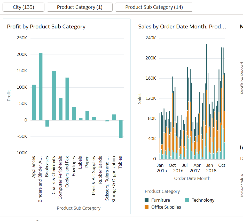
Figure 24: Profit by Product Sub Category filtered by different sub categories but unaffected by Product Category
Search for Content or Ask Data-Related Questions Using Natural Language
First introduced in the May 2026 update, the Natural Language Search capability remains in preview in the July 2026 release. This feature turns the Home page search bar into a conversational AI Assistant, combining the search for existing assets with on-demand analysis. You can type questions into the search bar (such as «Show me sales by segment» or «Did David create any sales workbooks last week?») to look for related content or build a new dashboard from scratch.
Here’s a quick reminder of the two ways to use it:
- Navigate to your Oracle Analytics Home Page and click on the search bar at the top.
- Type your question in plain English.
- Choose whether you want to search for existing content or ask AI to generate a new dashboard:
- Press Enter to search for existing content: The AI Assistant will instantly find and display the most relevant dashboards, workbooks, and datasets already available in your system.
- Press Shift + Enter to generate a brand-new dashboard: The AI Assistant will immediately generate a temporary dashboard to answer your question.
When you choose to generate a new visualisation, OAC automatically creates an interactive dashboard that includes:
- An LLM-created insights summary explaining the data trends in plain language.
- Up to five custom visualisations answering your query.
- A conversational thread on the left-hand side of the page, allowing you to ask follow-up questions (for example, «Can you only show information for this fiscal year?») by simply pressing Enter.
With this feature, instead of spending time navigating through all your folders or manually configuring charts, you can interact with your analytics platform as if you were talking to a colleague and receive instant visual answers.
Set Parameter Data Actions Can Now Set Multiple Parameters
With this new OAC feature, you can set values for multiple parameters by selecting a data point in a chart, table, or pivot table. When you invoke a Set Parameter data action, either by selecting a data point in a visualisation or by clicking on a button, the action behaves like a selection and sets the values of one or more parameters wherever those parameters are used on the canvas, including in filters and visualisations.
As an example, let’s create a treemap showing sales by Customer Segment and Product Category. Each data point represents the intersection of these two attributes. Clicking on a data point captures both values and passes them dynamically to separate parameters. To configure this:
- Create the parameters that you want the data action to update:
- In the Data pane, click on Parameters.
- In the Parameters pane, click on Menu, then select Add Parameter:
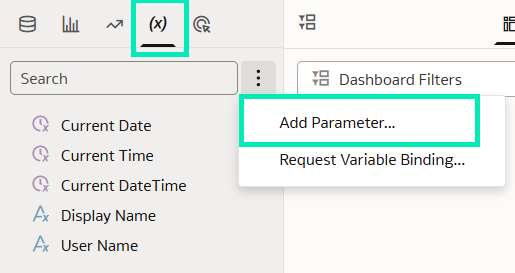
Figure 25: Add Parameter
- In the Name field, enter a unique name, preferably similar to the name of the column you are using. In our example, we create a parameter called Product Category Parameter for the Product Category column.
- Click on Data Type and choose the type of data the parameter will accept; in this case, select Text.
- If you want the parameter to accept multiple values, enable Allow Multi Select.
- In the Available Values field, select how you want to specify the parameter’s available values. In this case, select Column.
- In the Initial Value field, choose how you want the parameter’s initial value to be determined. If you don’t want to use an initial value, select Value and leave it blank, as in our example.
- Click on OK.
- Repeat the process to create a second parameter. In our example, we create Customer Segment Parameter for the Customer Segment column:
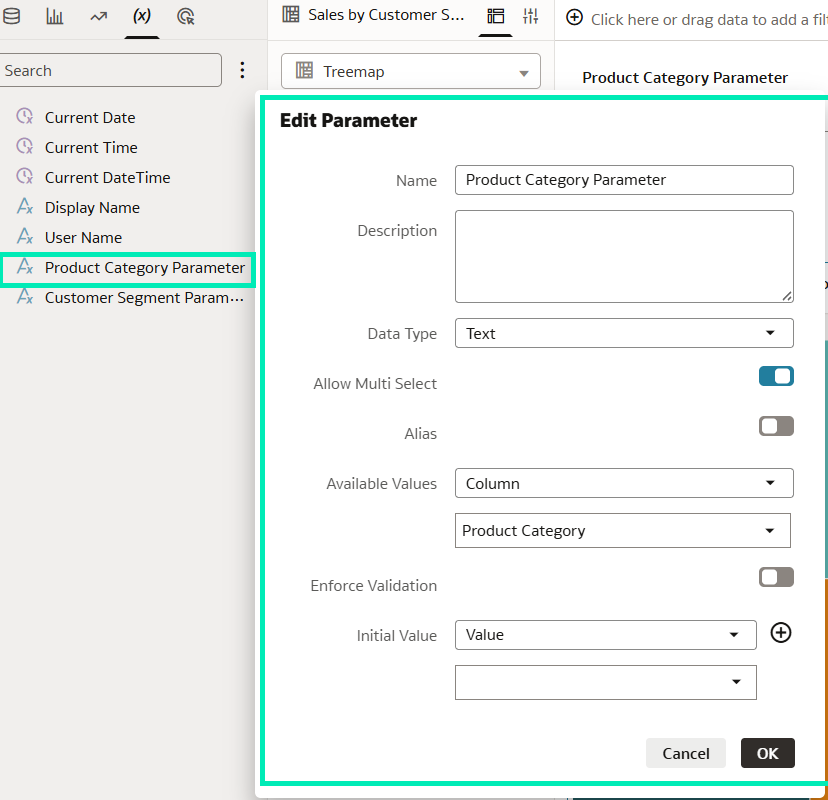
Figure 26: Create Parameters configuration
- Create a Set Parameter data action with both parameters:
- In the Actions pane, click on Create Action.
- In the Name field, give your data action a meaningful name; we call ours Set Values.
- In the Type field, select Set Parameter.
- In the Requires Data field, set it to On.
- In the Anchor To row, select a column to associate with the data action.
- In the Parameters section, click on None, then select your parameter.
- In the Pass Values row, select Column, then select the corresponding column from your dataset in the Column
- To add another parameter, click on Add Parameter and configure it as required.
- Click on Create. In our case, we add both parameters created in the previous step:
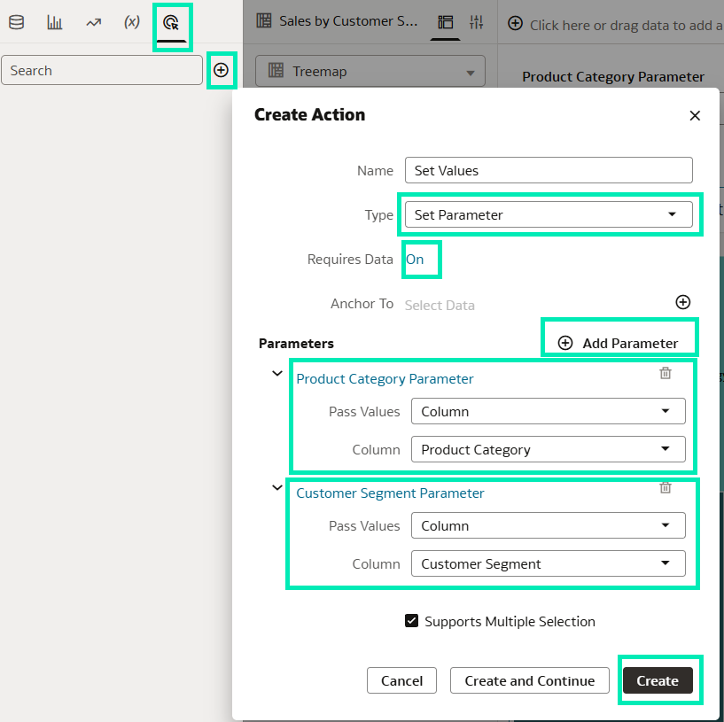
Figure 27: Create Data Action configuration
- Connect the data action to the visualisation:
- Navigate to your visualisation and go to the Properties
- Open the General tab, then under On click action, select the data action you created. In our case, we select Set Values:
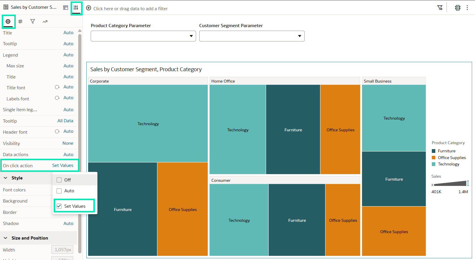
Figure 28: Connect a Data Action to the visualisation
We can see that both parameters are initially empty in the Dashboard Filters visualisation. Once the data action has been connected to the treemap visualisation, clicking on a data point invokes the action and passes its values to the corresponding parameters exposed in Dashboard Filters. As each data point represents the intersection of Customer Segment and Product Category, both parameters are populated simultaneously:
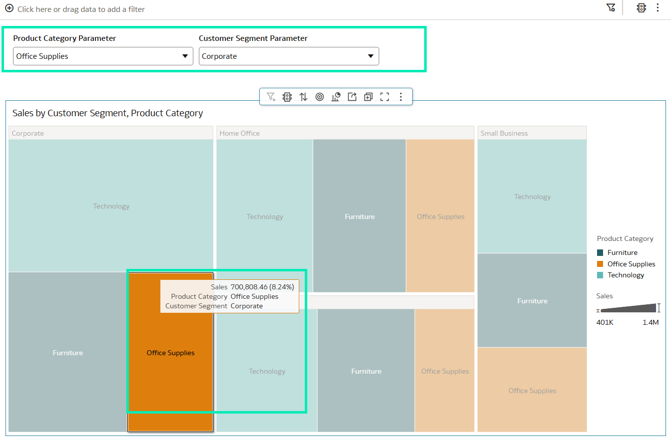
Figure 29: Data Action invocation
This example is based on Oracle’s Create a Set Parameter Data Action to Pass Column Values, and there are two more similar use cases:
- Create a Set Parameter Data Action to Pass Static Values: Unlike a Set Parameter action that passes values from selected data points, this configuration passes fixed values that you specify when creating the action. The parameter is updated with the predefined value or values regardless of the data points selected when the action is invoked.
- Create a Set Parameter Data Action for a Button Bar: You can create a Set Parameter data action that doesn’t require data so you can assign it to a button in a button bar. When you click on the button and invoke the data action, one or more parameter values are updated wherever those parameters are used in the workbook.
Use 100% Bar, Stacked Area, and 100% Area Charts in Overlay Chart Visualisations
In Oracle Analytics, you can use overlay charts to combine multiple chart layers that share a common category axis, making it easier to compare related measures, identify trends, and detect patterns. With this OAC update, you can now use 100% Bar, Stacked Area, and 100% Area charts as layers in Overlay Chart visualisations.
Let’s create an overlay chart that combines a 100% Area chart with other chart types.
From the visualisation tab, select Overlay Chart:
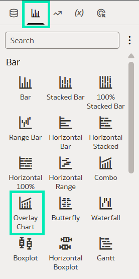
Figure 30: Overlay Chart creation
- Drag a field to the Category (X-Axis) of this Overlay Chart in the Grammar In this case, we use the Quarter Date field as the category:
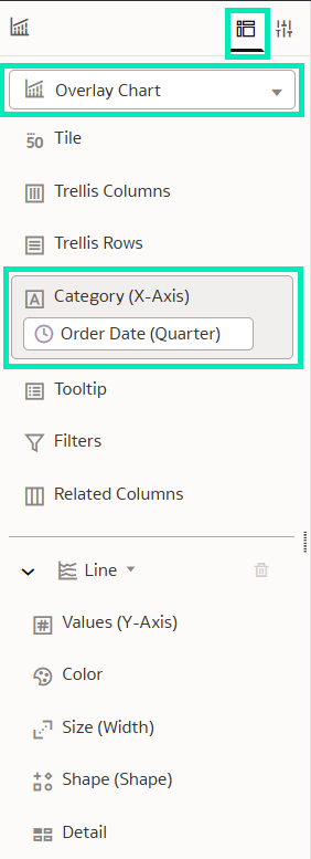
Figure 31: Overlay Chart category (X-Axis)
- Now we create three different chart layers:
- In the first chart layer, select 100% Area to show the Sales percentage contribution of each product category across the quarters.
- Drag the Sales measure into the Values (Y-Axis) grammar.
- Drag the Product Category field into the Color
Notice that the Y-Axis of this chart is scaled to 100% to show each product category’s percentage contribution to sales:
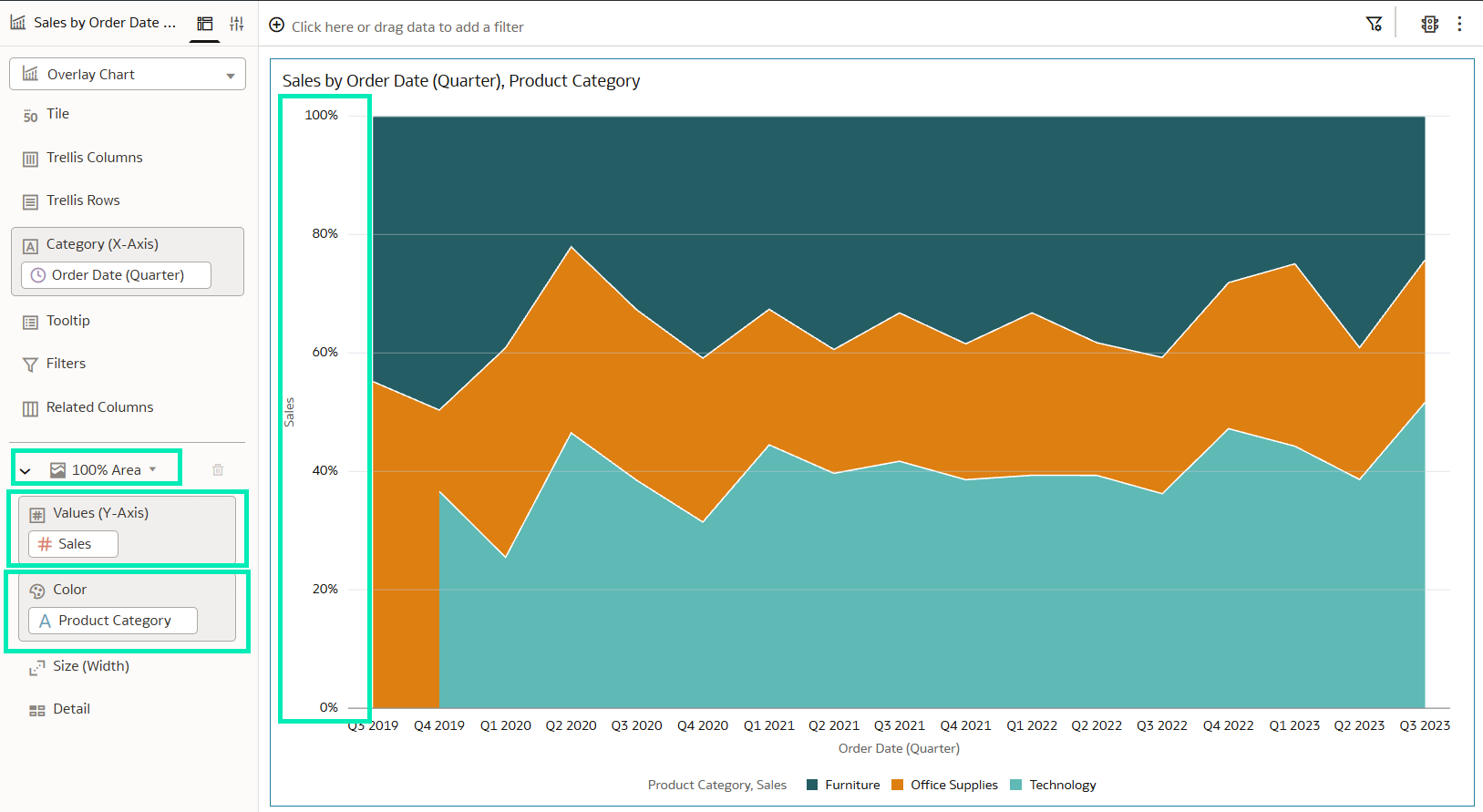
Figure 32: Overlay Chart first layer
- Now we can create the second layer:
- For the second layer, select a stacked bar chart with a numeric scale axis to show Discount by Customer Segment.
- Drag the Discount measure into the Values (Y-Axis) grammar.
- Drag the Customer Segment field into the Color
Because Discount is a measure on a numeric-scale chart, OAC assigns it to the numeric Y2-Axis:
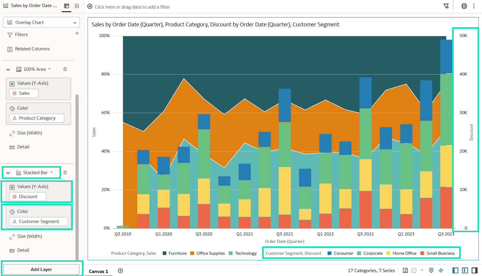
Figure 33: Overlay Chart second layer
- Now we can create the third layer. In this case, we want to see the Quantity Ordered displayed with the other two layers.
- In the third chart layer, select a line chart, which is a layer with a numeric scale axis.
- Drag the Quantity Ordered measure into the Values (Y-Axis) grammar.
Because Quantity Ordered is a measure on a numeric-scale chart, OAC assigns it to the numeric Y2-Axis, along with the Discount measure:
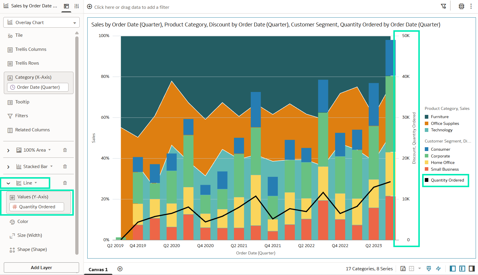
Figure 34: Overlay Chart third layer
This new feature allows you to build layered overlay charts with additional visuals, enhancing data comprehension and offering a wider range of display options.
Deploy Semantic Models to a Resource Group
Previously, OAC limited users to a single semantic model deployment per instance. But thanks to this new feature, administrators can set up additional resource groups to deploy up to three independent semantic models (one per resource group) in a single OAC instance.
Once deployed, these semantic models are exposed as Subject Areas that users can query across workbooks and dashboards.
Deploying multiple models allows you to easily reuse existing setups from other OAC environments, manage complex data domains more effectively, and improve governance by limiting access to specific datasets. It also lets you isolate workloads across different departments, which optimises performance and reduces query contention.
Here’s how to deploy a semantic model to a dedicated resource group in order to use multiple semantic models in a single OAC instance:
- In the OCI main menu, go to Analytics Cloud to access the list of instances in your account:
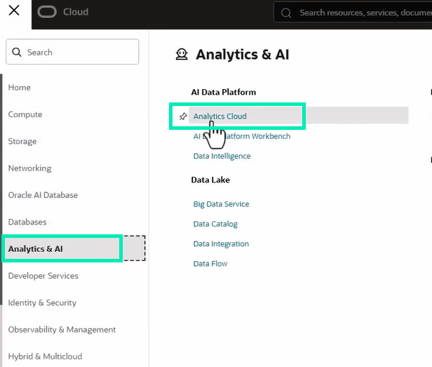
Figure 35: OCI main menu
- Select the instance in which you want to deploy the semantic model, or create a new instance.
- Inside the instance, go to the Resource groups tab and click on Create resource group:
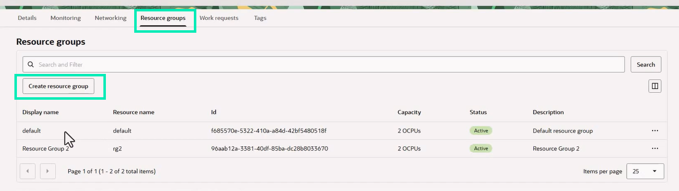
Figure 36: Resource Groups tab inside the Analytics Instances detail screen
- Fill in the form and then click on Create.
- The display name will be the one shown when we deploy the semantic model from Oracle Analytics Semantic Modeler:
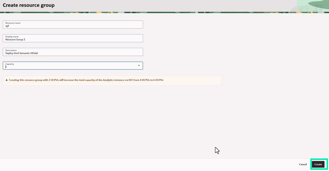
Figure 37: Create Resource Group form
- Once the resource group has been created, open the Deployments tab on the Semantic Models page and click on the upload button for the resource group you have just created:

Figure 38: Deployments tab inside Semantic Models
- Choose whether to upload the semantic model from a file or select one from the Semantic Models Once you have selected the model, click on Deploy:
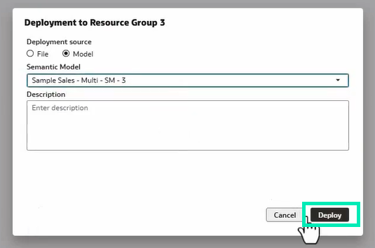
Figure 39: Screen to select the semantic model to deploy
You can also deploy a semantic model by selecting it in the Semantic Models tab, clicking on the three-dot menu in the upper-right corner, selecting Deploy, and choosing the target resource group:
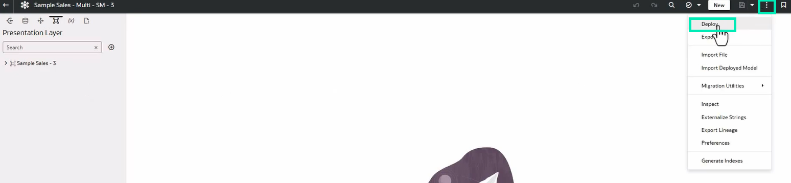
Figure 40: Alternative deployment of the semantic model
You can then create a new workbook and add the subject areas corresponding to the semantic models deployed in the different resource groups. You can use these subject areas within the same workbook, but you cannot combine fields from different semantic models:
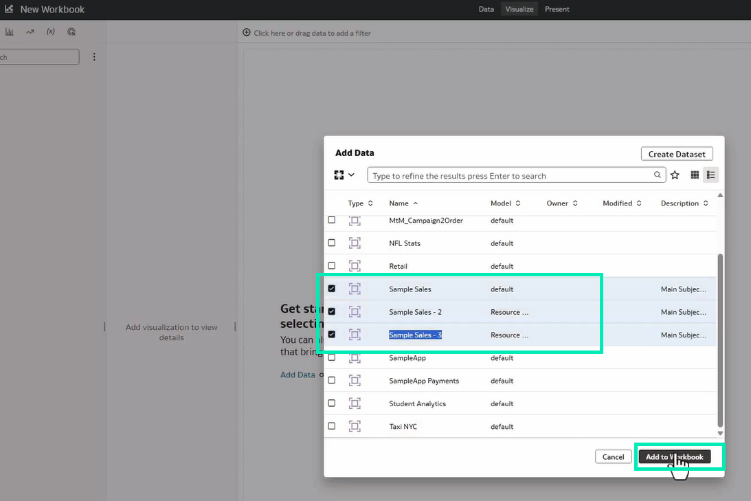
Figure 41: Adding Subject Areas from different semantic models to the same workbook
Conclusion
The Oracle Analytics Cloud July 2026 update delivers a comprehensive set of enhancements that further strengthen the platform’s capabilities across data visualisation, user experience, AI, collaboration, and semantic modelling.
On the analytics and dashboarding side, this release enhances exploration and visualisation by introducing embedded visual data bars in tables and pivot tables, support for additional chart types in overlay visualisations, multi-parameter data actions, fine-tuned filter controls for individual canvas visualisations, and instant AI-generated interactive canvases from natural language queries.
From an AI, data modelling, collaboration, and administration perspective, this release improves efficiency and governance through shared filter groups, calculations, and data actions across workbooks, and new resource group deployment options within the Semantic Modeler.
Here at ClearPeaks, we will continue to monitor and analyse each OAC release to help you to understand and use these new capabilities. If you would like to explore how these features could be applied to your environment, get in touch with our team of certified Oracle experts today.