04 Jun 2025 Data-Driven Champions: Our Experience in the Oracle Analytics Challenge 2025
In February we had the opportunity to represent ClearPeaks in the Oracle Analytics Data Visualization Challenge 2025, creating a visualisation based on Formula 1 data that ended up being a winner. In this article we’ll walk you through the story of how we got our idea onto the podium!
Challenge Overview
In January 2025, Oracle Analytics unveiled this challenge, designed to give users the opportunity to show off their data visualisation skills. Anyone with an Oracle account could take part in the competition, whether they were experts or beginners.
As part of the challenge, participants were provided with an Oracle Analytics Cloud (OAC) instance, which included several preloaded datasets and demo visualisations to serve as inspiration. However, competitors could also use any public dataset, and in the end that’s what we decided to do.
The judging criteria were based on a combination of design and analytical considerations, such as clarity of purpose, appropriateness of visualisations, range of methods, and narrative quality. Fortunately, a series of online webinars was made available, in which Oracle Analytics experts shared tips on storytelling, choosing the right visualisations, and creating impactful infographics.
Given ClearPeaks’ extensive experience with Oracle Analytics, we decided to take a shot at the challenge and put our skills to the test by creating a visually engaging, highly interactive dashboard, but this time outside the typical business context in which we work.
The Winning Visualisation
Of the three entries that we submitted, the winning entry was titled ‘Champions Face to Face’.
This visualisation presented a performance comparison over time between two F1 drivers from a list of all-time champions, showing key metrics such as the number of victories, constructor impact rates and performance evolution, among others.
By allowing users to select any two champions and organising the data to simulate a head-to-head confrontation, the visualisation aims to evoke the competitive spirit that is so intrinsic to Formula 1, offering users an immersive and engaging experience:
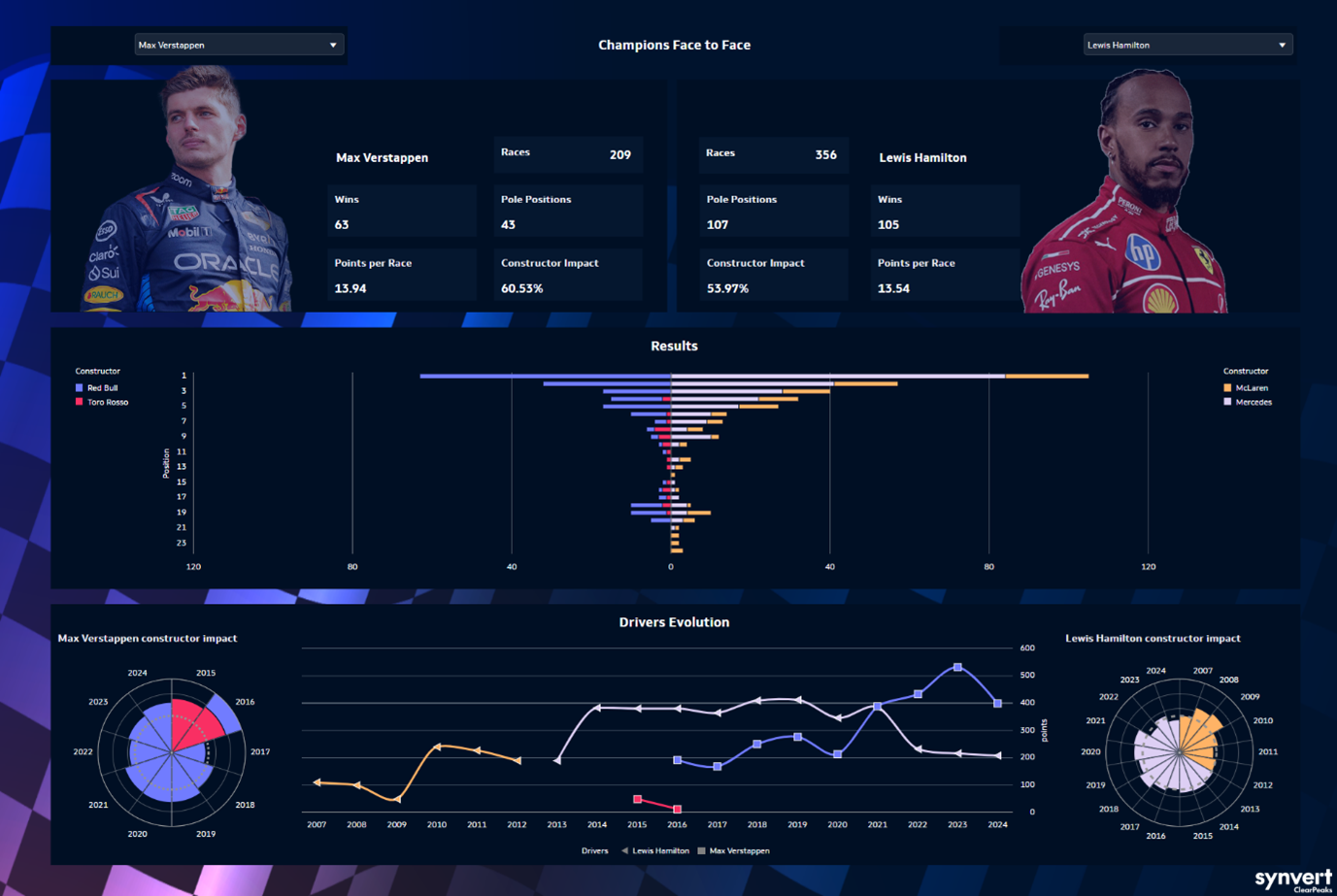
Figure 1: Champions Face to Face Visualisation
You can access this visualisation and many more in the Oracle Analytics Data Visualizations Gallery, including our other two entries to the challenge. It’s an excellent resource for inspiration or just to explore innovative implementations of various Oracle Analytics features.
Choosing and Preparing the Dataset
Now for the big question: what made us choose Formula 1 as the subject of our visualisation?
From the outset, our goal was clear: to create a visualisation that was engaging, interactive, and accessible. However, the key was to select the right topic, and while reviewing the datasets available in the challenge instance, we discovered one focused on Formula 1. Inspired by some clever uses of data showcased in the introductory webinars and demo visualisations, we decided to follow that path.
The dataset provided consisted of simulated races, but we wanted the real deal so we chose to work with a public dataset based on authentic F1 statistics, allowing us to compare historical data across multiple drivers, delivering a more faithful and immersive experience, especially for Formula 1 enthusiasts.
Downloading the dataset files was just the beginning. We needed to model, clean, and prepare the data to ensure our visualisations were both comprehensive and insightful. After analysing the original dataset, which comprised 14 CSV files, we created two distinct datasets within OAC.
The first dataset was made up of 10 CSV files covering drivers, standings, qualifiers, and results at the Grand Prix and driver level. The second dataset used 7 CSV files that included driver, results, and lap time data, structured at the driver and lap level. This separation improved dashboard performance and simplified the required calculations. For example, metrics such as total points per driver are more efficiently calculated when using data at the Grand Prix and driver level rather than at lap level.
Crafting the Visuals
Once the data was ready, we had to display it in a way that conveyed the competitive nature of F1, and we came up with a three-segment layout:
- The upper segment shows images of the chosen champions alongside some key metrics, such as total victories and constructor impact rates. These elements are shown as a mirror, enhancing the sense of a face-off between the two champions. The main reason we chose these metrics is because they allow comparisons that are independent of the car each driver used. In particular, the constructor impact rate measures a driver’s relative performance compared to their team-mates, offering valuable insights into individual skills.
- The middle segment shows a butterfly chart illustrating the frequency with which each champion finished in each race position. This visual maintains the mirrored design and groups the data using each constructor’s signature colour for quick interpretation.
- The lower segment introduces time through three visuals. At the centre, a line chart tracks the points scored by each driver over the years, highlighting performance evolution and the various constructors they raced for. Flanking the line chart are two radar charts, one for each driver, providing detailed analysis of their contribution to different constructors during their careers. Each radar chart includes a reference line at the 50% contribution mark, allowing users to easily assess how each driver performed relative to their team-mates. What’s more, the charts also indicate mid-season team changes when applicable.
Challenges and Lessons Learned
We ran into several challenges along the way, such as selecting the best topic and identifying a suitable dataset, crucial elements for creating insightful, high-performing visualisations with the potential to win the competition.
Nevertheless, the experience proved to be immensely valuable, allowing us to showcase what we’ve learned over the years as Oracle Analytics developers. Opportunities to choose the topic, dataset, and dashboard design from scratch are rare, and in particular, this project allowed us to explore and apply many of the latest features in Oracle Data Visualization (ODV), several of which we’ve highlighted in our regular OAC blog releases. For example, we wanted to deliver a comprehensive Formula 1 experience by dynamically changing the driver’s image when selected from a dropdown menu, and this was possible thanks to the Visibility parameter feature, enabling more immersive, customised user interactions.
An important design principle for us was to ensure that users could follow the comparison between the two drivers as a story. This is reflected in the mirror layout, the clearly defined three-segment structure, and the carefully selected visuals. Additionally, we learned that by customising all the tooltips, users can easily identify and interpret any data point they want to.
Finally, we emphasised the “Present” capabilities of ODV: we adjusted settings to optimise screen resolution and eliminate unnecessary elements such as filter panels and canvas bars. This approach maximised the use of available screen space, helping the visualisations to stand out more effectively.
Conclusion
All in all, this challenge was a rewarding experience that allowed us to sharpen our Oracle Analytics skills and to stretch our creativity in a more versatile, less executive-driven setting. From identifying the ideal topic and dataset to crafting compelling visuals, we successfully balanced the technical and creative elements of business intelligence, making it a truly enriching exercise for any BI professional.
We’re incredibly proud to have been selected as one of the winners, a recognition that validates our approach and inspires us to continue pushing the boundaries of data visualisation!
You can find our three entries in the Oracle Analytics Data Visualization Gallery: Formula 1 – Grand Prix Championship, HCM Attrition Analysis and Formula 1 – Drivers face to face.
If you’re interested in learning more about how we use Oracle Analytics to turn data into impactful stories, or if you’d like support building your own advanced dashboards, don’t hesitate to reach out!