26 Mar 2026 Azure Maps for Power BI: A Guide to the New Markers Update
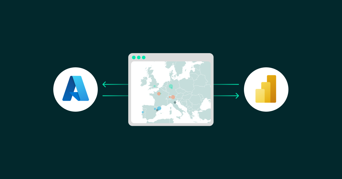
This article explores the latest features of Azure Maps in Power BI and how they solve real-world logistics challenges, moving beyond traditional bubble-based visuals to a high-precision, interactive mapping experience. We’ll also address the long-standing challenges of geospatial visualisation in Power BI, and show how these enhancements can now support sophisticated live-tracking ecosystems.
The Evolution of Azure Maps
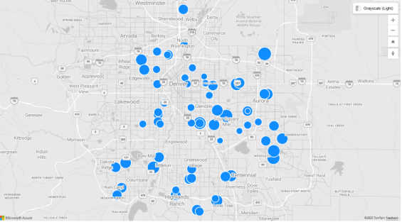
For many years, Power BI users have relied on the standard bubble layer in Azure Maps, and whilst effective for showing general density, there are three significant drawbacks in modern logistics:
- Lack of Visual Identity: A circle looks the same whether it represents a 10-tonne freighter or a last-mile delivery bike.
- Static Behaviour: Bubbles don’t show which way a vehicle is facing or if its battery is running low; users must click to find out.
- Clutter: In high-density fleets, overlapping circles create visual noise that makes it harder for dispatchers to take quick decisions.
Source: Microsoft
New Azure Maps Capabilities
Microsoft’s recent update to the Azure Maps marker layer has introduced new capabilities for geospatial visualisations. Users are no longer limited to one-size-fits-all icons, but can now:
- Apply DAX logic to Scalable Vector Graphics (SVGs): Make icons smart enough to change behaviour based on sensor data.
- Enable high-density performance: Render thousands of unique assets without the lag associated with legacy custom visuals.
- Build a digital twin: Create a visual mirror of the physical world in which assets move, update, and react in real time.
What Makes This Approach Different?
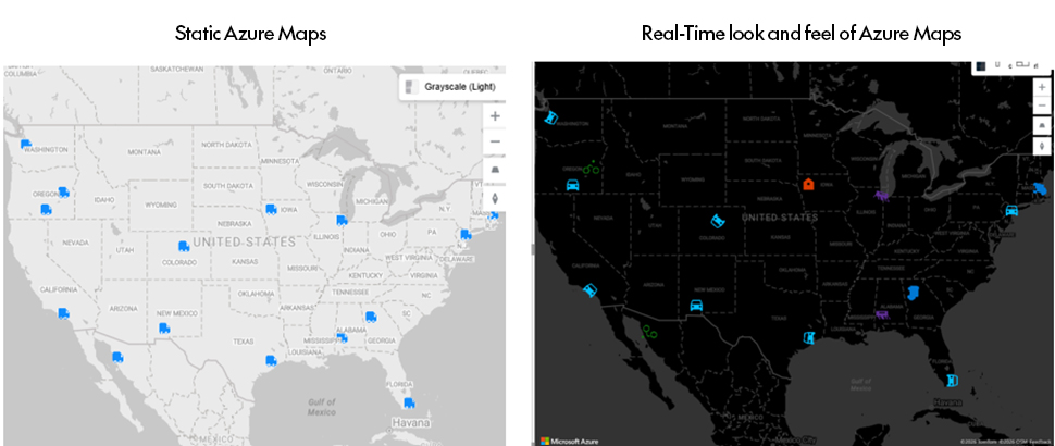
Whilst the standard Azure Maps features available in January 2026 allow you to replace bubbles with a single fixed icon, like a truck or car, that single image applies to your entire dataset. We’ll extend this approach by demonstrating how to dynamically switch icons based on the data. If your logistics fleet uses a mix of vehicles (for example, cars, trucks, bikes, or drones), this method ensures each asset is represented by the correct icon in real time.
Source: Actual demonstration using the implementation steps below
The Use Case: Multi-Modal Delivery Tracking
Imagine a modern delivery company operating in a dense urban environment. To maximise efficiency, the fleet uses different types of vehicle based on delivery distance and traffic conditions:
- Drones: Handle small medical packages efficiently over short distances.
- Bikes: Navigate narrow areas of city centres for rapid food delivery.
- Trucks and cars: Manage heavier bulk deliveries from the outskirts of the city.
Let’s see how this use case can be implemented and visualised in Azure Maps.
Step-by-Step Implementation
Step 1: The dataset
Prepare your data in CSV format (e.g. Logistics_Data.csv), including columns for Latitude, Longitude, Vehicle Type, and Heading.
| Vehicle_ID | Driver | Lat | Long | Status | Heading | Load_Type | Battery_Level | Vehicle_Type |
| CAR-101 | A. Miller | 40.7128 | -74.006 | In Transit | 360 | Electronics | 88% | Car |
| CAR-102 | S. Chen | 34.0522 | -118.2437 | Delayed | 45 | Medical Supplies | 42% | Car |
| CAR-103 | M. Jonson | 42.7157 | -120.1611 | Loading | 0 | Perishables | 95% | Car |
| CAR-104 | L. Garcia | 29.7604 | -95.3698 | In Transit | 275 | Furniture | 61% | Car |
| CAR-105 | K. Patel | 25.7617 | -80.1918 | Maintenance | 90 | Empty | 12% | Car |
| CAR-106 | B. Smith | 47.6062 | -122.3321 | In Transit | 120 | Electronics | 75% | Car |
| CAR-107 | R. White | 39.7392 | -104.9903 | Delayed | 220 | Textiles | 30% | Car |
| CAR-108 | J. Doe | 32.7157 | -107.1611 | Loading | 0 | Industrial | 100% | Car |
| TRK-109 | T. Nguyen | 42.3601 | -71.0589 | In Transit | 15 | Automotive | 54% | Truck |
| TRK-110 | E. Wilson | 33.749 | -84.388 | Delayed | 95 | Consumer Goods | 68% | Truck |
| BIKE-201 | L. Garcia | 44.0522 | -118.2437 | In Transit | 0 | Bike | 30% | Bike |
| BIKE-202 | K. Patel | 30.073 | -112.2437 | In Transit | 220 | Bike | 45% | Bike |
| DRN-301 | B. Smith | 41.8781 | -87.6298 | In Transit | 15 | Drone | 95% | Drone |
| DRN-302 | R. White | 31.881 | -87.6298 | Landing | 0 | Drone | 15% | Drone |
| WH-900 | E. Wilson | 42.7604 | -95.3698 | Loading | 0 | Warehouse | 100% | Warehouse |
Step 2: Initialise the visual
Add the Azure Maps visual to your Power BI report and drag the Latitude and Longitude columns into the appropriate fields.
Step 3: Create the Marker Icon Intelligence DAX measure
Use the following DAX measure to dynamically switch SVG icons based on vehicle type.
Scalable Vector Graphics define how an image is rendered on the map through mathematical instructions that control elements such as shape, size, and colour.
DAX Formula
Marker Icon Intelligence =

-- Define SVG Strings (URL Encoded)

VAR TruckSVG = "data:image/svg+xml;utf8,<svg xmlns='http://www.w3.org/2000/svg' viewBox='0 0 24 24' fill='%230078D4'><path d='M20 8h-3V4H3c-1.1 0-2 .9-2 2v11h2c0 1.66 1.34 3 3 3s3-1.34 3-3h6c0 1.66 1.34 3 3 3s3-1.34 3-3h2v-5l-3-4z'/></svg>"

VAR BikeSVG = "data:image/svg+xml;utf8,<svg xmlns='http://www.w3.org/2000/svg' viewBox='0 0 24 24' fill='%23107C10'><path d='M15.5 5.5c1.1 0 2-.9 2-2s-.9-2-2-2-2 .9-2 2 .9 2 2 2zM5 12c-2.8 0-5 2.2-5 5s2.2 5 5 5 5-2.2 5-5-2.2-5-5-5zm0 8.5c-1.9 0-3.5-1.6-3.5-3.5s1.6-3.5 3.5-3.5 3.5 1.6 3.5 3.5-1.6 3.5-3.5 3.5zm14.5-8.5c-2.8 0-5 2.2-5 5s2.2 5 5 5 5-2.2 5-5-2.2-5-5-5zm0 8.5c-1.9 0-3.5-1.6-3.5-3.5s1.6-3.5 3.5-3.5 3.5 1.6 3.5 3.5-1.6 3.5-3.5 3.5zM15 12l-3-3h-3l-2 3h2l1-1.5h2l2 2h3z'/></svg>"

VAR DroneSVG = "data:image/svg+xml;utf8,<svg xmlns='http://www.w3.org/2000/svg' viewBox='4 4 16 16' fill='%235C2D91'><path d='M21 16.5c0 .3-.2.5-.5.5h-1.3l-1.7-3h-1.5l1.7 3h-1.2l-1.7-3h-1.5l1.7 3H12l-1.7-3H8.8l1.7 3H9.2l-1.7-3H6L4.3 16.5H3c-.3 0-.5-.2-.5-.5s.2-.5.5-.5h1.1l1.6-2.8c-.1-.1-.1-.2-.1-.2V9h12v3.5s0 .1-.1.2l1.6 2.8H20.5c.3 0 .5.2.5.5zM9 11h6V10H9v1z'/></svg>"

VAR WarehouseSVG = "data:image/svg+xml;utf8,<svg xmlns='http://www.w3.org/2000/svg' viewBox='0 0 24 24' fill='%23D83B01'><path d='M12 3L4 9v12h16V9l-8-6zm0 11c-1.1 0-2-.9-2-2s.9-2 2-2 2 .9 2 2-.9 2-2 2z'/></svg>"

VAR CarSVG = "data:image/svg+xml;utf8,<svg xmlns='http://www.w3.org/2000/svg' viewBox='0 0 24 24' fill='%2300BFFF'><path d='M18.92 6.01C18.72 5.42 18.16 5 17.5 5h-11c-.66 0-1.21.42-1.42 1.01L3 12v8c0 .55.45 1 1 1h1c.55 0 1-.45 1-1v-1h12v1c0 .55.45 1 1 1h1c.55 0 1-.45 1-1v-8l-2.08-5.99zM6.5 16c-.83 0-1.5-.67-1.5-1.5S5.67 13 6.5 13s1.5.67 1.5 1.5S7.33 16 6.5 16zm11 0c-.83 0-1.5-.67-1.5-1.5s.67-1.5 1.5-1.5 1.5.67 1.5 1.5-.67 1.5-1.5 1.5zM5 11l1.5-4.5h11L19 11H5z'/></svg>"

-- Logic to switch icon based on type

RETURN

    SWITCH( SELECTEDVALUE('Logistics_Data'[Vehicle_Type]),
        "Truck", TruckSVG,
        "Bike", BikeSVG,
        "Drone", DroneSVG,
        "Warehouse", WarehouseSVG,
        "Car", CarSVG,
        TruckSVG -- Default icon
    )
Note: SVGs are easy to create and access through design platforms such as Figma, making it possible to design custom vector graphics, export the code, and parameterise it in DAX. In turn, that allows a design concept to be translated into a data-driven visual within a dashboard. Whilst SVGs are widely available, the key is how to embed them in DAX so they can be used effectively in Power BI. One example is shown above.
Step 4: Bind icons to the map
- In the Format pane, navigate to Markers.
- Change the Mode to Image.
- Click on the fx (conditional formatting) button next to Image URL.
- Select your Marker Icon Intelligence measure.
Step 5: Dynamic rotation
To create a more professional, intuitive logistics UI, make your markers point in their actual direction of travel:
- In Marker settings, locate the Rotation property.
- Click on the fx button and select the Heading field from your dataset.
- Icons will now orient dynamically based on the vehicle’s direction.
Final Performance Results
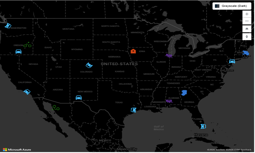
The image below shows cars and trucks in blue, bikes in green, drones in purple, and warehouses in orange, using real-time vehicle icons. The new Marker feature replaces standard bubbles with meaningful, realistic icons that can rotate based on live data. Above all, this layer is highly optimised and rendering performance is significantly improved compared with legacy custom visuals.
Source: Actual demonstration using the implementation steps
Conclusion
This blog post has shown how Azure Maps has fundamentally shifted from static representations to a dynamic, visually effective experience that responds to real-time scenarios. By using these new features, we were able to create a real digital twin of our fleet: whether it’s a bike weaving through a busy city centre or a drone delivering urgent medical supplies, each asset now has a distinct visual identity. Combined with telemetry data and live coordinates, this level of customisation transforms the dashboard from a simple report into a high-performance tracking system.
If you are exploring real-time tracking, location intelligence or more in Power BI and Azure, our team here at ClearPeaks can help you to design scalable solutions that can turn operational data into actionable insights. Simply get in touch and one of our experts will get straight back to you!