23 Jul 2025 Comprehensive Highlights from the Oracle Analytics Cloud July 2025 Update
Oracle has issued their July 2025 release of Oracle Analytics Cloud (OAC)! Full of exciting updates and enhancements, they continue delivering useful tools to maximise your data insights, and this year we’ve seen a focus on new AI features with every release. As always, we’ll be diving into the most impactful novelties and improvements to help you stay ahead and get the most out of your analytics. Let’s explore this new release together.
Access Contextual Insights from the Tooltip Toolbar
At the beginning of this year Oracle introduced Contextual Insights, a smart AI-powered feature that provides instant, automated analysis of any data point selected on a dashboard, letting users look deeper into specific data selections directly from visualisations. For example, if you work with sales and orders data and have a graph that shows profit grouped by order priority, the Contextual Insights feature helps you to understand what’s behind each category. In our OAC January 2025 blog post you can find a detailed overview of how to enable and configure this feature.
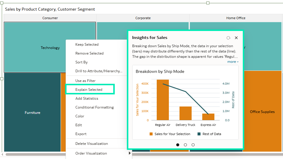
Figure 01: Contextual Insights
Now, Oracle has made the Contextual Insights feature more visible and accessible to users. There’s a new Explain Selected option in the tooltip toolbar. Simply select a data point in any of your visualisations and click on the Light Bulb icon to access Contextual Insights instantly:
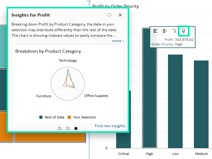
Figure 02: Contextual Insights Icon in Tooltip
Instead of right-clicking on a data point and searching for Insights in a pop-up menu, this enhancement allows users to interact with their data more intuitively. By integrating the Explain Selected option directly into the tooltip, Oracle has made it easier and faster to uncover insights.
Access the Visualisation Toolbar More Easily
In the latest Oracle Analytics Cloud update, floating visualisation toolbars are now displayed in the visual’s top border. This frees up the entire horizontal space above the chart for the title:
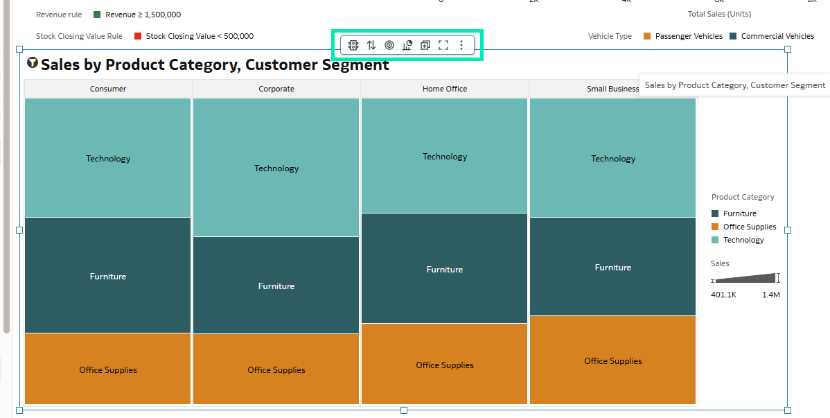
Figure 03: Floating Visualisation Toolbar
The floating toolbar appears when you hover the mouse pointer over a visualisation; it does not appear when just passing over it. Its individual icons enable you to interact with or modify the visualisation according to your preferences, and as the workbook author you can also restrict end-user interactions.
These settings are located in the Present tab in the Edit Workbook mode:
![]()
Figure 04: Present Tab
In the left pane, under Visualization Actions, you’ll find the toolbar settings, where you can customise the actions available to end users:
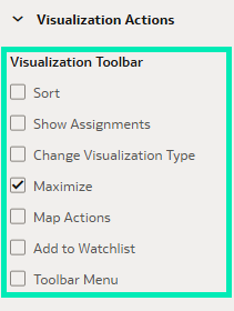
Figure 05: Toolbar Settings
What’s more, Oracle has made the toolbar more responsive and adaptable to theme changes. For example, it automatically adopts the dashboard theme’s background and primary font colours:
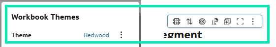
Figure 06: Redwood Theme
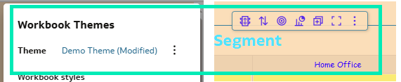
Figure 07: Demo Theme
The toolbar also adapts when visualisations overlap in the Freeform Canvas layout. By default, the Toolbar Position property is set to Auto, enabling this behaviour. You can adjust the Toolbar Position property to suit your preferences in the General Properties pane of the visualisation:
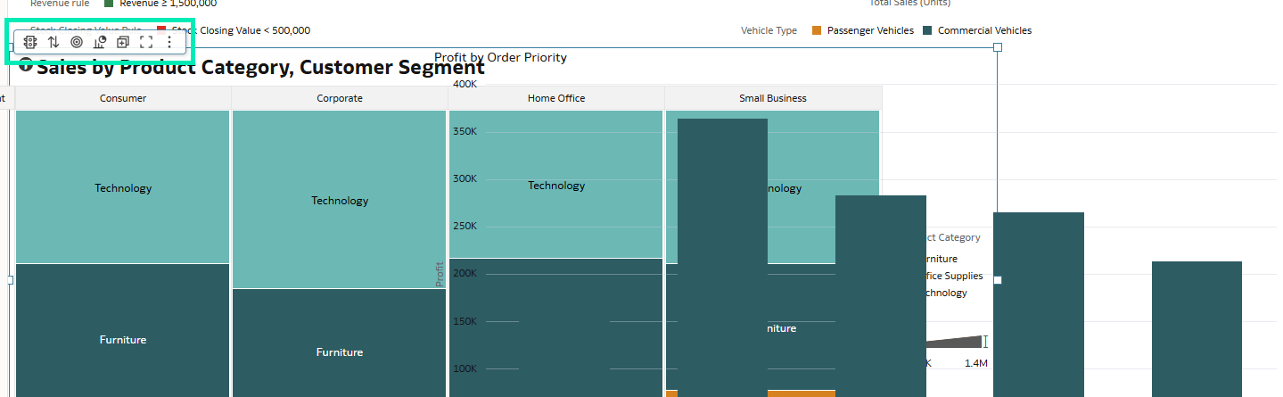
Figure 08: Toolbar Position
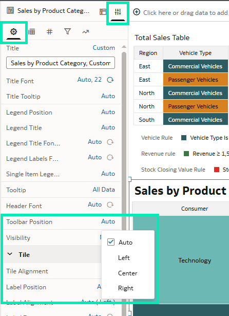
Figure 09: Toolbar Position Property
Add More Powerful Dynamic Lines to Maps
This new release has also enhanced map visualisations. In their previous release Oracle added a new layer type called Dynamic Lines, designed to connect data points to show the relationships between them:
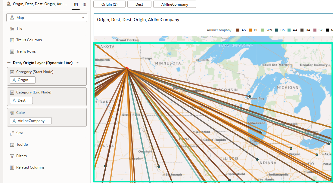
Figure 10: Dynamic Lines
Oracle has introduced a number of customisable properties for the Dynamic Lines layer, enabling you to make it cleaner and more informative. Properties such as size, transparency, data label position, outline, and more, allow you to get the most out of your data. One of the most interesting settings is the Line Shape property. By default, it’s set to Straight, but you can also choose Curved:
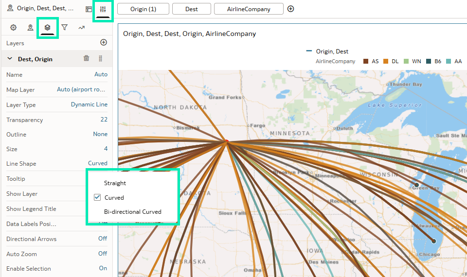
Figure 11: Curved Dynamic Lines
To depict bidirectional connections between two locations, select the Bi-directional Curved line shape. First, filter out any records where Starting Location equals Target Location, so that only distinct location pairs remain:
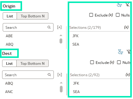
Figure 12: Curved Dynamic Lines
After selecting the Bi-directional Curved line shape, you’ll see two lines on the map, representing the back-and-forth relationship between both locations:
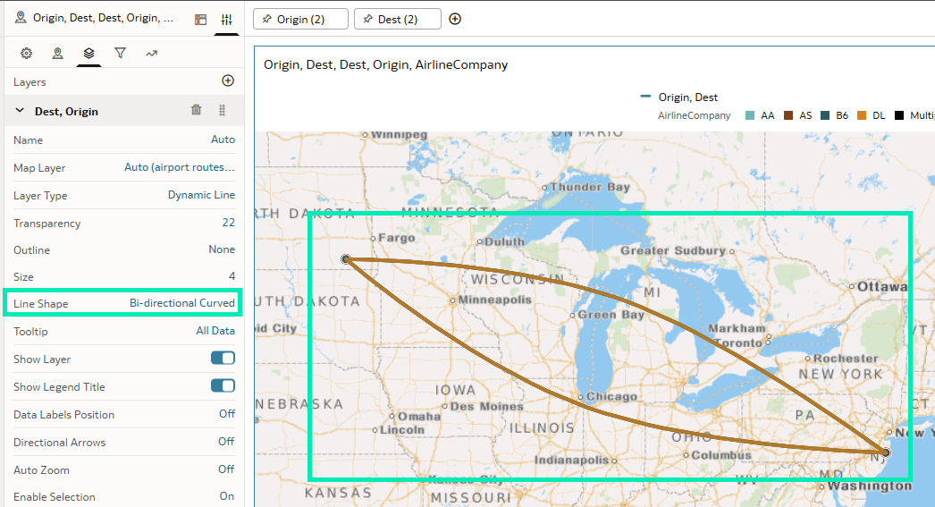
Figure 13: Bi-directional Dynamic Lines
You can also add additional directional arrows to make these tendencies even more visible. Just like lines, arrows offer a wide range of customisation options:
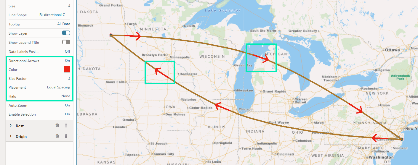
Figure 14: Directional Arrows
The Dynamic Lines layer type opens up new possibilities for creating map visualisations that are aesthetically appealing as well as detailed and meaningful. Whether it’s logistics, network connections, or any other origin–destination data, this update will help tell a clearer, more impactful story.
Create and Share Custom Pages
This update introduces the ability to create and share custom home pages, providing a more personalised approach to how content is organised and shared between your colleagues and end users. Although the default home page is fully customisable by logged-in users, there are scenarios where shared customised home pages are useful, for example, when different data assets need to be displayed depending on the department or entity. Let’s explore this functionality in more detail.
The list of all available pages is accessed by clicking on the Hamburger icon at the top left of the page. It includes pages you have created and those shared with you:
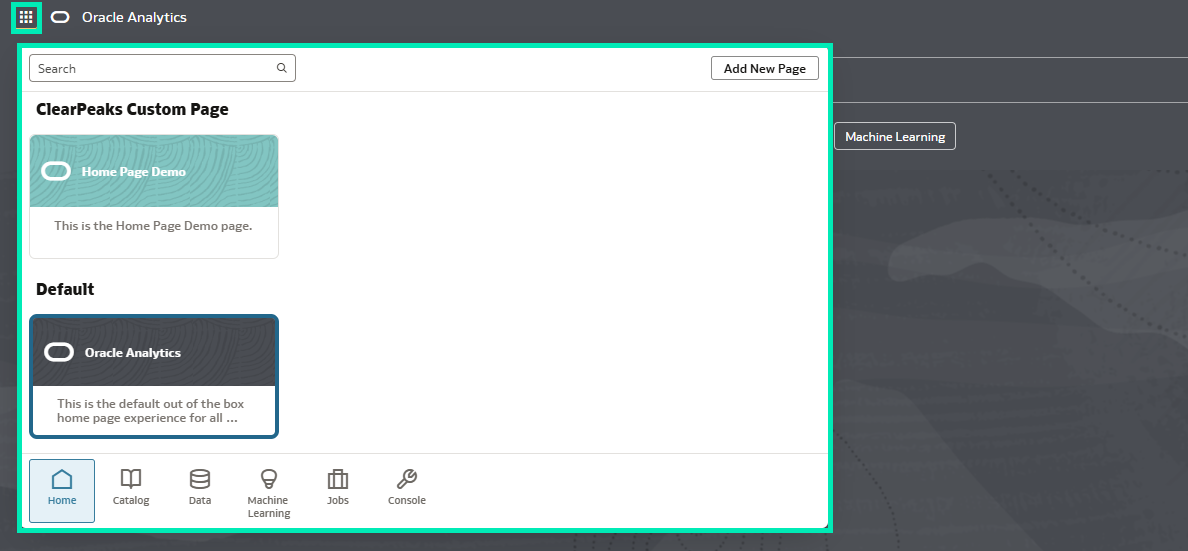
Figure 15: Custom Pages List
By simply clicking on the Add New Page button, a new tile is added to the page list:
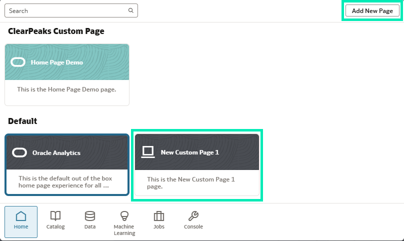
Figure 16: New Page Tile
Selecting the Inspect button opens the configuration window:
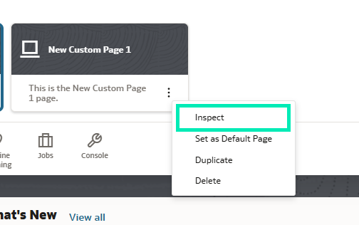
Figure 17: Inspect Button
From the configuration window you can change properties like name and description, choose an icon and colour for the page, and define its category:
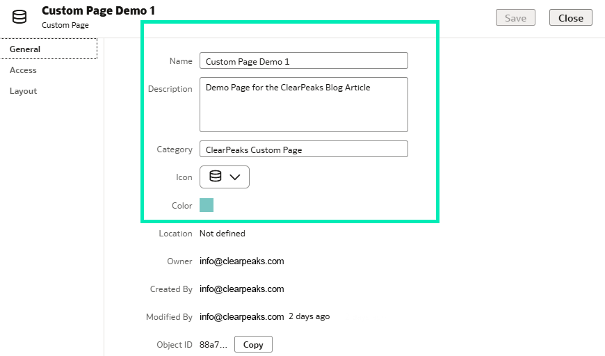
Figure 18: Configuration Window
The Access tab allows you to add users and configure their permissions. You can give Full Access, Read-Write, and Read-Only access to users:
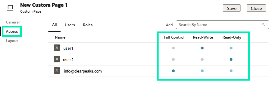
Figure 19: Custom Page Access
The third tab, Layout, defines the homepage content. Here, you can configure the positioning and selection of data assets according to your specific requirements or the purpose of the custom homepage:
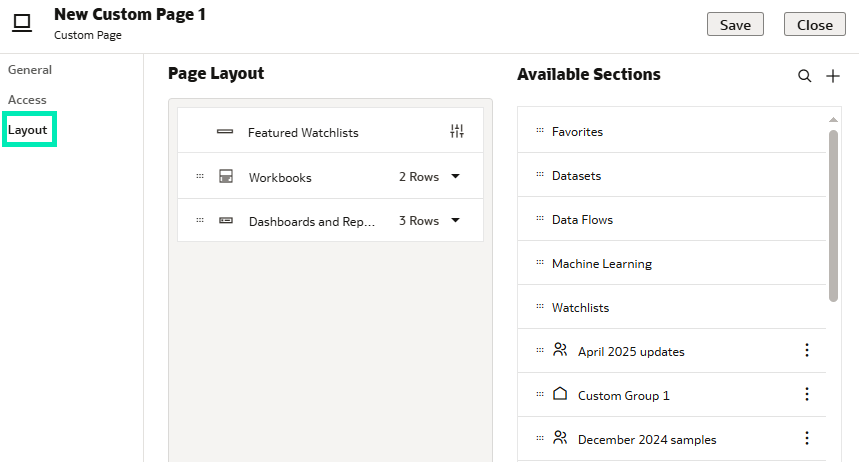
Figure 20: Page Layout Settings
Finally, the new custom pages appear in the page list window under the specified category, configured according to requirements, shared with relevant parties, and ready to use:
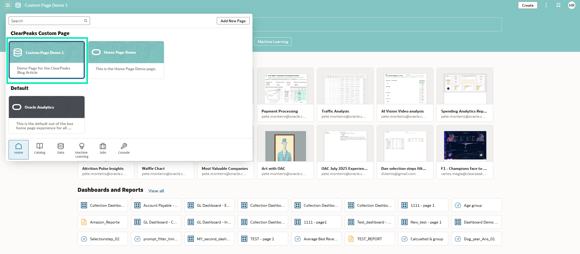
Figure 21: Custom Page
This new OAC update might not look like much, but it brings a powerful new approach to simplifying access and improving user experience. By categorising homepages and defining their content, users are shielded from overwhelming or irrelevant data, allowing them to focus on the information that really matters.
Change the Label Positioning for Linear Gauges
Following the introduction of gauge visualisations in the March 2025 OAC update and the addition of linear gauges in the May 2025 OAC update, Oracle has now continued to enhance this feature. In this release they have improved the label positioning for linear gauges. Let’s take a closer look:
Select the Gauge visualisation:
Figure 22: Gauge Visualisation Selection
In the Grammar panel, under the Values (Gauge) section, add a numeric value:
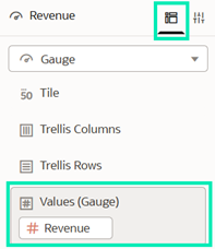
Figure 23: Gauge Values
Navigate to the Properties panel and under the General section, go to Gauge and select the Type property. You can select either Horizontal Bar or Vertical Bar:
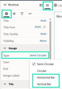
Figure 24: Gauge Type Property
Horizontal Bar: Having selected Horizontal Bar gauge type, change Range Labels from None to Start/End or All. In this example, we’ll select All to better visualise the results:
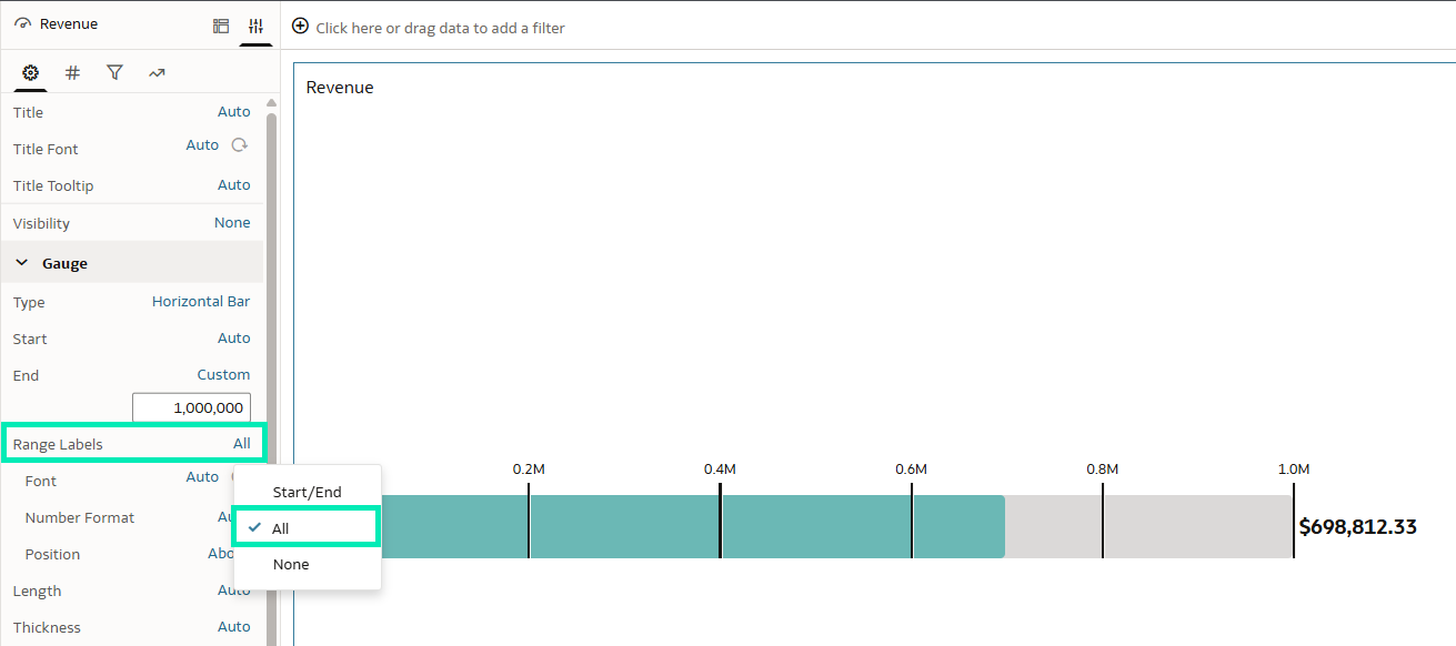
Figure 25: Gauge Range Labels Property
Once selected, a Position property will appear, enabling you to adjust the label positioning. By default, it is set to Above, as we can see in Figure 25. Now we have the option to move the labels Below if necessary:
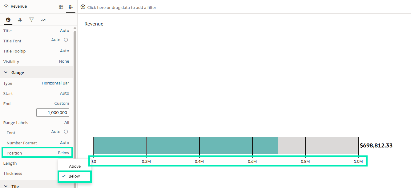
Figure 26: Gauge Range Labels Below Position Property
Vertical Bar: Just as with the Horizontal Bar gauge type, the label position can also be adjusted for the Vertical Bar gauge type. By default, the Position property is set to Before:
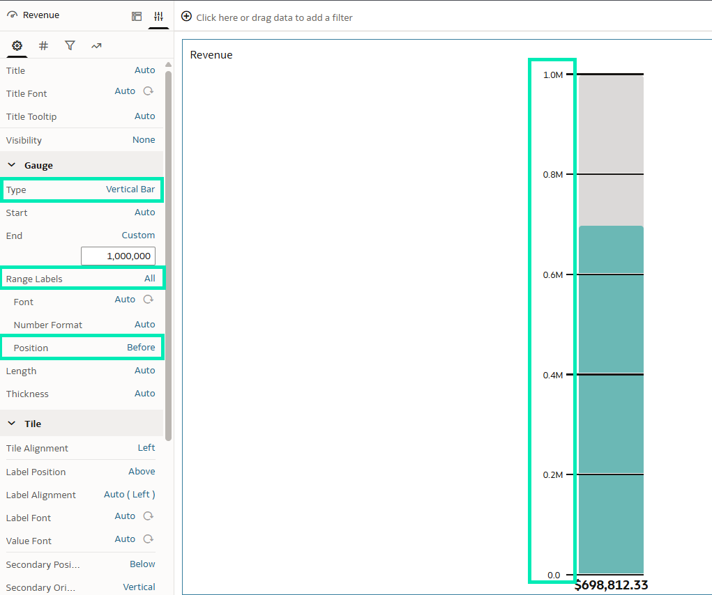
Figure 27: Gauge Range Labels Before Property
We can change the position to After:
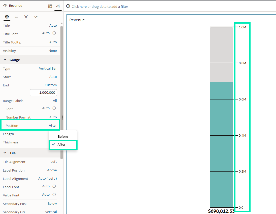
Figure 28: Gauge Range Labels After Position Property
In summary, the new Position feature in the horizontal or vertical gauge visualisation offers us greater flexibility to adapt these visuals more effectively to specific requirements or layout preferences.
Enable Consumers to Use Oracle AI Assistant to Gather Insights More Easily
The AI Assistant feature gets better with each release! This time, Oracle has extended its capabilities to consumers: now, end users as well as developers can interact with AI Assistant to gain insights directly from dashboards or reports, significantly reducing development time and associated costs. By questioning the AI Assistant chatbot, users can deepen their understanding of the underlying data, generate new visualisations for additional insights or context, and even save their findings to a Watchlist for future reference.
To use this feature, ensure that the dataset has the Assistant option enabled, then follow these steps:
- Open the workbook in which you want to enable the feature.
- Right-click on the dataset in the left-hand pane.
- Click on Inspect.
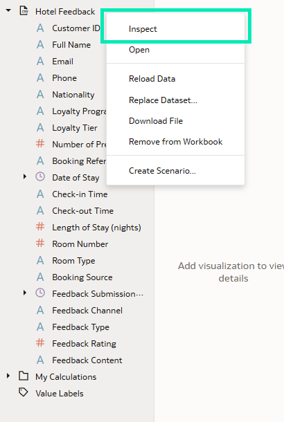
Figure 29: Inspect Dataset
- Then, go to the Search tab and make sure you have selected Assistant or Assistant and Homepage Ask in the Index Dataset For dropdown menu:
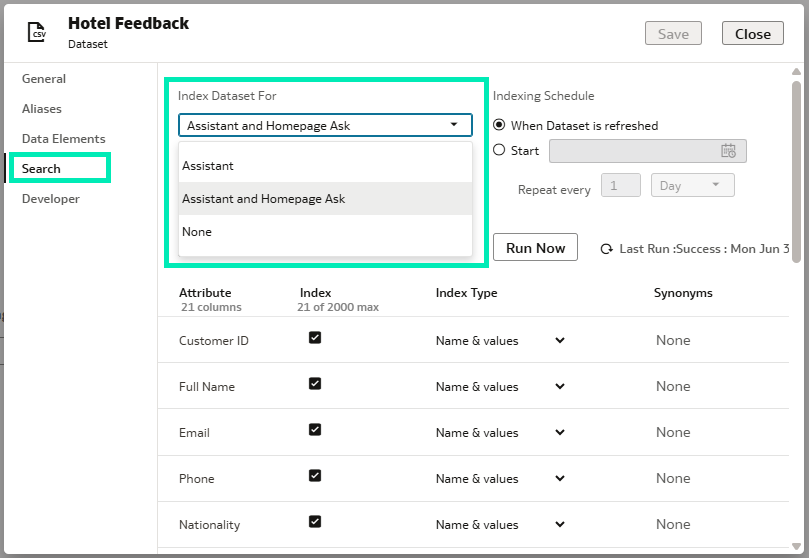
Figure 30: Search Tab Options
Once the feature has been activated, go to the consumer presentation options and enable the Insights Panel by checking it:
- Go to the Present tab located on the top bar.
- In the left-hand pane you will see the Insights Panel
- From there, you can choose to enable the Watchlists and/or the Workbook Assistant. The Watchlists contain all the AI Assistant-generated visuals saved by the end user, whilst the Workbook Assistant enables the chatbot for end users.
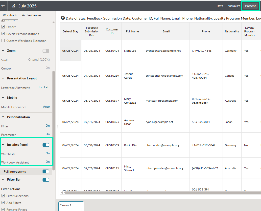
Figure 31: Workbook Present Tab and Insights Panel
By selecting the Light Bulb icon from the workbook, consumers will be able to use AI Assistant and start querying their data:
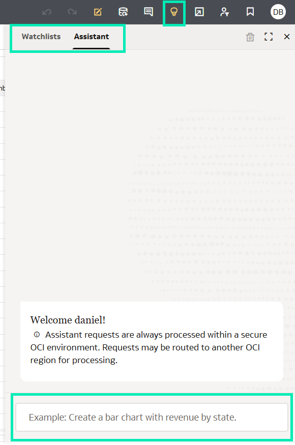
Figure 32: AI Assistant Chatbot
Format Parameters of Date, Time, or Timestamp Data Types
Oracle has just introduced a new capability that allows authors to customise date and time formatting in parameters, enabling authors to define specific data formats when configuring parameters, and thus making them more intuitive and easier for consumers to interpret. Let’s look at an example:
In the left-hand pane, go to Parameters and click on Add Parameter:
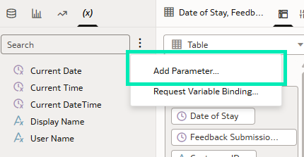
Figure 33: Add Parameter
From there, expand the Data Type dropdown list to view all available data types. For this example, we’ll be using the Date format:
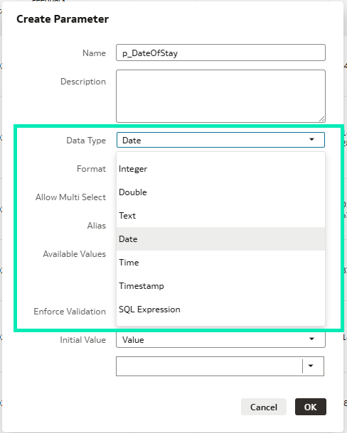
Figure 34: Create Parameter Settings
Expand the Format dropdown list to view all available options. In this case we’ll be using the custom option dd-MMMM-yyyy:
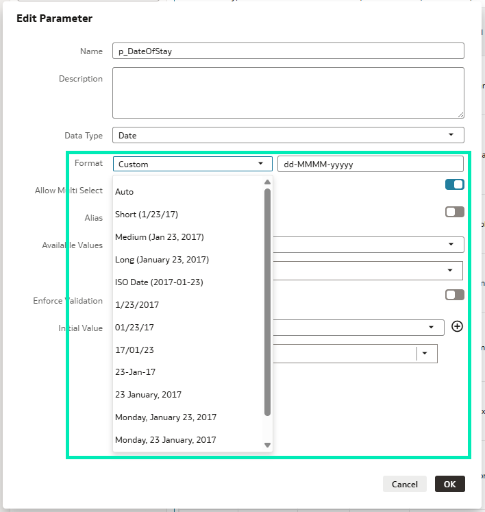
Figure 35: Customise Data Type in a Parameter
The parameter should look like this:
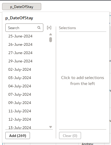
Figure 36: Parameter Output
Changing the parameter format can help provide end users with a clearer understanding of dates, times, or timestamps.
Format Headers and Data Headers Differently in Pivots
Oracle now provides the ability to format pivot header labels independently, allowing authors to modify the font and formatting properties of header labels separately from other cells within the pivot visualisation, empowering users to design visually appealing pivot tables within their dashboards.
In the following example, the pivot table displays Product Category and Product Type as rows, with several measures as values, including subtotals and totals:
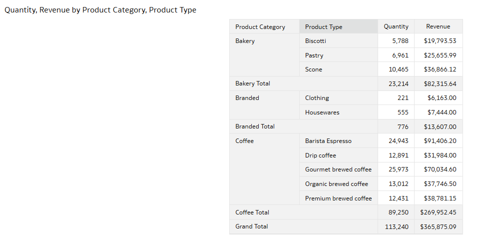
Figure 37: Initial Pivot Table
We can start by adjusting the formatting of the header and its data by navigating to the Properties panel and selecting Edge Labels:
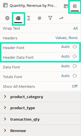
Figure 38: Header Font and Header Data Font Properties
Header: We’ll set the text to bold and apply a warm terracotta background to match the coffee shop theme:
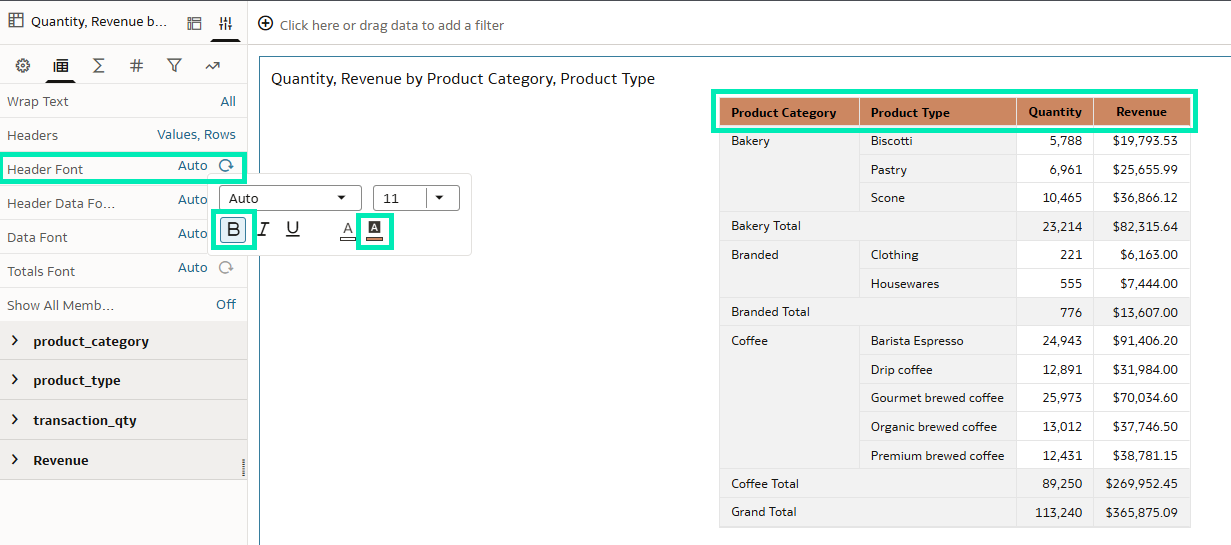
Figure 39: Header Font Property Edition
Header Data: We’ll italicise the text to add a bit of variation to our pivot table:
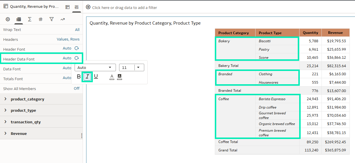
Figure 40: Header Data Font Property Edition
Next, we’ll format the subtotals by navigating to the Properties panel and selecting Edge Labels, then update the relevant attribute to configure the formatting of the subtotal font:
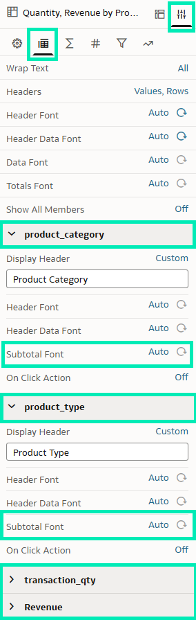
Figure 41: Subtotal Font Property
Subtotal Font: In this case, we’ll change the subtotal Product Category attribute. Following the coffee shop theme, we’ll set the text to bold and apply a blush beige background:
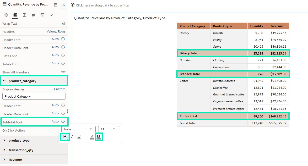
Figure 42: Subtotal Font Property Edition
Finally, as a finishing touch to the pivot table, we’ll modify the Grand Total format by going to the Properties panel and adjusting the settings under Totals:
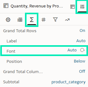
Figure 43: Grand Total Rows Font Property
Grand Total: To complete the styling, let’s apply another coffee shop-inspired background, this time using a cinnamon brown colour. We’ll also set the text to bold and change the font color to white to enhance visual clarity:
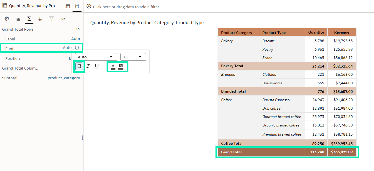
Figure 44: Grand Total Rows Font Property Edition
Our final version of the pivot table is now complete, fully styled to align with the coffee shop theme. Compared to the original, it introduces several visual and functional enhancements that significantly enhance readability and interpretability:
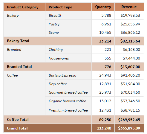
Figure 45: Final Pivot Table
Update the Database Connection for Individual Tables Within A Dataset
Oracle has also just introduced a new feature that allows users to update the connection used by individual tables within a dataset, reducing the number of steps typically required, such as adding the new connection to the dataset, re-importing the table, and re-establishing joins, whilst preserving existing reports that rely on it.
This is particularly beneficial for mirrored or regionally distributed data sources, where maintaining identical schema structures is crucial. The schema and table structures between the original and replacement sources must remain consistent.
For instance, to change the connection of a table in the dataset you should:
- Right-click on a table.
- Select Replace Connection.
- Choose the connection that you want to change to.
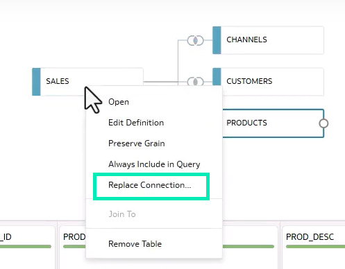
Figure 46: Replace Connection Feature
- Now click on Validate to make sure that the selected table matches the schema and structure of the existing one.
- Once validation is successful, click on Replace:
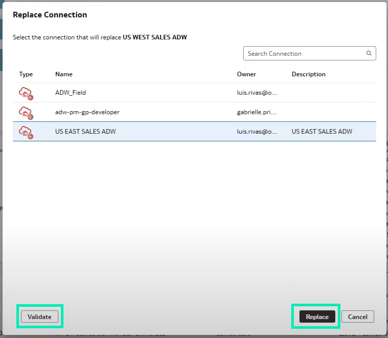
Figure 47: Replace Connection Menu
- It is best practice to review the table changes to ensure accuracy:
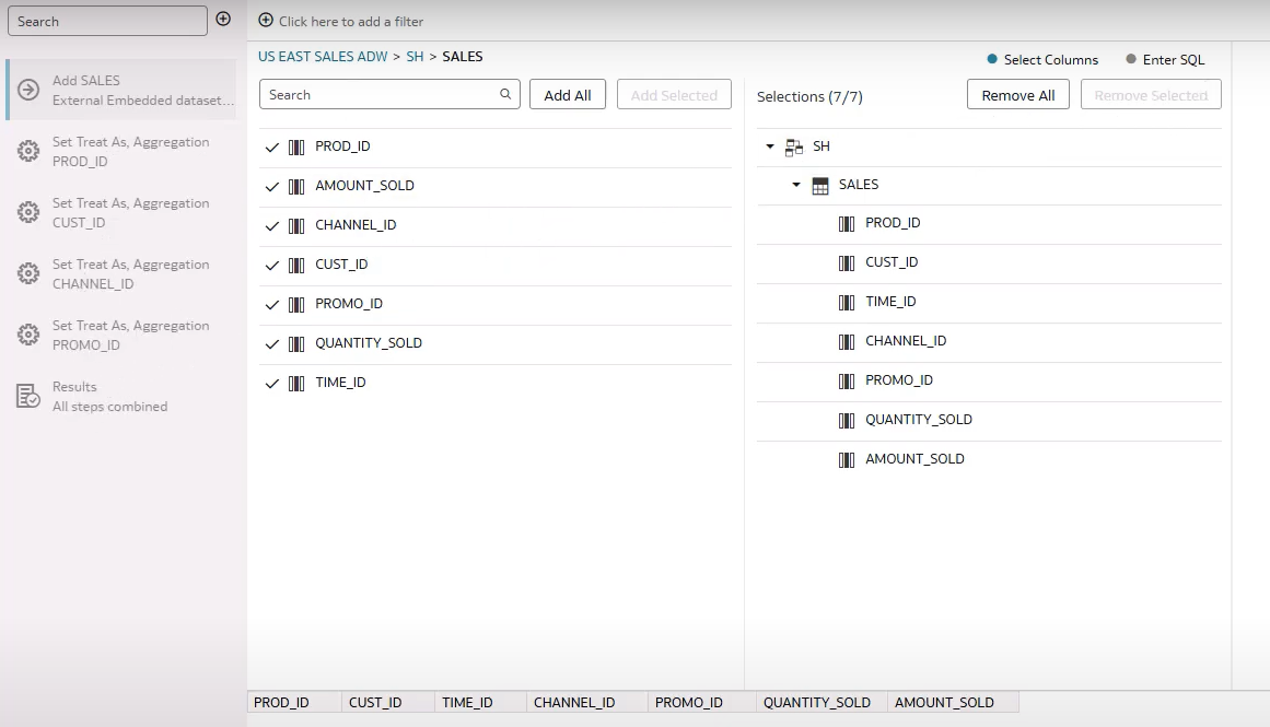
Figure 48: Column Validation
With just a few clicks, Oracle allows users to change the connection used by a table, saving time and ensuring that reports relying on the dataset remain intact.
Get Easier Insights into Workbook Calculations
Oracle introduced the Explain feature some time ago, helping authors to gain advanced insights into a specific column selected from a dataset, with a simple right-click. Now, Oracle has extended this feature to support workbook calculations as well. Let’s take a look at an example.
We have a coffee shop sales dataset containing transaction, product, and store details, including revenue, transaction quantity, and unit price. To get deeper insights, we’ve created a calculation that divides Revenue by Transaction Quantity:
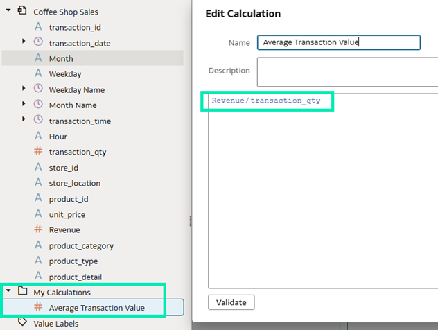
Figure 49: Calculation Creation
By right-clicking on the calculation, we can see an explanation:
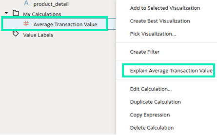
Figure 50: Explain Calculation Feature
Once we click on that feature, we’ll see three different explanations:
- Basic Facts: What the values of the selected calculation are and how they relate to each other:
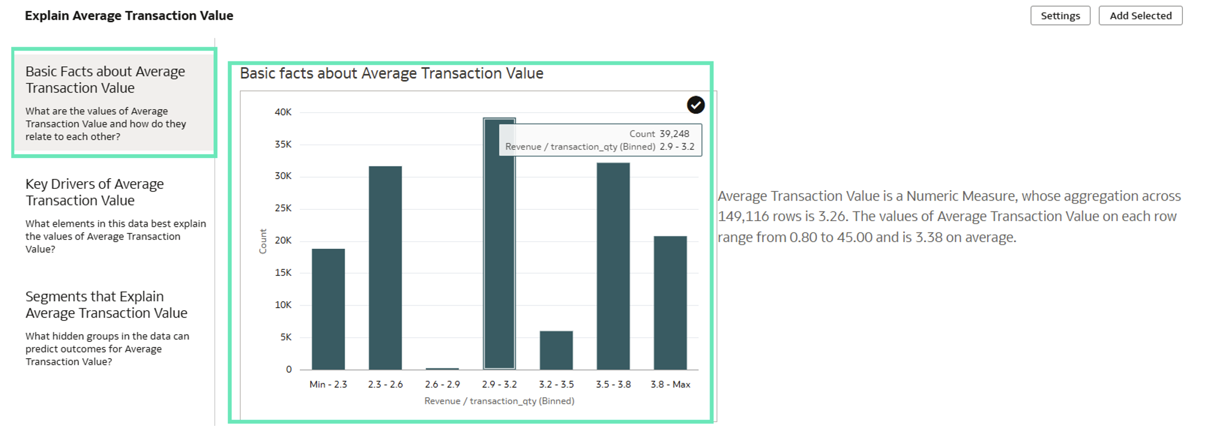
Figure 51: Basic Facts about Calculation
Scrolling down reveals a range of insightful visualisations, which can be added directly to the canvas. All visualisations can be added at once using the Here option, or selected individually:
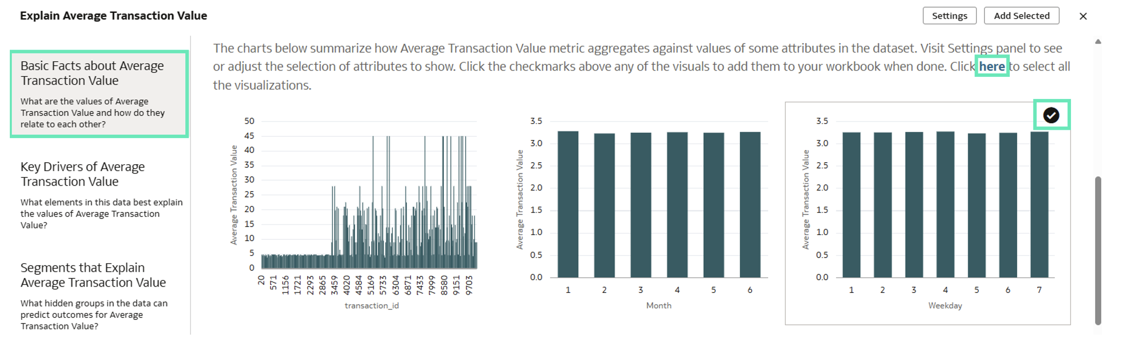
Figure 52: Alternatives to Select Visualisations from Basic Facts about Calculation
In this case, let’s select two meaningful visualisations and go for the next section:
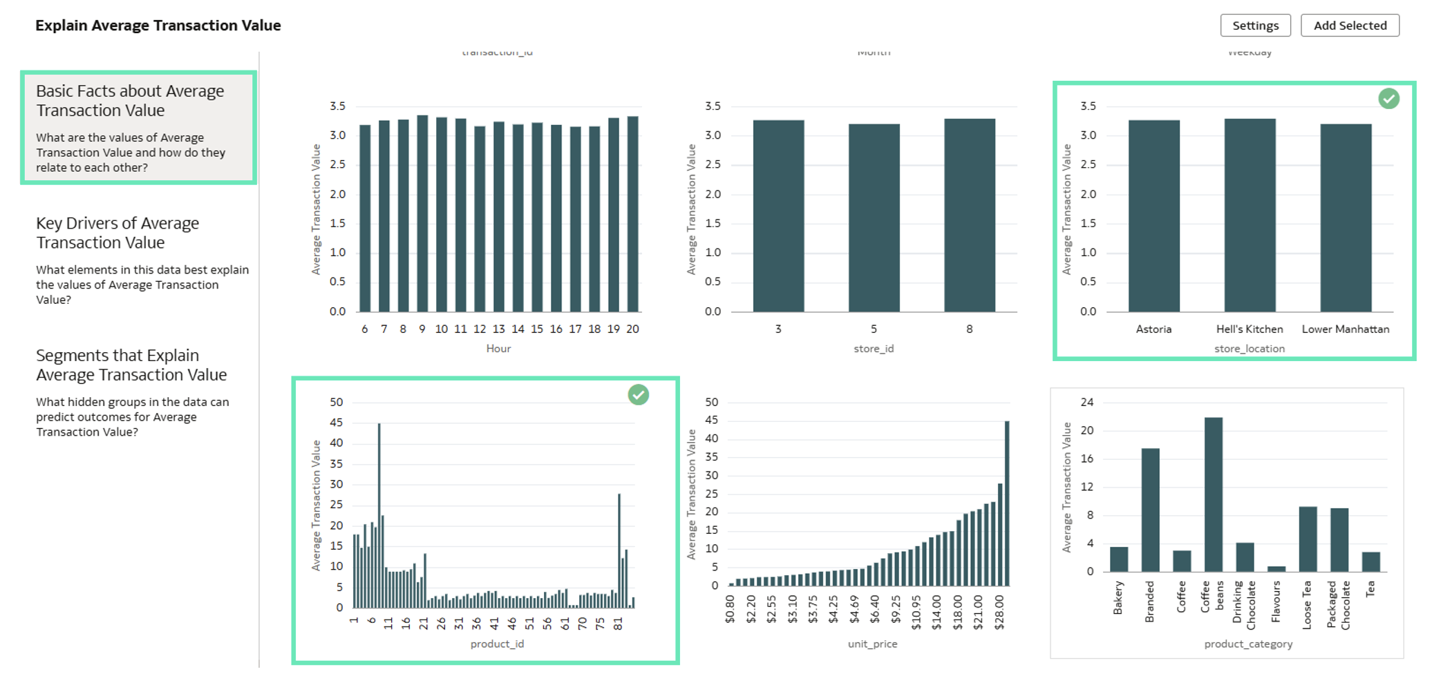
Figure 53: Selection of Visualisations from Basic Facts about Calculation
- Key Drivers: Which elements in the data best explain the values of the selected calculation. In other words, key drivers are the most significant as they show the strongest correlations with the selected calculation. In our case we can see that the top three key drivers are Revenue, Product Category and Transaction Quantity. You can change the number of top key drivers displayed and, as with other visualisations, you can add all insights at once using the Here option, or select them individually. In this case, we will add all of them by clicking on Here:
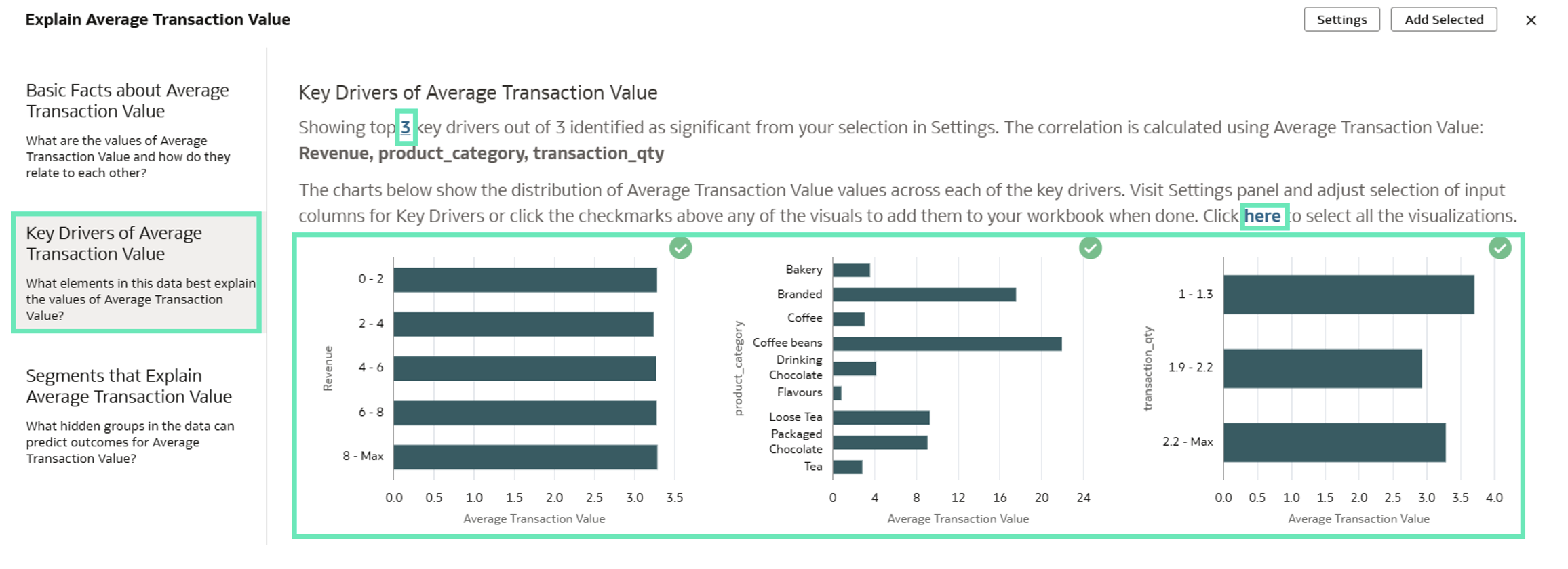
Figure 54: Key Drivers from Calculation
- Segments: Which hidden groups in the data can predict outcomes for the Average Transaction Value. It shows the top 20 segments associated with the selected calculation:
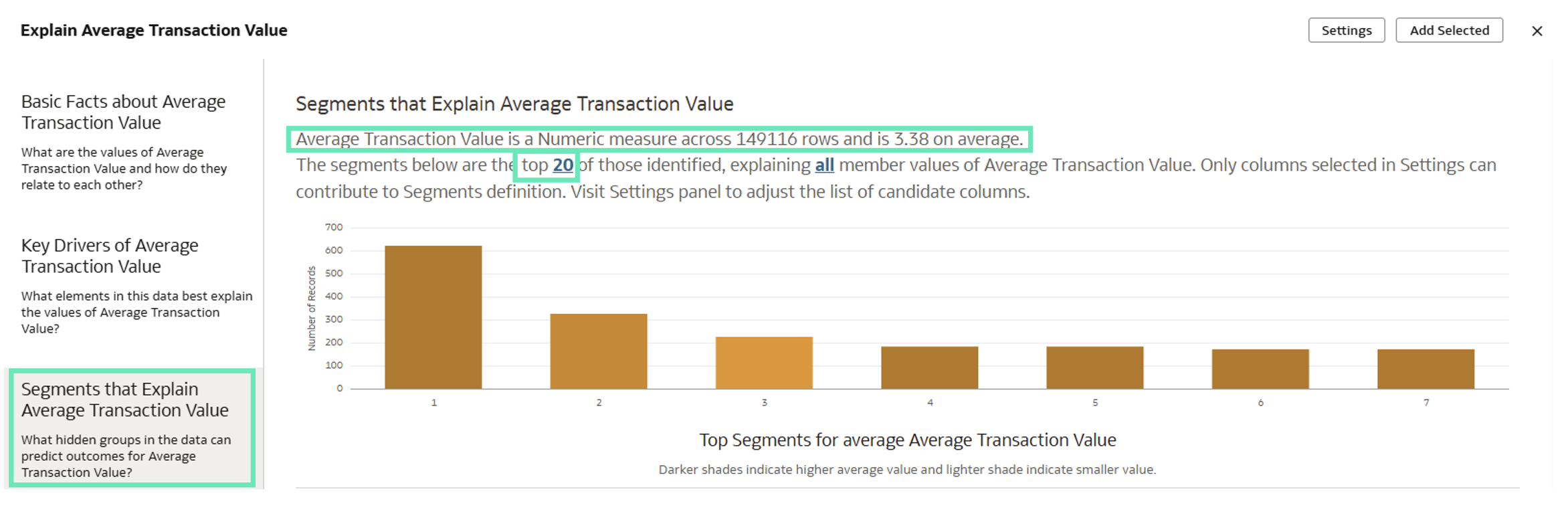
Figure 55: Segments that Explain the Calculation
Now that we have selected several visuals from the different sections, let’s add them to the canvas by clicking on the Add Selected button:
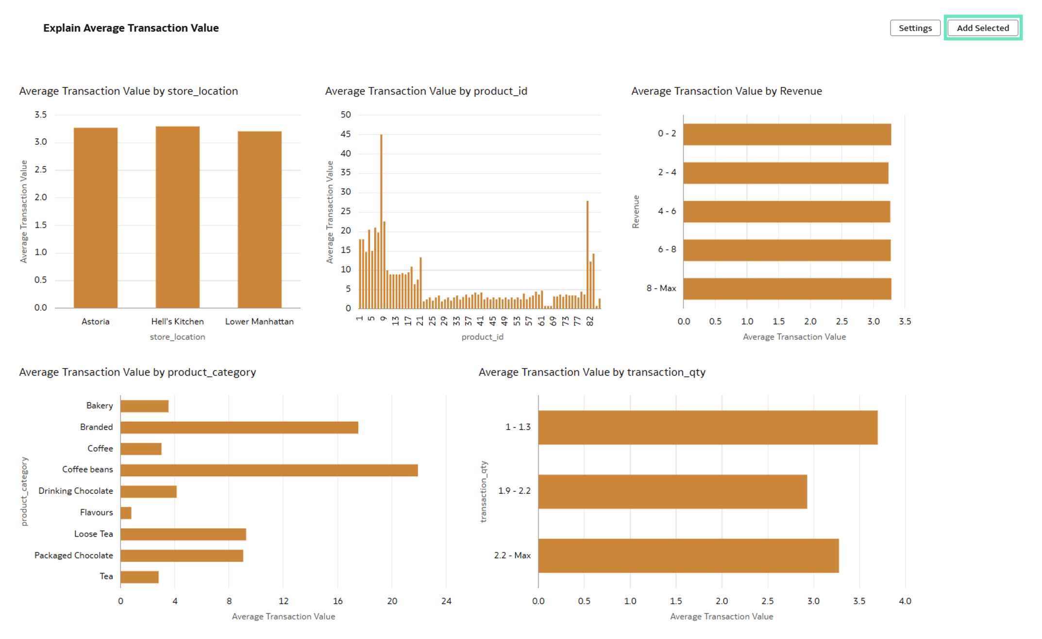
Figure 56: Adding All the Selected Visualisations
It works similarly on Attribute calculations:
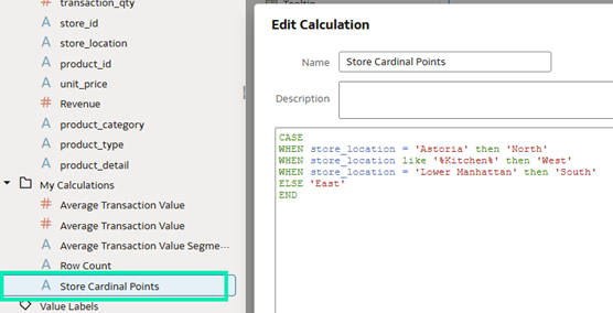
Figure 57: Attribute Calculation
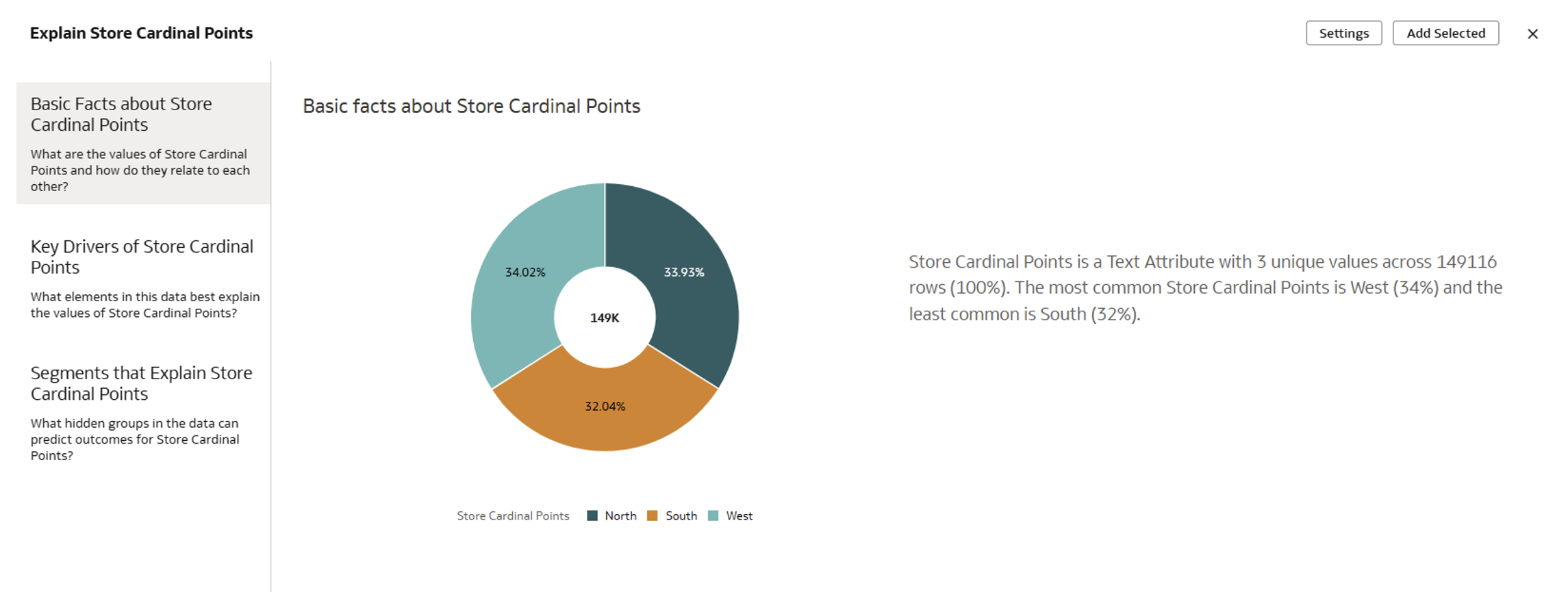
Figure 58: Explain Attribute Calculation Feature
It is important to note that the Explain feature does not support complex calculations that change the grain of the query.
To sum up, with just a few clicks, we were able to identify meaningful charts and patterns and create a canvas using Explain on calculations, letting authors and users design and define their reports based on these insights.
Perform Similarity Analysis on Datasets
Recently, Oracle introduced the Vector Search feature, which includes a new VECTOR data type, enabling the storage of data in vector format for semantic searches within the 23ai Autonomous Database. With the July 2025 release, this functionality is now accessible directly from the OAC platform, provided that a Vector Search model has already been installed in your 23ai Autonomous Database. Please check out our Introduction to Vector Search in Oracle Database 23ai article to learn more about Vector Search, its installation and configuration.
Now let’s explore how to perform similarity analysis on datasets using a Vector Search model.
The first thing to do is to register the Vector model that’s installed in the Autonomous Database:
- Go to your OAC home page, and in the top right click on Register Model/Function.
- Select Vector Embedding Models:
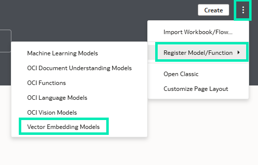
Figure 59: Register Model
- A window showing available connections will pop up; choose the one where you have installed the model.
- Next, select the Vector Embedding Model that best suits your needs; you can review all the models here.
- Once the model has been selected, you can customise the name, description and vector distance parameters.
- To finalise, click on Register to be able to use the model.
Now that the model has been registered, let’s create a Data Flow and start using it:
- From your OAC home page, click on Create, then on Data Flow:
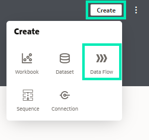
Figure 60: Create Data Flow
- Add the dataset you want to work with; this will only work if your dataset resides in the same database as your model. Not only that, it’s also best practice to add only the specific data you are going to use, ideally up to 15 items, due to the Data Flow timeout limit of 2.5 hours.
- Next, add the Similarity Analysis node:
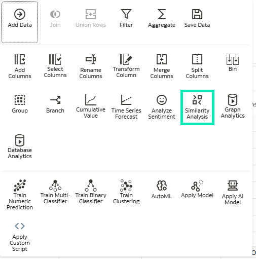
Figure 61: Similarity Analysis Node
- All registered models will appear; select the one you have just registered:
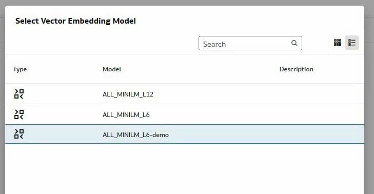
Figure 62: Vector Embedding Models in the Tenant
- Then, configure the parameters for the similarity analysis. To do so, collapse the Output section and look for Parameters.
- Start by selecting the Source Value from which you want to perform the similarity comparison. In our example, MEMBER_ID = 74724.
- Now decide if you want the closest or furthest values to the source. Select Top for the closest and Bottom for the furthest; you can also choose the number of results to return.
- Select the Reference Columns used to identify unique records; you can select up to three columns.
- You can also decide if you want to include these columns for profiling.
- To complete the Data Flow, add a Save Data step to store it in a dataset.
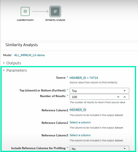
Figure 63: Similarity Analysis Parameter Tab
Once the Data Flow has been successfully executed, you can start working with the results in OAC:
- Create a new OAC workbook and select the output data.
- You should now see the data columns created and used to compare the different records:
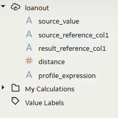
Figure 64: Saved Data Fields
- source_value and source_reference_col1 represent the source value previously defined.
- result_reference_col1 contains the identifiers of the records closest to or furthest from the source.
- distance indicates the similarity score, with 0 being the closest.
- profile_expression provides all values used to create the vector for each record.
By dragging and dropping these fields into the visualisation pane, you can quickly generate highly practical and self-explanatory visuals:
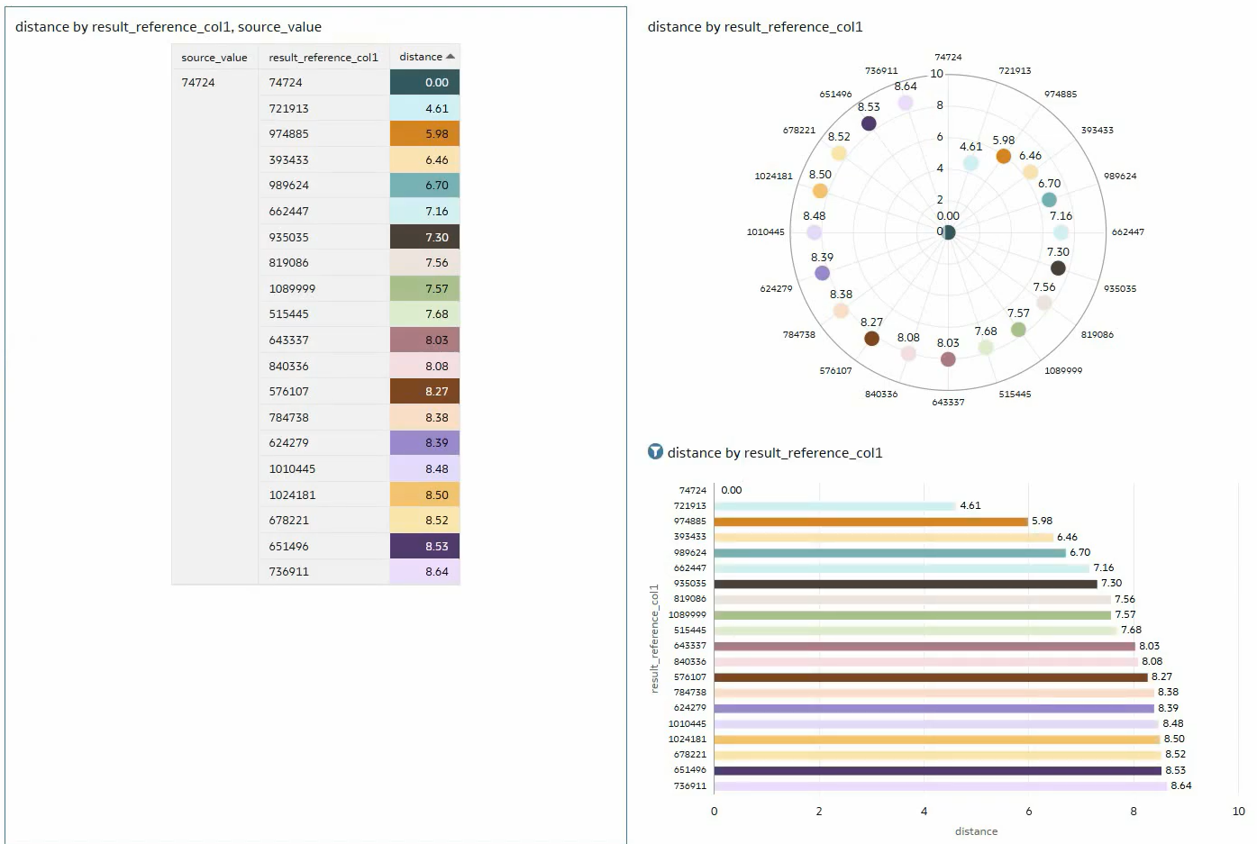
Figure 65: Similarity Analysis Report
Conclusion
The OAC July 2025 update has delivered a great set of features with one central theme: AI. Oracle continues to enhance user experience by streamlining processes and reducing friction for end users. For instance:
- Accessing contextual insights directly from the tooltip toolbar.
- Enabling consumers to use the Oracle AI Assistant to gather insights more easily and without needing the dashboard author.
- Facilitating insights into workbook calculations by right-clicking on the calculation.
- Performing similarity analysis on datasets in OAC directly, instead of database development.
What’s more, as we’ve come to expect, Oracle has refined the look and feel of Oracle Data Visualization and enhanced its reporting capabilities by offering:
- Easier access to the visualisation toolbar.
- More powerful dynamic lines for maps.
- Customisable label positioning for linear gauges.
- Extended formatting support for Date, Time, and Timestamp parameters.
- Independent formatting of headers and data headers in pivot tables.
We specialise in delivering cutting-edge OAC solutions tailored to your business needs. Whether you’re aiming to optimise dashboards and visualisations, to collaborate more effectively through Watchlists, to enhance your security model, or to accelerate time to insights, our expert team is ready to support you. Simply reach out to us today!