
01 Abr 2026 Oracle Analytics Cloud March 2026 Update Highlights
Following our Oracle Analytics Cloud January 2026 Update Highlights post, Oracle has published further updates for March 2026.
In this blog post, we’ll explore several key features from the latest release. On the dashboarding side, we’ll highlight enhancements to conditional formatting, Sankey chart capabilities, the use of parameters within the Button Bar visualisation, and colour density in heatmaps. From a modelling perspective, we’ll examine improvements to the Data Flow Designer, making data preparation more efficient and flexible. And finally, we’ll cover the latest developments in AI, with a focus on new agentic capabilities.
Conditional Formatting with Text Comparison Conditions
Conditional formatting automatically applies visual styles to cells based on their values, allowing you to apply enhancements such as colours, icons, data bars, and font styles. For example, you can highlight sales figures in green to indicate strong performance, show low-profit items in red to flag potential issues, and arrow icons can show upward or downward trends. This helps users to interpret data more quickly and to make decisions faster.
We have witnessed many enhancements to conditional formatting, some of which we have covered in our blog series in the past, like our posts on Applying Conditional Formatting to Totals and Subtotals and Conditional Formatting for Attributes.
With the latest update, users can apply conditional formatting based on text matches in attribute columns, making it easier to identify records containing specific words or phrases.
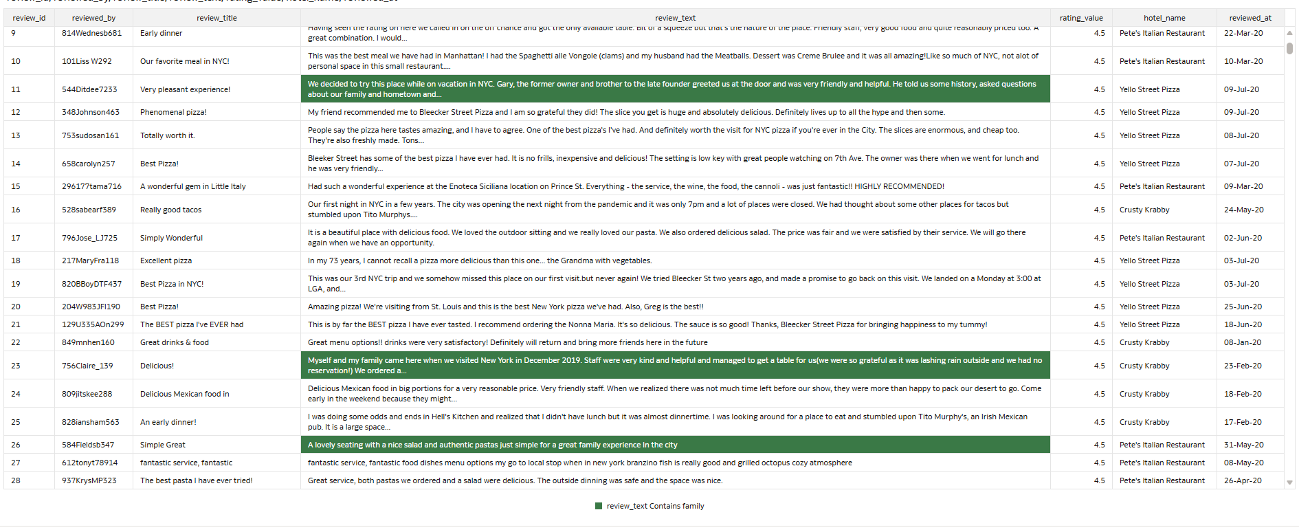
In a scenario where a user is analysing a hotel review report and wants to highlight all the reviews containing the word “family” to identify feedback related to family stays, the new text-based comparison feature would be particularly useful:
 +
+
Figure 01: Satisfied requirement: Table attributes with highlighted values based on text comparison
In practice, setting up the rule follows the same process as any other conditional formatting rule. The report is built on a table visual of hotel guest reviews. Each row represents one review, with the text stored in the review_title and review_text columns.
First, to create a new rule, open the workbook in Edit mode, hover over the table visual and click on the traffic light icon to manage conditional formatting rules:
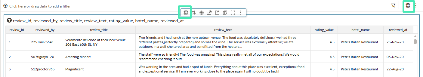
Figure 02: Open the settings to manage conditional formatting rules
Then add a new rule by clicking on the Plus icon and entering a meaningful name:
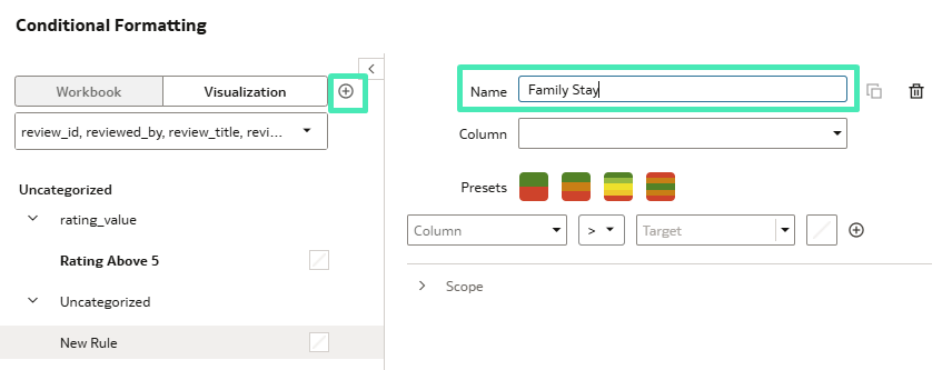
Figure 03: Create a new custom formatting rule
To configure the rule (Figure 04), select a text column first. The setup window automatically shows the conditions available for text comparisons. From there, choose Contains, enter the text to match, and select the highlight colour for matching cells.
By default, the rule ignores case sensitivity; however, this can be changed by enabling the Case Sensitive option.
After clicking on Save, the custom formatting rule will be applied to the visual, and the cells containing the word “family” will be highlighted, as shown in Figure 01.
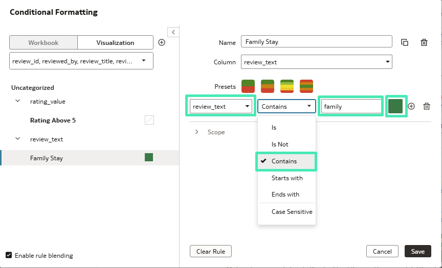
Figure 04: Text comparison conditional formatting rule setup
Enhanced Data Flow Designer
The Data Flow Designer provides an intuitive visual workspace where users can prepare, transform, and enrich data without writing code. Through its drag-and-drop interface, developers can add steps to clean, join, aggregate, and enhance datasets. It also supports more advanced capabilities, such as training machine learning models and applying them directly within the data flow.
The Data Flow Designer view has been enhanced with two separate layouts for smoother navigation. A toggle switch in the top-right corner, beside the zoom slider, allows users to switch between the Compact and Expanded layouts.
The Compact layout displays inputs and data sources closer to where they were implemented in the data flow. This makes it easier to see exactly where a data source has been added, whilst reducing the need to scroll back to the far-left side of the screen:
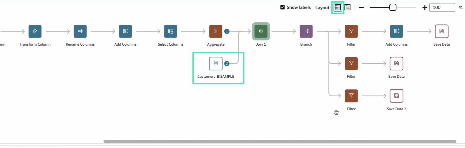
Figure 05: Compact layout view
The Expanded layout displays all the inputs and data sources on the far-left side of the screen. This view is useful when developers need to see all the data sources included in the data flow:
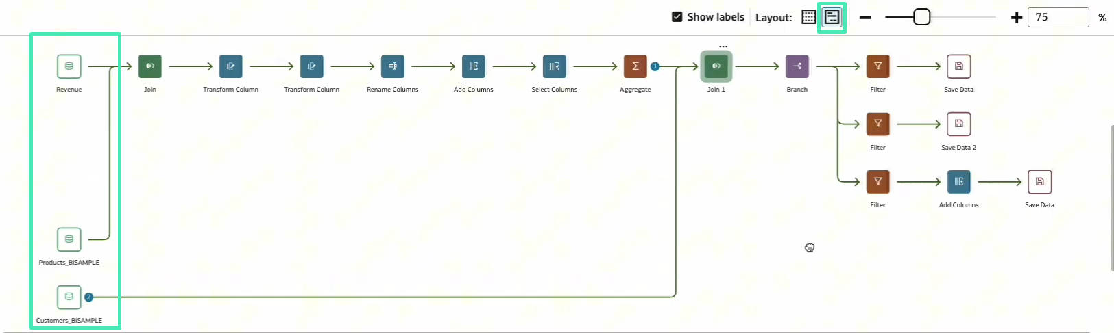
Figure 06: Expanded layout view
Enhance Sankey Charts in Workbooks
In this latest release, Sankey charts have received a significant enhancement. For a quick refresher on the basics, you can revisit our previous blog post on Oracle Analytics Cloud July 2024 Update Highlights.
This new feature improves Sankey visualisations by automatically grouping nodes that belong to hierarchical attributes. It works when the dataset is structured correctly and a hierarchy is defined in the data model.
Previously, Sankey charts treated each node as an independent element, which could lead to dispersed layouts and crossing flows that made the visualisation harder to interpret. With this update, if a hierarchy exists in the semantic model, OAC automatically recognises it and organises the nodes according to their hierarchical relationship.
When creating a Sankey chart, selecting columns from the same hierarchy as categories allows OAC to align the nodes according to the parent-child structure. This creates a clearer, more structured visualisation and improves the readability of the flow.
As shown below, when Brand, LOB, Product Type, and Product are added to the Category section, and the Products hierarchy is defined in the data model, the Sankey chart automatically arranges the nodes to follow that logical hierarchy:
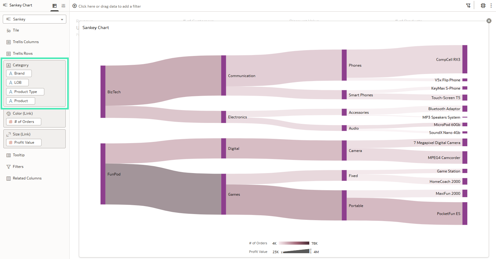
Figure 07: Sankey chart generated from the data mart categories, automatically organised according to the hierarchy
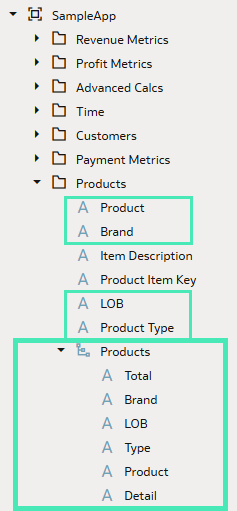
Figure 08: Categories and Products hierarchy defined in the SampleApp data mart
To summarise, this feature does not require any additional configuration in the visualisation. The grouping behaviour is automatically applied when hierarchical attributes are used.
Use Data Actions to Update Parameter Values
In our blog post about the Oracle Analytics Cloud September 2025 Update, we introduced the Button Bar visualisation and explained how it can be used to add interactive buttons to your workbooks.
With the March 2026 release, Oracle has enhanced this feature by allowing buttons to set parameter values through data actions. This capability enables users to update parameter values simply by interacting with a visualisation.
By combining Set Parameter data actions with the Button Bar, users can switch between visualisations, dynamically change the data displayed in charts, or control workbook behaviour through simple clicks.
Let’s look at the following example. The main page of the workbook is shown in Figure 09 and contains two Button Bars. The one on the left allows you to select the category to visualise, whilst the one on the right lets you choose the chart type used to display the data:
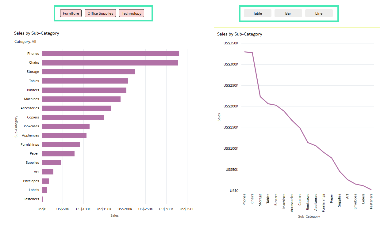
Figure 09: Workbook with two Button Bars and different charts
If you select one of the three categories (Furniture, Office Supplies, or Technology), the charts automatically update to display data for the selected category. In addition, you can choose the chart type on the right (Table, Bar, or Line) using the second Button Bar.
For example, when selecting Furniture and Table, the dashboard appears as follows:
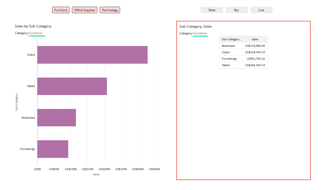
Figure 10: Workbook canvas with Furniture and Table selected in the Button Bar
And if you select Office Supplies and Bar, the dashboard displays:
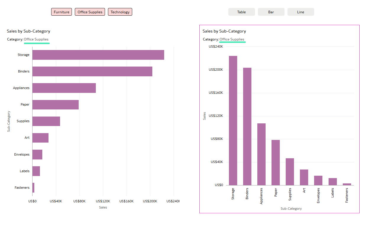
Figure 11: Workbook canvas with Office Supplies and Bar selected in the Button Bar
As you can see, the content updates according to the selected buttons. This behaviour is implemented by defining a set of parameters and configuring different data actions.
In this post, we’ll walk you through this enhancement step by step and show how to use it to add more interactivity and flexibility to your OAC reports.
In the Visualize pane, add two Button Bars at the top of the canvas. Then add a horizontal bar chart to the left of the canvas. On the right, add three charts: a Table visualisation, a bar chart, and a line chart.
Place these three charts in the same position so that only one is displayed at a time, depending on the selected button:
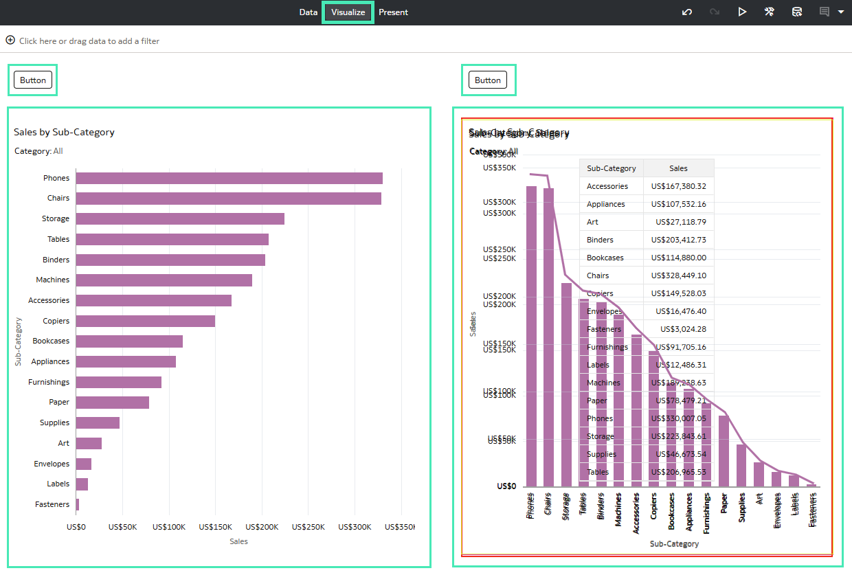
Figure 12: First step of the Button Bar creation in the Visualize pane
To create the button that filters data by category (as shown in Figure 12, where all the categories are selected), you first need to create a parameter.
A parameter acts as a user-defined variable that stores and manages a value (or set of values) that can be used across different elements of a workbook. Parameters enable dynamic interaction, allowing you to control and update the data displayed.
Go to the Parameters tab, click on the three dots, and select Add Parameter…:
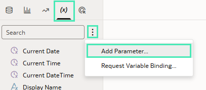
Figure 13: Steps to create a new parameter
An edit window then opens where you can define the parameter settings. For this example, configure the options as shown in Figure 14.
It is important to select the column from your dataset that is used as the filter column in your charts in the Available Values section (Figure 15). In this case, select the Category column.
In the Initial Value field under Enforce Validation, you can define the default value for the parameter. In this example, the value is left blank, meaning that no category is selected by default and all categories are displayed:
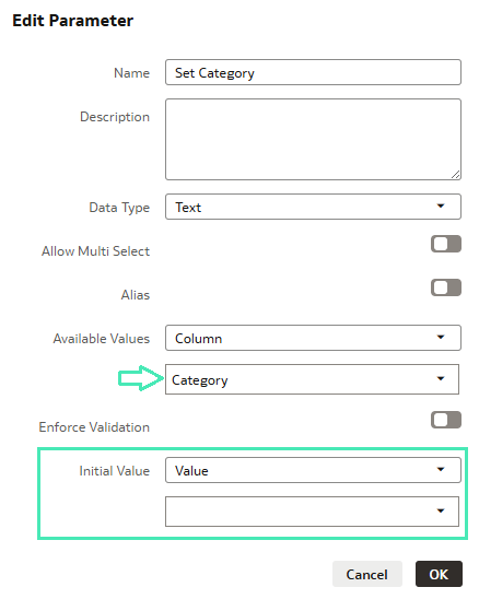
Figure 14: Edit Parameter window
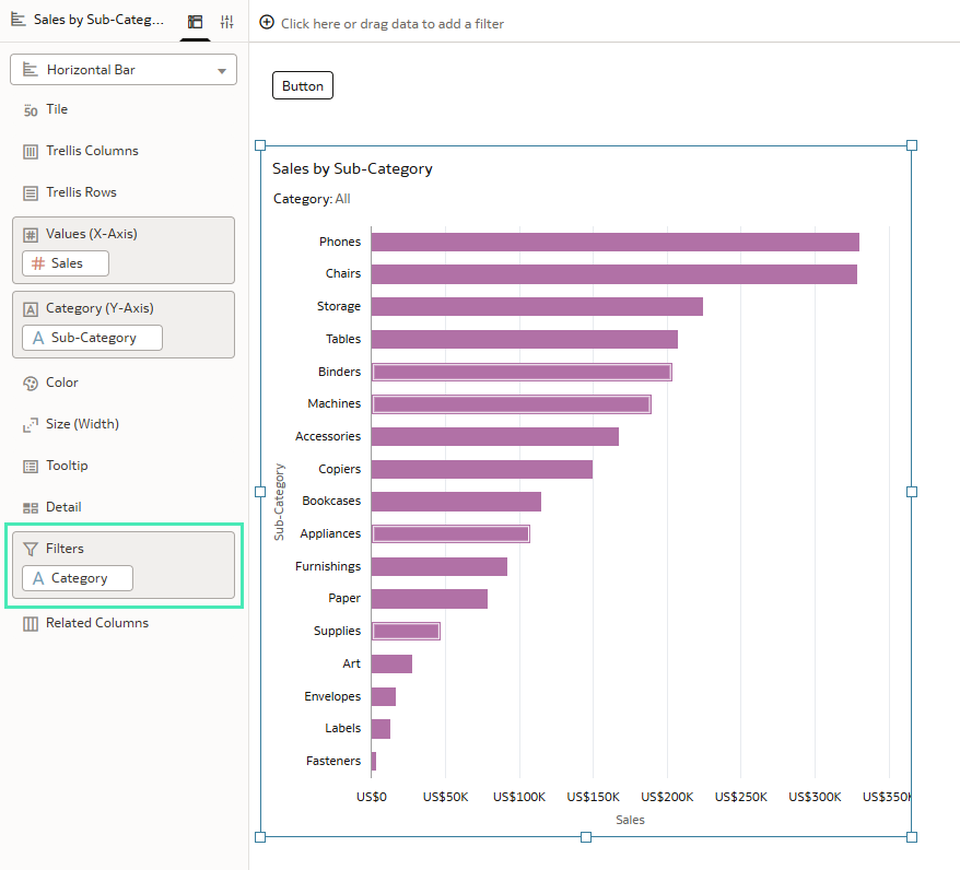
Figure 15: Chart edition
Once the parameter has been defined, the next step is to configure the data action.
Go to the Actions tab and click on Add:
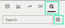
Figure 16: Steps to create a new data action
An edit window opens; select Set Parameter as the Action Type, then choose the parameter that you created in the previous step (in this example, DA Set Category):
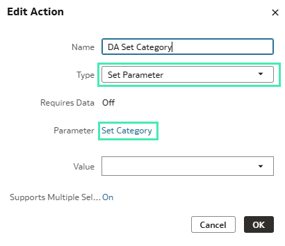
Figure 17: Edit Action window
At this point, the parameter and the data action are created; the next step is to connect them to the Button Bar.
Since the Category field has already been added as a filter in the charts, no additional configuration is required for the chart itself.
Select the Button Bar at the top of the canvas and add three controls: Furniture, Office Supplies, and Technology.
For each control, go to the Action field and select the previously created data action, which in this example is DA Set Category. Then click on the Pencil icon and set the corresponding values:
- For the Furniture control, set to Furniture
- For the Office Supplies control, set to Office Supplies
- For the Technology control, set to Technology
This ensures that when a user clicks on one of the buttons, the parameter value is updated and the charts refresh accordingly:
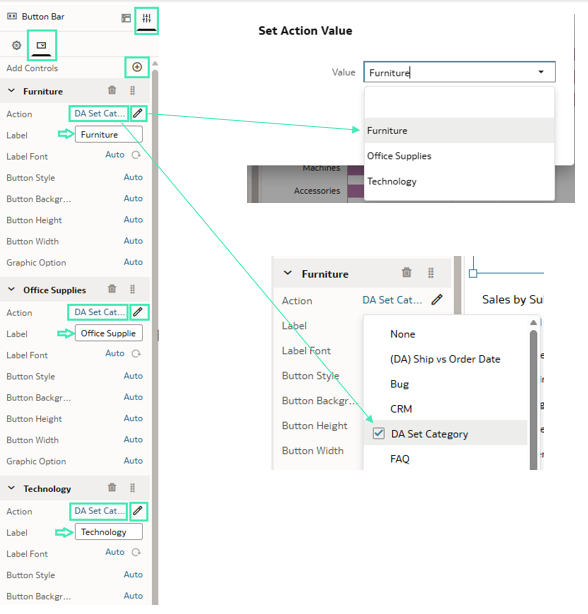
Figure 18: Button Bar configuration
After completing this step, the right side of the canvas should look like this:
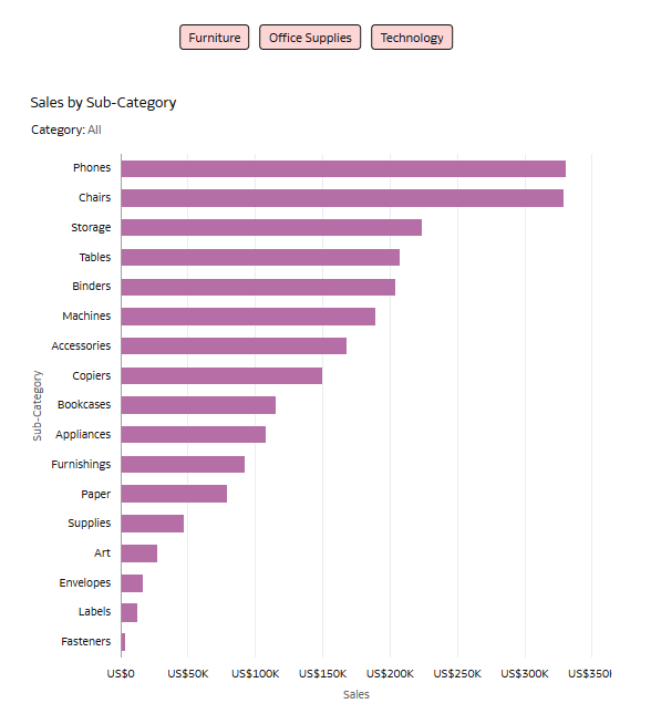
Figure 19: Look and feel of the right side of the canvas
Now we’ve configured the first Button Bar, we’ll set up the second Button Bar (shown in Figure 09), which allows users to switch between different chart types.
As before, the first step is to create a new parameter. In the Edit parameter window, name the new parameter Select Chart Type. In the Available Values section, select Values and add:
- Table
- Bar
- Line
Under Enforce Validation, select Values and set Line as the initial value. This means that the line chart will be displayed by default when the workbook loads:
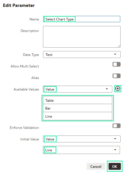
Figure 20: Edit Parameter window
The next step is to create the data action; its configuration is similar to that shown in Figure 17.
In the Action settings:
- Action Type: Set Parameter
- Parameter: Select Chart Type
- Value: Line
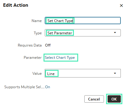
Figure 21: Edit Action window
Once the parameter and the data action have been created, configure chart visibility so that only one chart is displayed at a time.
First, select the line chart. In its configuration panel, go to Visibility and select the parameter Select Chart Type; then leave the Condition field as Any, since this is the default chart:
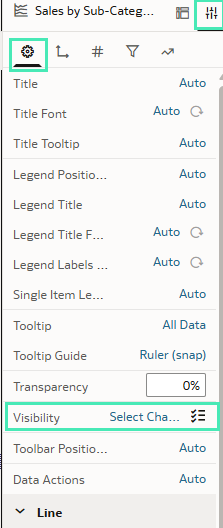
Figure 22: Editing chart visibility: step 1
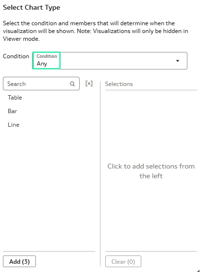
Figure 23: Editing chart visibility: step 2
For the other charts:
- Select the Bar chart and set the Visibility Condition to Exact Match with the value Bar:
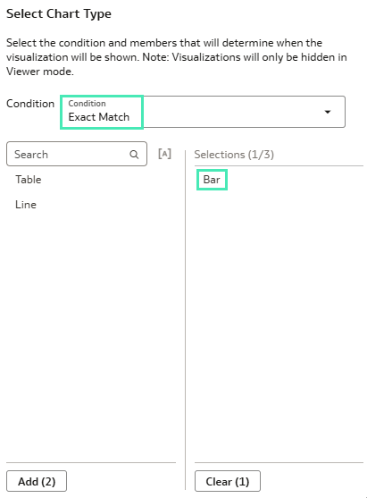
Figure 24: Bar chart Visibility Condition
- Select the Table visualisation and set the Visibility Condition to Exact Match with the value Table:
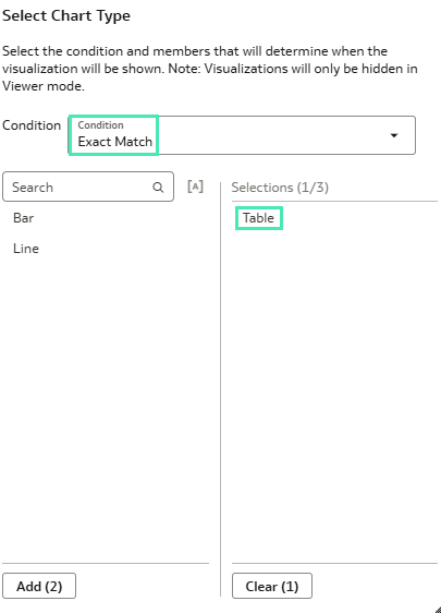
Figure 25: Table chart Visibility Condition
This ensures that each chart appears only when its corresponding value is selected.
Finally, we’ll edit the second Button Bar; its configuration is similar to the first. Add three controls: Table, Bar, and Line.
In the Action field, select the previously created action Set Chart Type.
Then, click on the Pencil icon for each control and assign the corresponding values:
- Table → Table
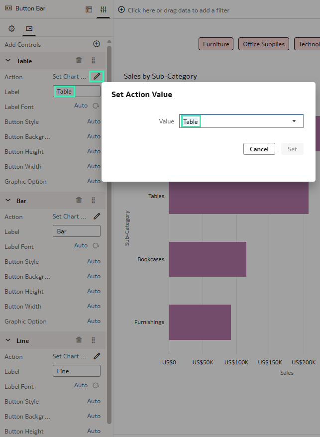
Figure 26: Button Bar: Table control
- Bar → Bar
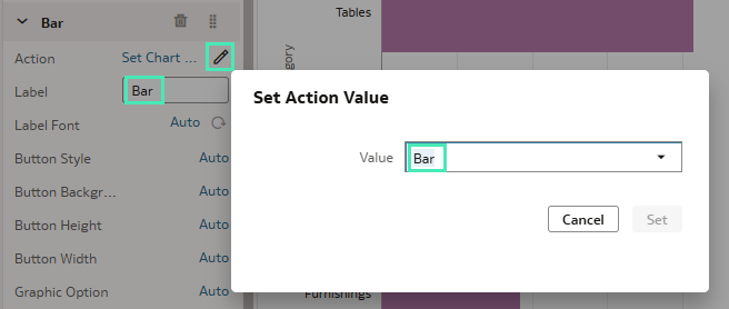
Figure 27: Button Bar: Bar control
- Line → Line
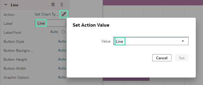
Figure 28: Button Bar: Line control
After completing these steps, your canvas will be fully interactive, allowing you to select the category using the first Button Bar, and to switch between Table, Bar, and Line charts using the second Button Bar.
This interaction is powered by parameters and data actions, enabling a dynamic and flexible experience within your workbook.
Create Heatmaps with Metric-Driven Colour Density
This dashboard feature allows you to incorporate business metrics into geographical analysis, providing a more intuitive view of how values are distributed across different locations.
To get started, create a new workbook and select the Map visualisation. Then add your geographic field to the Category (Location) section. Next, click on the three dots on the Category (Location) field and change the Layer Type to Heatmap:
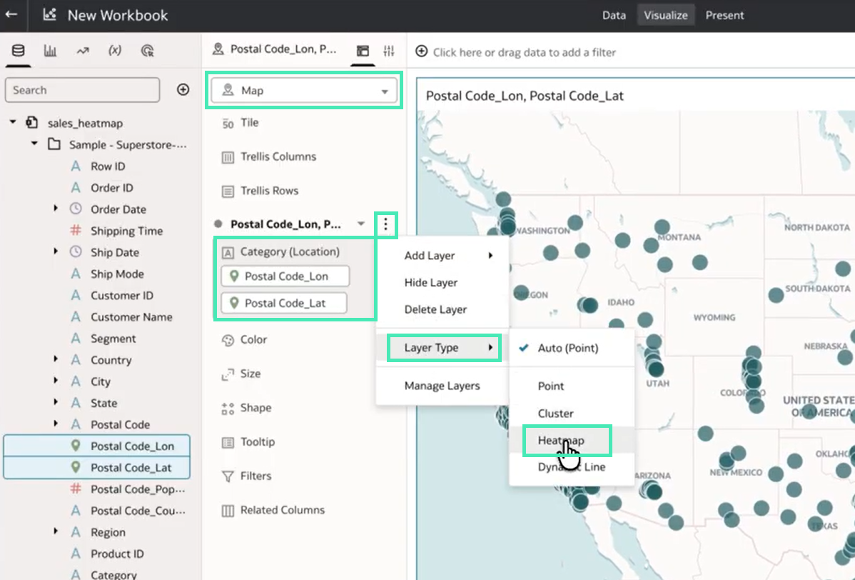
Figure 29: Map visualisation: Heatmap configuration
Once the heatmap layer is enabled, drag the business metric you want to analyse into the Color section. The heatmap updates automatically, highlighting areas where the values are higher or lower based on the selected geographic dimension:
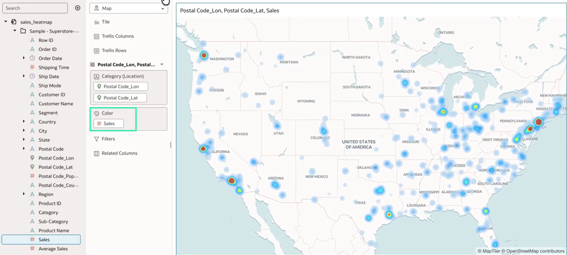
Figure 30: Map visualisation: Heatmap with metric as colour
Finally, adjust the heatmap intensity using the Intensity control, which allows you to increase or decrease the visual impact of the metric based on your analysis needs.
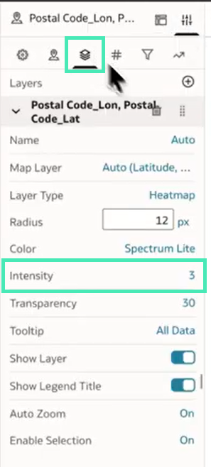
Figure 31: Map visualisation: Intensity control
Enhancements to Custom AI Data Agents
In our previous blog post, we explored the creation of domain-specific AI agents in OAC. This release introduces new enhancements that offer greater flexibility and control over how these agents look and behave.
First, you can now customise your First Message with a range of formatting options, including font styles, sizes and colours, text formatting and positioning, etc. This allows you to create more engaging introductory messages, improving the initial user interaction with the agent.
Figure 32: Formatting options in the AI Agent First Message
Another set of enhancements focuses on improving control over the Retrieval Augmented Generation (RAG) capabilities. When uploading documents for the agent to reference, you can now configure two additional options: Priority and Language.
The Priority setting is particularly useful when documents contain overlapping information, ensuring that the agent gives precedence to higher-priority sources when generating responses, even if similar content exists elsewhere:
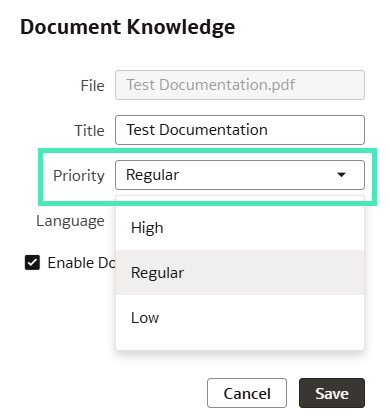
Figure 33: Priority options when adding new documents to an AI Agent
The Language setting allows you to define the language of each document in advance. This helps the agent to interpret and retrieve content more accurately and efficiently. There’s a wide range of supported languages, making it suitable for multilingual documentation:
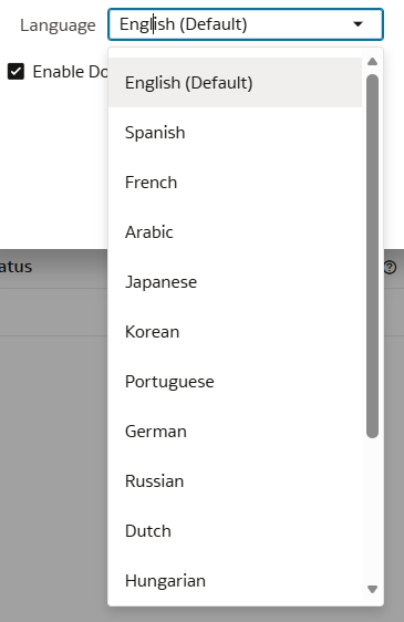
Figure 34: Language options when adding new documents to an AI Agent
Use AI Functions in Custom Calculations
This release also introduces the ability to use AI functions within custom calculations in a workbook. Custom calculations allow users to apply functions to their data to derive new insights beyond what is available in the base dataset. With this update, several AI-driven functions are now available.
The AI Generate function runs a prompt against every row in a dataset and returns an AI-generated text value for each of them. It’s especially useful for summarisation, classification, enrichment, and data tagging:
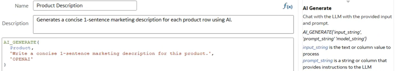
Figure 35: Using the AI Generate function
The AI Aggregate function combines text across multiple rows and submits it to the AI model as a single input. This supports use cases such as generating group-level summaries, sentiment analysis, and producing aggregated insights:
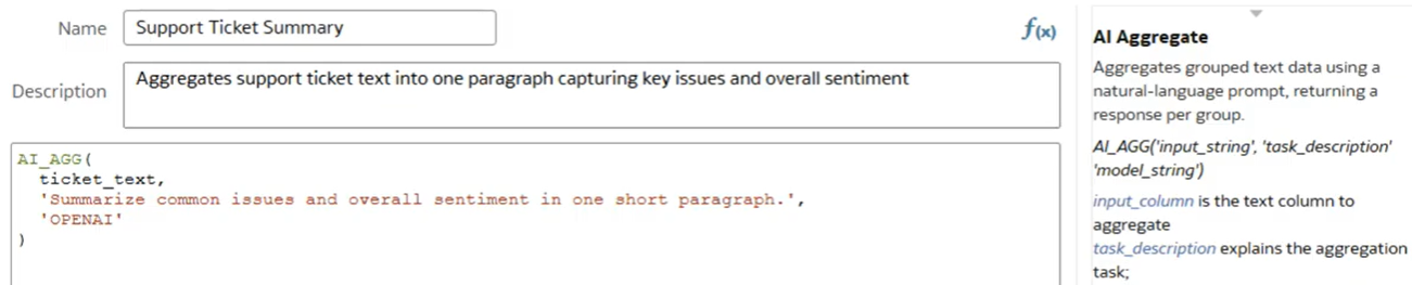
Figure 36: Using the AI Aggregate function
The AI Filter function evaluates a natural language query and returns a true or false value for each row based on the model’s response. This is particularly useful for use cases such as sentiment-based filtering, intent detection, and relevance evaluation:
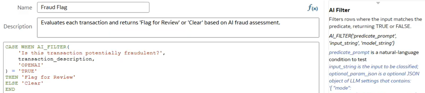
Figure 37: Using the AI Filter function
Before using these functions, you first need to register an AI model. This can be done from the OAC home page by clicking on the three dots next to the Create button, then selecting Register Model/Function, then Generative AI Models:
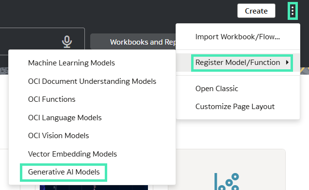
Figure 38: Registering an AI Model
In the new window you can select a model either from an existing Autonomous Data Warehouse (ADW) or from an Oracle Cloud Infrastructure (OCI) resource connection by choosing a compartment:
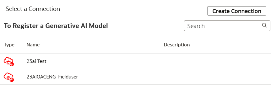
Figure 39: Selecting an AI Model
Once a model has been registered, the AI Functions become available in custom calculations. For example, consider a dataset containing customer records with a detailed Biography field. If the text is too long for practical analysis, you can use the AI Generate function to create concise summaries for each row:
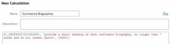
Figure 40: Using AI Generate to summarise the Biography column
After adding the calculated field to the workbook, you can compare the original Biography with the generated summary. As shown, the model follows the prompt closely, producing concise yet accurate summaries for each customer:
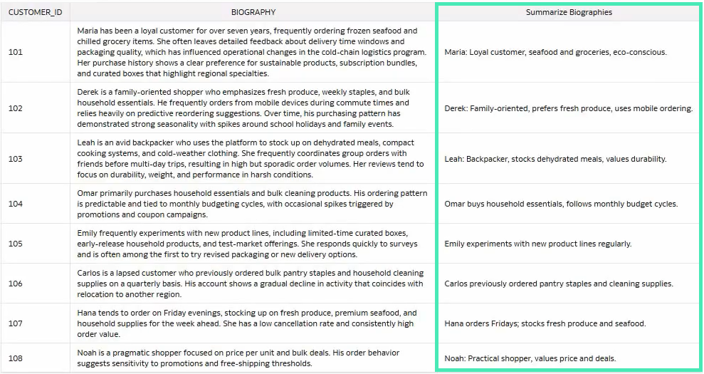
Figure 41: Comparison between original Biography column and generated summary
Overall, these new AI functions expand the range of possibilities for enhancing and enriching data directly within your workbook. They reduce the effort and time previously required to apply these transformations, helping users to move more efficiently from raw data to meaningful insights.
Conclusion
The Oracle Analytics Cloud March 2026 release brings meaningful enhancements to several areas of its platform.
The update is heavily focused on dashboarding and storytelling, with improvements to conditional formatting rules, enhanced Sankey charts and heatmaps, and more powerful data actions that give users more control over their dashboards. At the same time, it also introduces a redesigned, more intuitive interface for building data flows, along with AI-related advancements, including enhancements to custom AI agents and the implementation of AI functions within custom calculations.
Oracle has once again shown that it is committed to both adding new capabilities as well as refining existing features. The result is a more balanced platform that, with each release, offers greater flexibility and control, supports reliable data preparation, and integrates machine learning and AI into everyday workflows.
Here at ClearPeaks we’ll continue to track and analyse every major OAC release so that you can make the most of what’s new. If you are exploring these capabilities or considering how they could fit into your organisation, do reach out — our team is always ready to help!
