11 Jun 2025 Oracle Analytics Cloud May 2025 Update Highlights
The Oracle Analytics Cloud (OAC) May 2025 update is here! Oracle has just presented the latest updates with a variety of new functions, and as always, we’ll highlight the most valuable features to keep you up to date and to help you bring more insights to your data. Let’s see what’s new!
Add A Reference Line Using A Derived Date Column
Oracle has introduced the capability to add a reference line using a derived date column, allowing us to insert lines representing key metrics, such as averages or medians, segmented by time intervals like year, quarter, or month. Thanks to this feature, temporal analysis in visualisations is now much easier, and what’s more, as we’ll see later on, we can now use parameters to dynamically adjust the position of these lines or bands in the chart.
Consider the following visualisation where the x-axis represents a date-type column, specifically years, the y-axis displays a measure (Claim Amount), and the data is segmented by a categorical attribute (Type of Driver):

Figure 01: Line chart visualisation using derived date column
To add a reference line, follow these steps:
- Open your workbook and click on the visualisation where you wish to add the reference line or band.
- In the Data pane, click on the Analytics icon to access advanced analytical options. Then, select Add Statistics and activate the Reference.
- Choose the column you want to use as a reference. In the Analytics panel, configure the relevant properties. Use the Type setting to choose whether to display a line or a band.
- If you are working with a date-based column, keep in mind to adjust the Z Order setting to control whether the line appears in front of or behind the visualisation.
- Once all these steps are complete, click on Save to apply the changes.
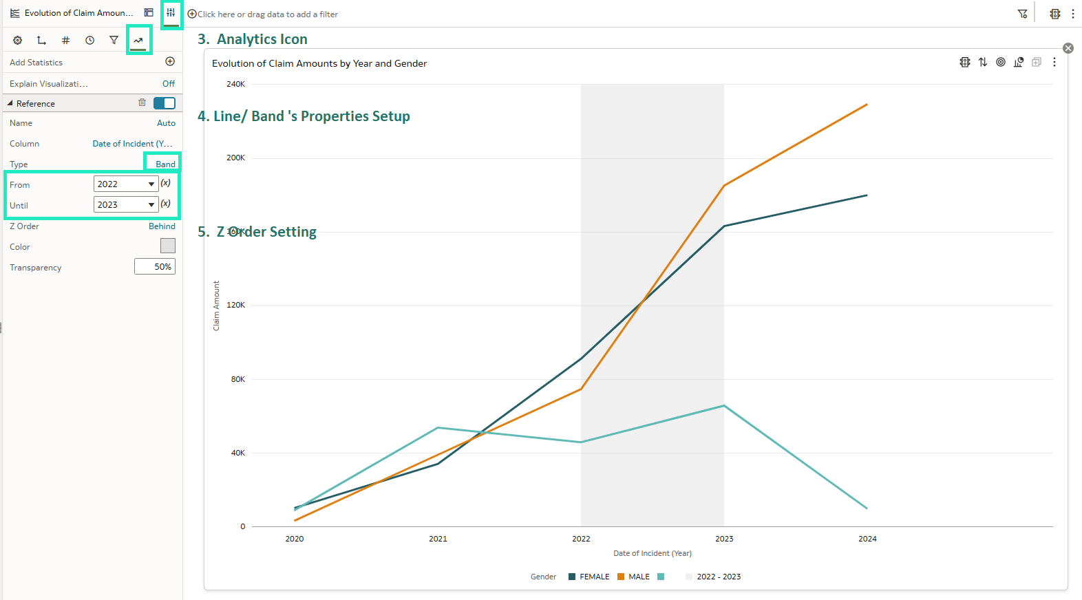
Figure 02: Reference band using a derived date column
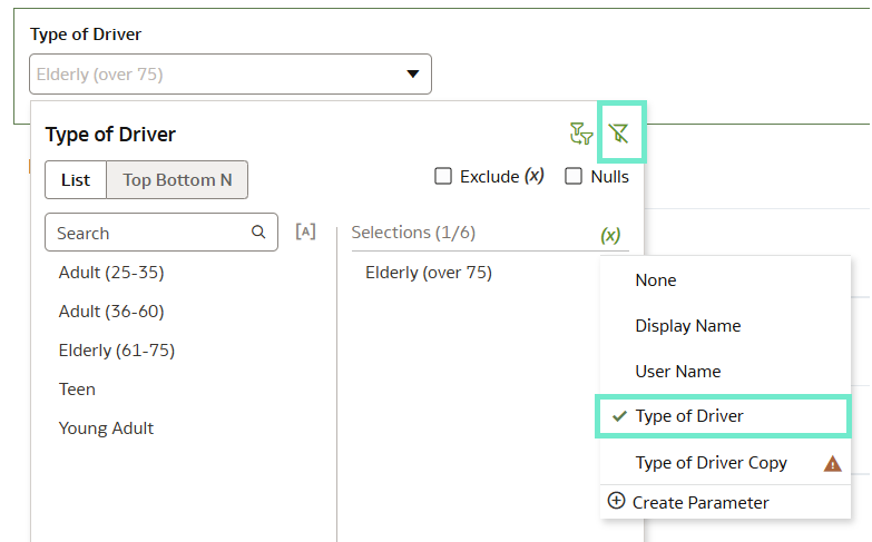
Bind Parameters to Reference Lines That Use Attribute Columns
As mentioned above, it is now possible to bind a parameter to a reference line or band within a visualisation, allowing dynamic control over its position. This functionality lets us select a value using a filter, which dynamically updates the reference line or band based on the selected parameter value:
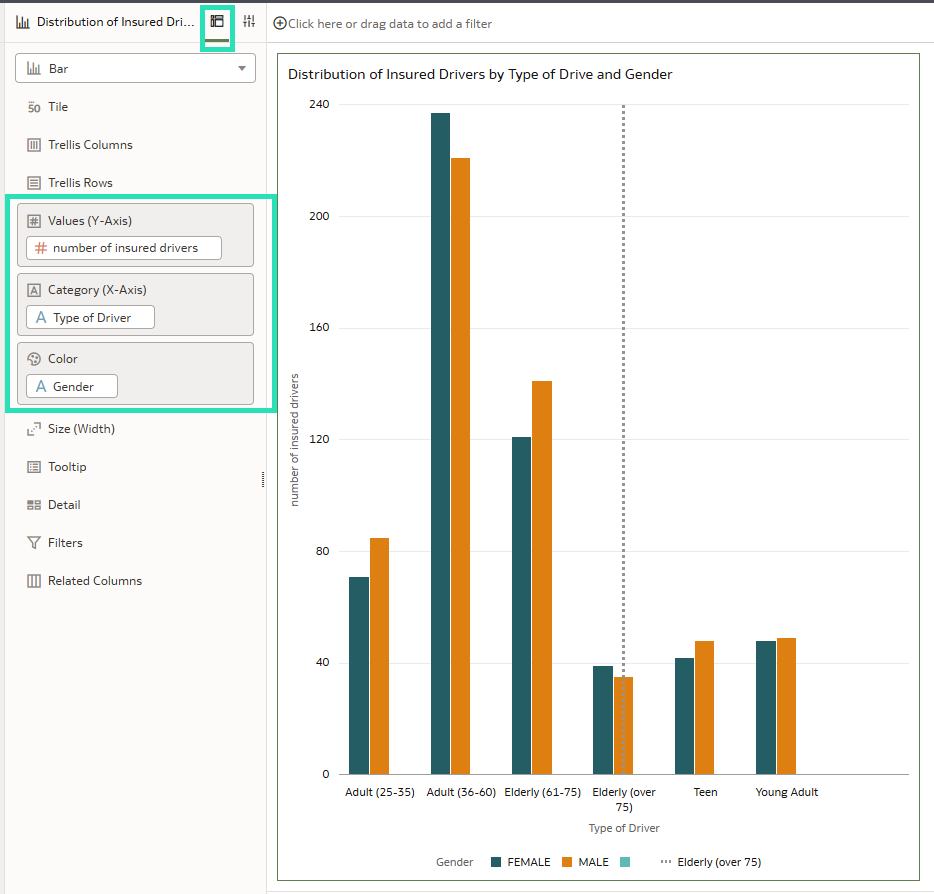
Figure 03: Using reference lines in bar chart visualisations
To get started, click on the visualisation containing the reference line or band you want to work with; then click on Properties and go to the Analytics tab. Once the Reference section is opened, do the following:
- For a reference line: find the Value field, choose Bind to Parameter (x), and then click on Create Parameter.
- For a reference band: do the same in both the From and Until
Finally, click on Save to apply the changes:
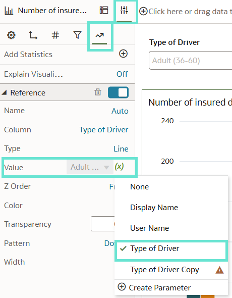
Figure 04: Setting up bind parameters for reference lines
To filter the reference band using a visualisation filter, drag the relevant visualisation onto the canvas and apply the same parameter used for the reference band.
Then go to Properties, navigate to Filter Controls and enable the desired filter type (in this case, List). Note that reference bands can only be filtered by a single value, so you must disable the multiselect option. Finally, click on Save:
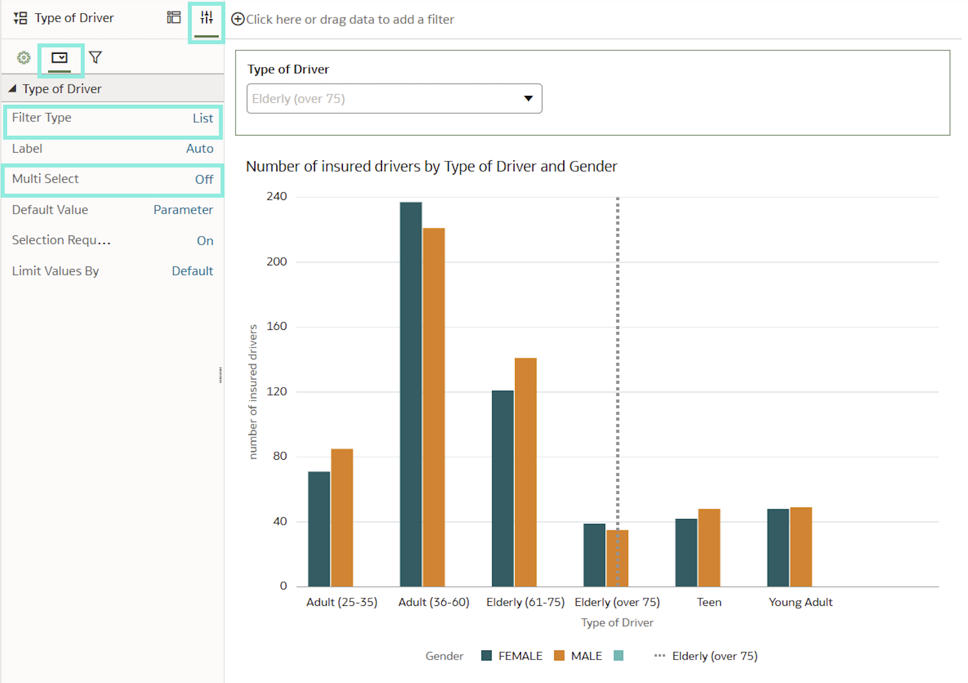
Figures 05 & 06: Dynamic Reference lines: Parameter binding and Filter configuration
Create Linear Gauge Visualisations
After releasing gauge visualisations in the March 2025 OAC update, Oracle has now introduced additional enhancements to this feature. By opening the Properties pane and expanding the Type section, you can select from the newly added gauge chart types, Horizontal Bar and Vertical Bar:
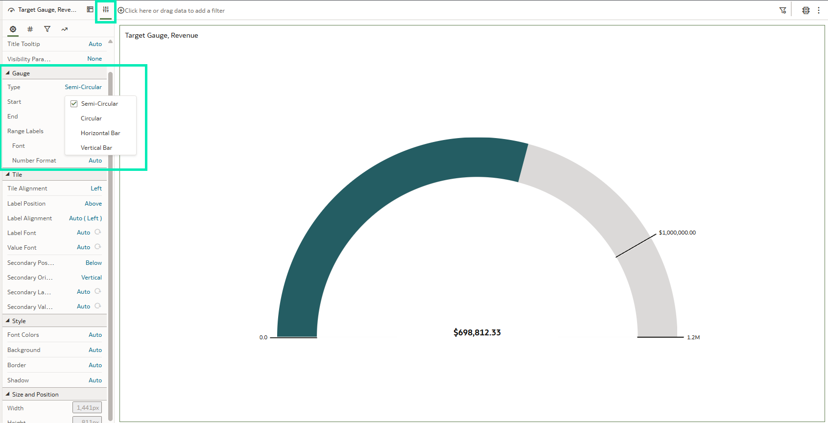
Figure 07: Gauge visual and its Settings pane
These chart types can also be customised by applying conditional formatting, adjusting the thickness and length of the gauge bar, or adding range labels to the visualisation:
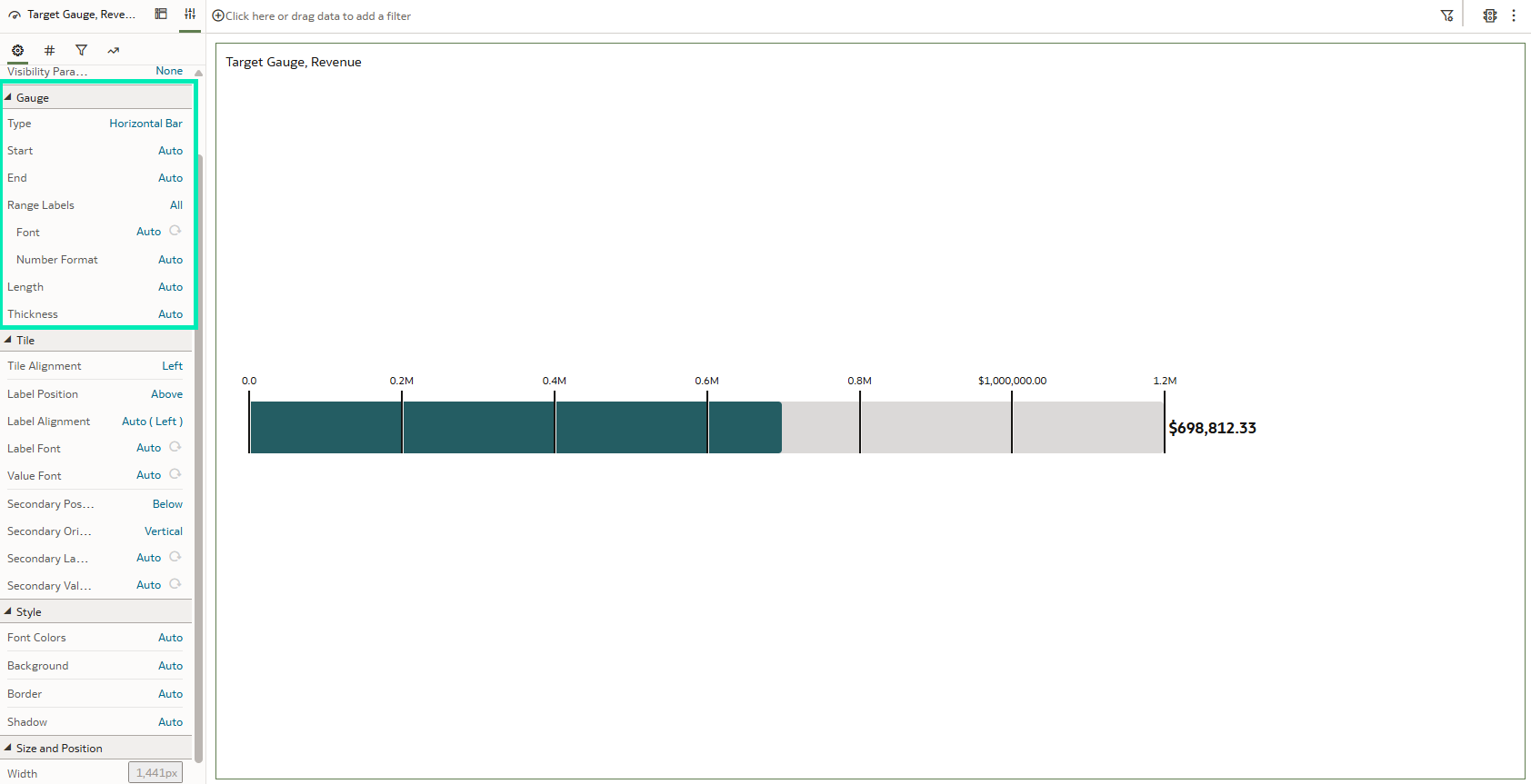
Figure 08: Linear gauge visual and its Settings pane
Thanks to these features, gauge visualisations provide better understanding of the data whilst keeping things as simple as possible.
Download Option for System Map Layers
System map layers can now be downloaded as a JSON file for advanced customisation. This functionality is particularly useful for adapting maps to specific geographic structures, enabling more accurate and insightful visualisations to support analysis and informed decision-making. Note that this action requires administrator privileges.
1. Go to the OCI Home page, open the menu, and click on Console:
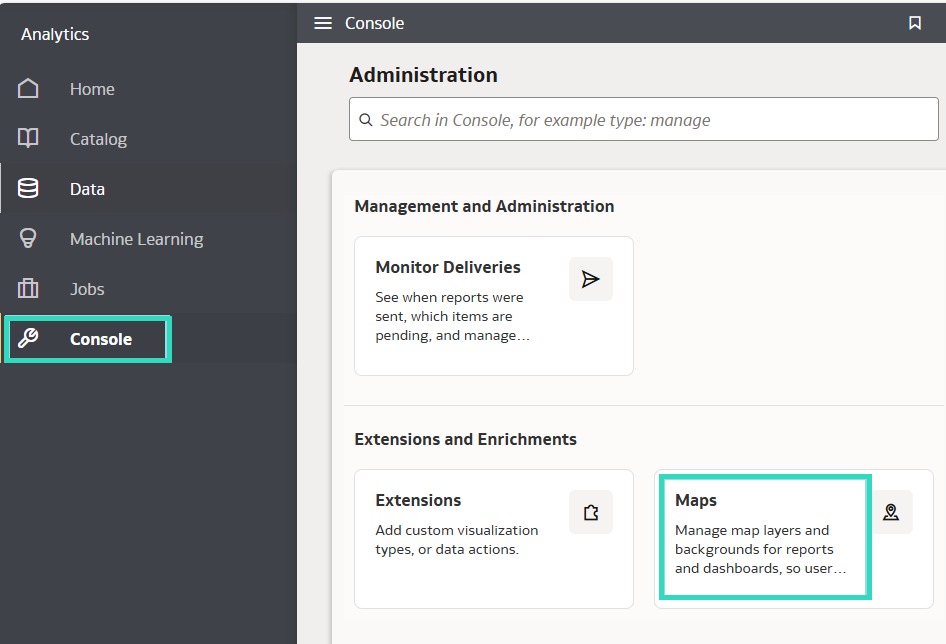
Figure 09: Console and Map: Extended features and enrichments
2. Next, click on Maps and Data Layers, then select System Map Layers:
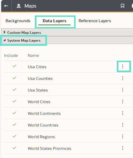
Figure 10: System Map Layers
3. Find the system map layer you want, click on the Options icon (…) and select
4. Save the system map layer as a JSON file.
Dynamic Lines on Maps
This new feature is particularly useful for working with geographic points and visualising connections between them on a map. These connections are represented using dynamic lines that link start and end coordinates. In our case, we used this functionality to display flight routes and movements between cities. The start and end data can include latitude and longitude coordinates, city or country names, geographic points, or polygons.
To use this feature, follow these steps:
1. Open a workbook from the Home
2. Create a map and select the Dynamic Line layer type:
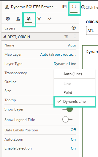
Figure 11: Creating a dynamic line in our visualisation
3. Drag the source data to the Start Node and the destination data to the End Node.
4. To adjust the line thickness, go to Properties, then Layers, and finally to the Size section:
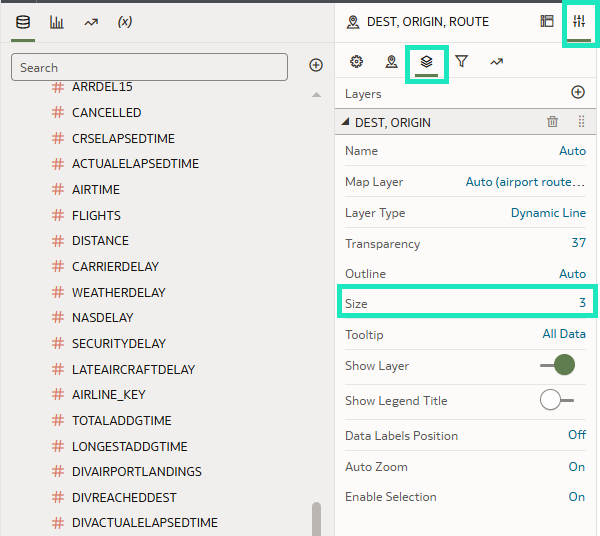
Figure 12: Configuring a dynamic line
Save your work to visualise dynamic lines connecting the selected points:
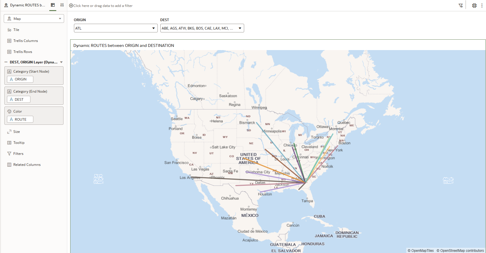
Figure 13: Interactive Map visualisations with dynamic lines
Load Local Subject Area Queries from the Cache to Maximise Performance
Oracle is enhancing not only the look and feel of Oracle Data Visualization, but also its performance. A new option in the Data Access settings now allows authors to decide whether data is cached or loaded directly from the data source for each dataset table.
By selecting Extracted under the Data Access settings, a dataset table will always load its data from the cache. This means all queries will run with preloaded data and consistent performance. Users must wait for the Reload Data operation to complete before using the dataset, to ensure the table is fully cached.
Changes in the dataset, like adding or removing columns, will not impact users until all the data is available in the cache. And if a dataset reload fails, workbooks will use the most recently loaded data.
Oracle recommends that authors use the same Data Access option for all the tables in the dataset. If a reload fails, any tables set to use automatic caching will switch to live data.
To configure Data Access as Extracted:
- Click on the Navigator menu and then on
- On the Data page, go to Datasets
- Locate the dataset you want to work with.
- Click on Actions and then
- From the bottom tab, go to the table you want to work with.
- Then click on Edit Definition.
- In the right-hand pane choose the appropriate data access option.
Set the Default Workbook Layout for the Mobile App to Desktop Mode
In this release, Oracle has introduced a new feature that allows authors to specify the most suitable workbook layout for mobile app users: a new mobile experience option called Desktop Mode has been added. This mode mirrors the desktop experience without applying any breakpoints, and as a result users can experience the full design and functionality of the workbook on smaller screens.
It is important to note that this setting will only work when the user selects Auto as the default layout for the workbook in the app.
To set up this feature from a workbook:
- From the top bar, go to the Present
- Once in the Present tab, click on the Workbook tab in the left pane.
- Look for the Mobile section and then click on the Mobile Experience field to select a layout:
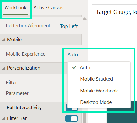
Figure 14: Mobile layout
Use Selection Steps in Workbooks
Selection Steps is a feature that was previously available in OBIEE and Oracle Analytics Classic, and it has now been introduced in this OAC release. It allows users to specify which levels or members of a hierarchy they want to display in a table or pivot visualisation.
Unlike traditional filters, which select values from a column before aggregation, Selection Steps operate at the hierarchy level and are applied after aggregation, meaning that they do not impact aggregate values:
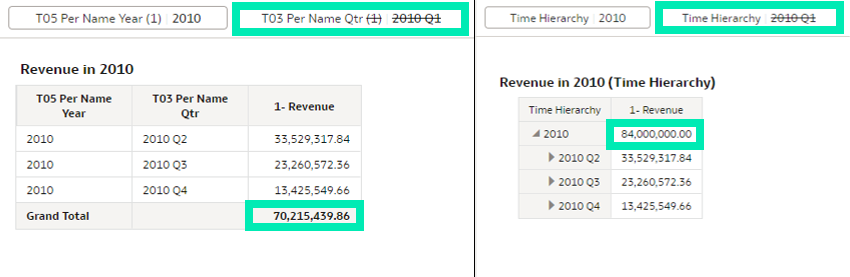
Figure 15: Comparison in aggregation between using a filter and using Selection Steps
Another difference from standard filters is the order of application. While the placement order of filters in the filter bar is typically irrelevant, the sequence of Selection Steps determines the order in which they are applied.
Selection Steps use two main elements: actions and operators. The combination of these elements with specified values defines the behaviour of the Selection Steps and determines which data is displayed.
There are three actions available for Selection Steps:
- Add: Select levels or members to add to the selection.
- Keep Only: Retain only the specified levels or members from those already included in the selection. This is the default action and does not add new members to the selection.
- Remove: Select levels or members to remove from the selection.
The operators available depend on the type of hierarchy used, and they offer a wide range of options to select what levels or members of the hierarchy the Selection Steps will act on. You can find an in-depth explanation of each operator in the official Oracle documentation here.
Selection Steps can be applied in several contexts: directly in the workbook filter bar, as a filter within a visualisation, or as part of a dashboard filter visualisation. This last option allows you to configure the level of interaction that users will have by changing the value of the Consumer Interactivity setting in the Filter Controls tab inside the Properties pane.
This setting allows you to define the interaction level as Full, Restricted or Minimal, and the data displayed in the Selection Steps will change accordingly:
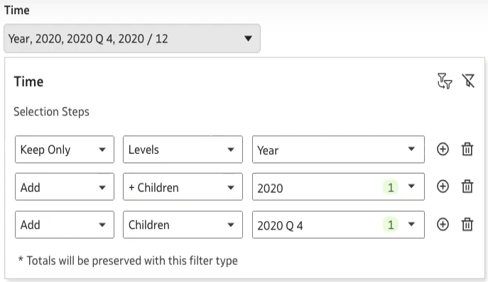
Figure 16: Selection Steps display with Full interactivity
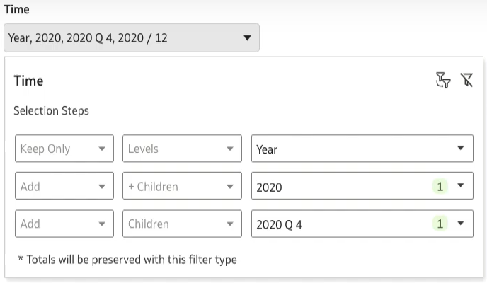
Figure 17: Selection Steps display with Restricted interactivity
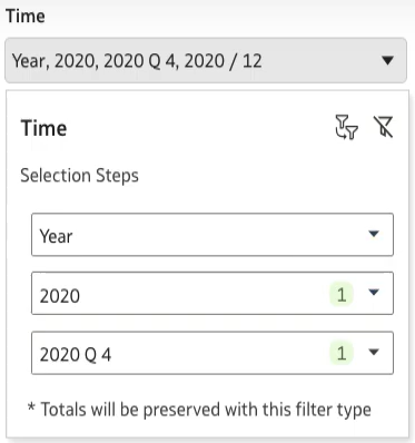
Figure 18: Selection Steps display with Minimal interactivity
Use System Variables in Workbook Email Schedules
An interesting feature introduced in the January 2025 release and now improved even further is the option to create workbook email schedules.
This feature allows users to share a visualisation from a workbook via email by creating a schedule that delivers the results to selected recipients. This schedule can be configured to run at a specific time, or to repeat hourly, daily, weekly, monthly, or yearly.
Here are the steps you need to follow to create a workbook email schedule:
1. On the Home page, hover over a workbook, click on Actions, and select Schedule:
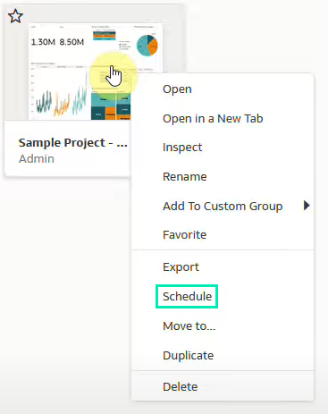
Figure 19: Creating a schedule for a workbook
2. In the Schedule tab, click on
3. Use the Format field to select a format in which to share the content:
- Acrobat (PDF): Use the Canvas field to select up to five canvases to share, and use the Size field to modify the default page size.
- Image (PNG): Use the Canvas field to select up to five canvases to share.
- Excel (XLSX): Use the Canvas field to select one canvas with table or pivot table visualisations, then use the Visual field to select the visualisation that you want to share:

Figure 20: Formats accepted for shared content
4. In the Schedule tab, select a start date and time. You can select Repeat to create a recurring schedule:
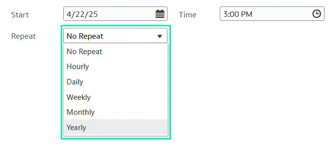
Figure 21: Repeat options for the Schedule
5. In the Email tab, enter the recipients. You can add Oracle Analytics users, application roles, and email addresses for external recipients; separate multiple email addresses with a comma. All recipients will receive the visualisations based on the data access configuration of the administrator user who creates the schedule.
6. If the data visualisations contain confidential data accessed by specific application roles and user groups, you can enable Bursting, and each recipient will receive a customised data visualisation based on their data access configuration.
7. Enter a subject and message. In the email message, click on Link and select one of these options:
- Add a URL link to the workbook
- Add a URL link to download the output
- You can also add a PNG image of your data visualisations to the email body by clicking on Output Image. To resize the image for optimal display, hover over it, then click and drag the right corner to adjust its size.
8. Click on Save to create the schedule.
9. The improvement included in this release involves the use of System Variables to indicate the current date and the sender’s details in the email. When configuring the subject and the message, you can use the following system variables:
- CURRENT_TIMESTAMP: Displays the date and time of the email delivery. Supported formats are:
- CURRENT_TIMESTAMP (e.g. 2025-03-19)
- CURRENT_TIMESTAMP:yyyy-MM-dd HH:mm (e.g. 2025-03-19 14:30)
- CURRENT_TIMESTAMP:EEEE, MMM dd, yyyy HH:mm:ss (e.g. Monday, May 5, 2025 14:30:15)
- USER: For non-bursting schedules, this displays the username of the user running the schedule. For bursting schedules, it displays the username of the recipient:
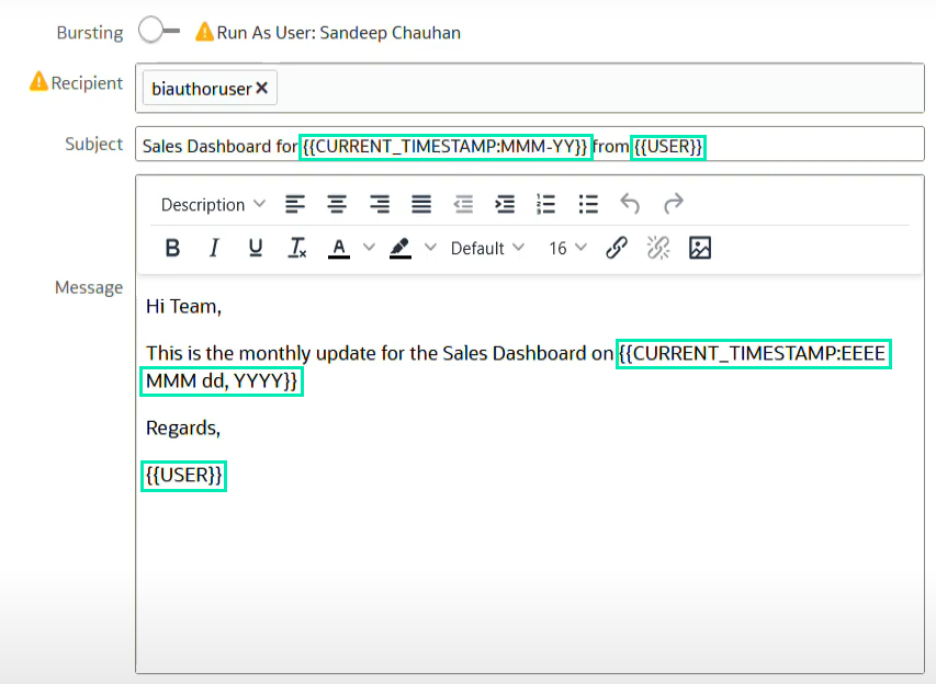
Figure 22: Use of system variables in the subject and message of the email
When using system variables, ensure that they follow the correct syntax format: {{Variable}}.
Analyse Video Content with OCI Vision AI Models
This release also includes a fascinating new feature that gives users access to pretrained Oracle Cloud Infrastructure (OCI) Vision models to analyse images and videos without having to be an expert in machine learning or AI (more details here).
With this feature, you can easily analyse image or video datasets for insights, or even create applications that are able to classify images or to detect elements such as faces, objects, texts, etc.
To use it, just follow these steps:
1. On the Oracle Analytics Home page, click on Create, then select Data Flow:
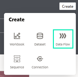
Figure 23: Creating a data flow for the dataset
2. Select a dataset that references the desired images or videos, then click on
3. From the Data Flow Steps pane, double-click on Apply AI Model:
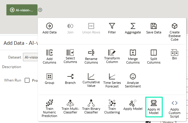
Figure 24: Apply AI Model
4. In Select AI Model, select the desired model, then click on
5. Use the Outputs and Parameters options to configure the model.
6. In Apply Model, expand Parameters and configure Input Column and Input Type:
- Input Column: Click on Select a column and select the dataset column that contains the bucket URL(s) of the images or videos.
- Input Type:
- If you’re referencing your source images by bucket, select
- If you’re referencing your source images individually, select
- If you’re referencing your source videos individually, select

Figure 25: Configuring the AI Model parameters
7. From the Data Flow Steps pane, double-click on Save Data, enter a name for the dataset, and choose a location to save it.
8. Save the data flow and click on Run Data Flow to analyse the images and output the results in a new dataset.
You should now be able to access your new dataset and analyse the results!
Note: If you are processing fewer than 20,000 images, a single data flow is sufficient. For larger datasets, divide them into multiple datasets, create a separate data flow for each, and use a sequence to process them all sequentially.
Generate Meaningful Dataset Descriptions Automatically
Oracle continues to enhance its AI Assistant with new capabilities. In this release, a new feature enables automatic generation of meaningful dataset descriptions via the AI Assistant, allowing users to quickly understand a dataset’s content without needing to open or explore it manually. It also helps prevent confusion between datasets with similar names.
To use this feature:
- Click on the Navigator menu and then on
- From the Data page, go to the Datasets tab:
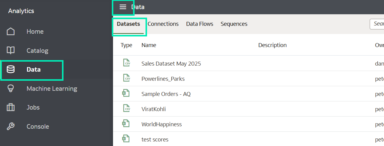
Figure 26: Dataset navigator menu
- Locate the dataset you want to describe. In this example, Sales Dataset May 2025.
- Once located, click on Actions and then Inspect:
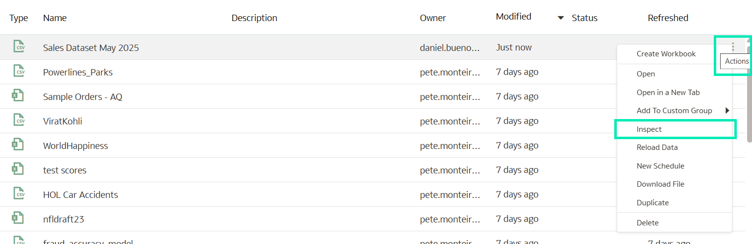
Figure 27: Dataset Actions menu
- Once the General page pops up, click on the wand icon, and the dataset description will be generated automatically:
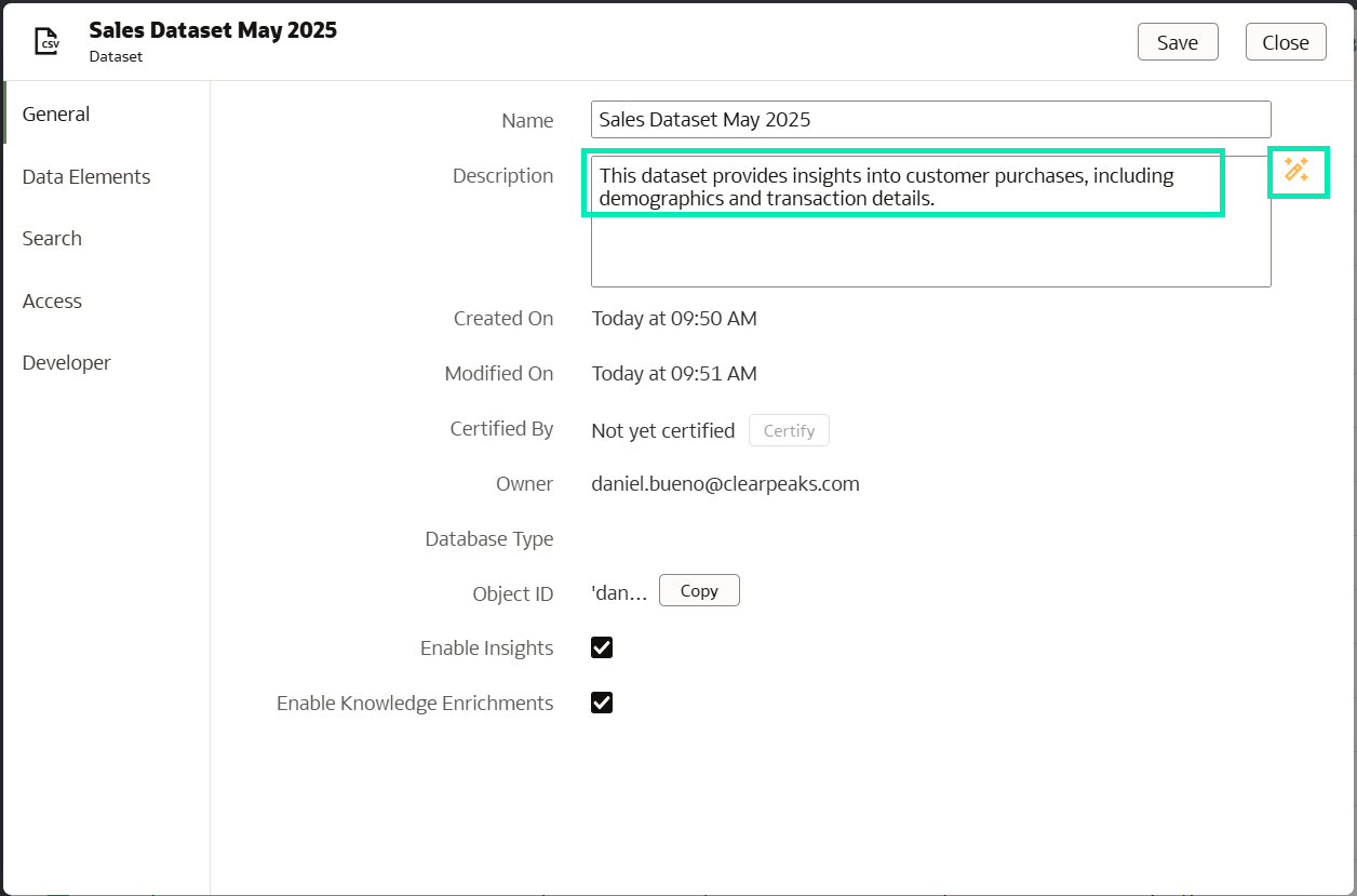
Figure 28: Dataset Home page
The generated description reflects the dataset’s structure and semantics, as shown in the following data snapshot:
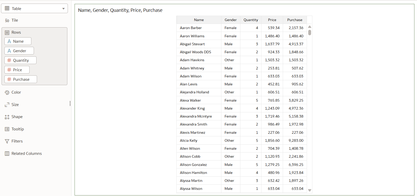
Figure 29: Dataset data
Conclusion
This latest OAC release has once again shown Oracle’s commitment to continuous innovation across the platform. From performance boosts to AI-powered enhancements, this update ticks all the right boxes.
Key highlights include:
- In-memory table caching for significantly improved dataset performance.
- Integration with OCI Vision AI models to analyse images and videos: a huge step forward for unstructured data analysis.
- Enhanced visualisations with reference lines based on derived date columns.
- The ability to use Selection Steps in workbooks, offering greater interactivity and control.
These updates empower users to extract even deeper insights from their data and to maximise the value of their analytics investments.
Here at ClearPeaks we specialise in delivering cutting-edge OAC solutions tailored to your business needs. Whether you’re looking to optimise dashboards and visualisations, collaborate more efficiently using Watchlists, strengthen your security model, or accelerate time to insights, our expert team is ready to help. Simply reach out to us today!