15 Oct 2025 Oracle Analytics Cloud September 2025 Update Highlights
Once again, it’s time for a new release of Oracle Analytics Cloud. Packed with valuable enhancements and improvements, this update continues to empower users with intelligent tools to gain deeper insights from their data. As always, we’ll take a closer look at the features that matter most, keeping you up to date with what’s new and helping you to get the most out of your analytics experience. Let’s get down to details!
Create Mekko Charts
This OAC release introduces Mekko charts. A Mekko chart (also known as a Marimekko chart) is a type of stacked bar chart in which both the height and width of each bar represent data values. The height indicates the measure, whilst the width is scaled proportionally, providing a clear visual comparison of category sizes:
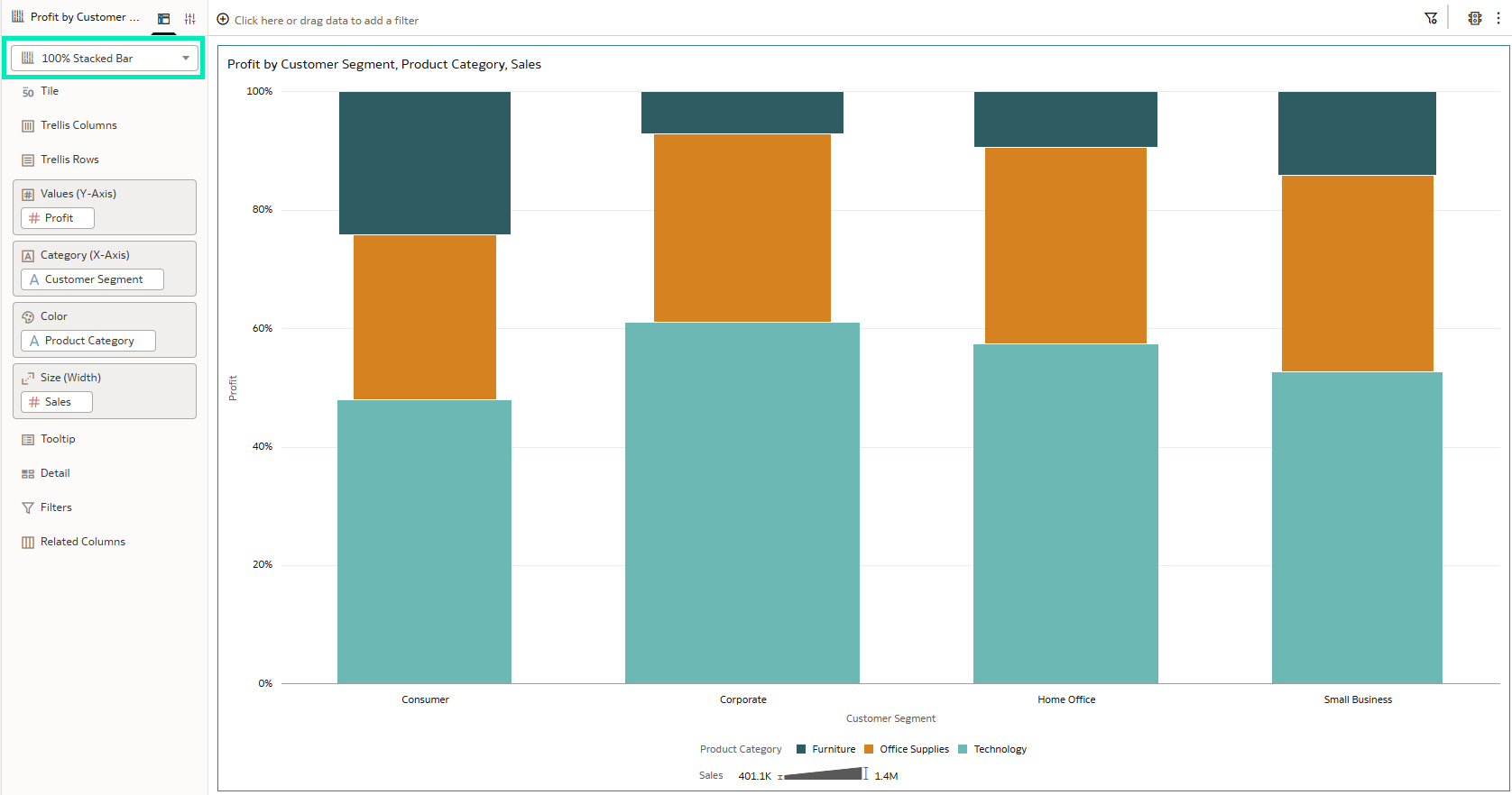
Figure 01: 100% Stacked Bar Chart
Mekko charts are available for all types of bar chart visualisations. To create one, you need to adjust two properties. First, the Bar Gap, which controls the spacing between bars and is set to a default value of 37%:
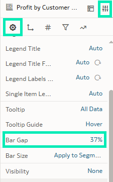
Figure 02: Bar Gap Property
To control the gap on the chart you can use the slider or type in the desired percentage; for our Mekko chart we’ll set this value to 0:
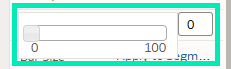
Figure 03: Bar Gap Slider
This property is available for all the bar chart variants:
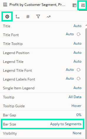
Figure 04: Bar Size Property
The second property to create Mekko charts is Bar Size; this property controls the segment sizes within stack bar categories. When set to Apply to Segments, the value of a measure column is applied to each segment accordingly, and when set to Apply to Stack, the width of segments changes, meaning that the value of a measure column is applied to entire chart area:
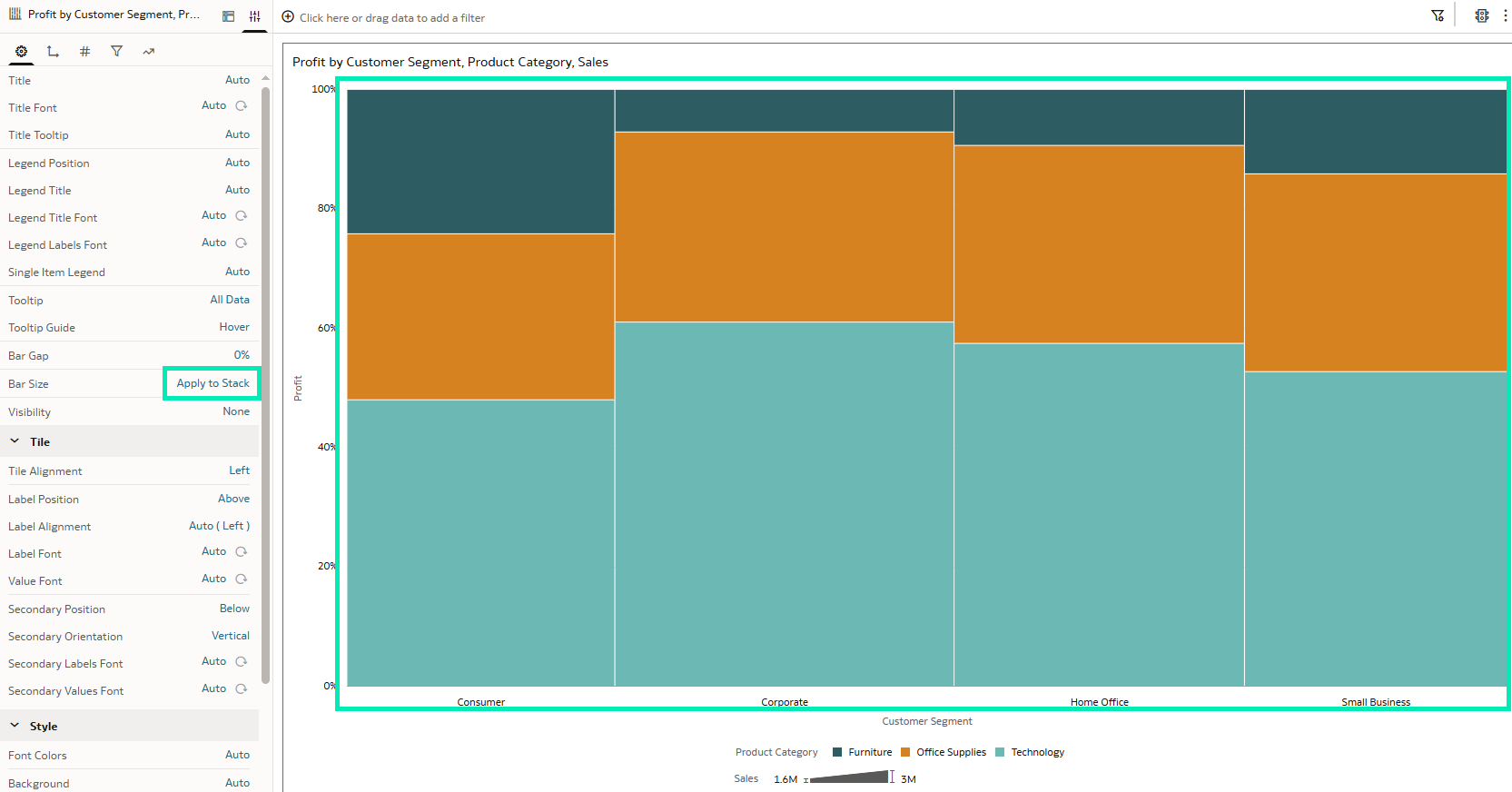
Figure 05: Applied to Stack
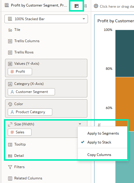
Figure 06: Grammar Pane Bar Size Property
By turning on and adding the data labels to the visual, we get a readable, informative, and aesthetically appealing Mekko chart:
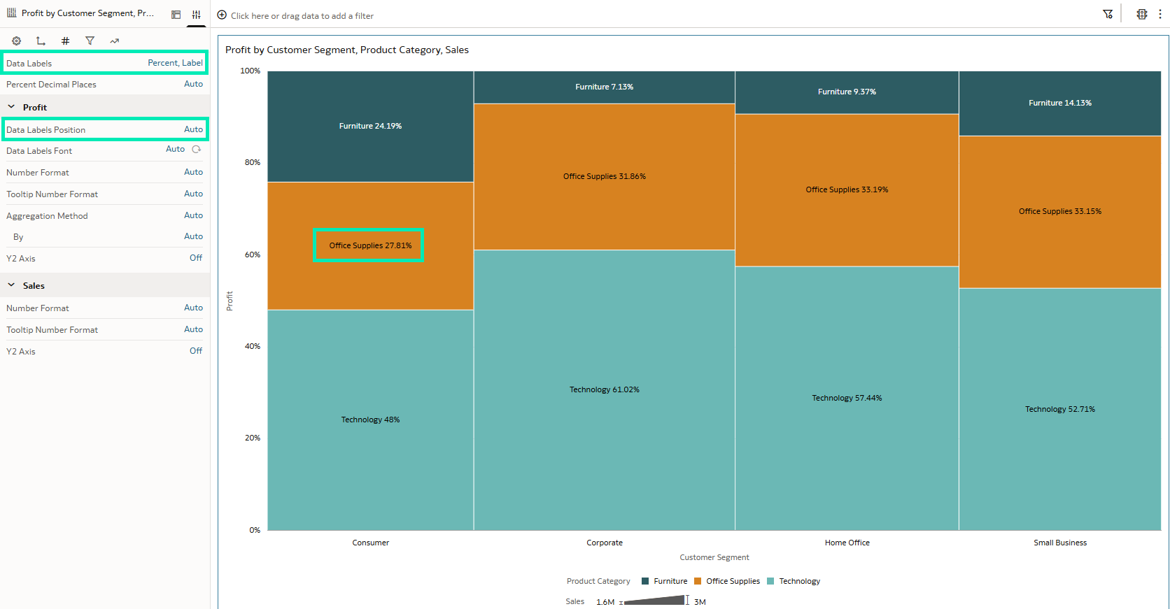
Figure 07: Mekko Chart
These charts are particularly useful for analysing market share, comparing products, or exploring any scenario that requires viewing category proportions alongside overall contribution.
Adding Buttons to Workbooks
This update introduces a new visualisation called Button Bar: this feature enhances workbook interactivity, allowing authors to design a more app-like interface within their workbooks. It can be found in the Visualisations pane under the Dashboard Controls section, and there’s a wide range of customisation options:
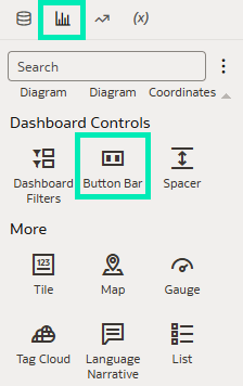
Figure 08: Button Bar Visualisation
When adding it to a dashboard, a single button is created on the bar by default. The Button Bar acts as a container for buttons, and additional buttons can be added as needed by selecting Add Controls under the Properties pane:
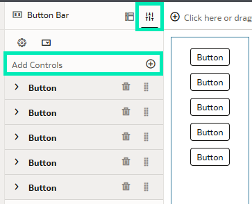
Figure 09: Adding More Buttons
The Button Bar includes high-level properties such as a common title for all buttons, button style, orientation, and alignment, along with other configuration options:
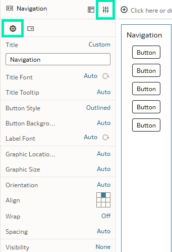
Figure 10: General Properties
What’s more, each button in the bar has its own set of properties, offering greater flexibility in designing buttons that suit their intended purpose. You can configure the button style to appear as outlined, borderless, solid, or displayed as a link:
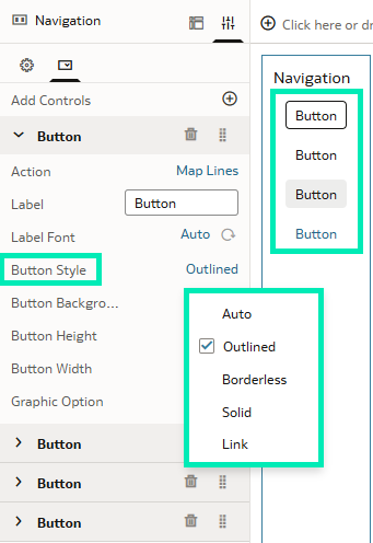
Figure 11: Button Style
Another cool button customisation option is the Graphic Option property. When set to Custom, it enables you to add an icon from the Oracle icon library, enhancing interactivity and improving the overall user experience:
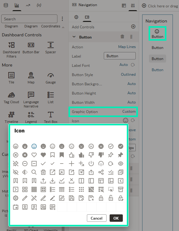
Figure 12: Button Icons
Another key setting is the Action property, which defines the button’s on-click behaviour. This property relies on Data Actions, which must be predefined in the Data Actions menu:
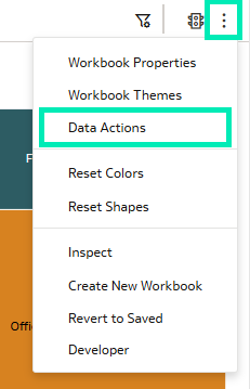
Figure 13: Data Actions Menu
Since buttons operate in a non-data context, Oracle has improved Data Actions by introducing an additional property that defines whether an action applies to a data or non-data context. By default, this property is enabled, and when turned off, the action can be invoked by a button:
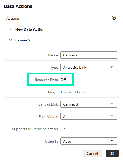
Figure 14: Requires Data Property
After setting this property to Off, it can be added to the button:
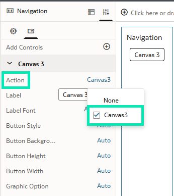
Figure 15: Action Property
With this enhanced navigation capability, users can now move between dashboard pages more efficiently, or use Data Action links to open other web pages relevant to their analysis. These buttons transform workbooks into more dynamic, application-like experiences, enabling users to explore data more intuitively.
Analyse Latitude & Longitude Data Points
With this release, Oracle continues to improve support for geospatial data processing. It introduces a set of Spatial functions that enable calculations on geometry data, such as measuring the distance between two locations:
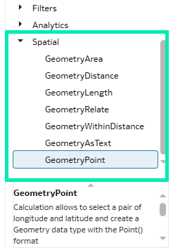
Figure 16: Spatial Functions
First, location data such as latitude and longitude must be converted into the Geometry data type. This data type represents spatial data in a flat coordinate system and is used to perform precise distance and area calculations. So, if your data contains coordinates for both a starting point and an ending point, you can carry out geometry-based point-to-point calculations:
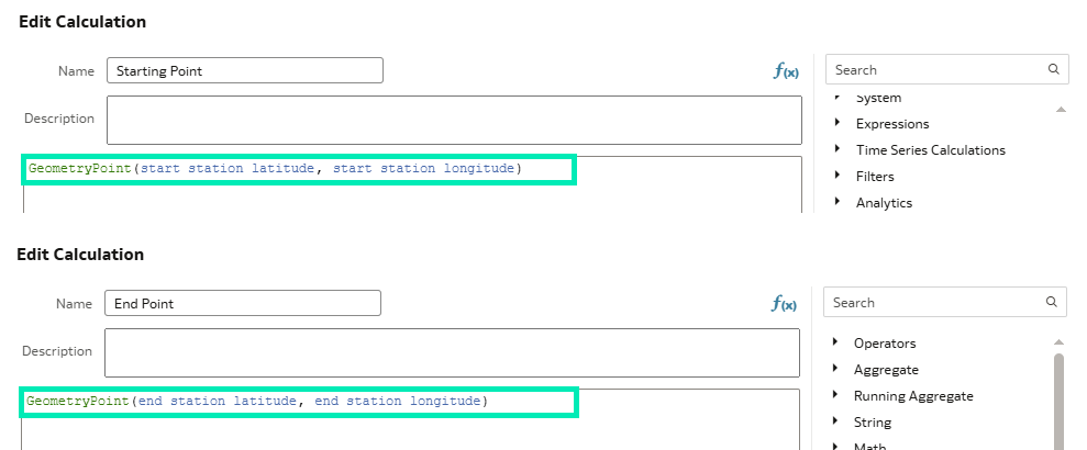
Figure 17: Geometry Point Function
These geometry point calculations allow you to compute the distance between two locations with the GeometryDistance function. By default, the distance is returned in metres:
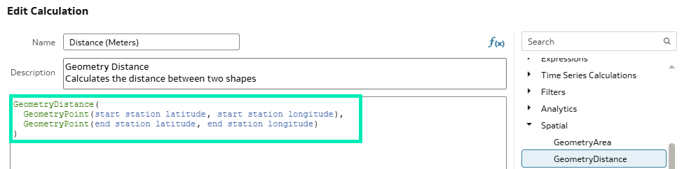
Figure 18: Geometry Distance Function
These calculations can be visualised, analysed, and integrated according to your business requirements:
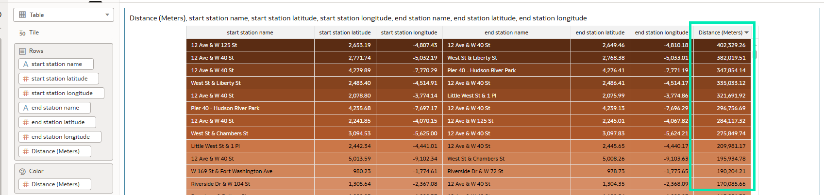
Figure 19: Distance Between Locations
These new functions can be applied not only in workbook calculations but also within data flows. This latest OAC update unlocks new ways to enrich your visuals with geographic information, and it will be particularly valuable for industries that rely on location-based insights such as logistics and public transportation. This combination of spatial and business metrics brings precise geographic context to data and delivers deeper insights.
AI Assistant to Optimise Column Names
Oracle continues to integrate more artificial intelligence capabilities into OAC, and with this September 2025 release, the Oracle AI Assistant helps to make datasets more user-friendly. Now you can automatically optimise and standardise column names in datasets to improve readability and clarity when building workbooks. The AI Assistant is available in the Dataset Editor mode by clicking on the Sparkles icon in the top header bar:

Figure 20: Dataset Editor
Even without invoking the LLM, you can make quick fixes to names, changing the case or replacing underscores with spaces, for example:
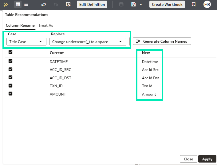
Figure 21: Column Name Editor
Sometimes, column names are abbreviated, and datasets may contain too many to update manually: this is where the AI Assistant becomes especially useful. By clicking the Generate Column Name button, the prebuilt prompt expands abbreviations within seconds, whilst retaining commonly used abbreviations:
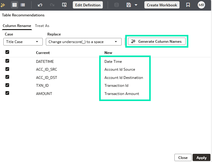
Figure 22: Column Name Editor
After clicking on the Apply button, the columns are renamed, and the changes are recorded in the transform script:
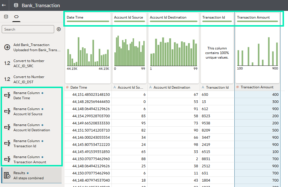
Figure 23: Column Rename Result
This feature is especially useful when working with raw datasets from different sources where naming conventions may be different. The AI Assistant handles the cleaning process and provides users with readable, intuitive column labels that are easy to navigate.
Add Descriptions to Columns
Another useful enhancement is the ability to add column descriptions when editing the dataset; this update improves data documentation and makes it easier for users to understand what columns represent at a glance.
The description of each column can be added in the Dataset Editor when switching the view to Metadata:
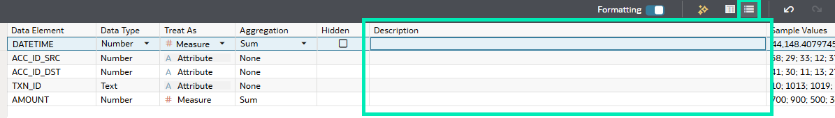
Figure 24: Metadata View
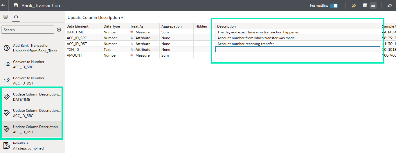
Figure 25: Column Description
There is no need to add descriptions to all columns, but only to those that require additional context or detail. As with column names, these changes are recorded in the transform script. After saving the dataset, the descriptions are stored with it and become available during workbook creation. When hovering over a column name, the description appears as a tooltip, providing users with additional information:
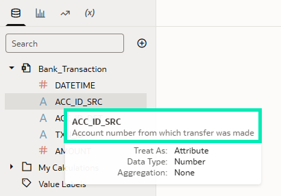
Figure 26: Column Description in Workbook Mode
With this update, Oracle aims to eliminate uncertainties behind the data, making datasets easier to understand and promoting collaboration between dataset creators and consumers.
Align Cell Values in Table & Pivot Visualisations
In this update, Oracle introduces greater flexibility in data representation for table and pivot table visualisations. You can now control the alignment of cell and header values, positioning them to the left, right, or centre within each cell. By default, headers are centre-aligned, attribute values are left-aligned, and measures are right-aligned, just as in previous versions:
Figure 27: Header Alignment
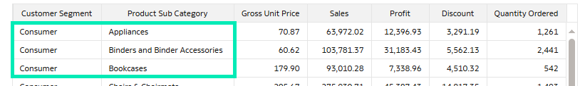
Figure 28: Attribute Alignment
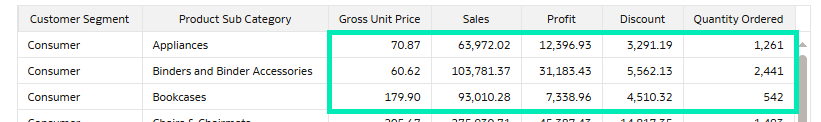
Figure 29: Measure Alignment
Under the Edge Labels property panel tab, all the font editors are now equipped with alignment control buttons:
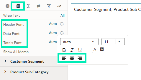
Figure 30: Alignment Control
Changing the alignment of the top-level data font affects all columns and their headers in the table:
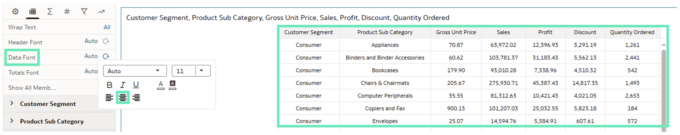
Figure 31: Top-Level Centre Alignment
Alignment control has also been added at the individual column level, so it can be adjusted according to your needs and preferences:
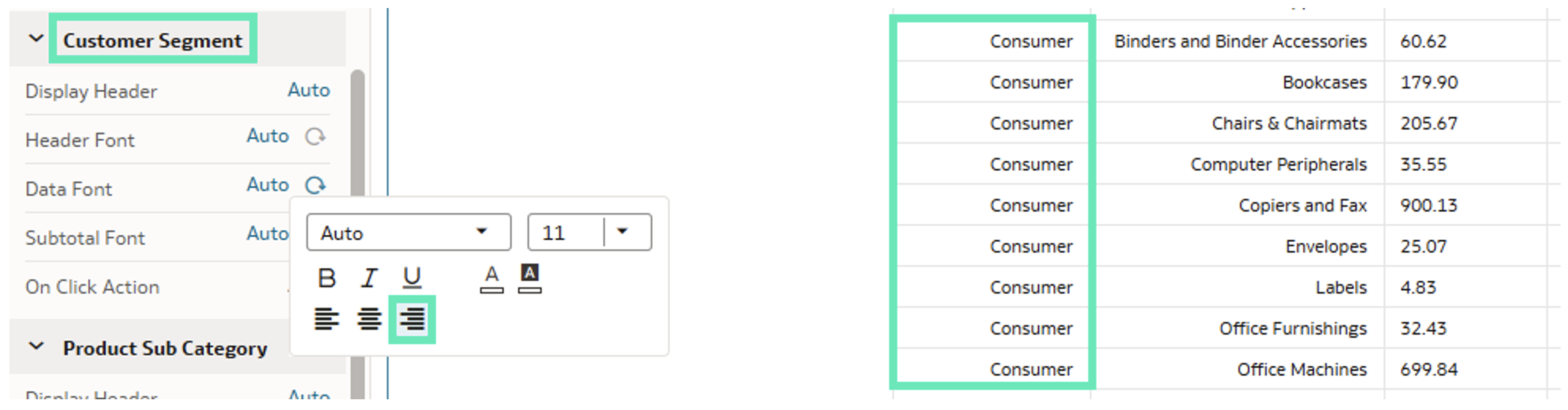
Figure 32: Column Right Alignment
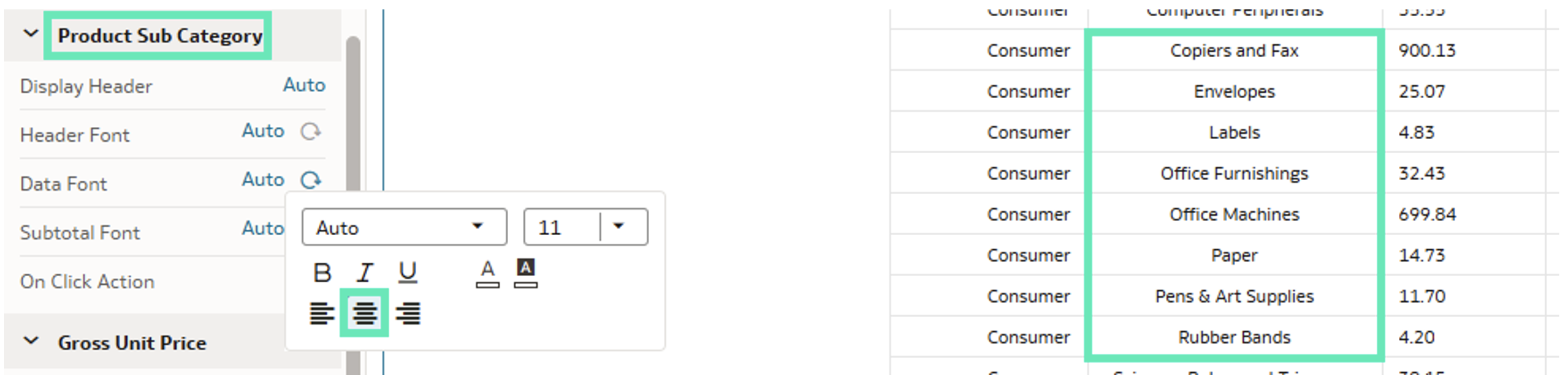
Figure 33: Column Centre Alignment
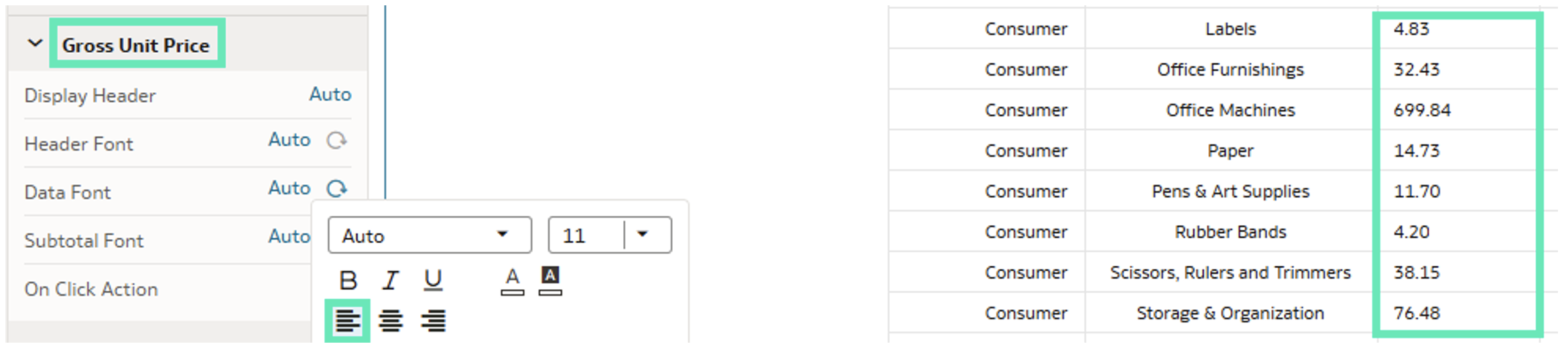
Figure 34: Column Left Alignment
This simple but effective addition to design properties provides customers with the flexibility to adapt tables and pivot tables to their specific requirements. By allowing greater control, Oracle ensures that reports not only deliver accurate results but also remain readable and visually consistent.
Use Derived Date Columns with Subject Areas
As previously introduced in datasets, this update brings derived date columns to Subject Areas. For any Date, Time, or Timestamp column in a Subject Area, Oracle now automatically derives multiple date granularity levels:
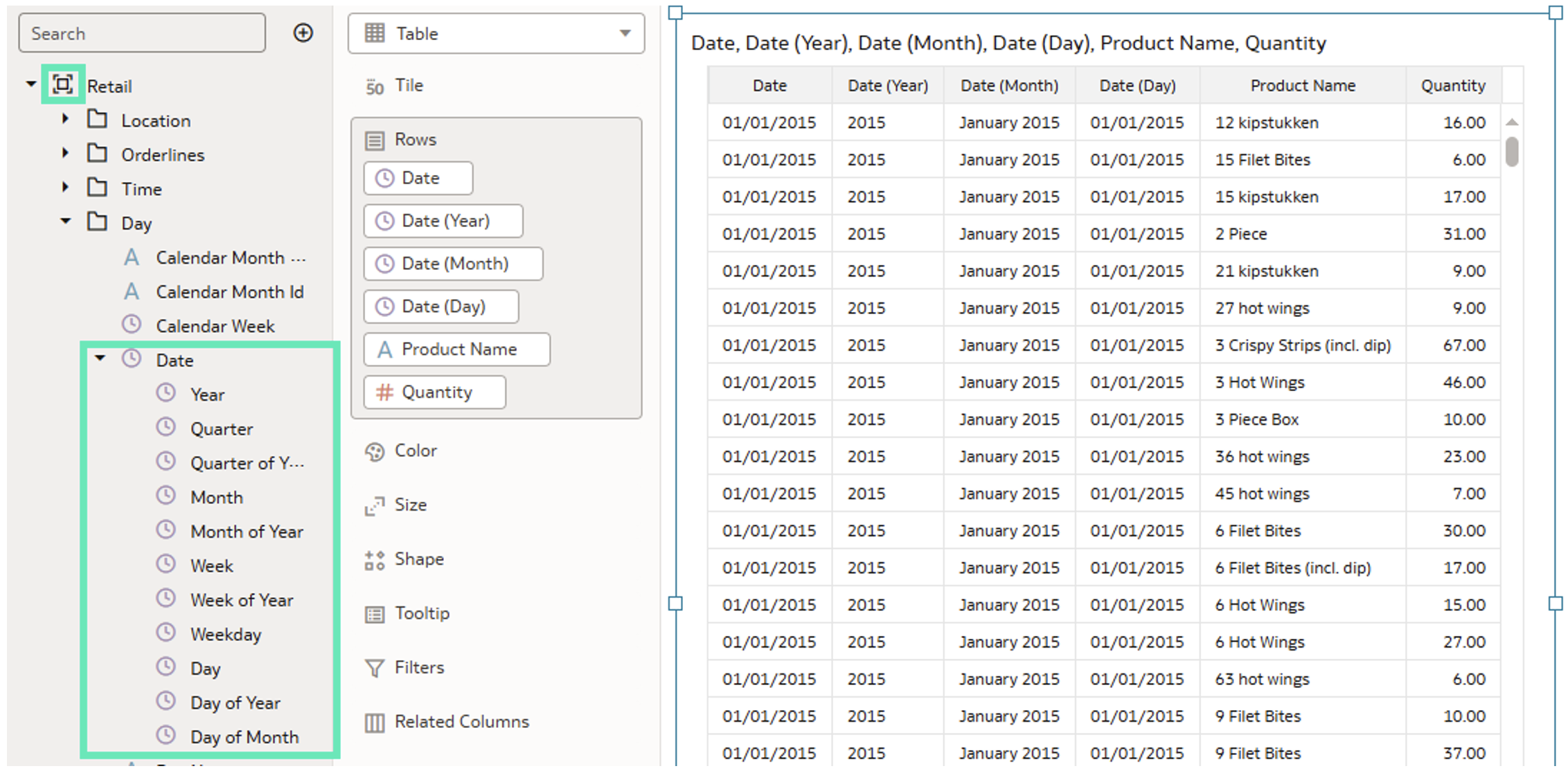
Figure 35: Derived Date Columns
These columns can be used in the filter dashboard bar, and all the filter bar properties can be applied to them:
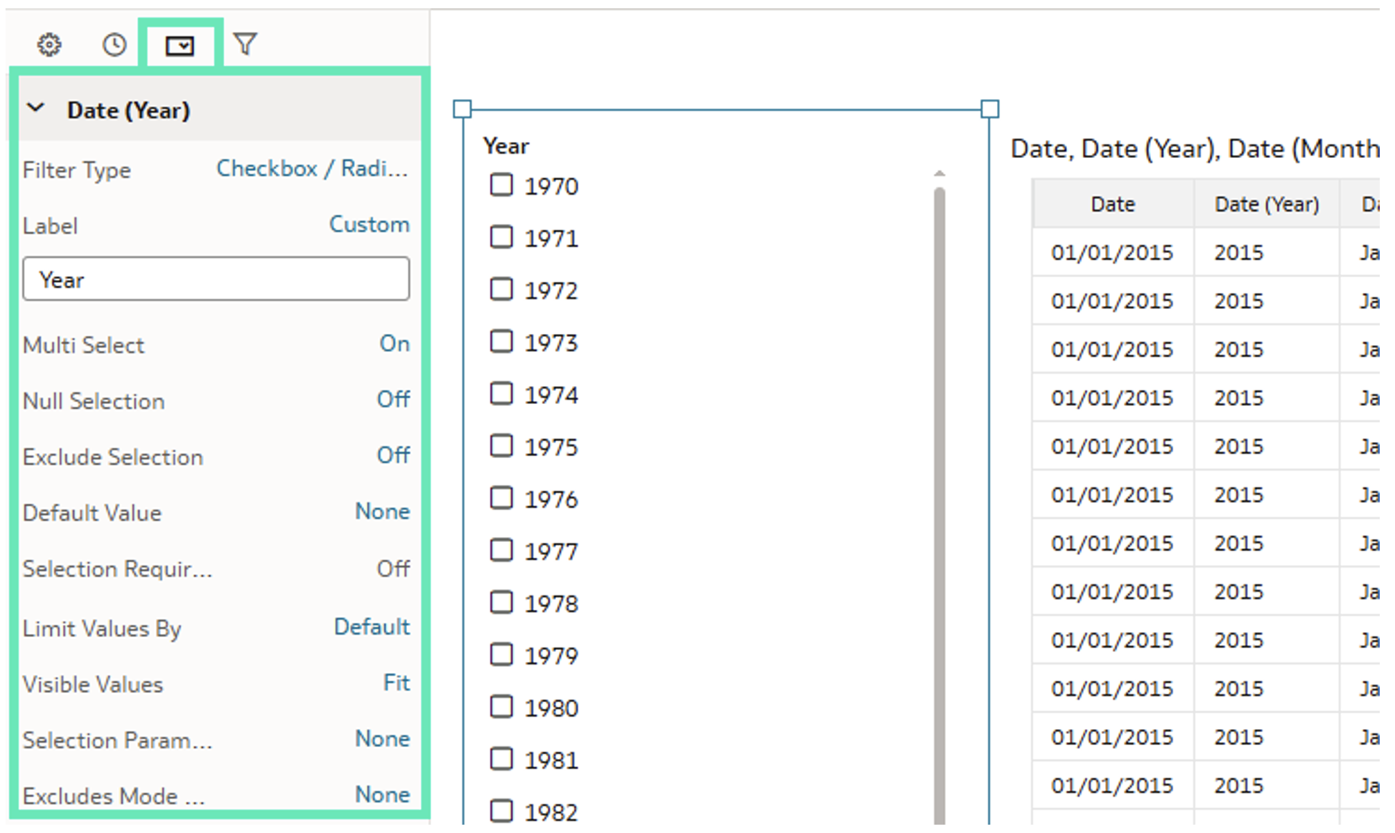
Figure 36: Filter Bar Properties
By using derived date columns, users can now adapt time-based analyses to the specific time intervals used in their business, without manual calculations or dataset modifications, providing a powerful way to accelerate business decision-making.
Select Individual Cells in Table Visualisations
This release introduces a simple but valuable improvement: the ability to select individual cells in tables, meaning that users can now copy specific cell values without selecting entire rows and columns. There are several ways to use this feature:
The simplest one is to just point to a single cell and click on it:
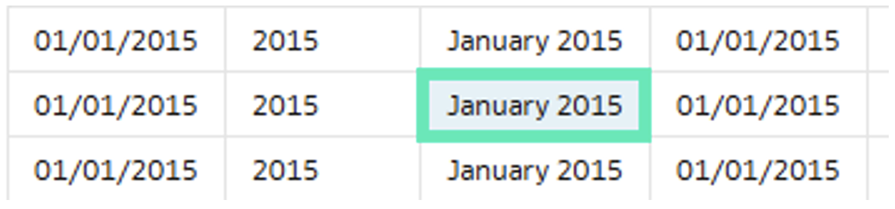
Figure 37: Single Cell Selection
By clicking on a cell and dragging, you can select multiple cells:
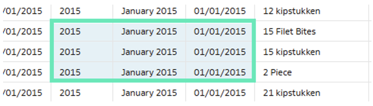
Figure 38: Multiple Cell Selection
And by pressing the Control or Command key, users can expand their selection or select multiple groups of cells by creating a highlighting frame:
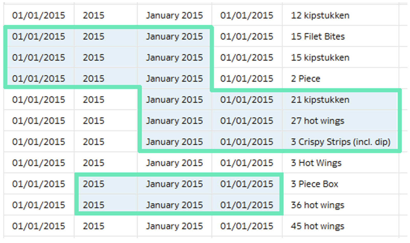
Figure 39: Multiple Group Selection
When you need to select a large block of cells, start by selecting the top-left corner cell, then press the Shift key and select the bottom-right corner cell of the target range:
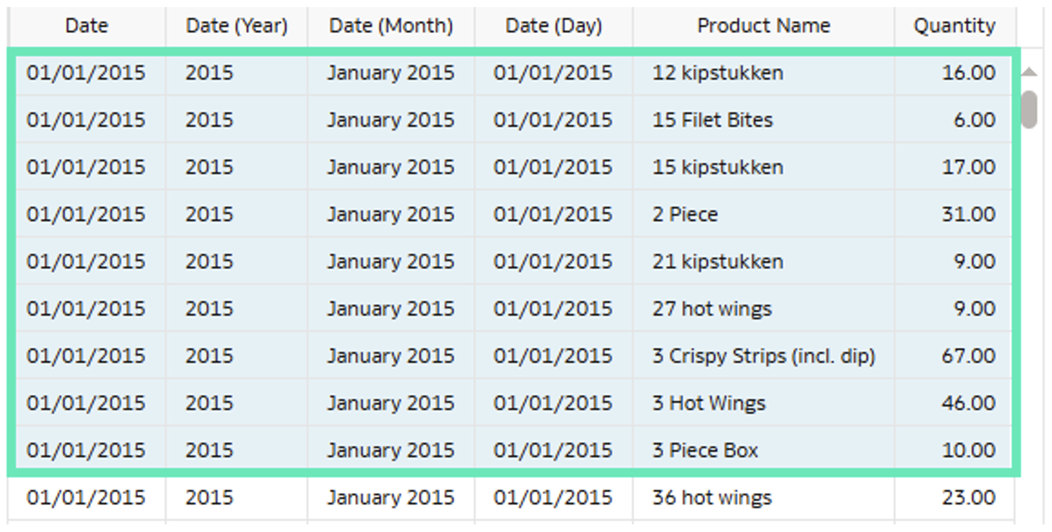
Figure 40: Big Area Selection
These cell selection combinations add precision and make it easier to quickly capture, highlight, or reuse specific information. This enhancement shortens the gap between data analysis and business action.
Filter Data based on Columns in Multiple Tables
Oracle has also extended Dataset Editor capabilities by adding the ability to apply filters using columns from multiple datasets. Previously, filtering was available only at the visualisation level when creating a workbook.
Click on the Filter icon on the top bar, then click on the Plus + icon to open the Expression Editor:
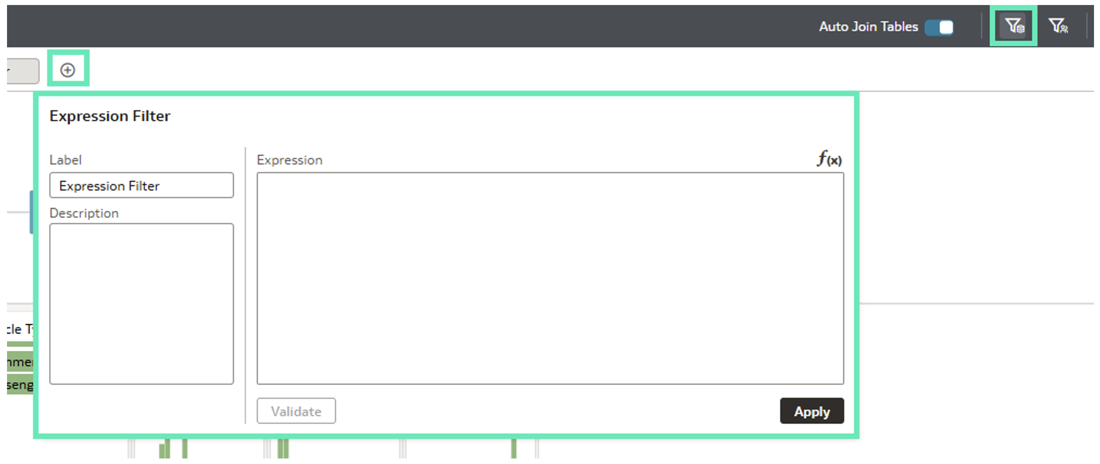
Figure 41: Filter Expression Editor
A single expression filter can include columns from multiple tables:
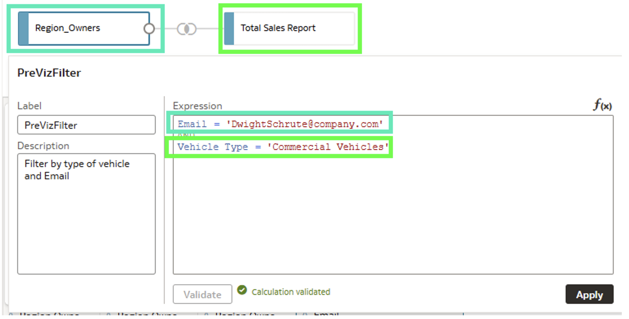
Figure 42: Filter Expression
After saving the dataset and switching to workbook mode, the filter is automatically applied and the filtered data is displayed:
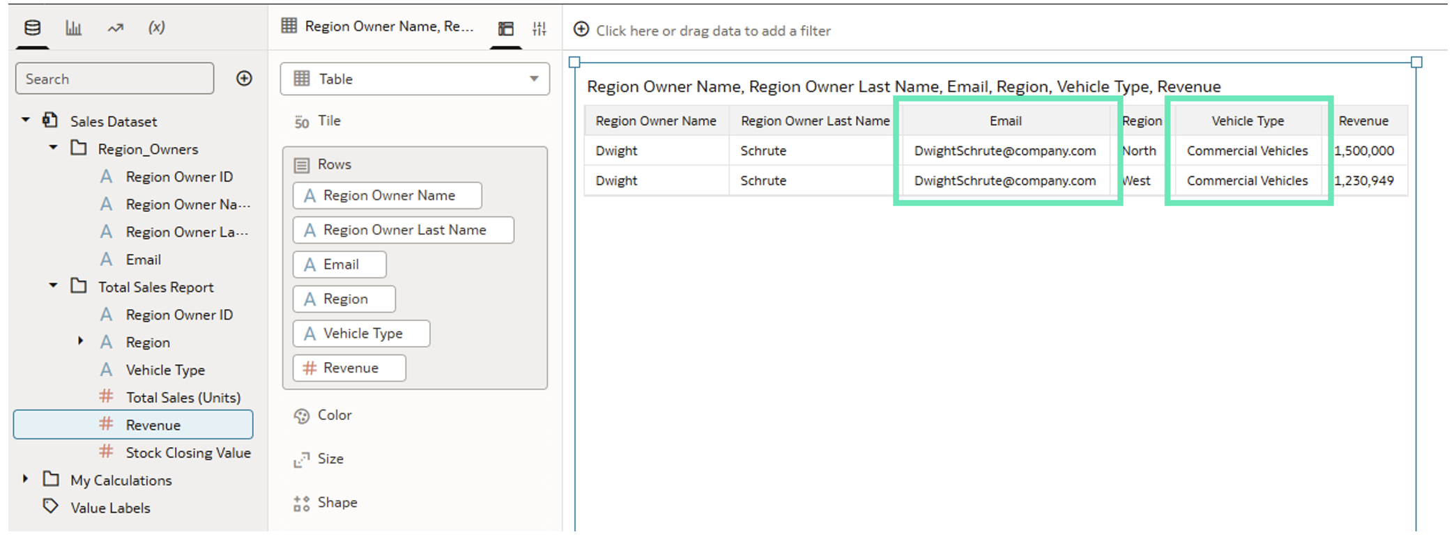
Figure 43: Filter Result
This Dataset Editor upgrade is especially useful when working with complex data models containing multiple tables. Filtering data during the data modelling step can improve consistency and reduce repetitive filter setups across multiple workbooks.
Conclusion
The Oracle Analytics Cloud September 2025 update continues Oracle’s steady pace of innovation, delivering upgrades and enhancements that make analytics more intuitive, flexible, and intelligent. From the ability to create Mekko charts, smarter data preparation with AI-assisted column naming, to better control over datasets, formatting, and geospatial capabilities, this release empowers users to work faster, collaborate more effectively, and uncover insights with greater precision.
It also highlights Oracle’s continued focus on AI, usability, and productivity, making it easier and quicker to transform raw data into actionable insights. Whether you’re analysing spatial data, refining datasets, or enhancing the app-like feel of your workbooks, these improvements help to save development time and support faster decision-making.
Here at ClearPeaks, we specialise in delivering cutting-edge OAC solutions that help organisations to unlock the full potential of their data. Our consultants combine deep technical expertise with business understanding to design scalable, future-ready analytics environments that drive smarter choices. Whether you’re looking to optimise dashboards and visualisations, collaborate more efficiently with Watchlists, strengthen your security model, or accelerate your time to insights, our expert team is ready to guide you every step of the way, so reach out to us today!