20 May 2026 How to Design Better Dashboards: UI/UX Tips & Best Practices
For most businesses and organisations, the problem isn’t having enough data but making sense of it. That’s where dashboards come in: when done right, they can transform complex datasets into actionable insights to support better decisions, but when done poorly, they’re just visual noise without any clear purpose.
It’s a common scenario we all know well: you’ve got lots of quality data, but no clear objective for using it. Here at ClearPeaks, we don’t just design dashboards that look modern. We design dashboards that deliver real business value and answer the questions that matter the most. Let’s see how we turn data complexity into clarity.
Key Questions Before Designing a Truly Effective Dashboard
What exactly is a dashboard? Basically, it’s a curated collection of visualisations that display relevant data to keep the user informed. For example, a green energy company could use a dashboard to check how much power their solar panels are generating, whilst a gas company could use one to quickly identify any issues in their pipelines.
But what makes a dashboard a genuinely useful tool? As the data visualisation and business intelligence pioneer Stephen Few said, a dashboard is “a visual display of the most important information needed to achieve one or more objectives, consolidated and arranged on a single screen so the information can be monitored at a glance”. In short, a successful design has one primary objective: to empower the user to interpret complex information instantly in order to make agile, confident decisions.
To achieve this, we must begin by asking the right questions. If we only display numbers and graphs that look nice on the screen but don’t offer clear answers that help to make good decisions, we’re not meeting the user’s needs.
This is why so many dashboards fail before design even starts. Before choosing charts, layouts, and colours, we need to understand the real purpose of the dashboard, and the following questions are the key to understanding the user’s needs.
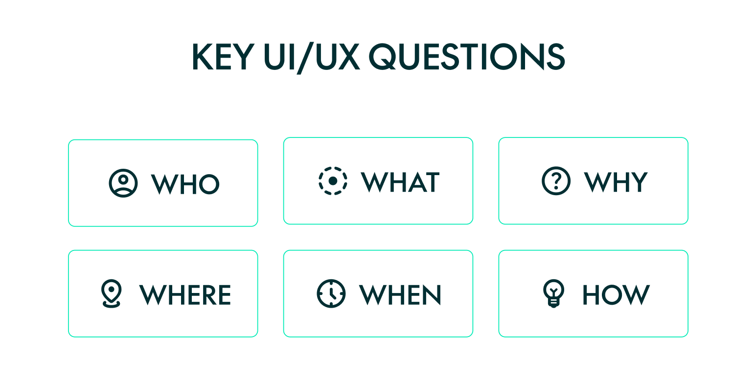
Who?
This is the foundation of every effective dashboard: it is essential to understand who will actually use the product, their level of expertise, their goals, and their daily workflow.
Who is the user? Who are we designing for?
The dashboard must be specifically designed for its target user. A C-level executive needs a high-level overview, showing trends and KPIs to support decision-making, but an analyst needs granular, actionable data with filters for deeper exploration.
That’s why we need to identify the user persona, along with their needs, goals, and pain points.
What?
We need to define what the dashboard is meant to achieve: this means understanding user goals and any potential challenges.
What does the dashboard need to do? What should it include? What should it allow the user to do? What’s the main problem we are trying to solve?
The focus of design is finding solutions to problems, so we need to understand what the problem is in order to find the best solution. For example, a green energy company that operates multiple solar farms collects real-time data on energy production. However, when output drops, the operations team struggles to identify the cause. The problem is not a lack of data, but a lack of visibility into performance issues.
So, what should the dashboard do? It needs to help the user to answer questions such as these: are all sites producing as expected? Where exactly are the performance drops? Are there any anomalies that require immediate attention? The dashboard should provide real-time production metrics, comparisons across locations, and the ability to drill down into specific sites. Its purpose is not just to display data, but to help teams to identify issues as quickly as possible and then take action.
What information is absolutely necessary and what can be omitted to avoid overloading the interface? What’s the single most important metric?
It’s crucial to filter the information given to the user: too much information means cognitive overload, leading to delays in decision-making. We also need to determine the information hierarchy, because if everything is highlighted, nothing stands out as important. Needless to say, choosing the right type of chart or visual to represent the content clearly is another essential element in designing an effective dashboard, and we’ll return to this in depth in future posts.
What actions should this data trigger?
A dashboard shouldn’t just be read; it should help to drive decision-making. What is the user supposed to do after seeing the data?
Why?
To create a successful dashboard, we need to understand its purpose, value, and the business motivation behind it.
Why do I need to create this dashboard? Why should the user use it? Why does it have this specific functionality?
Without a clear purpose, dashboards are just collections of charts and metrics that look informative but fail to deliver real value. We need to make sure everything on the screen is there for a reason.
Imagine that a team is wasting hours every week analysing data through messy Excel sheets. Because this process is so slow, they cannot make quick, smart decisions. In this case, the reason behind the dashboard is crystal clear: to save time and provide clear data so they can make better choices fast.
Where?
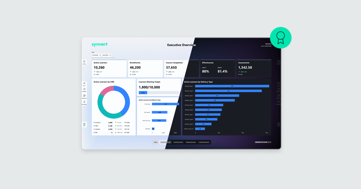
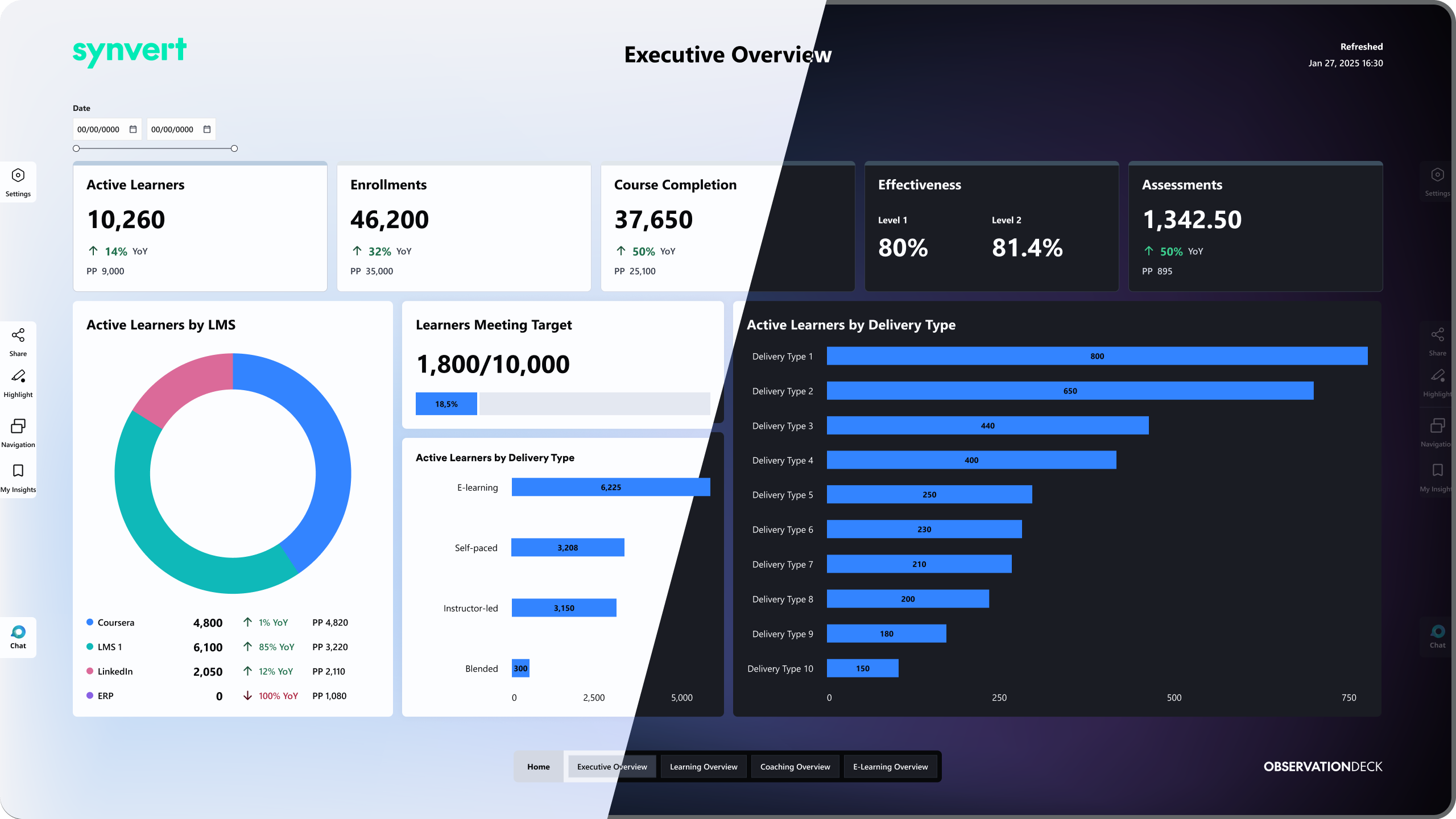
It’s important to identify the environment where the dashboard is going to be used. Is it going to be used on the go? If so, we’d need a mobile application. Is it going to be used on a big screen in a meeting room? Then we should use something like our own Observation Deck solution.
The experience defines the outcome: sitting in a meeting room with other stakeholders is very different from checking the dashboard on your phone on the way to meet a client. Each scenario has specific needs and solutions. That’s why a modern dashboard must be responsive and easily consumable across various devices, adapting effortlessly from large screens and desktop monitors to mobile.
Where will the user be when using the product? What device will be used: mobile, tablet, or desktop?
The dashboard’s physical context also matters. Sitting in front of a large monitor in a quiet office when the sun has already set is not the same as walking down the street on a sunny day, so the ability to switch from dark to light mode according to these conditions will help improve the experience greatly.
When?
Understanding when the user interacts with the dashboard helps to define the level of detail and functionality: a dashboard that is used several times a day is not the same as a dashboard that is used on a weekly or monthly basis.
How often will the user check the dashboard?
If the user checks it daily, they need real-time alerts to fix problems right away. On the other hand, if it’s checked monthly, they’re building long-term strategies, analysing historical trends to understand past performance and plan the future.
How?
Once these questions have been answered, the next step is to define how the dashboard will function in practice. This means turning user requirements into an effective interface by structuring data, designing navigation, and establishing clear hierarchies and patterns. Our goal is to ensure that the dashboard operates as efficiently as possible and offers maximum ease of use.
How will the user navigate from the moment they open the dashboard until they complete their task? How should the user feel when interacting with it? Is a quick glance enough? Can they trust their interpretation of the reports?
These are the questions we have to consider, and the answers will make a massive difference to the end result.
The Principles Behind an Effective Dashboard Design
In UI/UX design there are countless best practices, rules, and frameworks that help us to create digital products, from the usability heuristics of Nielsen to the Gestalt principles. All of these are fundamental to designing a successful dashboard, and below we’ll look at the most important ones and see how to apply them in practice.
Telling a Story with Data
When we design, we can’t just fill the dashboard with data: we need to tell a story. Data becomes powerful when it shows progression, context, and relationships. Instead of looking at isolated charts, the user needs to understand what is happening, why it is happening, and what could happen next. This is how data becomes genuinely useful. The user needs to see the big picture first, with the complex details revealed gradually: start with a clear overview, develop the problem, and finish with a resolution.
Less is More
We tend to forget this when designing, but every element on the screen is competing for attention. If everything is emphasised, nothing is. As the architect Ludwig Mies van der Rohe famously said, “less is more”. The user should never have to work hard to understand the dashboard. Reducing the cognitive load means removing what we don’t need and keeping just the essential information. This is not only about aesthetics; it directly affects how the user interprets information. A crowded screen means slower decision-making, because if you are not sure where to look, it takes you longer to act.
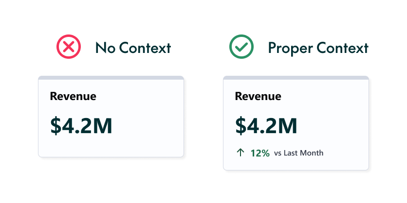
The Simpler, the Better
When designing a dashboard, we need to make it as simple as possible for the user. We shouldn’t make them do mental arithmetic. Instead of showing sales for this year and last year separately, for example, the dashboard should show the comparison directly, with a clear green label saying “+15% vs previous year”.
Nor should we force the user to remember values from other screens. If these values are needed for context, they should always be visible, in summaries or comparisons.
Function over Flash
Psychology shows that visual perception is heavily influenced by our existing mental models. Whilst a dashboard should be visually appealing, clarity must always come before aesthetics. This is why standard graphics, such as bar charts or line graphs, are almost always easier to interpret than overly complex, flashy visualisations. Remember: a chart that looks impressive but takes minutes to decode is a design failure.
Guiding the Eye
The human eye naturally tries to follow lines, curves, and smooth visual paths. In the West, for example, we read from left to right and from top to bottom, so the most important content should generally be placed in the upper-left corner. This natural scanning behaviour creates what we call the “F-pattern”, and designing around it is one of the most effective ways to establish a clear visual hierarchy. This tendency to follow a path is so strong that the brain even fills in missing information logically.
As we can see in the column chart below, our eyes naturally follow the sequence of the timeline. Even if one bar contains no data, leaving an empty space where the bar would normally appear, we don’t get confused. We still recognise the pattern, and the brain instantly understands that the empty space means “zero” because the visual continuity of the chart tells us so.
On the other hand, if elements are misaligned on the screen, the visual flow breaks and a major problem appears: the human brain has to work much harder to connect the information. This is exactly what we want to avoid.
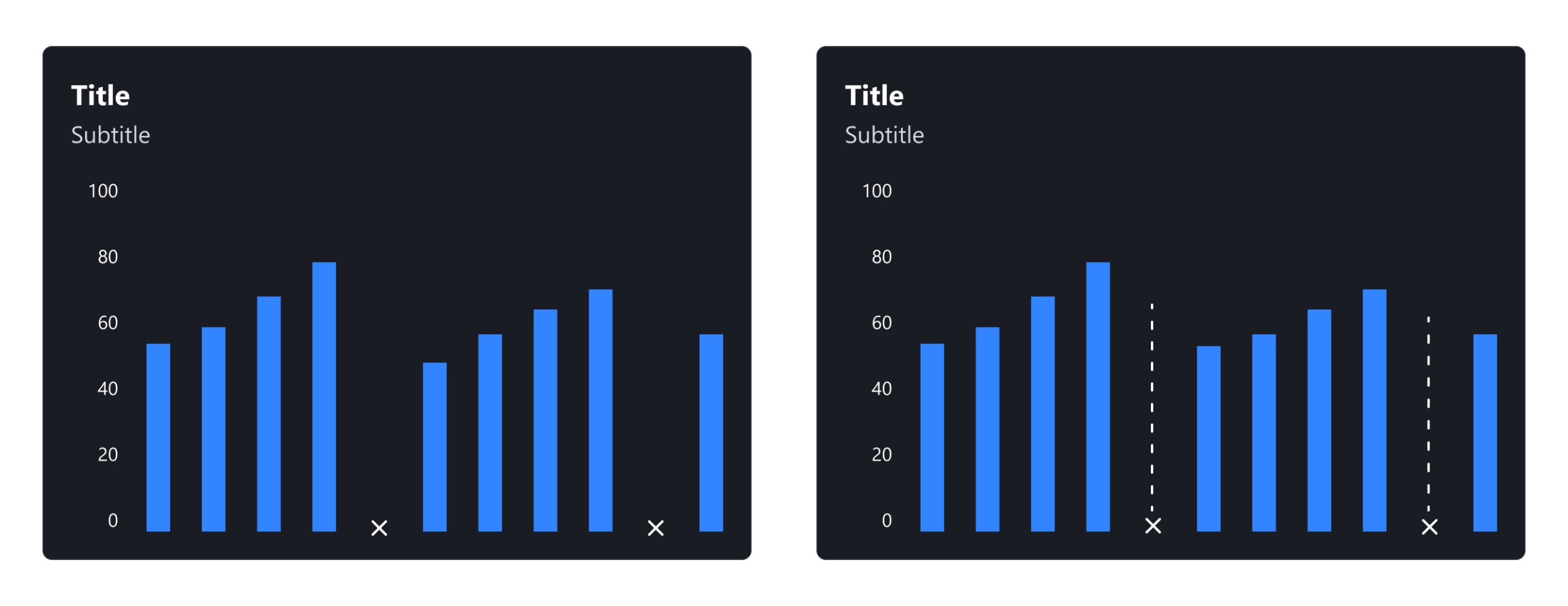
Example: We are able to see continuity in a bar chart. Even in months where there is no data, we recognise a pattern.
Use Visual Cues
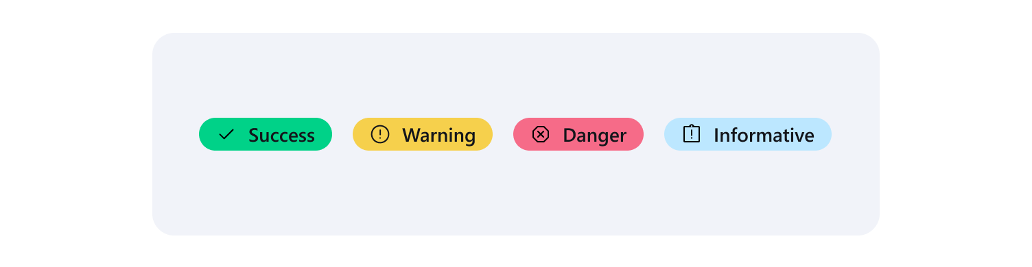
Elements that share visual characteristics, such as colour or shape, are automatically perceived as related. This is how data communicates a precise message. For example, by using a simple traffic-light system, dashboards can send an instant, obvious message without forcing the user to read the actual numbers: red usually means “needs attention”, whilst green means “performing well”.
Quick tip: always pair the colour with an icon to ensure the message is clear to everyone, including users who cannot distinguish the colours.
Proximity Creates Meaning
Elements that are placed close to each other are perceived as belonging together. In a dashboard, KPI cards about related topics should sit next to each other, with the charts connected to those specific metrics placed directly below them, helping the user to connect the high-level summary with the detailed graphics without getting lost.
Consistency Reduces Mental Effort
Consistency in layout, colours, and interaction patterns allows the user to learn quickly and build reliable mental models. Once the user understands how one element works, it becomes much easier for them to understand another element if the pattern is the same, as they don’t need to relearn the interface. This is what makes the experience intuitive and reliable.
Designing for Everyone
According to the World Health Organization, over 2.2 billion people globally experience some form of visual impairment, so accessibility is never just an aesthetic choice. Designers must create interfaces with high contrast, readable typography, and a clear hierarchy, and should never rely solely on colour to communicate meaning. Accessibility is not only about permanent disabilities: needs can also be temporary, such as navigating with a broken arm, or situational, such as reading a screen in glaring sunlight.
It’s interesting to note that yellow is the most visible colour in the spectrum to the human eye. Because it stimulates the retina more strongly than other hues, it is often one of the last colours to “disappear” or turn grey for people with severe vision loss, and this is precisely why yellow is commonly used for critical alerts, warning states, and key data anomalies.
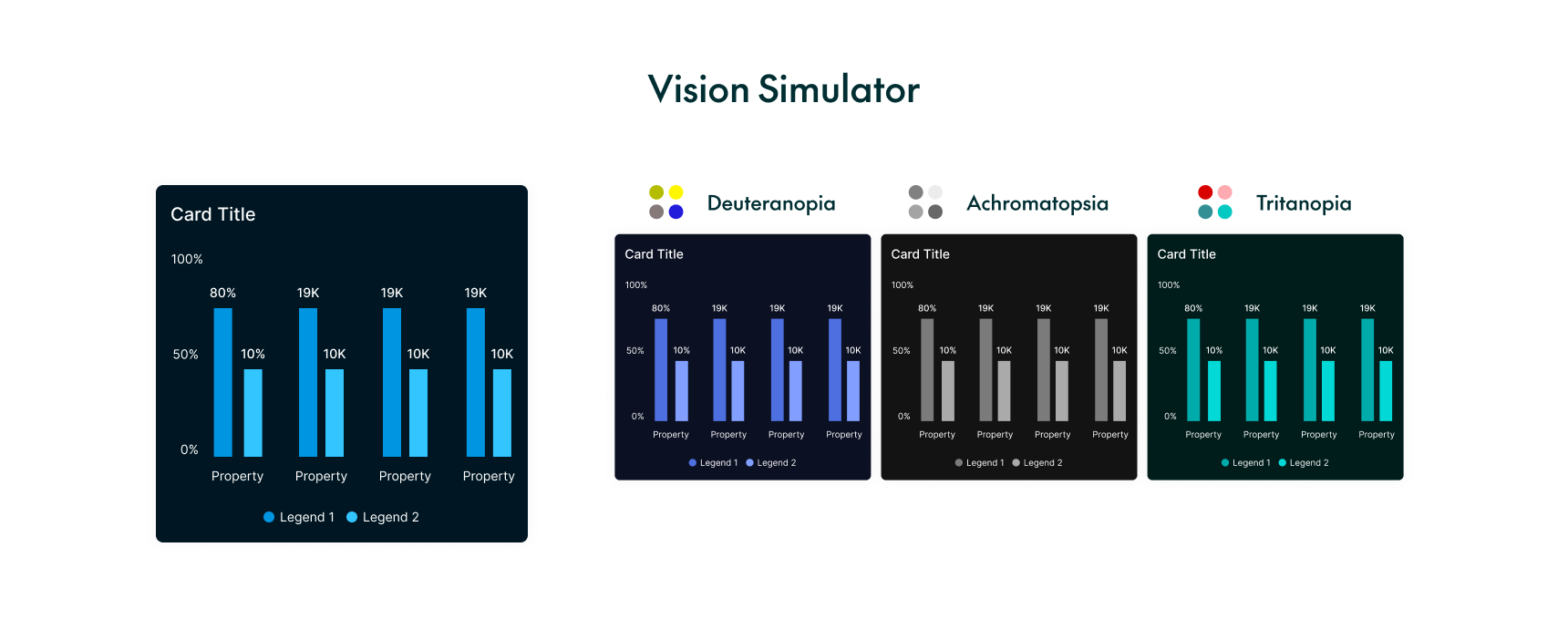
As we can see in the image below, people experience colour blindness in different ways, including deuteranopia, tritanopia, and achromatopsia. Everyone sees the screen differently, so designers must choose and test their colour palettes with these specific conditions in mind.
Now try to answer this question: Do the dashboards you rely on in your day-to-day work meet all these criteria?
Conclusion
Designing an effective dashboard goes beyond visual appeal: it directly affects how easily the user can interpret information, identify priorities, and make timely, informed decisions. A well-designed dashboard does not simply display data; it guides its user towards the right conclusions.
The dashboard design process begins long before opening Figma or any other design tool. It starts by asking the right questions to understand the user’s true needs, goals, and context. With this foundation in place, we can then apply design principles such as hierarchy, consistency, proximity, accessibility, and visual clarity to create a successful dashboard. It may seem obvious, but when under pressure to display large amounts of data, these rules are often overlooked.
At ClearPeaks, we help organisations and companies to transform complex data into clear, intuitive, and actionable dashboards that support better business decisions. Contact us to find out how we can help you!