10 Jun 2021 Building a COVID-19 tracker with CDP DataViz – Installing and Reviewing CDP Data Visualization
Continuing on the roadmap of Cloudera Data Platform (CDP) — the only hybrid-cloud, multi-cloud enterprise data platform built for the full data lifecycle, late last year Cloudera announced the general availability of their self-service visualisation tool called Cloudera Data Visualization (CDP DataViz), a tool that augments data exploration and analytics to more effectively share insights across the business.
In previous blogs, we covered other cool implementations of Cloudera like the Spinning up of a CDP Data Hub on Azure and Installing CFM and streaming data into Hive via Nifi and Kafka.
In this blog, we will focus mainly on the on premise version of DataViz. We will touch upon the installation details and how to enable DataViz for the creation of smart dashboards. We will also review some features of DataViz (since DataViz is such a vast tool, reviewing everything will need a series of blogs running into double digits!) and see how we can quickly deploy an intuitive application with a couple of dashboards on the COVID-19 dataset.
1. CDP Data Visualization
In an enterprise data platform, data will be in all shapes and sizes, coming in from numerous sources, be it batch or real time streams, thus making data exploration a challenging task. Trying to visualise this data using other third party tools is another challenge and involves integrations, and security and design constraints.
In comes CDP DataViz!
With DataViz, we can bring together and drive augmented analytics by surfacing visual analytics across all these sources of data. In a single dashboard or application, we can bring in a donut chart from a Hive DW, a bar chart from data in HBase, a table containing search history from Solr, and prediction results from a deployed ML model. Since DataViz is part of the Cloudera Data Platform, it integrates with all the services seamlessly.
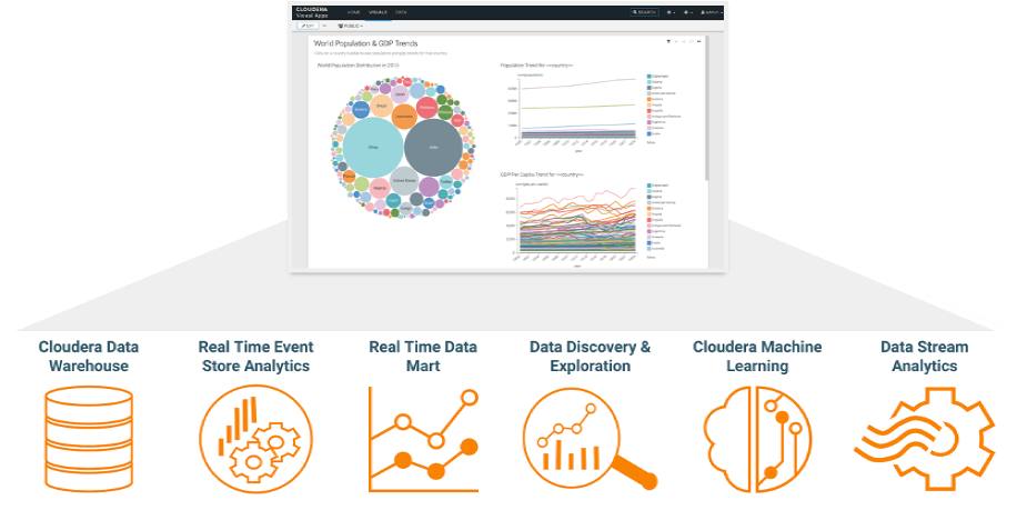
Figure 1: CDP Data Visualization Connects All Your Data Across the CDP Ecosystem
In short, DataViz enables:
- Fast, intelligent reporting – Rapid, out-of-the-box dashboarding and application building with built-in visual recommendations.
- Intuitive workflows, secured by SDX – Easy-to-use visual UI for fast data exploration and instant sharing anywhere without moving data or creating silos.
- Integrated data lifecycle collaboration – Accelerate insight sharing with a consistent, integrated data visualisation experience across all data and business teams.
It would be interesting to note here that DataViz isn’t primarily meant to compete with BI tools (though it has the capabilities to be used for that, which we will see later). Instead, it’s meant to provide in-situ data visualisation capabilities that analysts and data scientists can use without having to leave CDP. The visualisation assets can be packaged and run as applications, thus far exceeding the more rudimentary data viz capabilities built into Jupyter notebooks or similar.
CDP DataViz is available on both the Public and Private Cloud with the latest release in April 2021. It is available as an experience in the CDP Public Cloud, while the on-prem version is available via a runtime engine deployed inside Cloudera Data Science Workbench (CDSW).
2. Installation
The on-prem version of DataViz can be deployed as a project application inside CDSW since it is integrated with CDSW workflows. This makes CDSW a primary pre-requisite for on-prem DataViz. The installation and configuration of CDSW is out of scope for this blog post (let us know if you want a separate blog on that). For now, we will assume that we have a licensed and operational CDSW service on our CDP Cluster.
First, we will add the latest docker image available for DataViz from the Cloudera Docker Repository in the Engines tab of the Admin section. We will need to do this with a user that has admin privileges on the CDSW instance.
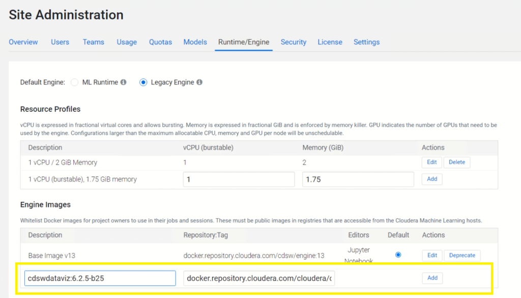
Figure 2: Adding the DataViz docker image
Next, we create a new project (we can also use an existing one), and in the Engine table inside the Project Settings section, we select the newly added DataViz engine.
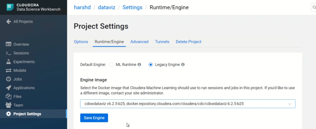
Figure 2: Select the newly added DataViz engine
Next, in the same Project, we will create an application with the below details:
- Name – DataViz Demo
- Subdomain – datavizdemo
- Description – Demo for CDP DataViz
- Script – /opt/vizapps/tools/arcviz/startup_app.py
- Engine Kernel – Python 3
- Engine Profile – 2 CPU / 4 GB Memory
Once we create the application, the Docker image is pulled from the Cloudera repository and deployed in the project. This will take some time during the first run. In a few minutes, the application status will change from Starting to Running.
We can now access the DataViz web interface using the subdomain we entered in the previous step.
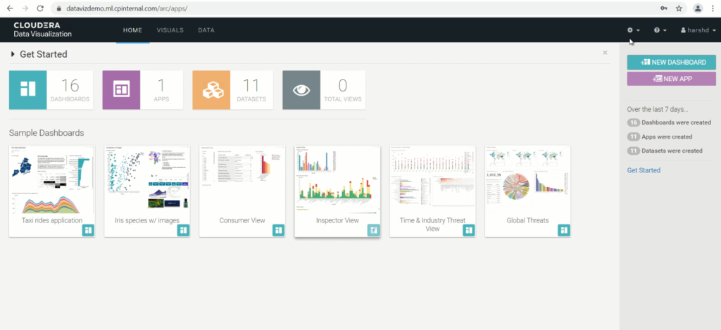
Figure 4: DataViz web interface
The DataViz does come with sample datasets and dashboards which can be used for self-exploration. This sample data resides in a MySQLLite database shipped with the Docker image.
3. Authentication
Cloudera Data Visualization by default uses local account (basic) authentication where users must be created manually through the UI, using the default admin user.
This authentication method can be supplemented to also enable LDAP authentication, so that corporate credentials can be used to log into DataViz instead.
These settings can be changed by using a script after navigating to Advanced Settings under Site Settings. The template for the script is available at Configure LDAP for DataViz and can be implemented after changing basic AD details as per environment.
DataViz can also use SSO authentication to leverage CDSW users already logged into the system. SSO authentication is disabled by default. This can be changed by navigating to the User Passwords section under Site Settings and selecting Permit Authentication via REMOTE_USER. This will permit user login using CML/CDSW login credentials and log users in automatically to DataViz.
4. Reviewing Dataviz by Building a COVID-19 Tracker
As we mentioned, DataViz is bundled with numerous features to build visual applications which cannot be reviewed in one go. To cover as much as we can, we will build a simple COVID-19 Tracker application with a couple of dashboards.
4.1. Data Connection
First things first, we need data and a connection to it.
We have sourced data from the ourworlddata website on the latest COVID-19 statistics as of 1st May, 2021. This the download link for the dataset. We pushed the data into our Hive warehouse and created a Hive table on top of it. We will skip these details as they are not part of the DataViz review.
We must now connect to our data prior to using the data modeling and visualisation framework of CDP Data Visualization. This can be achieved from the Data tab on the Top Navigation bar.
Click on Datasets → New connection. This opens up the Create New Data Connection modal window.
Select the Connection type as CDW Hive and enter all details of the Hive instance in the Basic and Advanced Tabs.
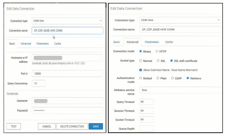
Figure 5: CDW Hive Connection parameters
Test the connection and save it.
We can explore the newly added connection and all objects under it via the Connection Explorer.
Next, click on New Dataset and select our source database and table for now, and save this dataset. We can also provide SQL as a source for the dataset.
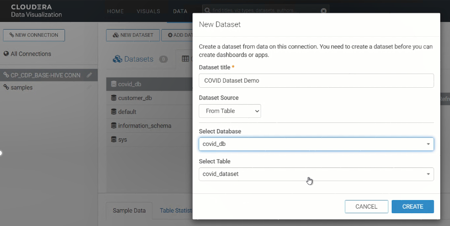
Figure 6: Creating a New Dataset
There we have our dataset to play with!
4.2. DataViz Objects
It is important to understand the below hierarchy of objects in DataViz before building a DataViz application.
Visuals → Visual is the basic, single unit of visualised data, e.g., a pie chart.
Dashboard → Dashboard is a collection of multiple visuals with optional filtering applied.
Application → Application is the collection of one or more dashboards tied together. An application can be launched as a standalone data visualisation tool in itself.
Now, we can start building our application. Click on the Visuals Tab from the top navigation bar, and then New Dashboard. This opens up the Dashboard Designer interface.
4.3. Building a Visual
Let’s build our first visual.
We select our dataset and click on Create New Visual. This will open up the Visual Designer which will display all dimensions and measures identified in the dataset. It also has a set of out-of-the-box visuals from which we can choose the best fit for our data. For our visual, we will choose the map. Based on the visual chosen, we will have to populate the shelves in the Visual Designer. In case of a map, we select the ‘location’ field as our Geo shelf.
In the Color shelf, drag the ‘new_cases’ measure. The default aggregator function used for all measures is sum, but it can be changed from the field properties section.
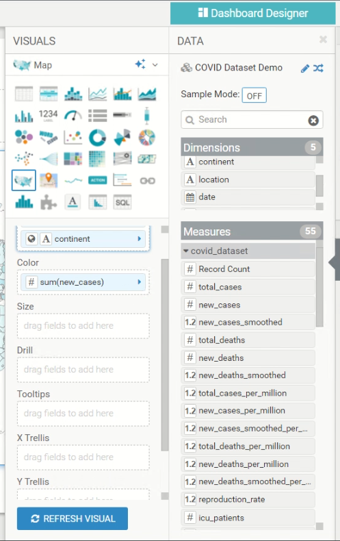
Figure 7: Visual Designer
Since ‘location’ is a string and not defined as a geo type, it will give an error. DataViz provides an option to change the type of the field to Geo Type at build time. Click on ‘location’ field in the Geo shelf to open Field Properties. In the Change Type section, select Country to denote that ‘location’ field values can map to Countries on a map.
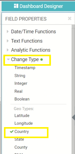
Figure 8: Field Properties – Changing Geo Type
Now, we will add a relative date filter to refer only to the previous day’s data. This will apply a dynamic filter to visualise new cases in each country based on the previous day’s data, considering the underlying tables get refreshed with new data every day. This will add the live quality to the dashboard as opposed to a static date filter.
For this, we will pull the date field in the filter shelf, and open its Field Properties. In the Select Values pop up, we will select the below options.
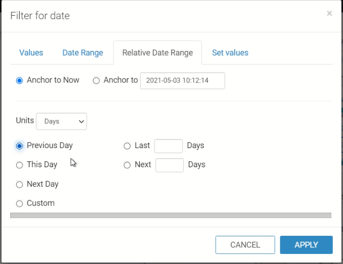
Figure 9: Relative date filter
Now click on Refresh Visual to have our Map on the dashboard to denote new COVID-19 cases by Country.
4.4. Explore Visuals Options
Once we create the visuals, DataViz allows us to explore how this visual might look in different visuals, different colours, or different styles/fonts. To try this, click on the Explore Options icon on the top left of a visual and select the appropriate option. This really is a cool feature for quick comparison of various visual styles on the same dataset, and allows the user to choose the best fit in minutes.
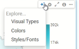
Figure 10: Explore Visual options
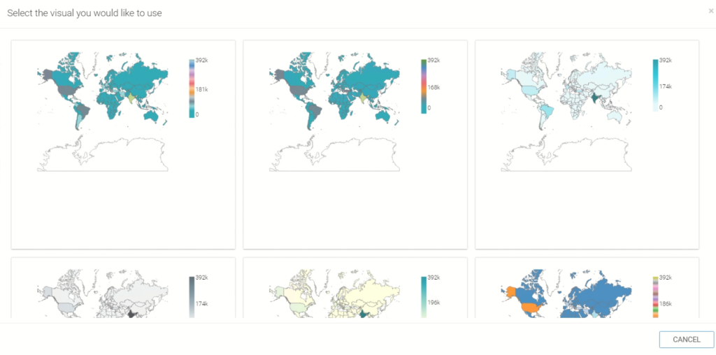
Figure 11: Explore Visual options
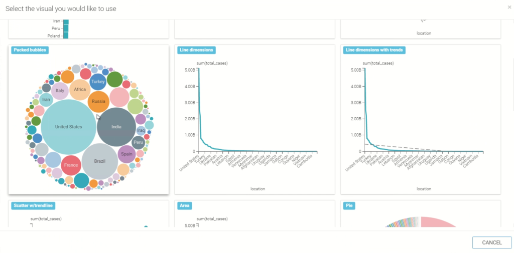
Figure 12: Explore Visual options
Similarly, we will create a Packed Bubble visual to denote Country wise total COVID-19 cases.
Now, let’s try the Dashboard level filter.
4.5. Dashboard Filter and Customisation
DataViz allows users to add filters at a dashboard level that enable all the visuals of the dashboard to filter data based on the selected values. We will add a filter from the Dashboard Designer Panel’s Filter tab. We select the dimension or measure we want to use as a dashboard filter. Let’s select ‘location’ field. This will allow us to filter our dashboard by selecting multiple countries, and compare data amongst them.
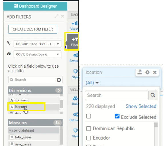
Figure 13: Dashboard Filter
Now, some final touches to the dashboard. We change the Title and subtitles of the dashboard from the title textbox on top.
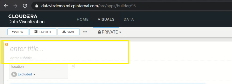
Figure 14: Dashboard title and subtitle
We can also change styles including font and colors, or apply custom css using the Style tab in the Dashboard Designer panel.
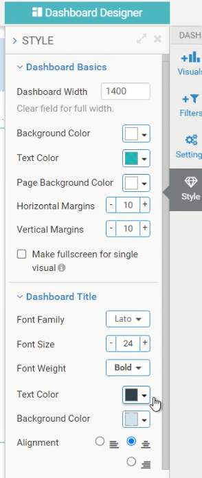
Figure 15: Customizing Styles for Dashboards
Finally, we save this dashboard into a workspace. Oh yes, the workspace!
4.6. Workspaces
CDP Data Visualization uses workspaces to manage both security and organisation of data visualisation in enterprise organisations. When you create a visual, it is automatically saved in your private workspace and can only be accessed by you (and the administrators). If you want to share your visuals or dashboards with specific users or a user group, move them to a custom workspace or move it to the public workspace if you want everyone to access it.
Now, we build another dashboard with 2 visuals to showcase country wise vaccination information, but we will skip the details to not make this blog a drag! You can easily use the information provided above and the Cloudera DataViz Docs to render the visuals.
The final step is to build a standalone application consisting of the 2 dashboards.
4.7. DataViz Application
Navigate to Homepage and select New App from the panel. This will open the App Designer interface. In the App Navigation tab, select the dashboards we created and enter tab title to be displayed on the navigation bar in the app. Give the app a name and save it – and you’re done. You can modify application-level settings using the App Designer panel which allows customisation such as adding a custom logo, changing style/fonts, background colour, etc.
![]()
Figure 16: App Designer – upload custom logo
We can now open the application from our home page. It will open as a standalone app with 2 tabs, each representing your dashboards and the visuals you built. The dashboard filters can be used to filter the data. The visuals are interactive, and you can drill down or view raw data by clicking on specific values of the visual.
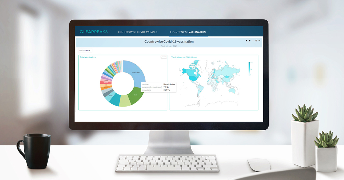
4.8. Covid-19 Tracker App on DataViz
Below is the preview of the application we just built.
![]()
Figure 17: Covid-19 Tracker Application – Country wise casese
![]()
Figure 18: Covid-19 Tracker Application – Country wise vaccination details
4.9. Natural Language Search
The recent DataViz release also mentions the much talked about and awaited natural language search as a feature under Tech preview. So while it is not generally available, we can use it for our tech review. First, we will have to enable search in DataViz. For this, navigate to DataViz Site Settings, and under Features section, enable all the search features.
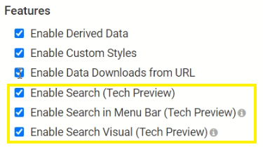
Figure 19: Enabling Search for DataVize
Now, we are able to see the search box in the top navigation bar.
![]()
Figure 20: Navigation Bar with Search field
Next, enable your dataset for natural language search. Navigate to the dataset from DATA → Select Connection → Select Dataset → Search Modelling → Enable search on this dataset.
Here, we can also define search group and include only those fields on which we want to enable search, and define search priorities.
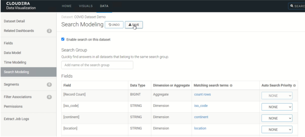
Figure 21: Search Modelling
From this point on, we can use the search bar to perform natural language searches on the dataset. An example of new_vaccinations vs new_cases per country using NLP is shown below. We did try different permutations to reach the final result, and can comment that the engine is rightly under Tech Preview. The NLP engine still needs some work to be fully operational.
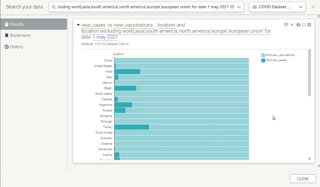
Figure 22: Visual with Natural language search
Conclusion
In this article, we have installed and reviewed the self-service data visualisation tool by Cloudera i.e. Dataviz (CDP Data Visualization). We also built a quick COVID-19 tracker application using DataViz, by leveraging our existing Hive DW in the CDP Base Cluster.
We have truly just touched the surface of a much more powerful tool by Cloudera. With features such as natural language processing, DataViz can really be the ultimate go-to tool for all users including business users, analysts, and data scientists for intelligent reporting, out-of-the-box dashboarding, and application building, with its easy-to-use UI for fast data exploration and instant sharing anywhere without moving data or creating silos.
We hope you found the reading useful and enjoyable, stay tuned for more articles like this!
Here at ClearPeaks, our expert and certified Cloudera consultants can architect and deploy the right set of tools for our customers to leverage. Please contact us if you’d like to know more about what we can do for you.