30 Sep 2013 Twitter and Oracle Endeca Information Discovery – Part 2
PART 2: Following up on the first part of Oracle Endeca Information Discovery
Endeca Studio analysis
After all the loading has been done, a new application in the Endeca Studio can be created with this new data. Then, some meaningful and dynamic dashboards can be created to start “surfing” that data and discovering interesting facts hidden among de hundreds of thousands of tweets that, otherwise, we had missed among the Twitter never ending stream. Let’s get to it.
Observing Messi and Neymar performance repercussion on Twitter
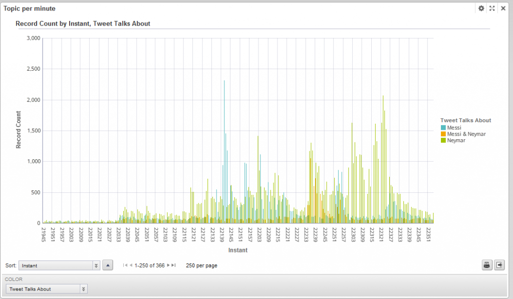
To observe the repercussion of the performance of the star players during the duration of the whole capturing window, the following multi-bar graph/timeline was created:
Figure 1. Messi and Neymar performance repercussion on Twitter
It shows how many tweets about Messi, Neymar or both of them where published over time (note that the “Instant” value is coded this way: “21945” means “Day 2 19h 45min”). The peaks at tweets record count mean that some important event has happened about the topic represented by the bar and, for that purpose, the tag cloud component is really useful. Tag clouds provide comprehensible information about the most frequent or relevant words or phrases in a certain attribute.
In our data domain we have two attributes that would be useful to see in that representation: “Tweet Themes” and “Tweet Words”. “Tweet themes” were extracted using the text enrichment engine and provide a meaningful way of understanding the contents of a tweet using a few words. “Tweet words” is just a list of the words inside a tweet and have no meaning by themselves. Building two tag clouds with both attributes provide an easy way of understanding what the tweeters are talking about at a glance. It is advisable to sort the “Tweet words” tag cloud by relevancy instead of by frequency since they are more intelligently weighted.
Let’s see some examples of tag clouds utilisation. At 21:41 (instant 22141) something happened with Messi because 2310 tweets where talking about him. If we click on that bar to filter by this instant and then look at the previously created tag clouds we observe the following:
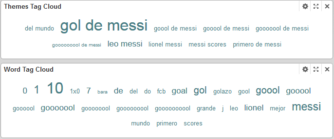
Figure 2. First goal instant tag cloud
We have easily found the precise instant at which Messi scored the first goal. At 22:36 there is a peak in the “Messi & Neymar” graph so let’s see why through the same process:
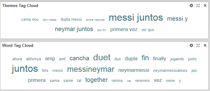
Figure 3. First time Neymar and Messi playing together instant tag cloud
People where excited because it was the instant at which Neymar entered in the field and it was the first time he was playing side by side with Messi. One more example of how easy it is to detect important events happening in a time line and identify the main reason using Endeca.
Sentiment analysis
The text enrichment component also provides sentiment analysis information that allows knowing if people are satisfied or not by observing how much positive or negative messages they are tweeting. Using the metric component this information can quickly be seen textually. We created one “Metrics Bar” using the following EQL query:
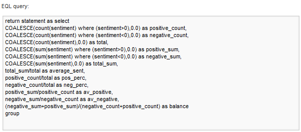
Figure 4. EQL sentiment query
The resulting bar can be setup as follows:

Many charts can be plotted to observe a sentiment attribute. Graphs in Figure 5 show two charts:
- The left one sums up all the sentiment evaluations of the two star players. We can see how the sum is positive for both of them, but it is almost three times more positive for “Messi”.
- The chart on the right side shows the sentiment evolution over time. Using the value axis dropdown menu, min (more negative sentiment), max (more positive sentiment) and avg (average of sentiments) graphs are plotted.
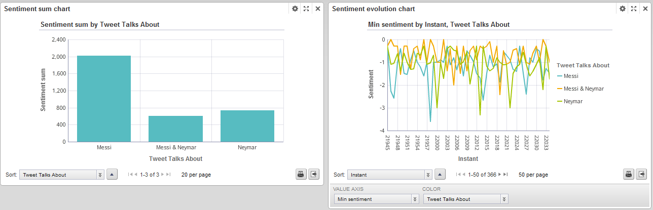
Figure 5. Sentiment sum and evolution charts
If we filter by the minute when Messi scored the first goal (21:41), we can observe how the global sentiment is very positive and the sum of sentiment of the tweets talking about Messi is very high:
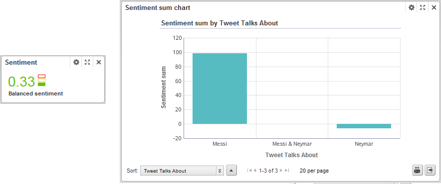
Figure 6. Global sentiment at a Messi’s goal
Where are the tweeters located?
Using the map component, the geographical coordinates embedded in the tweets can be used to place the messages in a map and know, in this case, from which countries the match is being followed. Since not all the tweets incorporate geographical location information, we can exclude the ones without that information using an excluding filter:
Figure 7. Excluding filter
The filtering can also be done from inside the map component using an EQL statement. In our example we used three different record sets inside the map to show, in separated tabs by sentiment, positive, negative and neutral tweets.
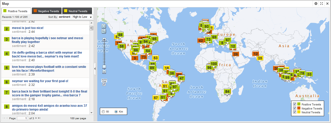
Figure 8. Tweets geographical distribution by sentiment.
Unstructured text search
The powerful Endeca search engine also allows textual searching through structured and unstructured data with some interesting features such as orthographic corrections or “did you mean” suggestions. Let’s suppose that we want to look at a certain event that happened during our capturing window time. Searching by “goal” and looking at the timeline graph, we can observe that the data peaks for the published tweets occur on the instants when the goals were scored. Additionally, an uncommon event happened during the match: someone from the audience jumped into the field. Searching the word “espontaneo” which is Spanish for “field invader”, we can identify that something regarding that term happened at 22:37 (instant 22237)and that it had something to do with Neymar (as the timeline in Figure 9 suggests).
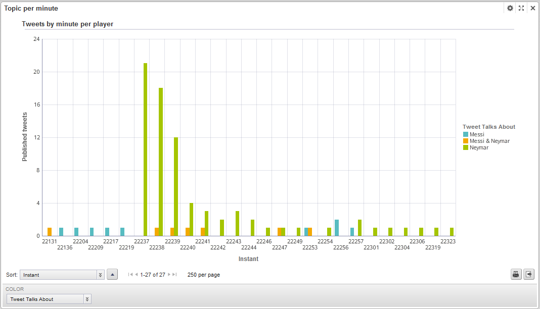
Figure 9. Searched event timeline
By clicking on it and looking at the tag clouds of that instant (Figure 10), we can guess that an intruder jumped into the field and tried to hug Neymar.
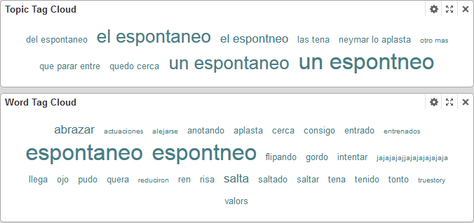
Figure 10. Event tag clouds
Setting up alerts
The last thing I am going to talk about in this post about Endeca Studio is about how to set up alarms for quickly identifying certain events that could happen amongst our data when certain conditions are met. Let’s suppose we want to monitor the top minutes with more than 1000 tweets (important events). Each alert has to be defined using a filtering EQL query. For example, for the proposed case, the following query was defined for moments with more than 1000 tweets:
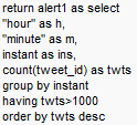
Figure 11. Sample EQL query to get minutes with more than 1000 tweets
Using an alert message as “{twts} tweets have been published at hour {h} minute {m}.” a graph as shown in Figure 12 is obtained. The data can even be refined by the alarms, for example if we click on the third alert for “Important minutes” (2481 tweets at 22:55) and look at the tag clouds, we can identify that Dongou replaced Messi at that moment.
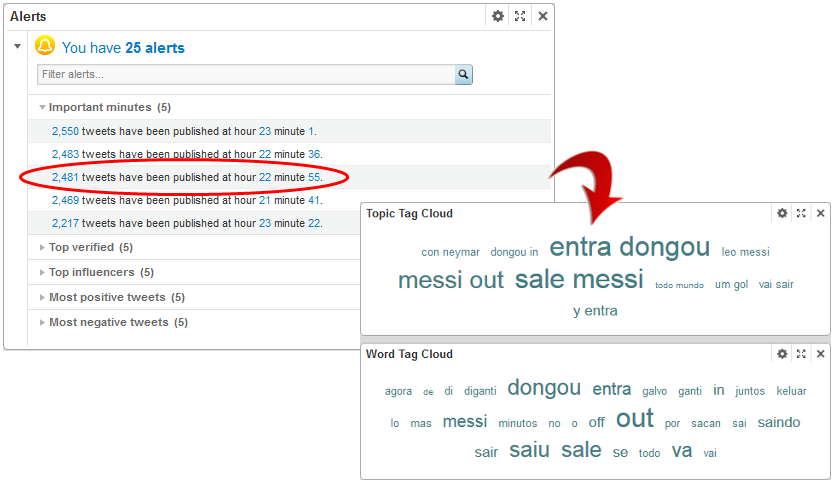
Figure 12. Alert results
Endeca Studio offers an easy and intuitive way of discovering and visualising information from both structured and unstructured data providing a user friendly interface and useful components. However, this simplicity is highly affected by how well the integrator manages the initial data. So it is important to consider that the right structurisation of unstructured data (as far as possible) paves the way to a better analysis later on.