23 May 2014 Rich Visualizations in OBIEE with JavaScript
Rich Visualizations in OBIEE with JavaScript

Are you suffering the consequences of Oracle BI’s limited, visually old fashioned out-of-the-box charts? Are the end users of your BI platform in need of extended functionalities? Today’s article is the first one of our Oracle BI Customization series – How to impress managers blog article series. To set out on this journey, I will show you how to integrate JavaScript into Oracle BI dashboards. JavaScript is a cross-platform programming language that provides you with the opportunity to meet your customer visual and usage requirements, thus enabling end user satisfaction.
A real case
For this article I want to start with a real scenario where the customer was very worried about the lack of user adoption in some of the corporate dashboards. In these dashboards, a standard Gauge view was used to display aggregated information. The Oracle BI 11g standard Gauge view, despite having improved if compared to the 10g version, still has limited visual options and therefore has a lack of grip for the end user. This was not unnoticed by the dashboard users, who very soon started complaining about the “poor look & feel” of the dashboard. As soon as this was identified, multiple alternatives where assessed in order to increase user adoption and therefore make sure the project was a big success. Among all options, the alternative of choice was to customize the analysis using JavaScript snippets. Here’s how it was done. Objective Create new gauges integrating JavaScript with Oracle BI. The goal is to have rich, clean, interactive and touch-enabled charts that will catch the attention of our users.
Implementation plan
Two simple steps are needed to get the integration done:
1. Deploy Java libraries on the WLS Server. We will get the Java libraries that help us to fulfill the requirements and we will make them available to the WebLogic server.
2. Create your custom charts in Oracle BI. We will create an analysis with a Narrative view that will include the code to display the customized charts.
1. Deploy Java libraries on the WLS Server
Usually, most of third party visualization tools require referencing some libraries in the format of JavaScript minimized files. Most of the times, the files are available directly from the Internet CDNs (like jQuery) so there’s no actual need to download or deploy any software component. However, most of the Oracle BI implementations have their servers isolated from the Internet and protected in internal LAN segments. In this cases, referencing these resources from Oracle BI, means having to first deploy them in the WebLogic Server as static resources. There are several ways to achieve this. Our recommendation is to create a virtual directory application and deploy it in your WebLogic Server. Once this is done, just copy the required JavaScript files to that folder using an FTP program, for instance, and the files will be automatically available to be used in Oracle BI. Issues creating virtual directories? Please contact us and we will assist you on doing that.
2. Create your custom charts in Oracle BI
2.1 Create an Analysis
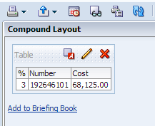
From the Home Page in Oracle BI, create a new Analysis that retrieves the set of data that you want to display in your charts. For instance, to represent the total amount of budget consumed, we retrieve one single record with two columns: “Actual Budget” and “Approved Budget”. However, if we want to represent the data of multiple countries we will have several records. Now, you have to bear in mind whether the number of countries that will be in your data set will remain the same or it may change over time. This is important to avoid any crush when displaying the chart; see below how to prevent it. For this scenario we create a report, which returns one single row.
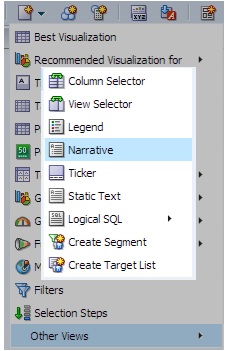
2.2 Add a new Narrative view
With your set of data ready to cook, we can start writing the script that will generate our chart. Add a new “Narrative view” from the drop down list of available views.
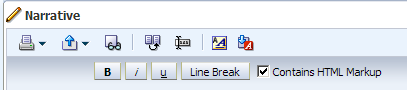
Do not forget to check the box: Contains HTML Markup
2.3 Reference the java library
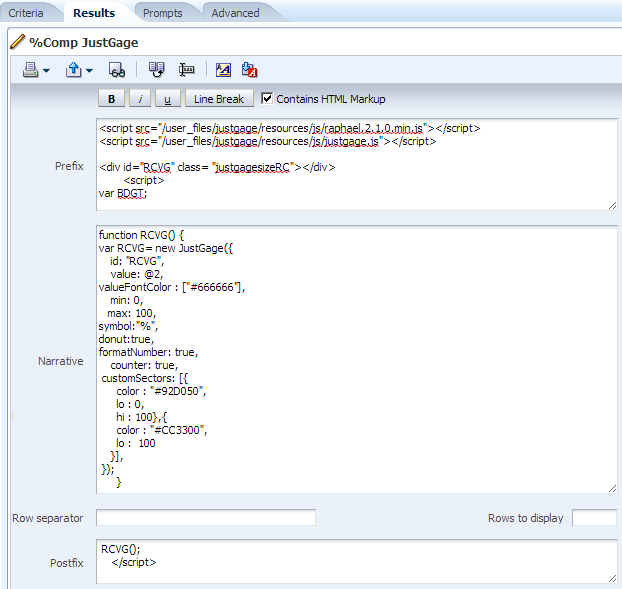
On the Prefix section of your view, reference the Java library for your development, we call JustGage libraries as follows:
<script type="text/javascript" src="{resources}/raphael.2.1.0.min.js"></script>
<script type="text/javascript" src="{resources}/justgage.js"></script>
2.4 Define the style in a class
In order to apply a same style along your development, optionally you can define a CSS class to adjust the parameters, see below an example we use to set up the chart size:
<style type="text/css">
    .JGsize {height: 100px; width: 100px;}
</style>
We strongly advice to create a single file with all CSS code and place it in the virtual directory; this will avoid any type of inconsistency when rendering the charts.
2.5 Write the JavaScript code
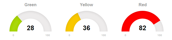
Define and call the function to render the chart with the appropriate parameters. The basic definition of JustGage function is ‘JustGage({id, value})’ – refer to the documentation of each JavaScript library for more details.
<script type="text/javascript">
 function RCVG() {
  var RCVG = new JustGage({
    id: "RCVG",
    value: @n,
    valueFontColor: ["#666666"],
    min: 0,
    max: 100,
    donut:true,
    formatNumber: true
  });
 }
RCVG();
</script>
Last, create a div container to render the chart.
<div id = "RCVG" class = "JGsize"></div>
Once you write the code keep in mind the structure of the Narrative view, where the Narrative section is the one that allows reference to the Answers columns @n and the Prefix and Postfix rendered before and after the Narrative as a simple block. Said that, the final result in our scenario looks as below:
2.6 Displaying the results
Click on done and see how amazing your chart looks in a Dashboard page, you can repeat this steps for multiple data sets and display them all in a dashboard to cross information.
If you are planning to implement it take into consideration which type of browser are you using, in case of JustGage was tested compatible with Chrome 20, Firefox 12, IE6, 7, 8, 9, Opera 12, Safari 5.1.2, Android 4.0.
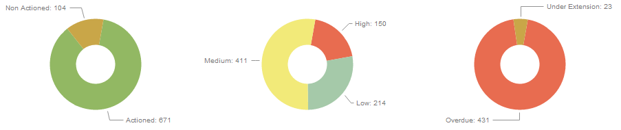
2.7 Advance example with Kendo UI
Other open source java libraries that are available is KendoUI, that brings you different features and look and feel, see below an example:
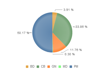
On that scenario the challenge is that we will have multiple records coming from our Answer and the number of records will vary. Then, if the number of records changes that will drive the chart rendering into madness. What we did is to use a dynamic array. For this we have to create and ID on each of the rows that will be used as a record reference on our array. See below the results of the Cost by Product Analysis:
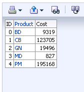
Now on our narrative view, we will create a variable defined as an array. For this scenario was enough to create an array of maximum 5 records. A for loop is created to read records and to create the array
var dim = new Array(5)

for (i=0; i <5; i++)
    dim[i] = new Array(2);
    var max_i;
    dim[@1][0] = "@2";
    dim[@1][1] = @3;
    max_i = @1;
Then when we create the function to create the chart we have to define the series of data will be displayed:
data.series[0].data.splice(max_i+1,5-max_i-1);
$("#chart3").kendoChart(data);
Looking at the results we see a consistent chart that will handle a set of data whatever the number of records:
An interesting Kendo UI feature is its interactive legend. This allows the user to simplify data on charts by clicking on the legend and compare specific KPIs, see the example below with line charts where we compare Actual versus Planing:

3. Conclusion
Customizing Oracle BI with JavaScript opens up a huge world of visual opportunities that may help you to meet the user requirements. Just make sure you are using them wisely and don’t fall into the trap of using them in every single Analysis. By enriching the information with visual aids and displaying the data in a proper manner we can add a huge value to the user, as highlighting key data and placing it on the correct context will drive your solution to success.
More on Customization right here – the links will be updated as soon as we publish the articles:
- How to create a Pop-Up effect
- How to create a schematic effect
- How to print a dashboard with JavaScript enhancements
- Key principals on dashboard design