10 Dic 2025 Oracle Analytics Cloud November 2025 Update Highlights
Welcome to the Oracle Analytics Cloud (OAC) November 2025 update roundup!
Oracle continues to enhance the analytics experience by improving usability, expanding AI-powered capabilities, and strengthening the connection between governed and self-service data. This release offers several exciting updates designed to simplify your workflow, empower end-users, and help you to get from data to insights even faster.
Let’s explore the highlights!
Use a Subject Area in a Data Flow
A long-requested feature has now arrived: you can use a subject area directly as a data source in a data flow. This bridges the gap between semantic models and data preparation, enabling a smoother workflow for blending curated subject area data with other datasets.
Previously, you could only create data flows using datasets or database connections, but thanks to this enhancement you can now select an existing subject area as an input when building a data flow. This allows you to reuse governed data models, complete with hierarchies, metrics, and business logic, without having to recreate them manually.
To use this feature, simply create a new data flow, and in Add Data, select Subject Area as your source. From there, you can choose columns, filters, and joins, just as you would with any other data source:
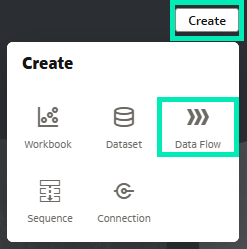
Figure 01: Create new Data Flow
When selecting data for the data flow, sources can be specifically filtered to see only Subject Areas. Once the desired Subject Area is found, it just needs to be selected and added as a source:
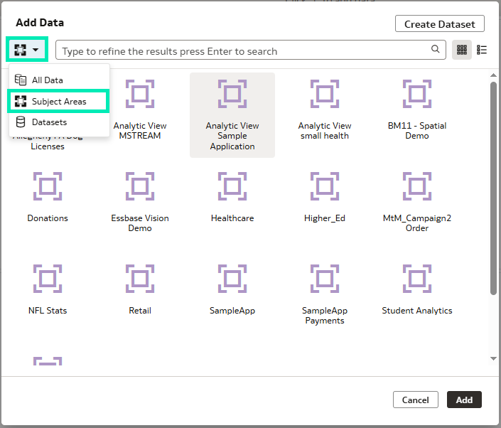
Figure 02: Data Flow options filtered for Subject Areas only
This feature is particularly useful for analysts who rely on enterprise subject areas but still want the flexibility of transforming and enriching data in their flows. It improves consistency, data governance, and efficiency, ensuring that everyone is working with the same trusted definitions across the platform.
Search for Content by Speaking or Typing Natural Language Queries
Oracle has once again raised the user experience bar by introducing natural language search. You can now search for content from your home page by simply typing or speaking your query (presuming the speech-to-text feature is enabled) in everyday natural language. We tested the speech-to-text feature in the demonstration instance, and it’s a great way to speed up the search process.
Instead of manually navigating through folders or having to remember then type specific names, you can ask Oracle Analytics things like “Show me my recent sales workbooks” or “Find dashboards about revenue performance.” The system interprets your request intelligently and displays the most relevant results, even when the phrasing varies:
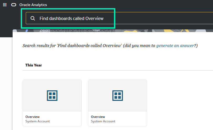
Figure 03: Results of a Content search with natural language
This update means a more conversational and accessible search experience, especially handy for users who prefer a voice-based interface or who are new to the platform.
AI Assistant Support in Embedded Mode
We follow AI developments closely and try to highlight every AI feature in OAC releases. This year, almost all releases include AI enhancements, so check out our previous blog posts if you want to know more: OAC September 2025 Release, OAC July 2025 Release, and OAC May 2025 Release. Oracle keeps pushing the integration of AI into analytics, and this update extends those capabilities to embedded analytics experiences. With the latest update, you can now access the AI Assistant directly, even when interacting with embedded analytics content inside other applications.
The code embedding the content is made available by clicking on the Developer button in the workbook menu:
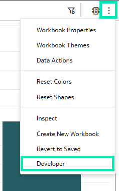
Figure 04: Developer Button
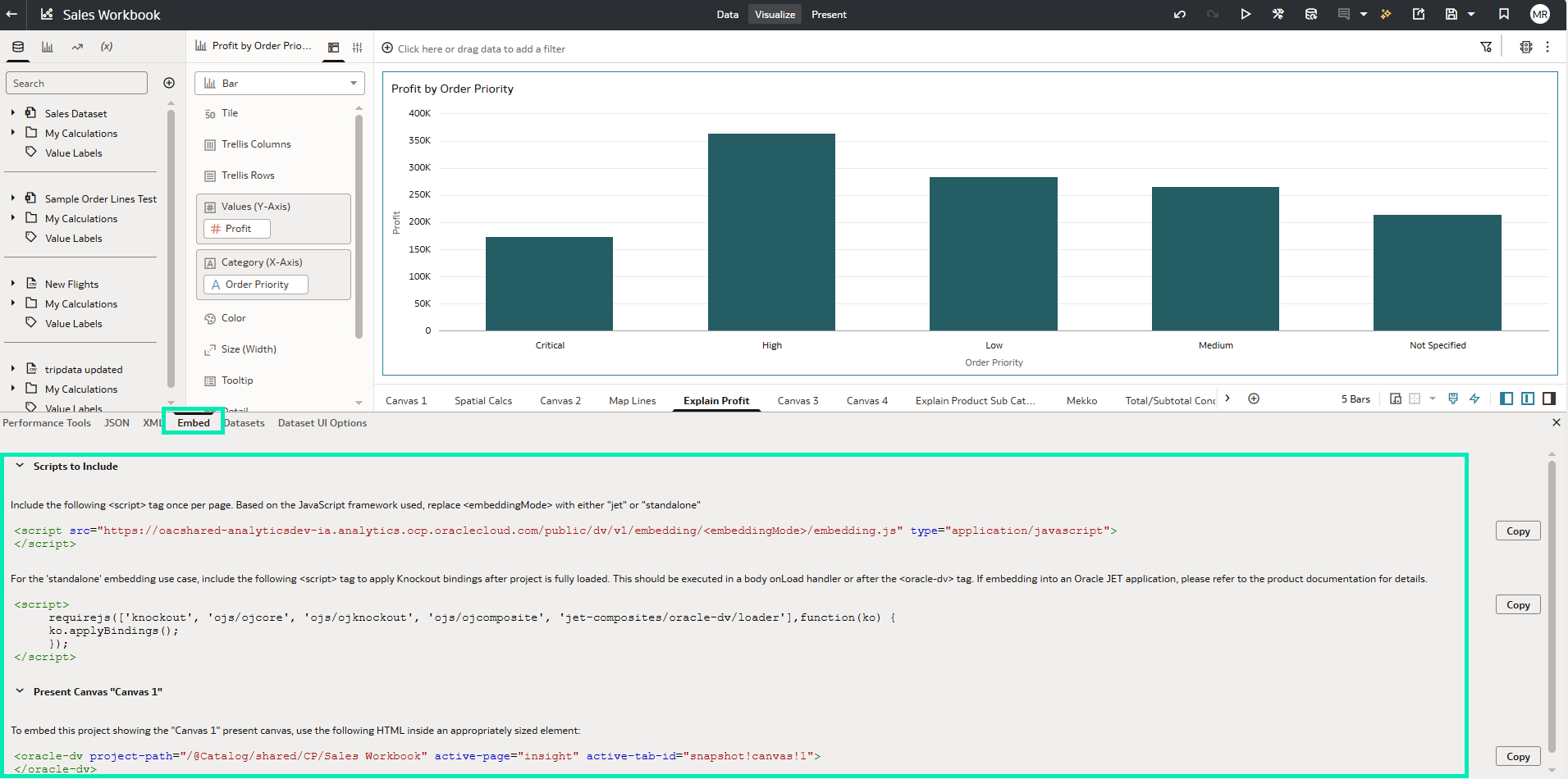
Figure 05: Code for embedding
This means that if a workbook is embedded within a portal, CRM, or custom web application, end-users can still ask the AI Assistant questions in natural language, such as “Show me last quarter’s sales by region” or “Which product category had the highest growth?” without leaving the host environment.
As with canvas embedding, Oracle AI Assistant has its own HTML tag with properties that enable AI capabilities outside the Oracle Analytics Cloud environment:
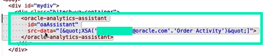
Figure 06: AI Assistant embedding code
The AI Assistant processes these queries directly within the embedded interface, delivering instant visual responses and insights. This enhancement extends self-service analytics beyond the OAC platform itself, empowering decision-makers to access intelligent insights wherever they’re working.
By enabling AI Assistant support in embedded mode, Oracle has taken another big step toward seamless, contextual analytics, where insights are available at the point of decision, not just within the analytics portal.
Create Conditional Formatting Rules on Dates
Oracle is continuously enhancing its conditional formatting capabilities, and one of the latest additions is the ability to create formatting rules for attributes, which we covered in our Oracle Analytics Cloud January 2025 Update blog post.
Oracle has now introduced another valuable improvement: the ability to create conditional formatting rules on date-time columns, giving you better control over how data-driven insights are visually presented.
You can now set conditions that compare one date with another: for example, highlighting projects in red when the Resolved Date is later than the Target Date. The process is straightforward: open the Conditional Formatting panel, choose a date column, and define your comparison rules.
First, hover over the table and choose Manage Conditional Formatting Rules:
Figure 07: Manage Conditional Formatting Rules option
The Conditional Formatting panel opens in a new window where you can set the advanced formatting rules for the date. Each rule can be named individually and can contain multiple conditions, each with its own colour and font settings. Once the conditions have been set, the changes need to be saved:
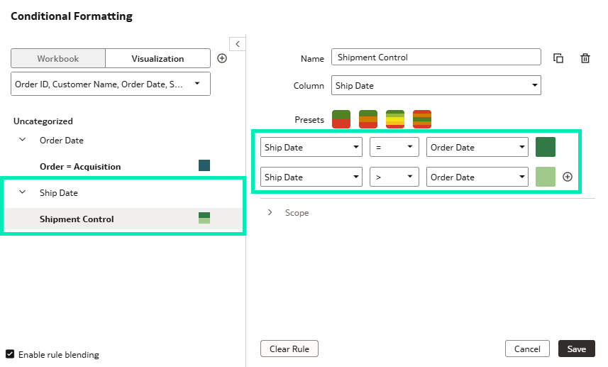
Figure 08: Conditional Formatting panel and rule setup
When the conditional formatting rules have been saved, they are instantly applied to the table, highlighting any cells that meet the defined conditions. A legend showing each rule and its colour is displayed beneath the table, helping users to interpret the highlights:
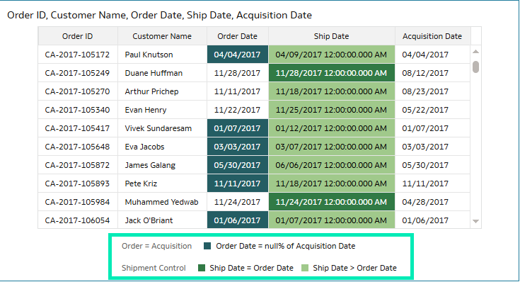
Figure 09: Highlighted cells after setting rules for Conditional Formatting
This enhancement enables users to identify overdue tasks, delayed projects, or future events instantly; with visually clear signals, teams can act on time-sensitive insights more efficiently.
Swap Columns Used in a Visualisation’s Axis and Legend Labels
The ability to swap columns for axis and legend labels means more flexibility for dashboard users. Previously, changing axis or legend assignments required editing the visualisation, an action limited to authors. Now, users can interactively swap columns from a curated list without leaving the dashboard, supporting more focused and dynamic dashboards. Now, a single visualisation can represent multiple metrics or dimensions, reducing the need for redundant charts and improving overall clarity.
For example, in a sales visualisation, you can easily switch the axis from Area to Branch, or adjust the legend to display Quantity instead of Category. This lets users explore data from different perspectives whilst maintaining the integrity of the curated dataset.
To use this dynamic feature, there are two steps to complete: first, create the visualisation and assign one column to each axis. All the columns and measures intended for dynamic swapping must be added to the Related Columns section:
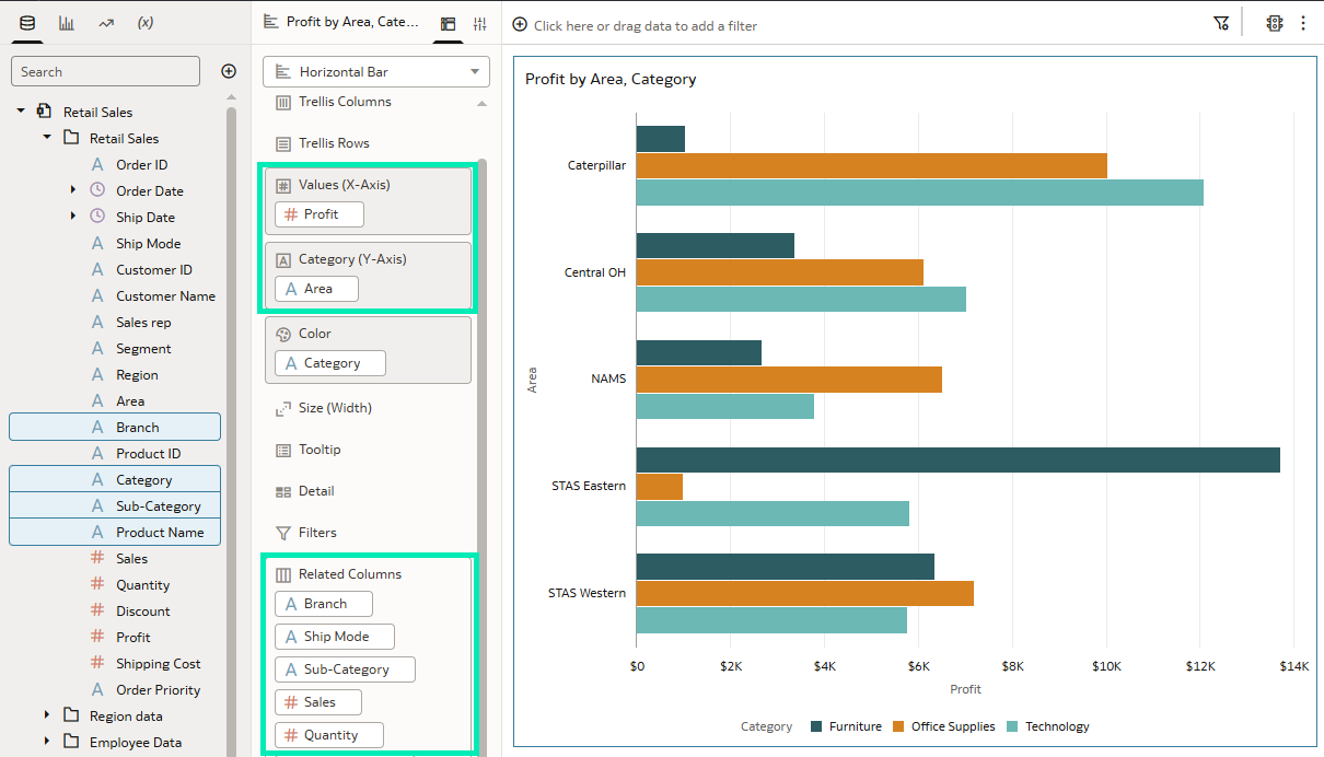
Figure 10: Initial visualisation preparation for the Column Swap feature
The column swap feature is disabled by default, which takes us to the second step: enabling it in the visualisation properties. You can activate the feature from the Visualization Properties panel under the Advanced tab:
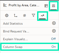
Figure 11: Enabling the Column Swap feature
Once the visualisation is properly set up and the feature is enabled, the attributes of each axis, as well as the legend colour attribute, can be swapped by clicking on the column or measure name and selecting an alternative from the drop-down menu. Remember that the drop-down menu’s available options correspond exactly to the columns and measures defined in the Related Columns section:
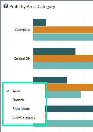
Figure 12: Drop-down Menu options
The results of the x-axis and legend column swapping are shown in this visualisation:
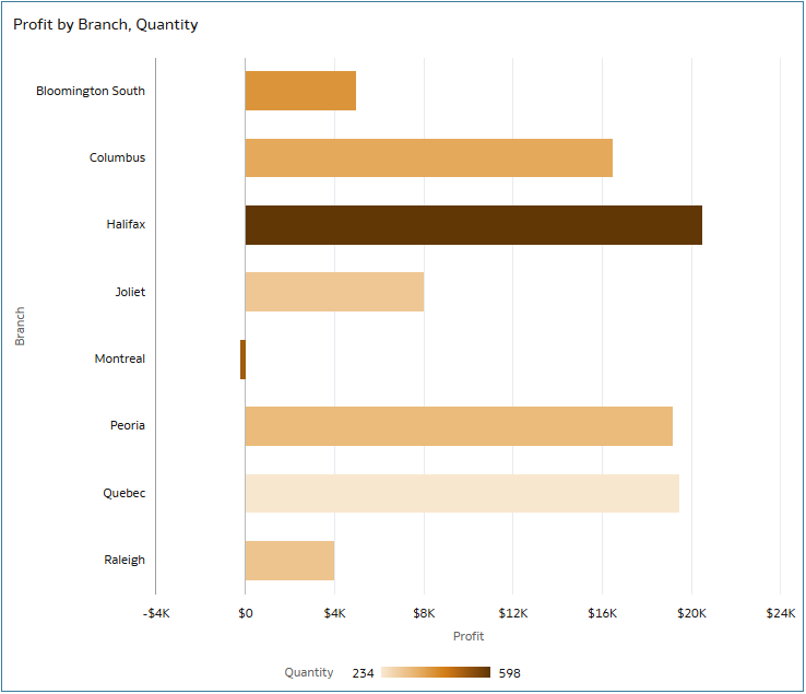
Figure 13: Visualisation after swapping column and legend
This improvement means a more dynamic and self-service-driven analytics experience, letting viewers adapt visualisations to their specific needs.
Access Export Options from the Visualisation Toolbar
Another new enhancement allows you to access export options directly from the visualisation toolbar, simplifying the process of sharing workbook content. Previously, exporting visualisations meant navigating through the main menu, which added unnecessary steps. With this update, each visualisation (including charts, tables, pivots, and maps) provides export options from its own toolbar.
From any visualisation, simply hover over the toolbar and click on the Export icon to access options such as exporting as an image, PDF, or data file. This feature allows users to capture and share insights on the go, whether preparing a report or saving snapshots for presentations:
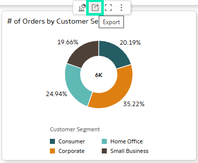
Figure 14: Export options from the Visualisation toolbar
By integrating export capabilities into the visualisation toolbar, Oracle has significantly improved both the efficiency and usability of the reporting process. Now, sharing insights is faster and more intuitive, without interrupting your analytic workflow.
Bind Parameters to Request Variables for Specific Visualisations
Just like Conditional Formatting, Parameter Binding continues to evolve. We noted in our May 2025 blog post that Oracle had introduced support for binding parameters to reference lines that use attribute columns, enabling more dynamic and interactive visualisations.
This November update introduces the ability to bind parameters to request variables for individual visualisations, offering a more flexible approach to managing variable-driven behaviour. In previous versions, setting a request variable affected the entire workbook, often influencing all visuals unintentionally, but with this update you can now bind a parameter to a request variable at the individual visualisation level, providing far greater precision and control.
For example, a single chart can now reflect a user-selected currency (via a parameter), while the rest of the dashboard remains unchanged.
Inside a workbook, in Edit mode, parameters can be accessed from the left panel where the Data panel is located. A new parameter can be added by selecting the menu button and choosing Add Parameter…:
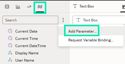
Figure 15: Adding a new parameter within the Data panel, Parameter tab
To configure parameters such as user-selected currency, specify the parameter properties as shown below. Once configured, confirm the changes by clicking on OK:
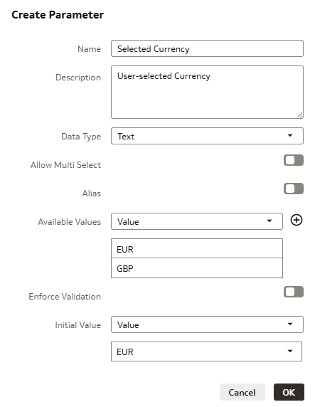
Figure 16: Example configuration for the Currency parameter
Newly created parameters can now be dragged and dropped onto an individual visualisation, allowing it to display a different currency from other visualisations within the same workbook:
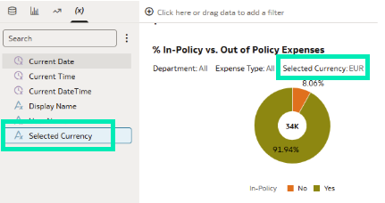
Figure 17: Adding a currency Parameter to the visualisation
You can now assign the request variable to that visualisation alone, providing localised control without affecting the wider workbook. This is done from the Parameters tab by selecting Request Variable Binding… from the menu. In the new pop-up window, choose the appropriate variable as defined in your semantic model and bind it to the currency parameter created earlier:
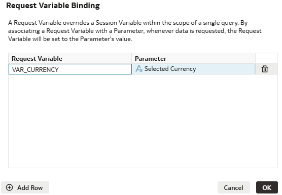
Figure 18: Adding a currency parameter to the visualisation
Due to limitations in the demo instance, the variables defined in the semantic model were not available, so the parameter-variable binding could not be completed.
This capability improves modularity and customisation, allowing dashboards to respond to user input at the visualisation level whilst maintaining global consistency across the workbook.
Create and Share Filter Groups
Oracle continues to simplify and strengthen filtering workflows with the introduction of filter groups. You can now combine multiple filters into a single, logical group and apply them together across your analysis.
Filter groups can be created directly within a workbook by selecting the desired filters, such as Region, Category, and Order Date, then grouping them into a reusable unit.
Filters can be added from the corner menu in the top right of the Filters bar by selecting the Create Filter Group option:
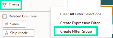
Figure 19: Create Filter Group
The Create Filter Group window opens, where multiple filters can be defined, and the group can be given a distinct name and description:
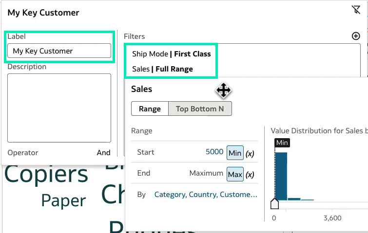
Figure 20: Grouping multiple filters together
Once created, this group can be shared with other users, enabling consistent filter logic across workbooks and dashboards. To make the group available for reuse, drag it to the Shared Objects section within the Navigation panel, then save it:
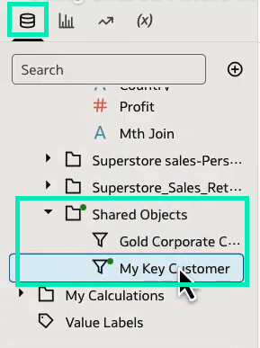
Figure 21: New Filter Group dragged to the Shared Objects section
Note that at the time of writing, this feature had not been fully enabled in the specific instance used for these demonstrations, which is why its use case is described only briefly.
It’s especially useful when teams use the same filter combinations repeatedly. Instead of reconfiguring filters each time, analysts can simply apply a shared filter group, saving time and ensuring consistency.
By introducing shared filter groups, Oracle enhances both collaboration and efficiency, ensuring that all team members are aligned in how they view and interpret data.
Conclusion
Oracle has again introduced improvements that advance analytics workflows across its platform. From streamlined export options and date-based conditional formatting to AI-supported features and expanded data integration, this release further strengthens Oracle Analytics Cloud for both business users and technical teams.
What’s more, capabilities such as column swapping, conditional formatting rules on dates, and enhanced parameter management, enable developers to build cleaner, more adaptable visualisations with less effort.
With AI now supporting embedded use cases and subject areas available within data flows, this update reinforces Oracle’s commitment to delivering a more integrated, adaptive, and user-centric analytics experience.
A key enhancement in this release is the transition of features previously powered by third-party large language models, such as GPT-4 Turbo, to Oracle Cloud Infrastructure (OCI) Generative AI services. This shift reflects Oracle’s ongoing strategy to expand native AI capabilities and to ensure tighter alignment across its analytics ecosystem.
Here at ClearPeaks, we’re committed to helping you get full value out of Oracle Analytics. If you’re exploring how these updates can strengthen your analytics strategy, improve efficiency, or unlock new use cases, just reach out to us and we’ll support you on every step of your Oracle Analytics journey!