19 Apr 2023 Gantt Charts in Power BI
A Gantt chart is a powerful tool for covering planning necessities in Project Management, providing a comprehensive overview of all project tasks, their duration, interdependencies, and sequencing. This visual representation enables project managers to quickly grasp the project’s scope, status, and progress.
While Power BI offers several Certified custom visuals to create Gantt charts, they might not meet the customer’s approval. There is an alternative solution using a matrix visual, categorising each task within its respective project and displaying relevant information through tooltips, allowing a more flexible and customisable approach to creating Gantt charts within Power BI.
In this blog post, we will analyse three different ways to visualise a Gantt chart in Power BI:
- Certified free visual: Gantt chart from Microsoft Corporation.
- Certified free visual (advanced features in the pay version): Gantt chart from MAQ LLC.
- Customised matrix visual, available by default in Power BI Desktop.
Data Preparation
To evaluate the different functionalities of the three alternatives, we will use the sample project dataset below:
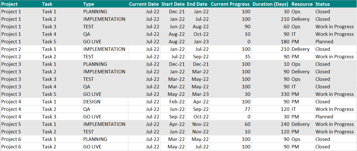
Figure 1: Project dataset
Option 1: Gantt Microsoft Corporation
The MS Gantt bar chart is free and Power BI Certified, allowing you to collect up to ten different data columns:
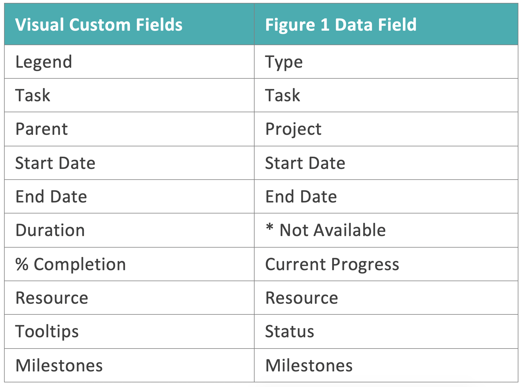
Figure 2: MS Gantt data relation
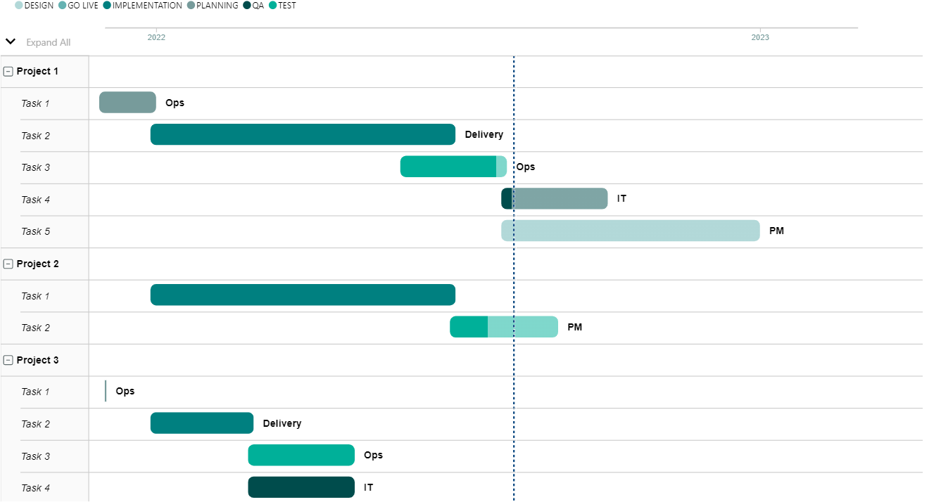
Figure 3: Gantt MS visual
This Gantt chart visual is designed to be user-friendly, accepting all necessary fields for easy data input. The bars are highly customisable, with the option to show task progress using a darker shade. The current date is prominently displayed, and time divisions can be adjusted to suit the needs of the project, in years, months, days, etc. Furthermore, the tooltip functionality provides additional relevant data, displaying all the information included in the Tooltip field when a data bar is selected.
Option 2: Gantt MAQ LLC
The MAQ LLC Gantt bar chart is available in a free Power BI Certified version, allowing users to collect up to seven data columns at no cost. Upgraded plans are also available, at an annual cost of $0.69 per user per year for organisations with 10,000 – 49,999 users, which allows up to ten data columns:
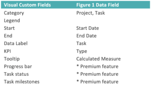
Figure 4: MAQ LLC Gantt data relation
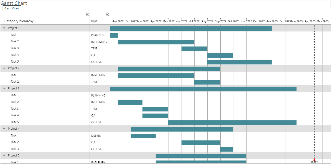
Figure 5: Gantt MAQ LLC visual
The visual, in the free version, does not accept all required fields and only the colour is customisable in the bars. The current date is clearly visible and time division can be changed to year, day, etc. Nevertheless, there are some great features, such as the tooltip displaying information added in a created calculated measure added to the tooltip field.
Overall, we recommend the paid version to see this visual’s real potential.
Option 3: Gantt Matrix Visual
The matrix visual is a default component in Power BI Desktop, and allows you to collect several data rows, columns and values:
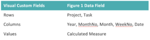
Figure 6: Matrix visual data relation
By using a DAX measure (CF Gantt) in the Values section, you can assign numbers 1, 2, or 3 to each task’s start and end dates, depending on its status. This feature enables users to quickly identify completed tasks, tasks in progress, and planned tasks.
CF Gantt =
VAR StartDate =
CALCULATE(
    MIN(Projects[Start Date]),
    REMOVEFILTERS('dimDate')
)
VAR EndDate =
CALCULATE(
    MIN(Projects[End Date]),
    REMOVEFILTERS('dimDate')
)
VAR ProjectPeriod =
    MIN('dimDate'[Date]) >= StartDate && MIN('dimDate'[Date]) <= EndDate

VAR ProjectTaskStatus =
CALCULATE(
    MIN(Projects[Current Progress]),
    REMOVEFILTERS('dimDate')
)

//VAR Result = IF(ProjectPeriod, 1)
VAR Result =
SWITCH(
    TRUE(),
    ProjectPeriod && (ProjectTaskStatus = 100), 1,
    ProjectPeriod && (ProjectTaskStatus < 100 && ProjectTaskStatus > 0), 2,
    ProjectPeriod && (ProjectTaskStatus = 0), 3
)
RETURN Result
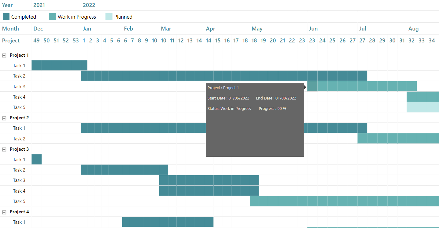
Figure 7: Gantt matrix visual
To configure tooltips in Power BI, go to the General Format Visual Options and set Tooltips to On. Then, create a new page (called Page 2) and format it as a tooltip in the visualisations pane by switching on the Allow use as tooltip option under Page Information, and setting the Type to Tooltip and Vertical Alignment to Top under Canvas Settings. To add values to the tooltip, click on the + Value button that appears when the tooltip is clicked on, and distribute the desired values as needed:
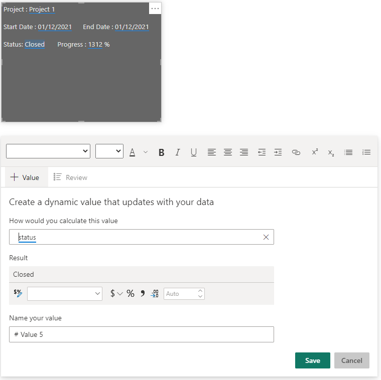
Figure 8: Tooltip configuration
Conclusion
These different Gantt visuals in Power BI highlight the versatility of visual data presentation, and while there may not be a specific visual that meets all your requirements, there are often existing visuals that can be adapted to meet those needs. With such a wide range of available possibilities, choosing the appropriate visual will depend on the specific needs of the project, with user-friendliness being a key consideration when multiple visuals meet the required specifications.
We hope you’ve enjoyed reading this blog post, and if you’d like any more information about how top-notch visuals can push your business even further, don’t hesitate to get in touch with us!