
19 Oct 2022 Highlights from Oracle Analytics Cloud’s September 2022 Update
We have already looked at some previous OAC releases this year, so we couldn’t miss this new September 2022 update! And although it’s a comparatively small release, there are some pretty interesting features that we have been busy testing and exploring.
Here’s our overview of some of them:
1. KPI Composite Card Style Tile Visualisations [Data Visualisation]
This new feature enables users to create KPI-style card visuals on all the visualisations in a workbook, letting users add a summary of measures to granular data.
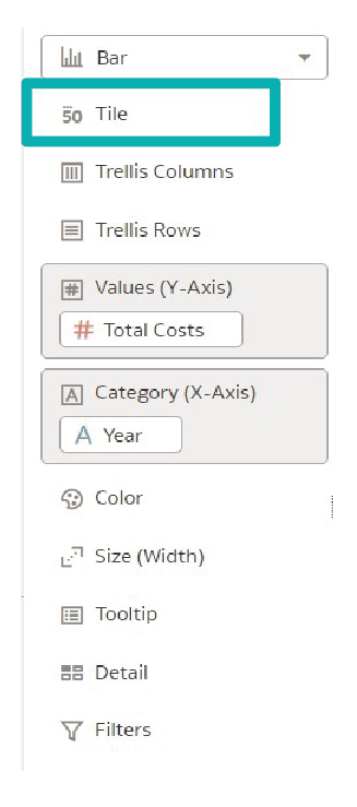
A “Tile” edge has been added to the Grammar Panel (highlighted below) of each visualisation, where we can add up to three measures to create this new card-style feature.
Let’s build a KPI-style card visualisation by creating a simple analysis and looking at the various properties that are offered. The image below shows that we have added the card tile to all the visuals in the workbook:
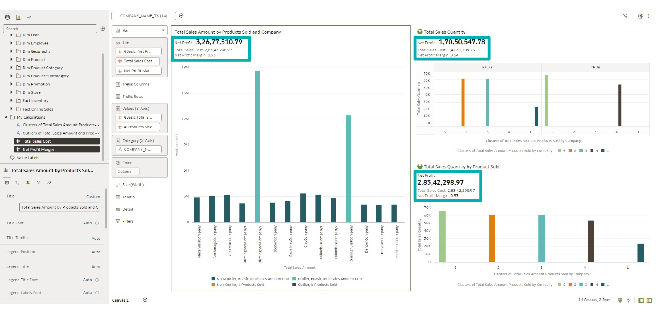
By default, the first measure in the tile becomes the primary measure, and the second and third measures become the secondary measures. A lot of properties have been added to the Properties Panel of this card-style tile visualisation, which help the user to control the alignment and placement of the primary and secondary measures on the tile.
Let’s focus on a single visualisation in this blog post to see the different properties now on offer:
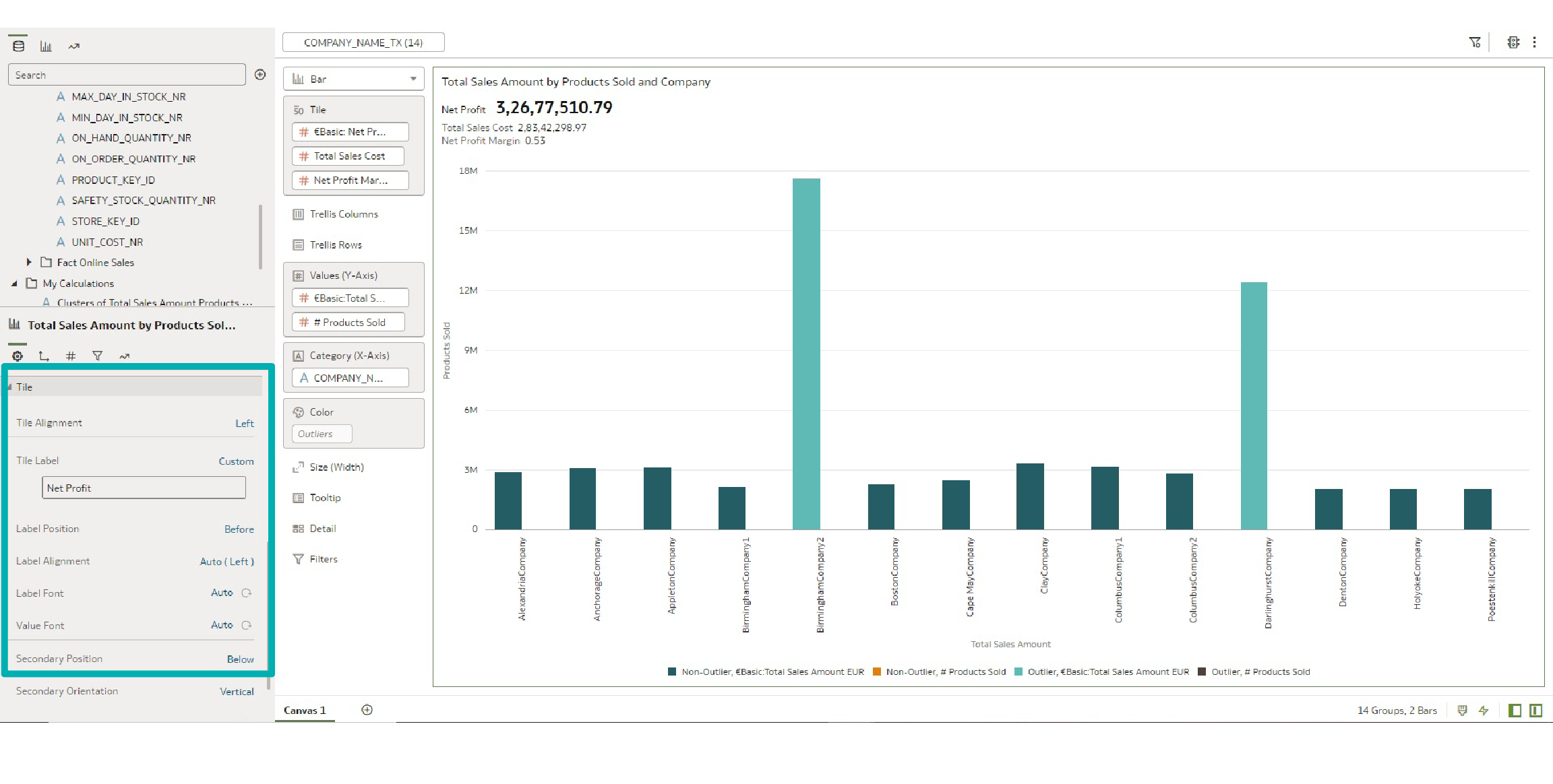
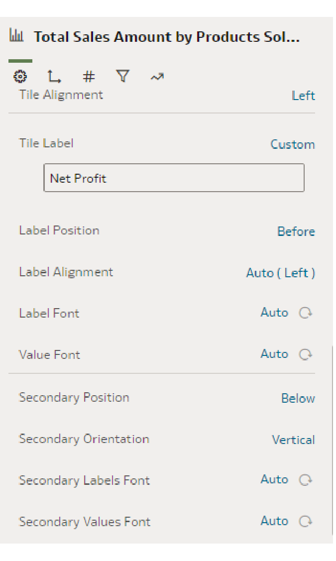
The image above shows the properties of the primary and secondary measures in the tile visualisation. Tile Alignment is set to ‘left’ by default, but the user can change it to centre or right. The user can also control the position of the primary measure label using the Label Position property, and the options to place it are above, below, before, or after the measure itself. The properties of the secondary measures are controlled together.
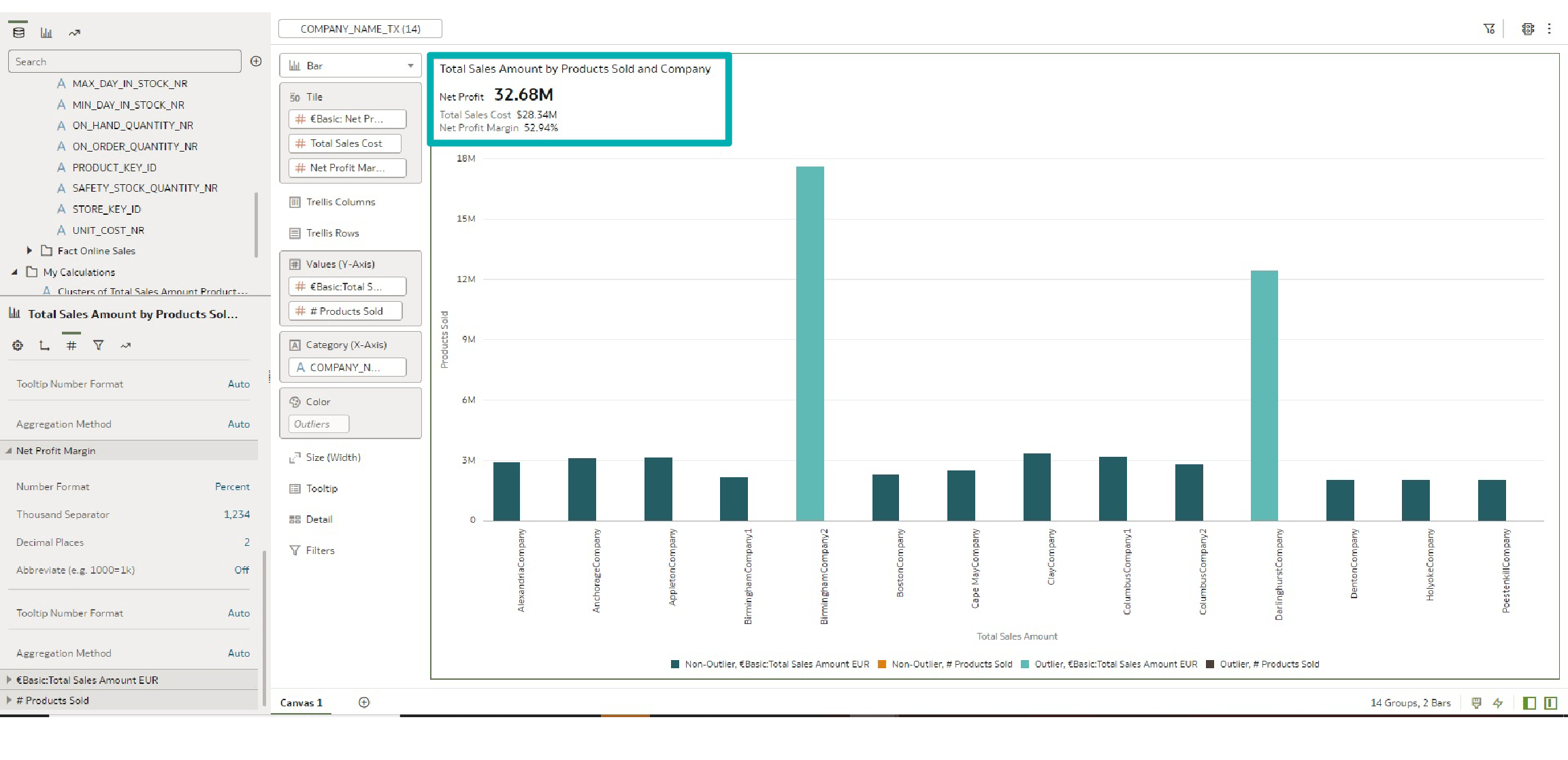
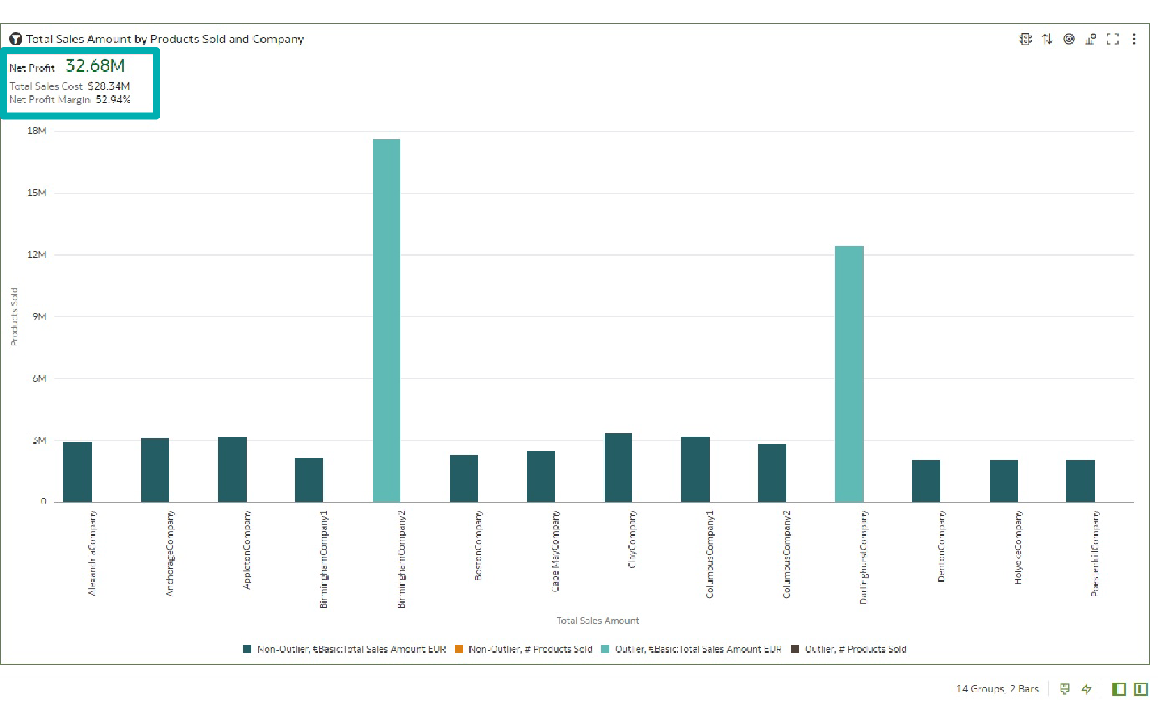
Additionally, there are also properties to change the measure values. As in the image below, you can observe the following changes:
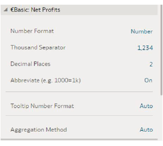
- For Net Profit (our primary measure), instead of displaying the total amount, we enabled Abbreviate. The total amount is displayed as 32.68M.

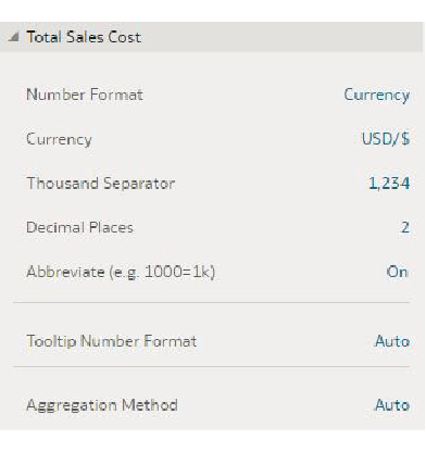
- For Total Sales Cost we added Currency, so now it displays as $28.34M.

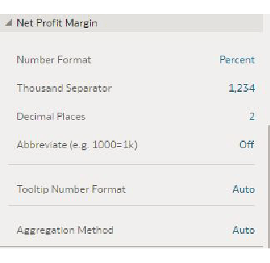
- For the third measure, Net Profit Margin, we changed the Number Format to display as Percent.

After changing all the properties, the new tile visualisation looks like this:
Oracle has also added the capability to add conditional formatting to these measures. The image below shows conditional formatting applied to the primary measure, where the rule is to add formatting (change the font to green) when Net Profit is more than 30M:
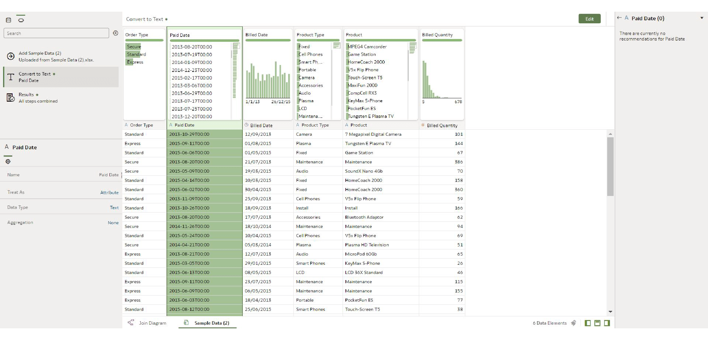
2. Converting AM/PM Text Fields into Dates [Data Preparation]
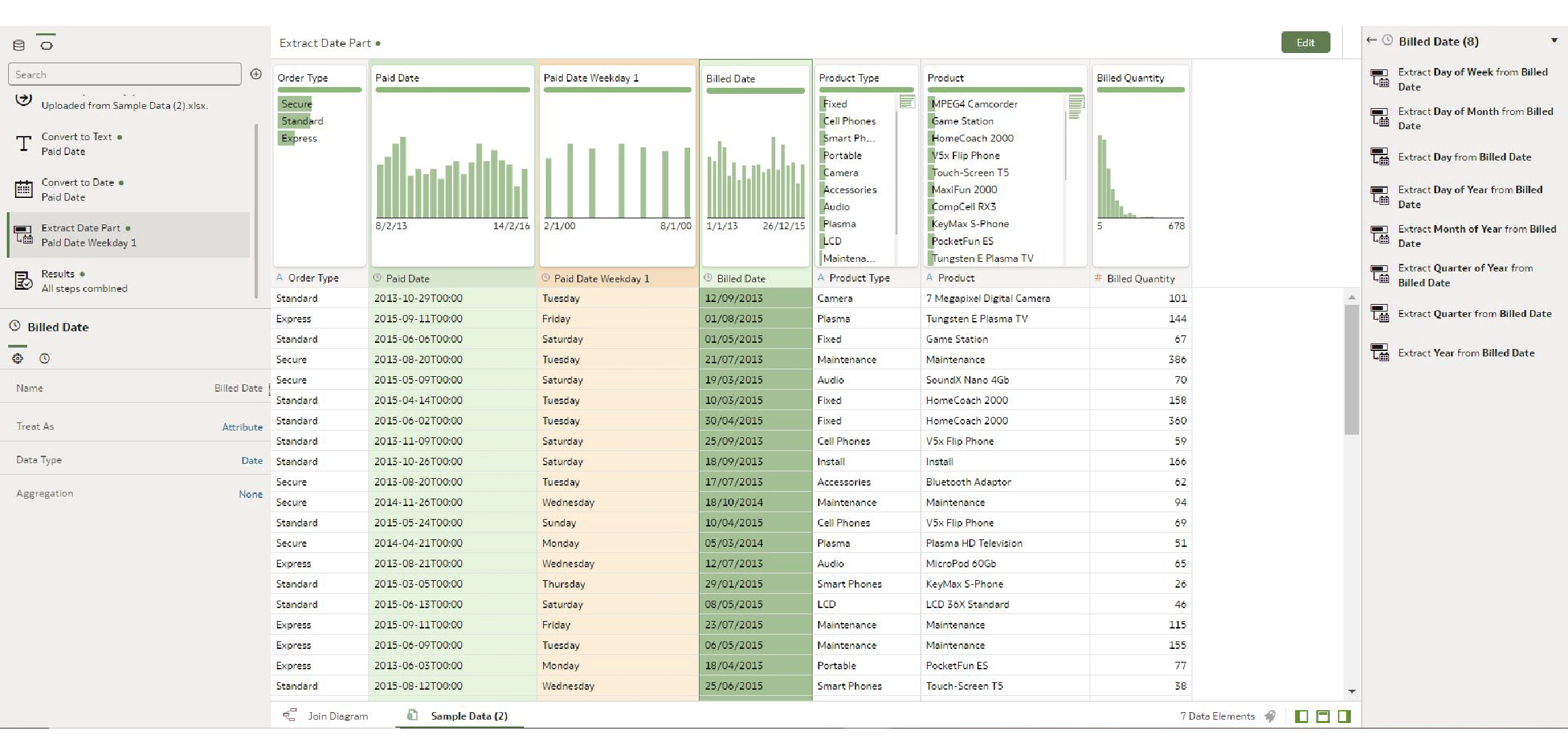
This new feature in Oracle Analytics helps us convert AM/PM text fields to Date more easily. In the example here, the Paid Date field is a text field, and you can see there are no recommendations:
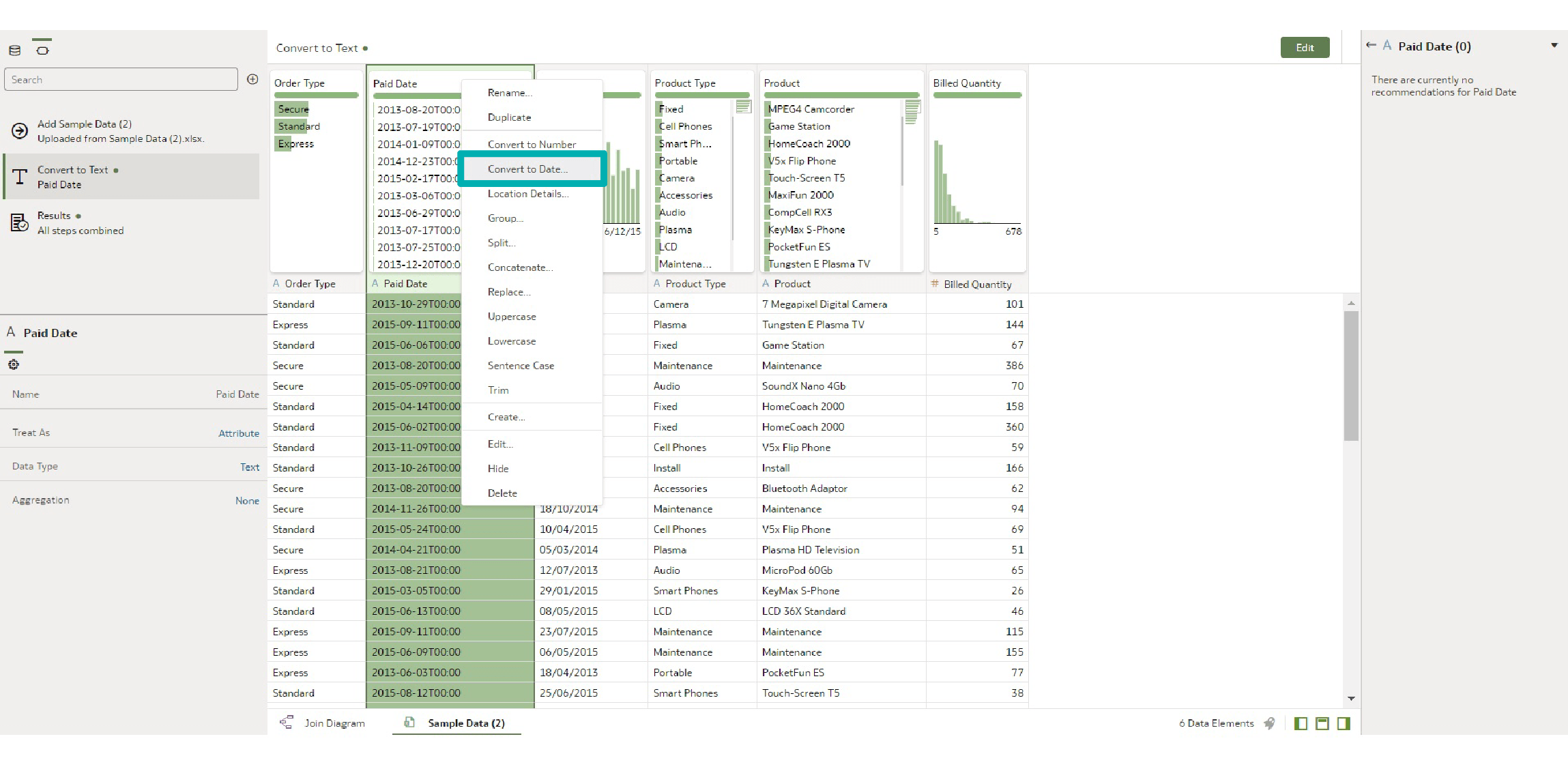
Now, right-click on the Paid Date column then click on Convert to Date, and you can see the system automatically detects the date format and converts the text to date.
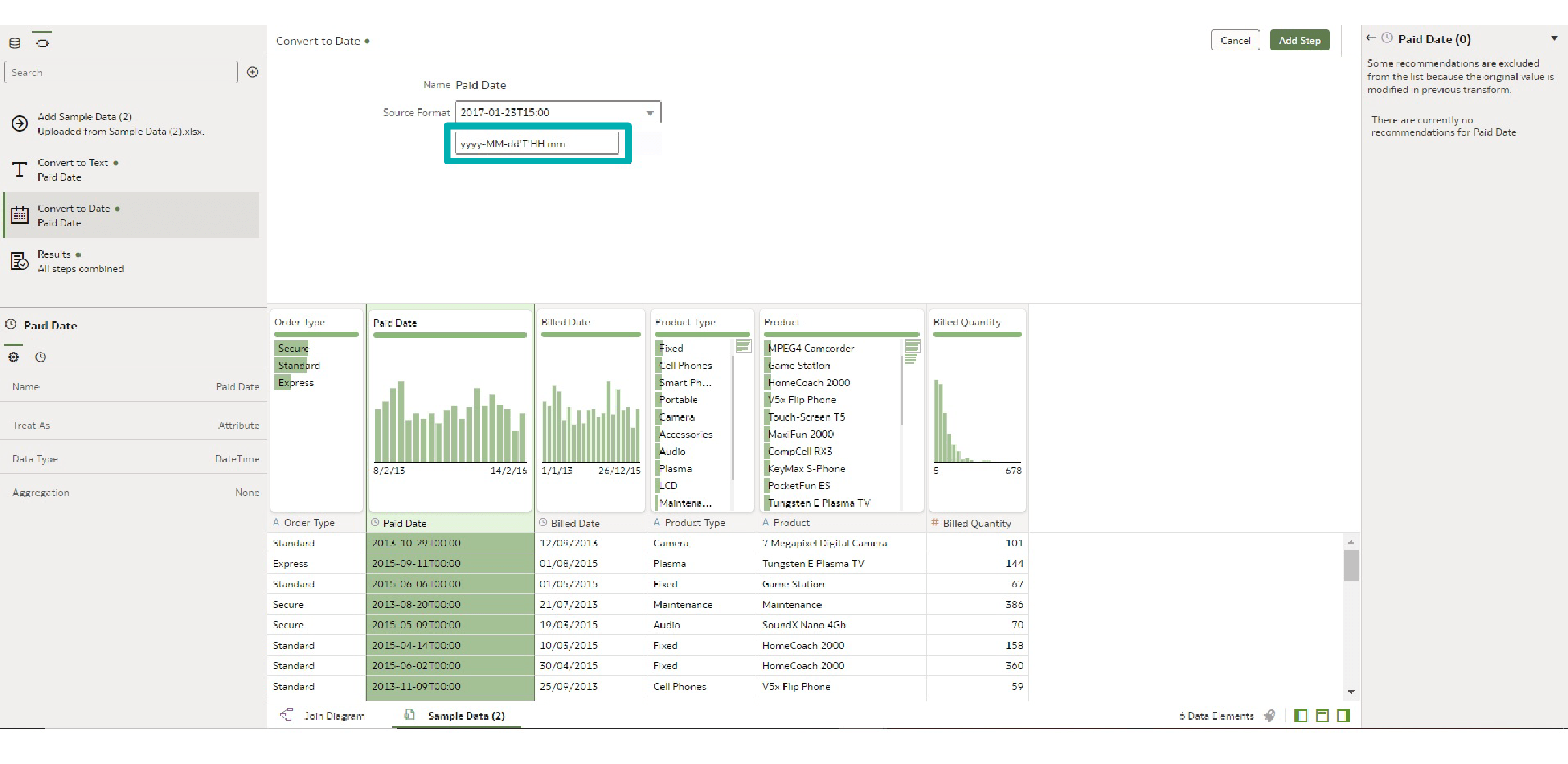
Converting the Paid Date to a date column enables us to use all date transformation options offered by Oracle Analytics because it recognises this column as a date. Click on Add Step and you will see that you can extract the parts of the date and day of the week. After adding this, you will see that the column Paid Date Weekday 1 is added to the dataset:
3. Personalised Tooltips for Calculation [Data Visualisation]
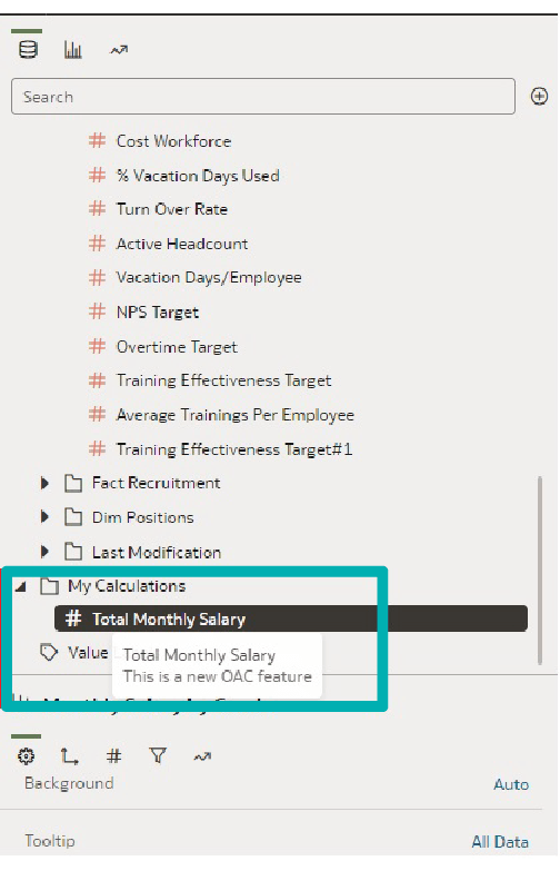
Oracle Analytics allows any user to create custom calculations in a workbook. These new data elements are stored in the My Calculations folder, and while this is nothing new, the update provides additional information for My Calculations by entering a description for a calculation. The description is displayed in the calculation tooltip.
Let’s create a custom calculation by opening a new workbook, right-clicking on the My Calculations folder, and clicking on Add Calculation.
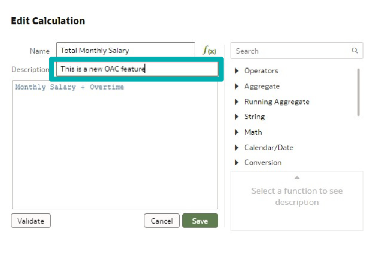
You can see that there is a new textbox to add a description to your calculation. Add this custom calculation to the visualisation in your workbook. When you hover over the new calculated column, the description is shown in the calculation tooltip. This is really useful when you have a complex formula and want to describe it, instead of showing the formula or leaving the description for the business to make their own reports:
Conclusion
This is not the biggest release we have seen this year, but it proves that smaller releases like this are worth it, as these are nice additions users have been asking for. The KPI-style visualisation tile gives us more options to present the measures on the dashboards. Converting AM/PM to date is something that users have been waiting for; we had often found the timestamp and date data to be in text format which always added additional complexity to the modelling. Personal tooltips are also a great addition to the measures, as it is handy to have a text box that gives some additional context to the calculation that we want to use.
If you’ve enjoyed this OAC blog series and have any questions about how Oracle Analytics can push your business to the top, don’t hesitate a moment longer and get in touch with our team of certified Oracle experts here!