20 Jun 2018 Implementing variable prompts in Oracle Data Visualization Desktop
Oracle DVD has never had the capability to display Variable Prompts in a canvas layout. However, Oracle has recently launched a plug-in to add this functionality to its visualization tool. This plug-in allows us to use another visualization that is capable of filtering other DVD visualizations in the same document and changing the dimensions that we are currently displaying in a canvas visualization.
Henceforth, the idea of this article is to explain the whole process, from uploading the plug-in to working with the visualization, and to introduce some practical use cases that will showcase additional functionalities.
All the steps to complete the process are explained below.
1. Upload Oracle´s plug-ins
To proceed with the implementation of the new visualization, Oracle has recently launched a new plug-in called Variable Prompt that can be downloaded here (Presentation Variable Prompts Plug-in). A plug-in is an application or a software component that adds a specific feature to an existing computer program. In this case, this plug-in adds a new visualization type to Oracle DVD. Once downloaded, you need to upload it in Oracle DVD by following the below steps:
- Navigate to Console.
- Select Custom Plugins from the menu.
- Upload Custom Plugin (zip file). You can drag a file over the download symbol as in the figure below.
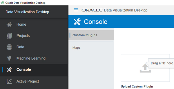
Figure 1: Uploading a Custom Plug-in.
After the file has been uploaded, Oracle DVD must first be restarted. Then it’s time to start playing with the new visualization.
2. Plug-in use cases
Reopen Oracle DVD and select a data source or a current project to use the new visualization. There are 3 use cases where we found implementing the plug-in interesting for our daily analyses. We’ll cover them, starting from the easiest to the most difficult use case. Before continuing, it’s important to emphasize that, when defining a new presentation variable, one should follow the steps in a very restrictive order.
2.1. Numeric Presentation Variable to use as a filter
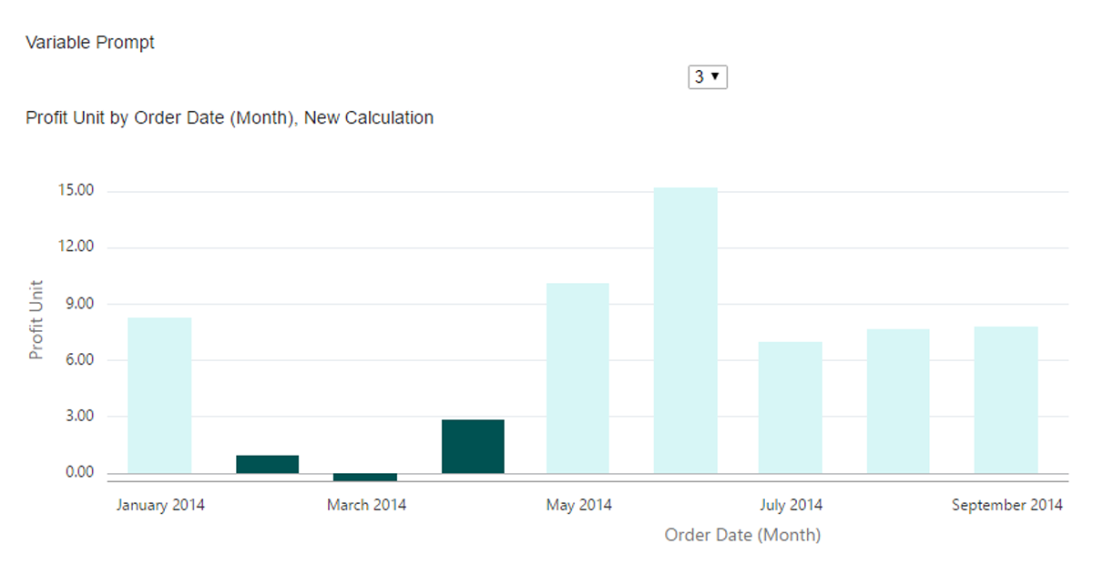
Imagine that you want to understand the behaviour of your data depending on a dynamic value. Using a Variable Prompt is a good way to test it and extract your own conclusions. In our first use case, we want to analyse which is the Profit Unit by month for a whole year. Henceforth, the goal is to define a presentation variable and use it to show which are the months where Unit Profit has been lower than expected (the value that we fix in the presentation variable).
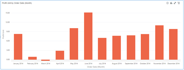
Figure 2: Analysis of Profit Unit by month.
We first need to create a new presentation variable to use it later. To do it add a new calculation as shown below:
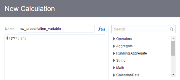
Figure 3: Defining presentation variable and setting a default value.
It’s very important to set a default value, otherwise it won’t work well. Once defined, save it. Afterwards, the following message will be displayed:
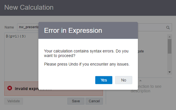
Figure 4: Error message when defining a presentation variable.
The error message will always display since are setting a new variable that isn’t yet defined, nor is it in the data source. Just click ‘Yes’ and continue onwards. Now you’ve added the Presentation Variable as a new calculated measure in My Calculations. Keep in mind that all the visualizations you want to affect with the variable must be related with it somehow, either through a filter or using the variable in a calculated measure. In this case, we are going to create a new calculated measure (New Calculation) to decide if the value that fixes the presentation variable will be above or below.
Then, it’s time to add the new visualization to the top of the current visualization and fill the presentation variables (name and the options) in the visualization panel at left-bottom corner.
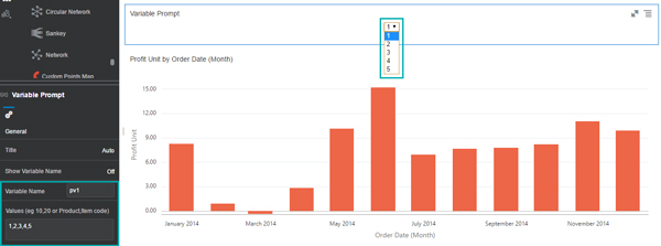
Figure 5: Displaying new visualization and setting options.
With the New Calculation, we can view those months where Unit Profit is lower than the value fixed by the presentation variable.
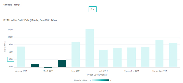
Figure 6: Result using presentation variable to implement new functionalities.
2.2. Use Variable Prompt as a Selected Dimension
This use case will give us another option to use Variable Prompt. Differently from the first case, we are also able to implement different visualizations in a single one. What does it mean? It means that we can select the dimension to display in the Variable Prompt. In this example we want to compare the Revenue by Brand over a time dimension in 2010. That time dimension will be the one that we are going to select in the Variable Prompt.
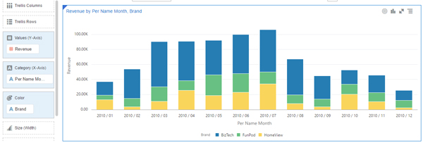
Figure 7: Comparing Revenue by month and Brand in a whole year.
In this case, what Variable Prompt gives us is the opportunity to choose which time dimension we want to display in X-axis, that allows us to compare Revenue by brand through a specific bunch of time. We are going to create a new presentation variable called “time” that will contain as possible values “Half Year”, “Month” and “Week”.
Follow the same steps explained for the first use case:
- Create a new calculation measure where it will be defined the presentation variable time.

Figure 8: Setting new Presentation Variable – time.
- When you create the variable, drag month dimension to set it as default value, as it can be observed between curly braces after variable definition.
- Add Variable Prompt Visualization, and define the features title, name and values.

There is a trick to make sure everything works fine. To understand it, let’s explain what the plug-in does exactly in terms of code. The plug-in is coded in JSON/JS and basically changes the default value of presentation variables. Problems occur when it changes the default values. Sometimes, it deletes characters (parenthesis or letters) needed to calculate the measure. In this case, the trick consists of adding blank spaces between the default value and both curly braces.
The results with each option selected are the following:
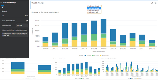
Figure 9: Comparing Revenue by different chosen Time dimension.
2.3. Use Variable Prompt to highlight a Maximum or Minimum of a specific measure
Now that we’ve seen the first two use cases, we are now going to add additional features and options to our daily analytics job. This example will consist of defining a presentation variable that simply selects a max or min, which the visualization will then highlight. That gives us the functionality to quickly view the maximum or minimum of a measure that is not displayed in the graph.
We want to display in a bar chart the profit made by different product sub categories.
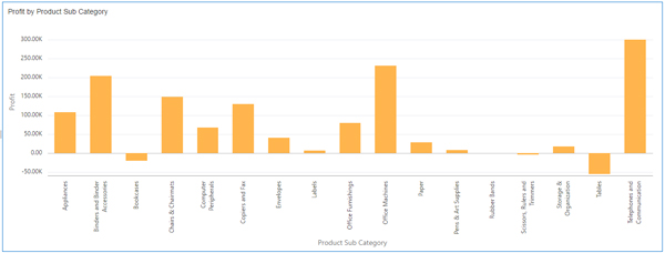
Figure 10: Profit made by Product Sub Category.
Again, we are going to follow these steps to implement it:
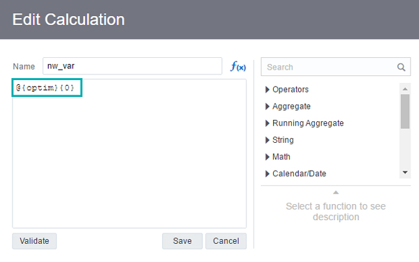
- Create a new calculation measure where it will be defined the presentation variable optim.

Figure 11: Definition of optim variable.
- When you create the variable, define 0 as default value (with reference to the lowest value while 1 shall refer to the maximum value).
- Add a calculation measure that will be the minimum of a measure when optim = 0 and maximum otherwise.
- Add the Variable Prompt Visualization, and define the features title, name and values.
In this case, we want to analyse those products with a minimum and maximum discount.
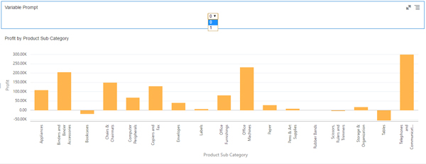
Figure 12: Variable Prompt added to view minimum or maximum of another measure (discount).
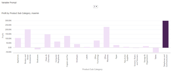
Figure 13: Maximum Discount shown in Telephones and Communications product sub category.
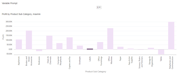
Figure 14: Minimum Discount shown in Labels product sub category.
This is an easy way for a user to detect quickly the minimum or maximum of a measure that is not displayed in the chart. In this case, we can see which product sub categories have a higher or lower discount while we are displaying profit in the bar chart.
Conclusions
Although there are still some restrictions in the new version of Oracle DVD (12.2.4.3), Oracle continues developing excellent plug-ins for further expansion in terms of DVD functionalities. In this case, Oracle presents a new visualization type to change classical visualizations and perform other features.
Remember that this plug-in gives us the opportunity to choose a hierarchical dimension, as time, that we want to display in a visualization by selecting it in a Variable Prompt. It allows us to have different points of view in a single visualization or different points of analysing our data set. It also gives us the option to easily differentiate the optimized dimension for a specific measure that doesn’t need to be displayed in the current chart, as it’s shown in the last use case, or even to filter a visualization using a Presentation Variable.
We are looking forward to finding out what Oracle is going to launch soon and will update you as fast as we can. We’ll be excited to solve any questions regarding the article and don’t hesitate to contact us if you are planning to implement this tool.