28 May 2014 OBIEE Customization Series – How to impress managers
When it comes to BI tools comparison one of the points in discussion is the Data Visualization or also referred as Data Discovery Capabilities.
Why does data visualization matter?
The human brain is not able to extrapolate data and map it correctly on its context. We are not capable to look at a set of data and at first sight understand the trending and its criticality. With the use of visual aid like graphs, charts, maps we provide to the audience the capability to understand the data, its trend, the critical parts, and to have a clear picture of the overall situation. The dashboard designer has to think about how visual aids can help the user to consume the dashboard effectively. The goal here is that the user must be provided with a clear idea of a particular business situation at a glance. Giving clear understanding and keeping things simple will be one of our great assets for user adoption as users will see the benefits from the first time. You are starting to understand the importance of visualizations on the BI projects and then it is time to know how to implement it, and probably time to add a talented designer into your BI team structure.
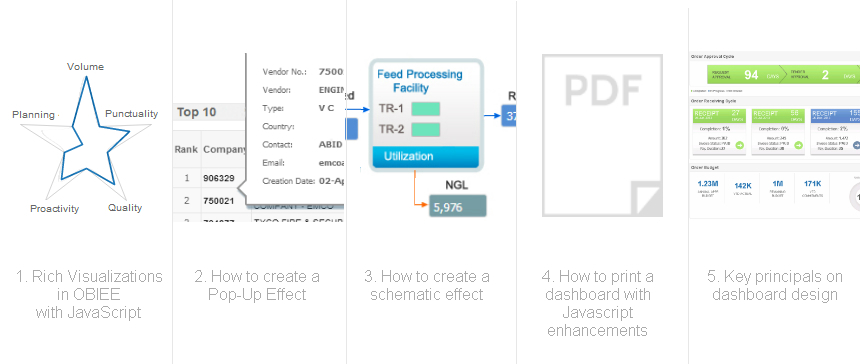
In this new visualization series we will cover from the very basic graph creation to the principals of dashboard design and how to present it on a professional fashion, in a nutshell: