16 Jun 2022 Oracle Analytics Cloud 6.4 – New Features
At the beginning of 2022, the Oracle Analytics team released OAC 6.4 with a host of new features and enhancements, spread over the March and May 2022 updates.
In this article, we’re going to give you an overview of some of the most exciting features, and then share our conclusions.
1. Persist ‘Right-Click’ Analytics Calculations [Data Visualization]
This is part of the May 2022 update. In previous releases we were already able to create Advanced Calculations (clusters/outliers), but this new feature Oracle Data Visualization (Oracle DV) lets us save the Advanced Calculations which can be re-used in subsequent analyses with different metrics.
Let’s take a quick look at outliers and clusters:
- Outliers highlight anomalies in data points in a given visual.
- Clusters identify homogeneous groups of data points.
- Both use k-Means and hierarchical clustering algorithms.
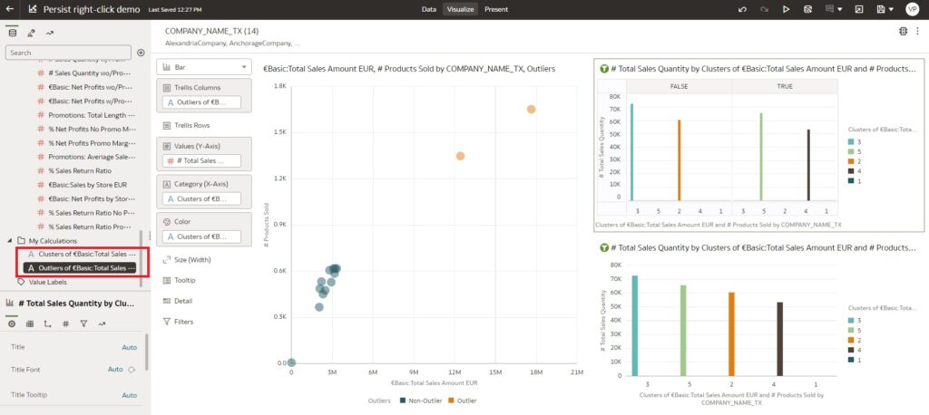
The formula will be saved under My Calculations in the left pane and it can be re-used in other visualisations from the same workbook. Creating a calculation enables you to analyse the same clusters or outliers across multiple visualisations with just a single click.
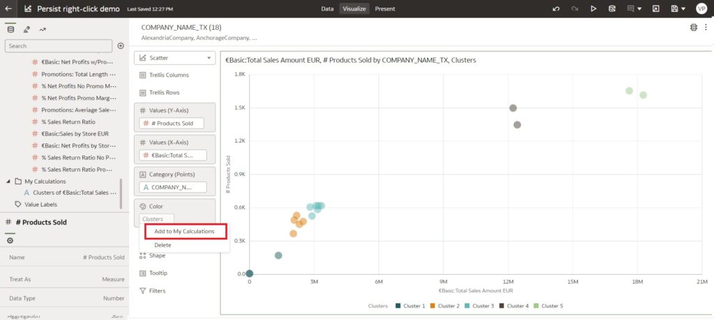
Below you can see how to create Advanced Calculations and save them under My Calculations:
- Right-click on any visualisation and select Statistics (we have created an analysis with a scatter plot chart).
- From the Statistics menu, select Outliers/Clusters; the results are shown directly in the visualisation.
- In the Grammar Panel, click on the Clusters or Outliers element, and select Add to My Calculations.
- The screenshot below shows how to save calculations from the Grammar Panel:
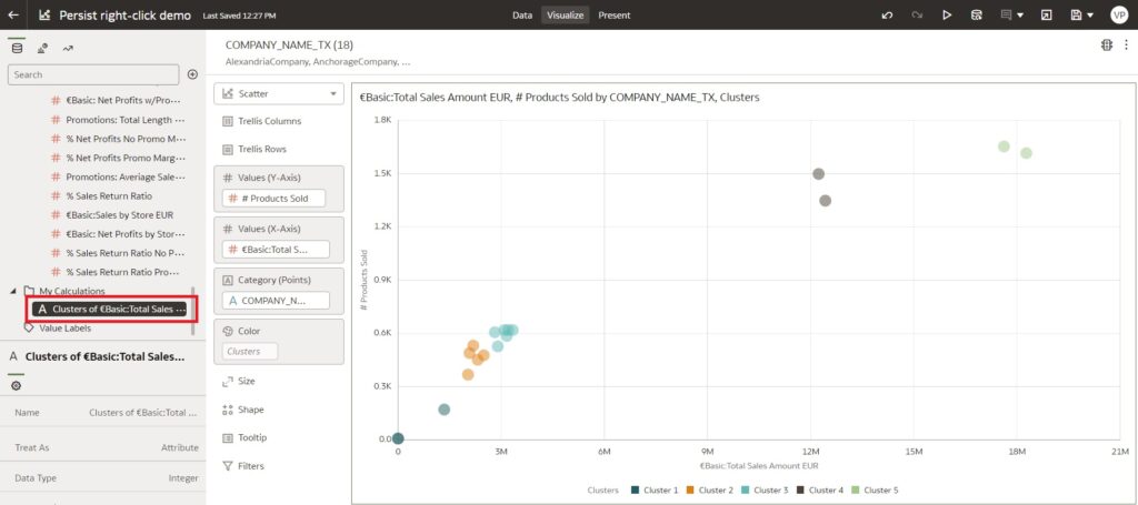
The above image shows how to create clusters and save them to My Calculations. Similarly, we can create outliers and save them there too.
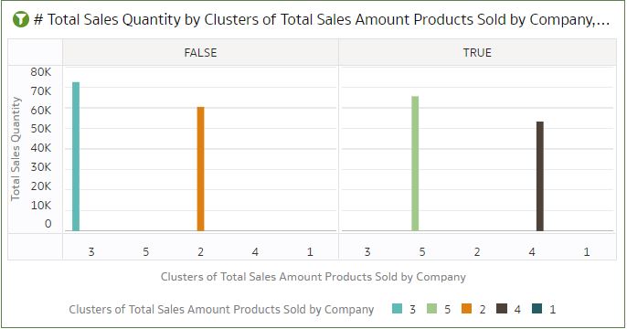
We can even drag the outlier to a chart that already has a cluster, so the visualisation combines both clusters and outliers:
2. Control Dashboard Filter Bar [Data Visualization]
Oracle Analytics added a new feature to OAC 6.4 as part of the March release, which helps you to run multiple filter options with a single control – a filter bar with drop-down selections, like the dashboard prompts in OBIEE/OAS. The new options available to users are:
- You can add multiple filter controls and choose to apply filters to specific visualisations on the canvas.
- It has its own grammar element as it is a visualisation type.
- There is a filter control with which you can limit the values of each filter (this can also be done from the filter controls of the property pane).
- Multiple properties have been added to the properties section of the dashboard filter bar, including:
- Orientation – vertical/horizontal alignment of the filter bar.
- Buttons – add or remove Apply and Reset buttons.
- Freeze buttons.
- Wrap.
- Optional feature to set the display format of the date/time dashboard filter.
- You can specify various settings, like how you want the dashboard filter to interact with the canvas and visualisation filters, and which items on the canvas to apply the filter to.
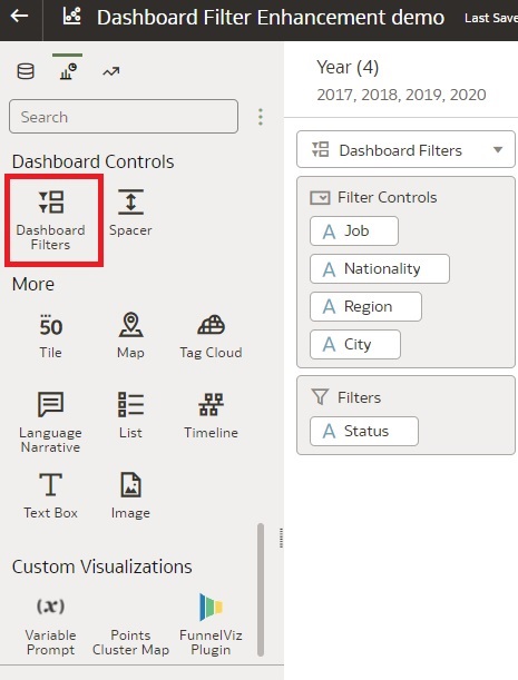
This feature can be applied from the Visualizations → Dashboard Controls → Dashboard Filters:
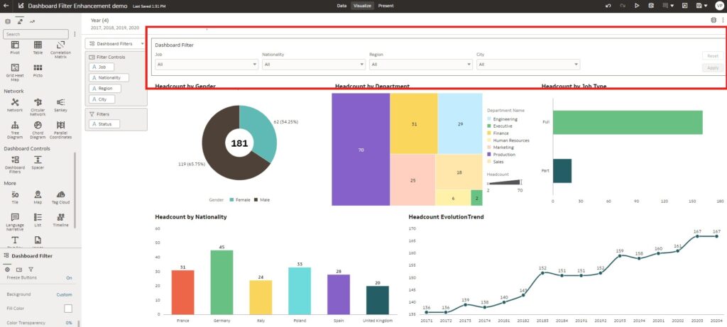
The image above shows the new dashboard filter bar added to a workbook, which has its own grammar content on the left.
This new feature may look like the existing workbook filter bar, but there are some clear advantages: this new dashboard filters chart is much more flexible and has more options in terms of formatting, positioning, and default values, especially when dealing with dates. So when should the filter bar be used? Mainly when a filter needs to be applied to multiple canvases (using the pin feature of the filter bar) or when there is a fixed filter that cannot be modified by any workbook consumer.
3. Inner Radius of a Donut Chart [Data Visualization]
This is an enhancement update, where you can control the inner radius of a donut chart. This helps to fit the number properly in the inner circle, making it look clearer and more professional.
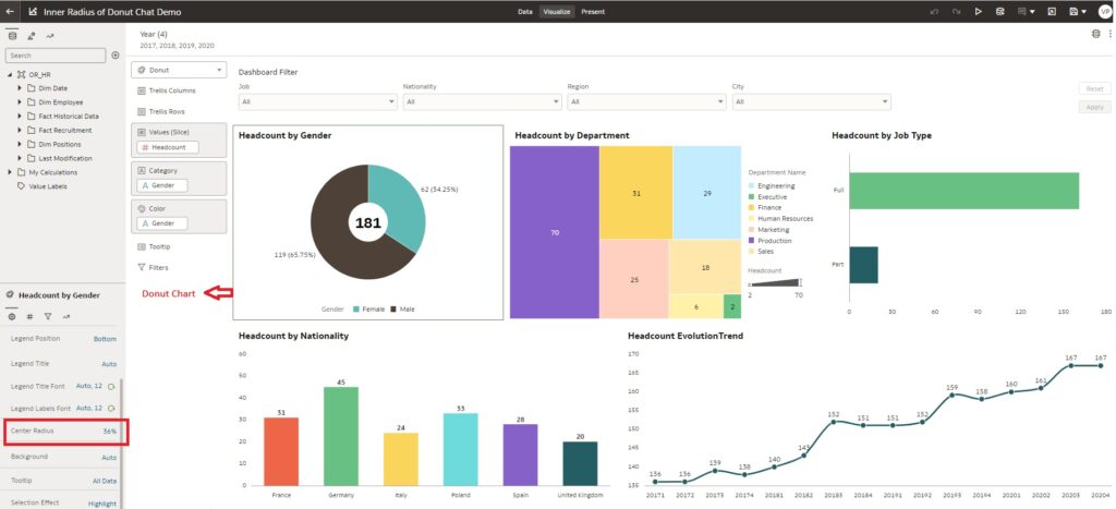
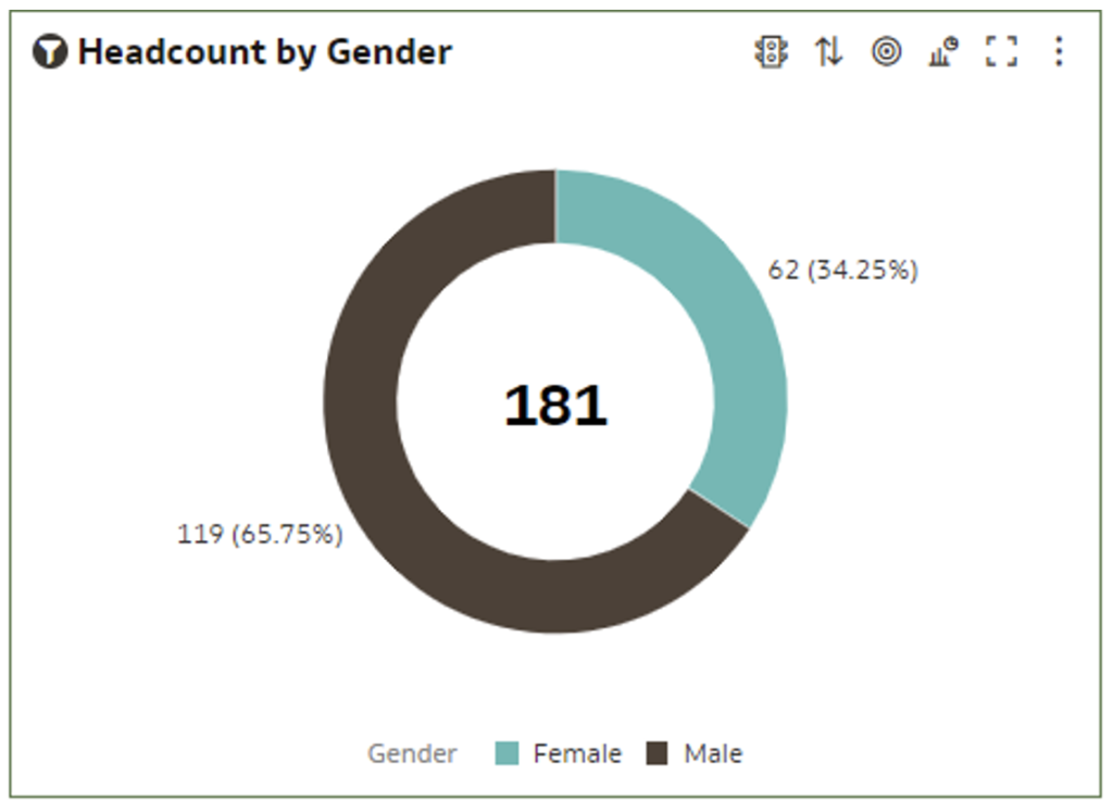
The screenshot above shows a donut chart with an increased centre radius.
This feature may seem to be a simple enhancement, yet really it’s a brilliant upgrade which many of us can benefit from. Previously, we had to use other workarounds to make the donut charts look better and hold the data in the middle.
4. ‘Unarchive’ Catalog Job Progress Tracking and Status [Analytics Classic]
Dashboard pages tend to have a lot of custom-coded elements, and doing it by hand is quite prone to error. Archiving and unarchiving catalogues has always been a fast, safe way to transfer entire dashboards between environments. The only issue, if the dashboard or dashboard catalogue folder is quite large, is that the unarchiving can take quite some time, and while it’s ongoing you can never know for sure what its status is. This is why Oracle has rolled out a new feature that can track the progress and status of unarchiving catalogues.
- While you are in Catalog, navigate to the location where you want to unarchive another catalogue file.
- Select Unarchive from the bottom-left section of the page.
- Click on Browse to find the catalogue file.
- Click on OK.
- You can track the progress of the unarchive job at the Unarchive Jobs tab that is in the My Account dialogue window.
- Click on My Profile in the upper-right of the page and select My Account.
- Click on the Unarchive Jobs
- The statuses of unarchive jobs and their timestamps are now visible, as shown in the image below:
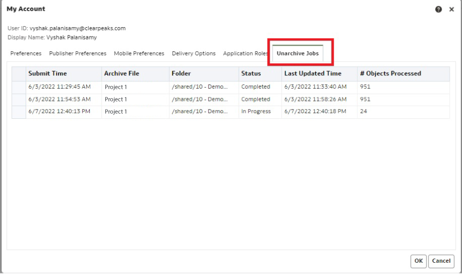
This feature needs some improvement: although it helps us to track the status of the unarchive job, it doesn’t auto-refresh to show the status, and instead you need to close this window and reopen it again from My Account. It would be nice if a small pop-up window appeared, showing the status without the user having to open the My Account window again.
5. Datasets with Multiple Tables [Dataset]
The new update in Oracle Analytics allows self-service data modelling with datasets while adding multiple tables to a dataset from different data source connections or local subject areas. This enables you to add multiple files to a dataset, where each file becomes a table, and you can define joins between tables within a dataset.
A dataset can include more than one file uploaded from your computer. It’s also possible to disable this default behaviour and join the tables manually, by switching off the Auto Join Tables toggle button in the Dataset Editor:
![]()
- Click on Create and then click on Create Dataset.
- Locate the dataset from your computer and click on Open.
- The Dataset Editor window opens with the dataset you added; you can add multiple files to the same dataset.
- The Dataset Editor contains a new Join Diagram pane which displays all the tables and the joins between them in the dataset.
- Oracle recommends adding the Fact table first, followed by the related Dimensions, and then creating a dataset based on each star schema and using data blending to analyse data between the two models.
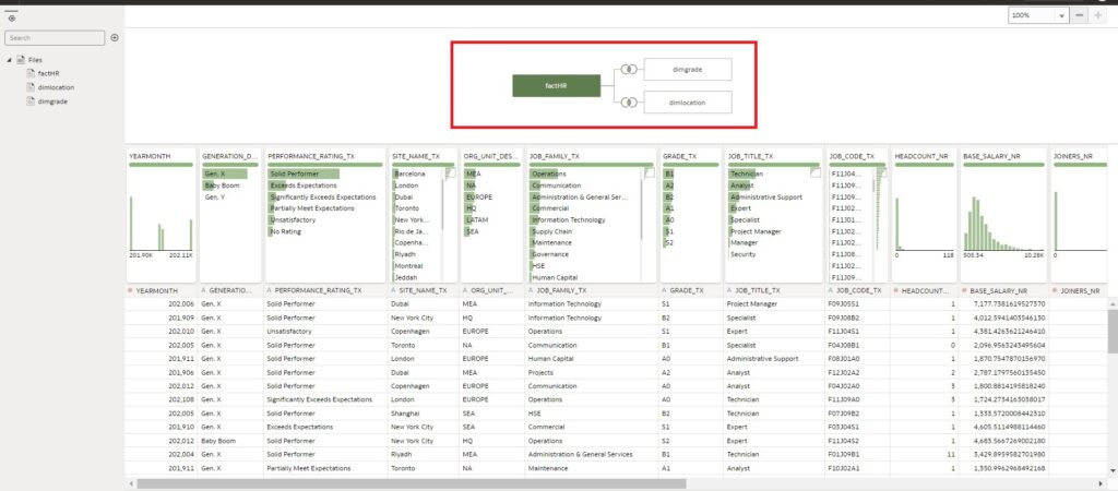
The image above shows how to create a dataset with multiple tables.
This feature helps the Oracle Analytics Server users who are working with the data visualisation tool as an alternative to the admin tool for modelling RPD (Repository Metadata).
Conclusion
OAC 6.4 is six months old now, and it still has plenty to offer. The Data Visualization tool boasts some nice features that keep steering Oracle in the right direction, hot on the heels of the competition. From what we’ve seen, the dataset with multiple tables feature is the one that stands out from the crowd, because it offers flexibility to business users and is a great complement to the traditional and powerful Repository Metadata (RPD), usually managed only by IT.
If you’re interested in what we’ve shared with you, why not get in touch with one of our expert Oracle consultants and see what ClearPeaks can do for your organisation? Just click here!