15 Jun 2023 What’s New in the Oracle Analytics Cloud – May 2023 Release
Welcome to our blog, where today we’re going to delve into the latest enhancements in Oracle Analytics Cloud (OAC). Read on as we show you the power of OAC and unlock new levels of data-driven insights! Don’t forget to check out our previous blog on Oracle Analytics Cloud – March 2023 to stay up to date with the latest features and advances. Now let’s dive in and continue our journey of discovery, looking at some exciting new features from the OAC May 2023 release.
1. Web Semantic Modeler
One of the most notable enhancements in the May 2023 OAC release is the introduction of the Semantic Modeler, a powerful tool that allows users to create and manage semantic models for their data sources, enabling a simplified and intuitive approach to data modelling and analysis.
The Semantic Modeler was introduced by Oracle in their July 2022 release, but only the preview version was available to users; now the web Semantic Modeler is GA (General Availability) as of the OAC May release. The ClearPeaks team already tested, implemented and reviewed this feature in a blog post last year, so we are not covering it in detail here, but if you want to know more, please check out “Breakthrough in Cloud BI? New Semantic Modeller in OAC (Oracle Analytics Cloud).”
2. Conditional Formatting on Maps
We wrote about the Conditional Formatting feature in some of our recent blog posts (OAC January ‘23 & OAC March ‘23), and although it has been available in Oracle Analytics for some time, there are now a lot of enhancements and new additions to this feature. With Conditional Formatting, we can visually highlight important information, identify trends, and draw attention to specific data points.
For this new release, Oracle has introduced Conditional Formatting on map visualisations. With map visualisations, we can transform our data into interactive and informative maps, enabling us to gain valuable insights based on location. And this new enhancement allows us to apply Conditional Formatting rules directly to the map, further improving our ability to highlight and analyse data in a spatial context. By combining the power of Conditional Formatting and map visualisation, we can uncover patterns, trends, and outliers in our data, leading to even more impactful data-driven decisions.
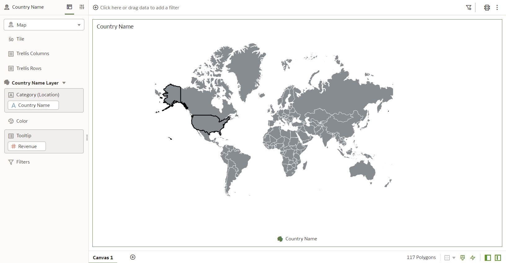
Now let’s run through the process of creating Conditional Formatting for maps. The first step is to ensure we have the right dataset and then to create a map visualisation. In the image below we have created a map visualisation with address details:
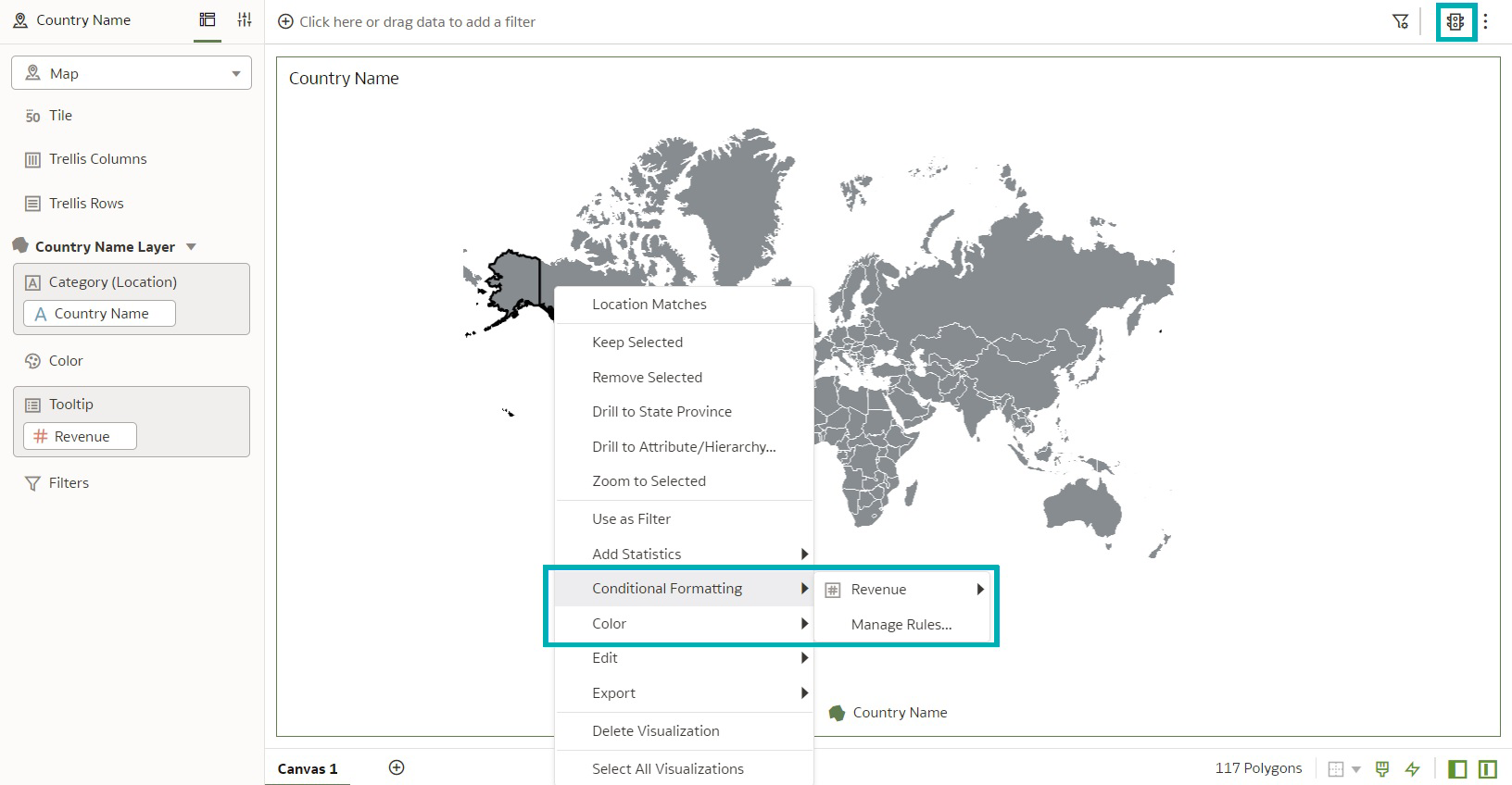
There are several ways to apply Conditional Formatting to a visualisation. We’re going to right-click on the visualisation and select Conditional Formatting, as you can see below:
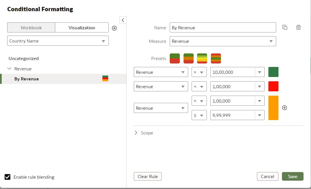
Now we have to define the formatting conditions. For example, we can set conditions based on data values, such as sales revenue above a certain threshold. We just choose the formatting style or options we want to apply when the conditions are met, which could include changing the marker colour, adjusting the marker size, or using different symbols or icons:
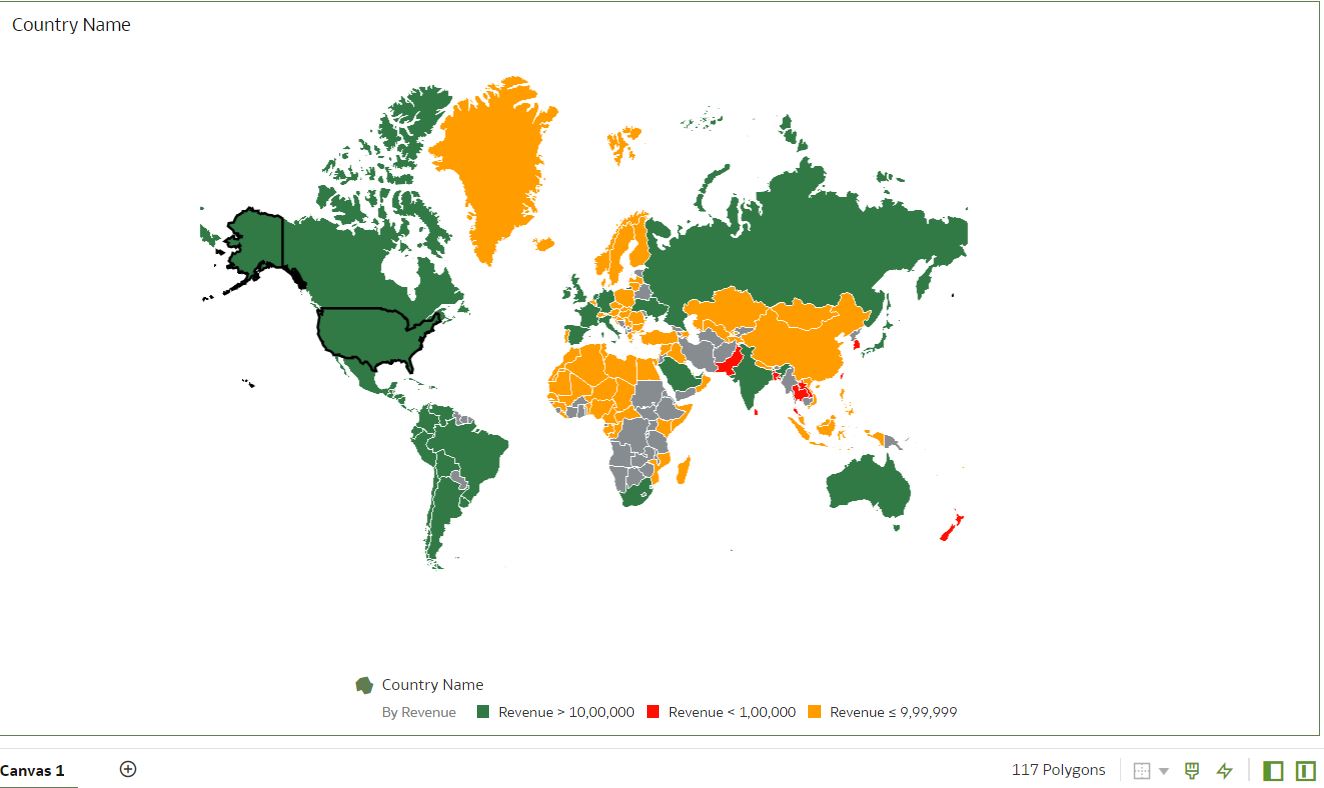
Below is a preview of the map visualisation we created, with Conditional Formatting applied:
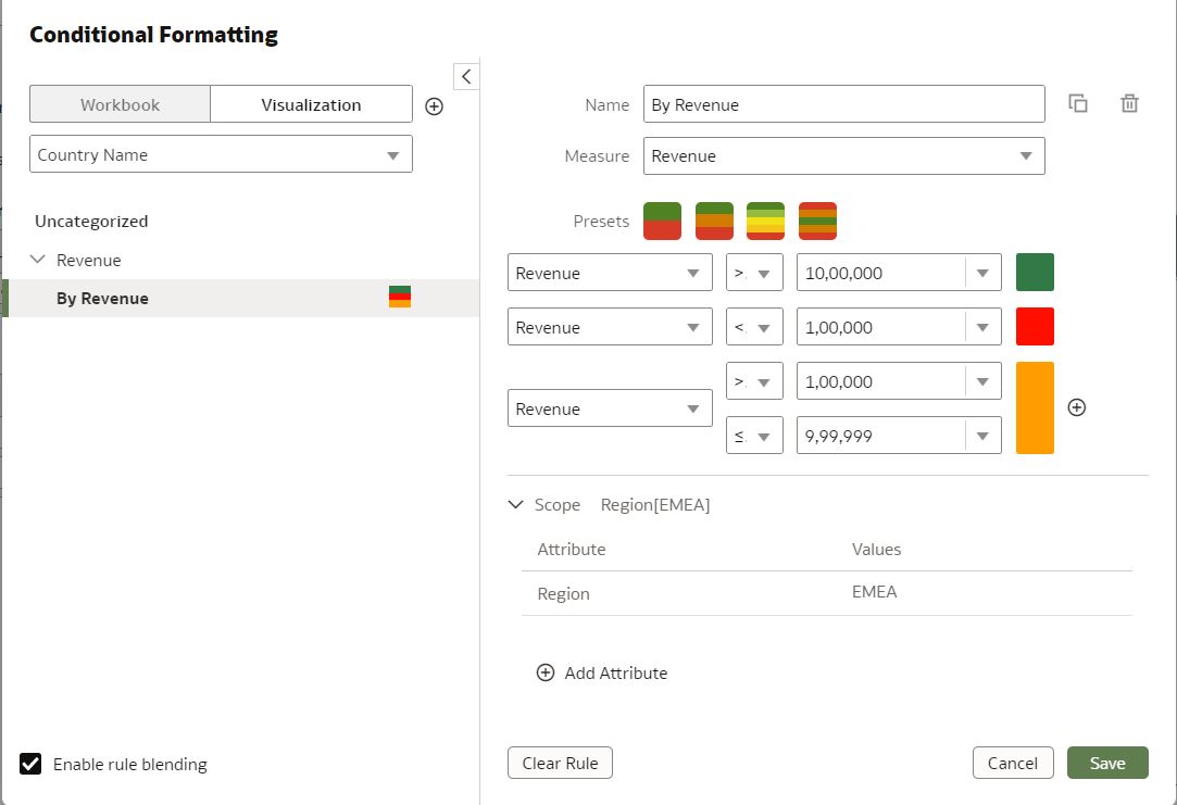
We can also change the scope of the formatting according to certain conditions – here, for example, we have changed the scope to apply the formatting to a specific region of the map only:
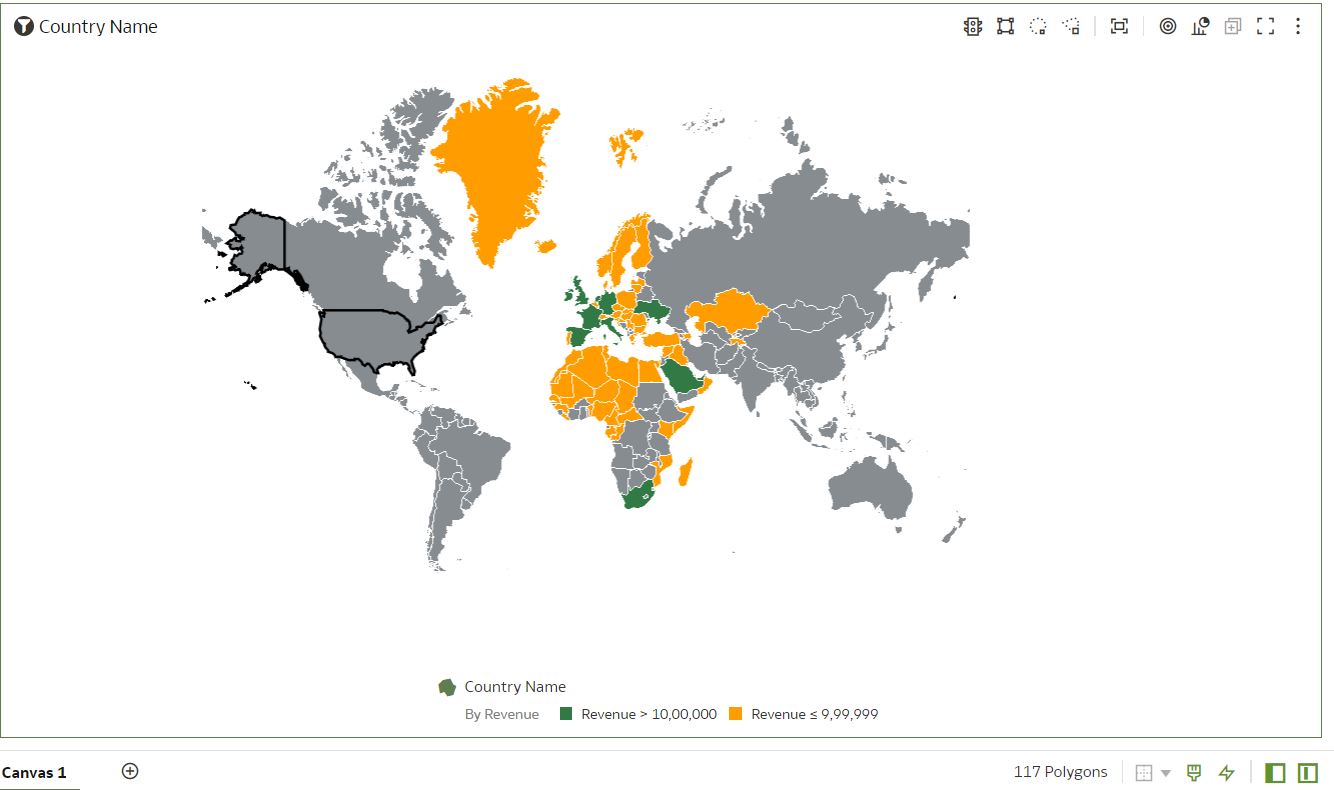
And now we have a map visualisation that shows revenue only for the EMEA regions, as selected in the scope of the Conditional Formatting tab.
3. Conditional Annotations (Rule-Based) on Visualisations
Conditional Annotations is an OAC feature that allows us to dynamically add annotations to our data based on specific conditions or criteria. With Conditional Annotations, we can provide contextual information, explanations, or additional insights to enhance the understanding of our data. Unfortunately, this feature is still not available for map visualisations, but hopefully it will come out soon! Until then, we’ll have to visualise this on a different chart.
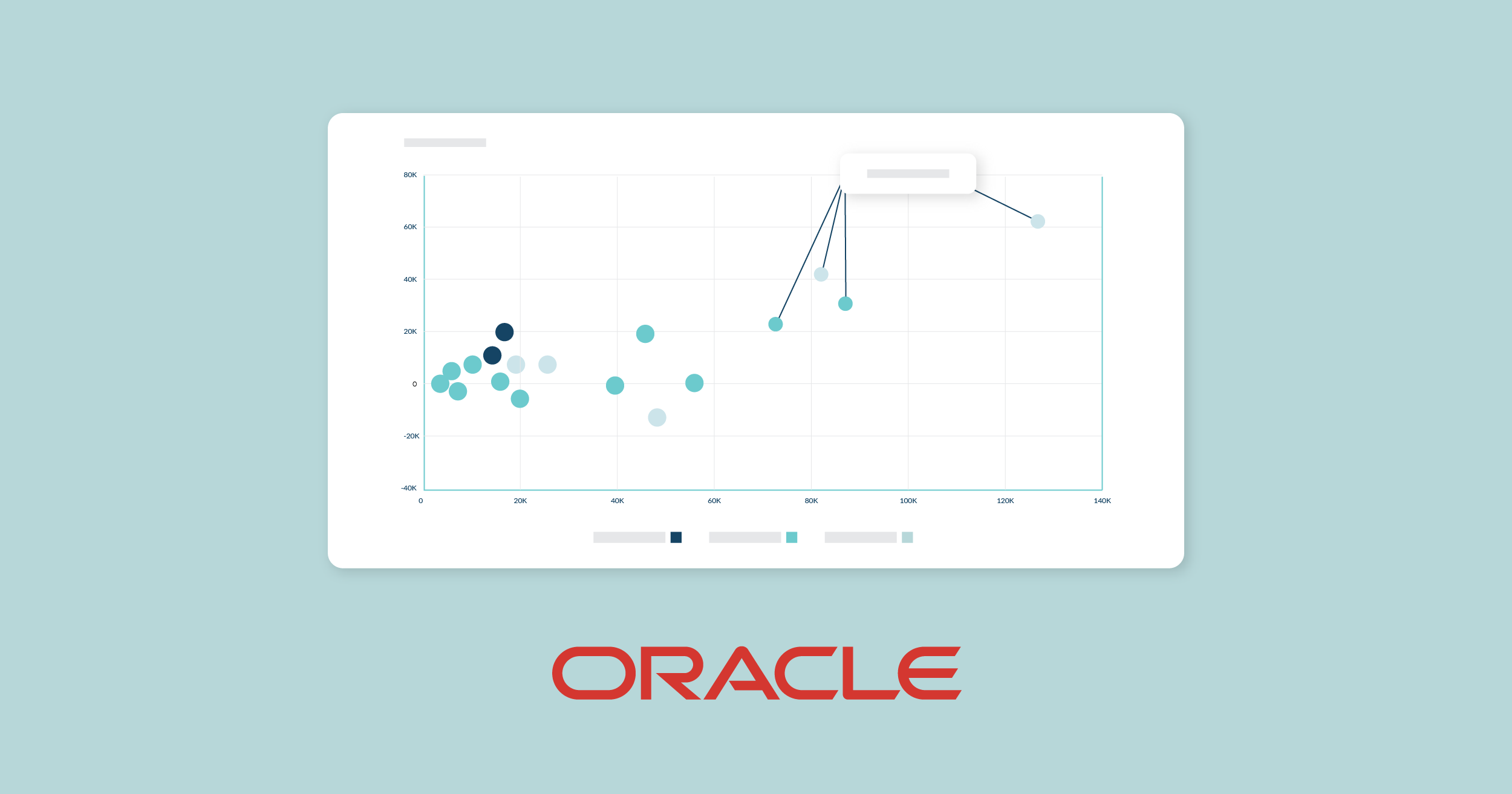
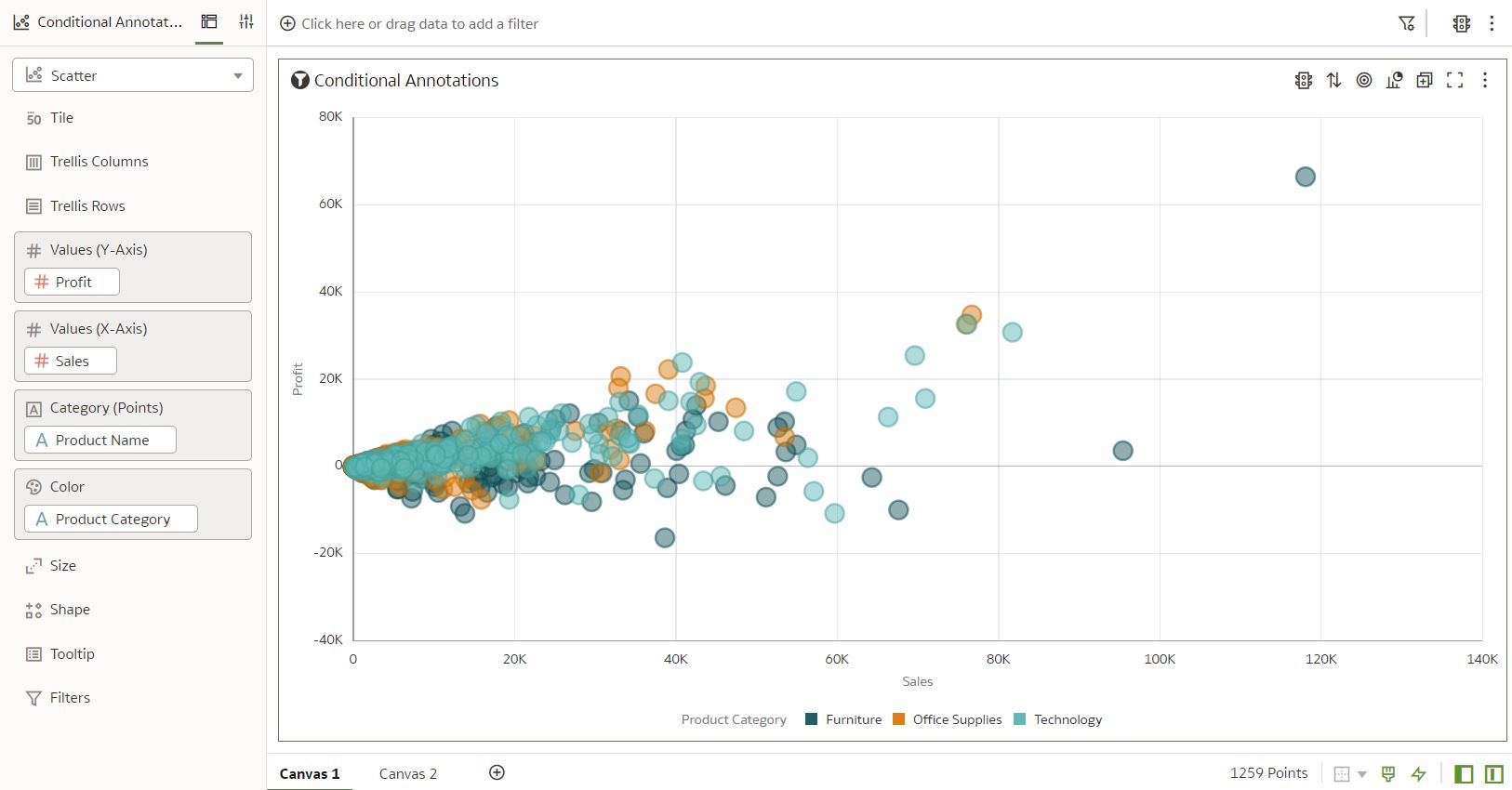
Let’s implement this feature with the example shown below. In this scatter chart, different categories of products are plotted according to sales and profits on the X and Y axes:
We’ll now highlight the products with the highest profits (>50,000), and to do so we’ll create a Conditional Formatting rule as shown below. By applying this rule, products with profits greater than 50,000 will stand out, allowing users to quickly identify and focus on these high-profit items.
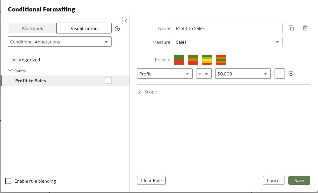
Under the format tab of the above condition, we add a Note that says, “Products with Highest Profit.”
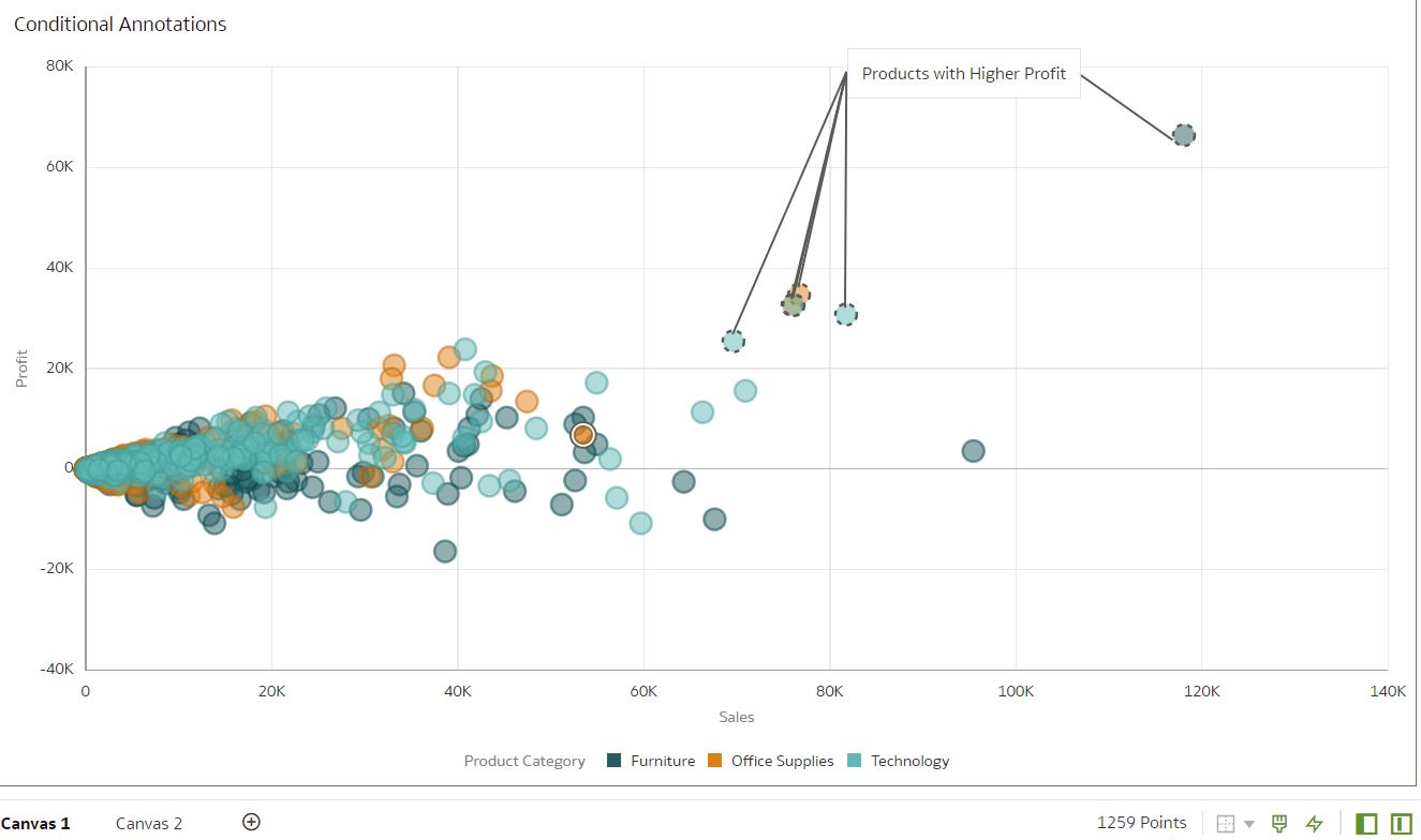
Finally, after applying this rule to the visualisation, we can see the products that meet the specified condition have the note linked to them. We can create multiple notes for multiple rules with Conditional Formatting.
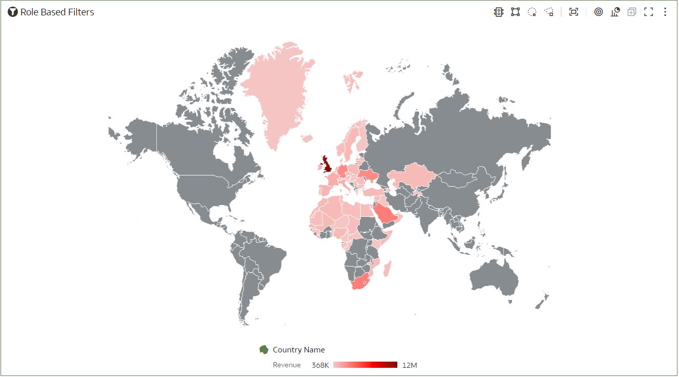
4. Role-Based Filters in Datasets
Different filter types enable you to focus on the data that you are interested in. Filters based on application roles, known as role-based filters, enable Oracle Analytics business analysts and users to access only the data they are allowed to see. For example, in a global sales report, we can enable some users to only access data for a certain region (e.g., EMEA). Before this release, this was only possible by defining the roles in the repository by creating datasets from subject areas.
Row-level security in OBIEE and role-based filters in OAC are different. In OAC, access to the data in a workbook is determined by the user’s role: if a user is not assigned to a particular role, they won’t be able to access the data in the workbook. This is a very secure approach to data access, as it ensures that only authorised users can access sensitive data.
However, it’s important to set up the roles correctly to guarantee that users have the appropriate level of access. This applies to the dataset owner as well (even the superuser won’t be able to see data unless a role is assigned), and although Oracle has recommended a workaround for this, it needs improvement, and we are sure we will see a definitive solution in future releases.
Now let’s apply a role-based filter to a sample dataset: we will take a simple dataset with region-wise revenue, and apply the filter to the Region field.
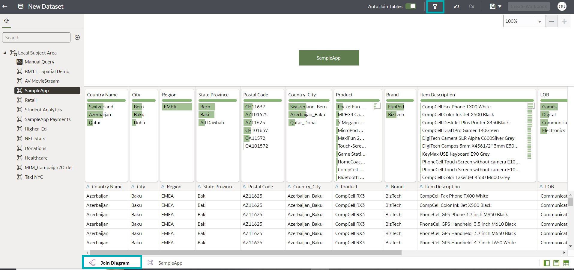
To create a role-based filter, select the Join Diagram tab in the dataset editor, then click on the Hide or Display the role-based filter bar icon on the top as highlighted in the image above.
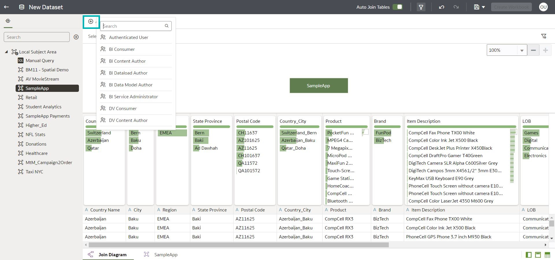
Click on the Add Role icon at the top left, then select the application role we want to apply to the dataset:
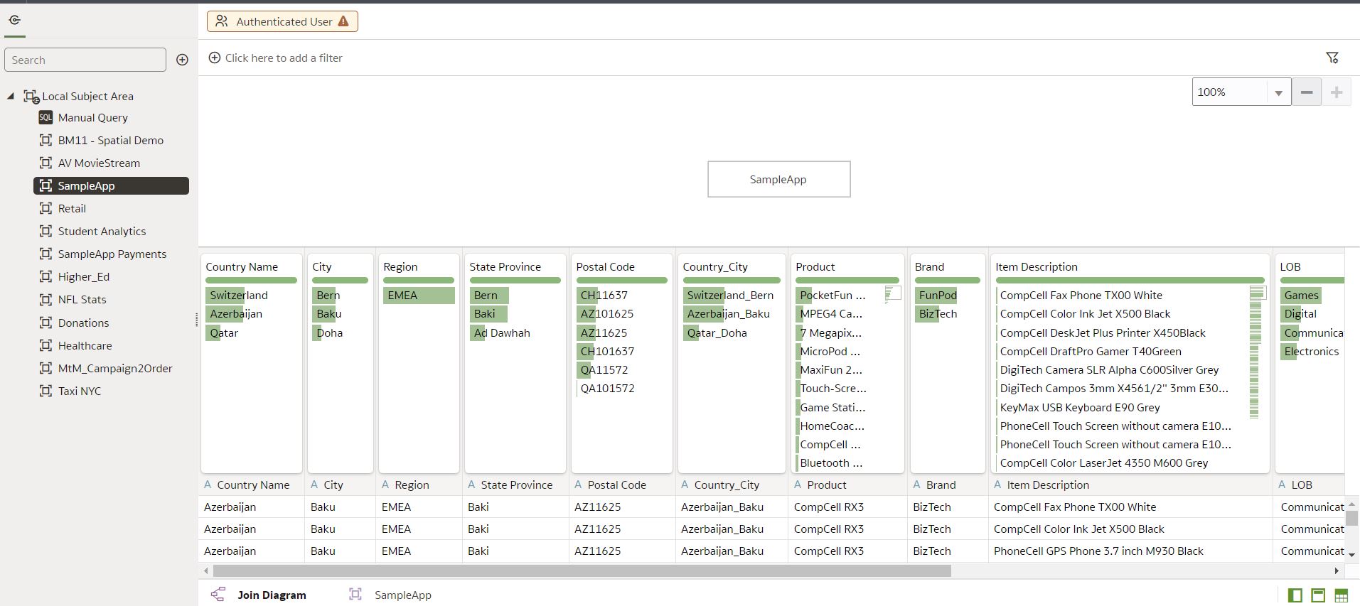
Click on the Add Filter icon after selecting the application role, then apply the appropriate filter to restrict data access. In this example, we are going to apply a filter on the Region field:
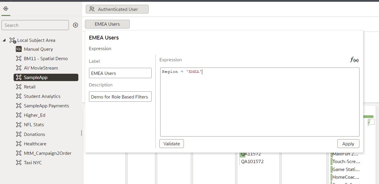
Add the condition to the Expression editor and click on Apply. We will immediately notice that the data in the preview view of the dataset does not filter after applying this role/filter; nevertheless, data filters will be applied when users access the workbook or dataflows associated with this dataset. If we now log in as a user with an EMEA user’s role and create a simple workbook with a map visualisation, we can see how the role-based filters are applied – the user can only see the data for the EMEA region.
5. Parameters Enhancements
Parameters were introduced in the March 2023 release and the ClearPeaks team covered this in an earlier blog post. In this release, when we define a parameter, Initial Values are no longer mandatory. In the Create Parameter window we can see a new option, First Possible Value, which allows us to use the first value as the initial value. Alternatively we can leave it blank, in which case the parameter holds no value.
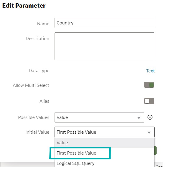
The image above shows the new option in the list, First Possible Value.
Conclusion
These latest enhancements to Oracle Analytics Cloud have introduced valuable tools for users to explore, create dashboards, and tell stories using their data. These updates also include features such as box plot and scatter plot visualisations, improved data connectivity, modelling capabilities, and Keyboard shortcuts to copy and paste grammar columns more easily.
These additions provide users with better functionality, helping them to uncover insights and to improve their analysis workflows. By leveraging these advancements, users can improve their data analysis capabilities and make more informed decisions.
You can learn more about the May release at the Oracle Analytics YouTube channel, and if you want to see how Oracle Analytics can help you with your particular use cases, don’t hesitate to get in touch with our team of dedicated experts here at ClearPeaks.