
11 Jan 2023 A Practical Guide to Charticulator in Power BI
Modern data visualisation tools offer the possibility to configure and personalise different charts: you can customise size, colours, position, legends, etc.. But in some particular cases, standard configurations fall short of meeting specific visualisation requirements from demanding clients.
Power BI is a powerful visualisation platform, but can sometimes be ill-adapted to the client’s requirements. In order to leverage the maximum performance of the tool, we need to go beyond the default visuals and use one of the huge number of visualisations available in the marketplace. One such example is Charticulator, an extension developed by Microsoft and certified for Power BI, that allows you to customise your visuals as you wish, with no coding!
In this blog post we will review this fantastic tool; below you can see some Charticulator examples that can be created without using a single line of code:
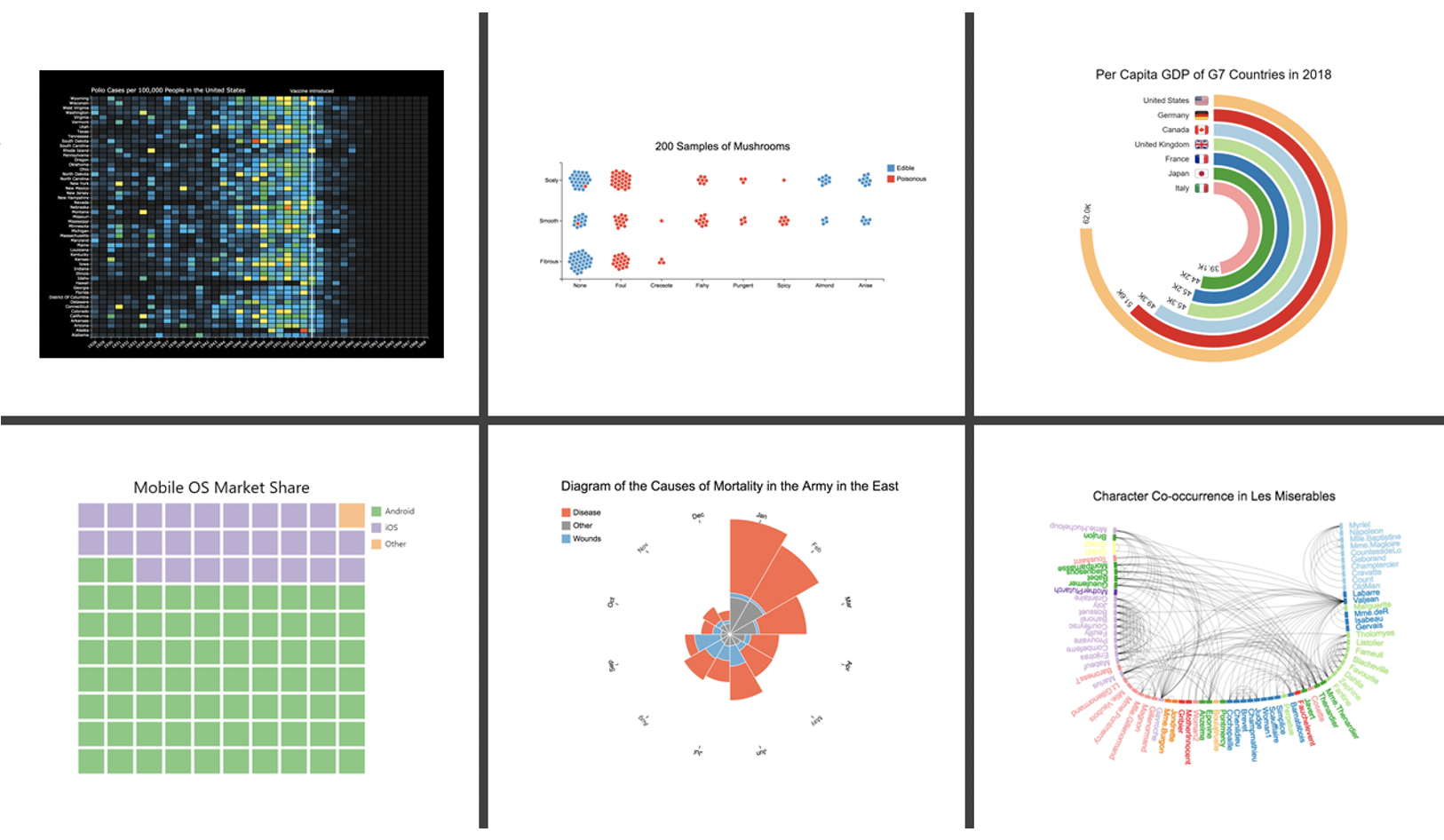
Figure 1: Charticulator examples, from their gallery
How Charticulator Works
In just a few clicks Charticulator allows us to get very attractive, customised results, as shown in the following animation:
Figure 2: Graphic creation from charticulator.com
Let’s start by installing Charticulator on the Power BI desktop, where we can add it to the project as if it was a marketplace visual. You can find more information about the installation process in the Microsoft Power BI Blog.
When you open Charticulator for the first time it may seem a little confusing, but you will soon find that it is simple and user-friendly. On starting up, we will see the following environment:
- Main Canvas: The result is shown in this section, and here is where we can add elements such as the legend, titles, the graphic, etc.
- The Glyph Section: The minimum expression that makes up the graph is added in this section; e.g. if it is a bar chart it would be a rectangle.
- Toolbar: Where all the elements that can be added to the chart are listed.
- Layer: This section allows you to see the vertical arrangement of the elements and to select them by layers.
- Attributes: Enables you to edit the properties of a selected element.
- Model Fields: Where the previously selected columns that the visual scope can access are displayed.
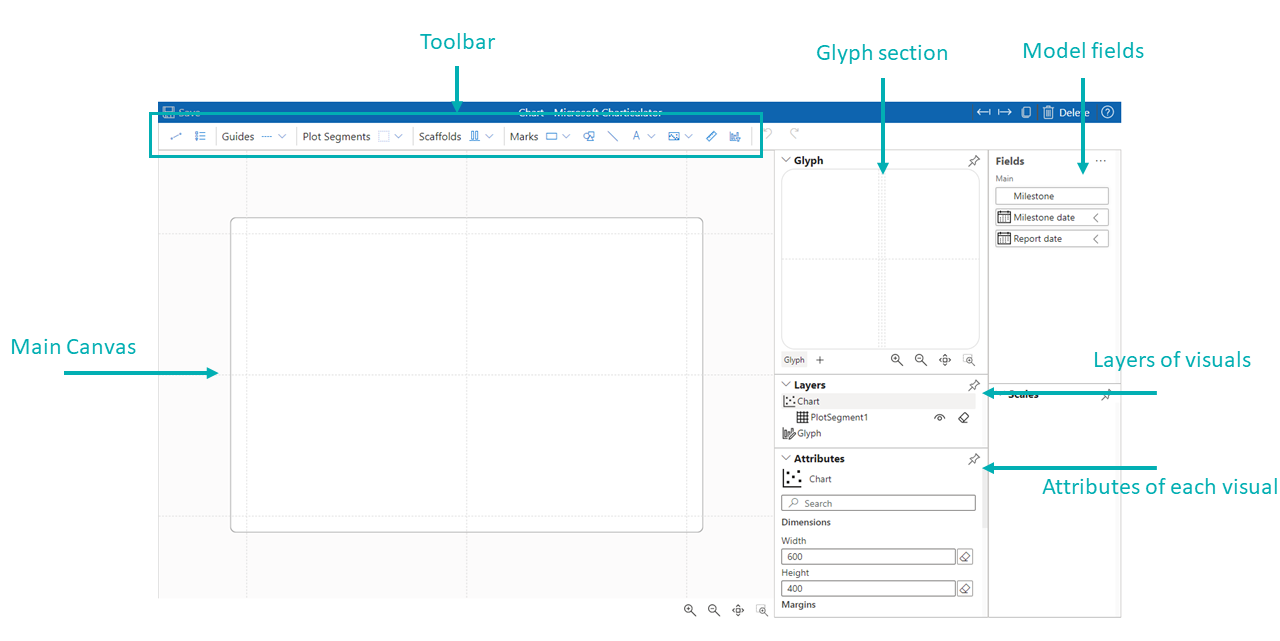
Figure 3: Charticulator Sections
Milestone Trend Analysis
A Milestone Trend Analysis is a very useful chart for project managers, where they can easily see if the project milestones are on track or not.
Milestones do not have a duration but provide a way to map out a project and provide achievable landmarks. Milestones can also indicate a change in the project development or a transition to another phase, thus giving meaning to each task and providing a way to track progress.
The structure of the data we need is simple: for example, the name of the column with the tasks, the expected date of the step, and the actual date reported when that step was reached.
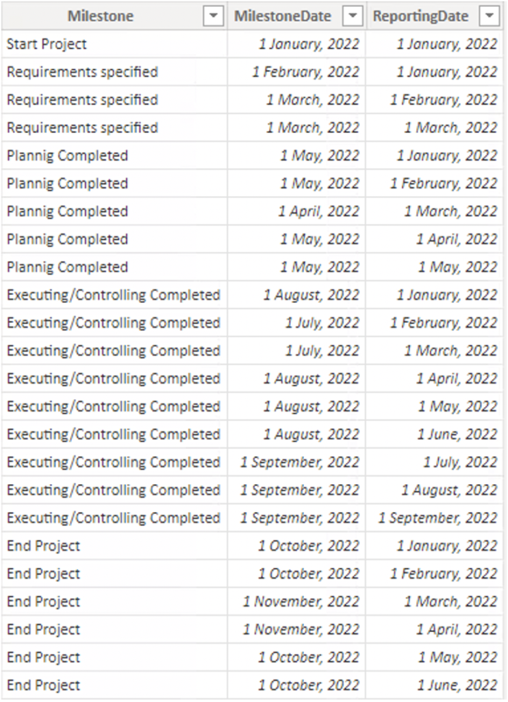
Figure 4: Examples of data
Now that we know what a milestone graphic means and what items we need, it is time to open Charticulator and start working. From the top menu bar we find the circle figure and add it to the Glyph section, then drag the time values onto the X and Y axes respectively. Now we have the axes of the graph and the element that makes it up – in our case, a circle:
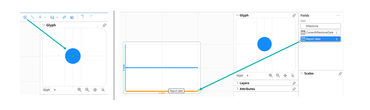
Figure 5: Adding the axes to the layout
Then the colours are added to each task of the milestone, as shown in the image below, by selecting the visual element (in our case the circle). We can edit it and modify the colour. We will select the column by which we want to segment, in our case the milestone, as it is the one that has the names of the tasks:
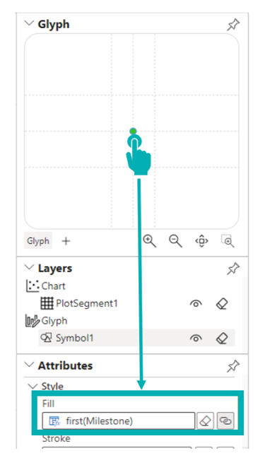
Figure 6: Add colour segmentation
The last step is to join the points together. Go to the top menu, find the Link option which will ask us what type of link we want between the nodes, and by which attribute we want to relate them: in our case we will select Line and Milestone:
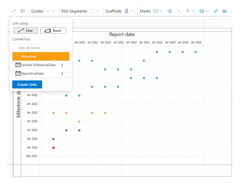
Figure 7: Add relationships between nodes
Once we have joined the points and added the necessary legend, titles and formatting, we will end up with a milestone chart like the one below.
This type of graph is tricky to make with the default visuals in Power BI, but Charticulator solves this problem in an easy, elegant way.
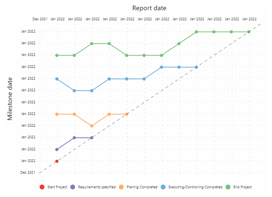
Figure 8: Final result of the Milestone Trend Analysis
Why Charticulator?
As we have seen, Charticulator facilitates and enhances the creation of customised visualisations, where the configuration and editing of each element makes it fit our needs like a glove.
Of course, the app is not perfect, as it is still under development and there are some bugs and enhancements to be made. In the Charticulator Github you can check the Issues to see if a certain action or bug is listed for future work, but in general Charticulator is a very constructive tool that meets all the requirements that a BI developer could have.
If you need some expert help with Charticulator, Power BI, or any of your other BI projects, simply get in touch with us here at ClearPeaks – our certified consultants would love to help you!