04 Jul 2017 Tableau 10.3: Data-driven alerts and a smart trick for KPI´s
With version 10.3, Tableau has introduced a very useful feature: Data-Driven Alerts. Now, when looking at a dashboard in Tableau Server, you can set up automatic mail notifications to a set of recipients when a certain value reaches a specific threshold. In this article, we’re going to go through the basics of this feature, explaining how to use it, and then show you how to get even more from it when dealing with KPIs.
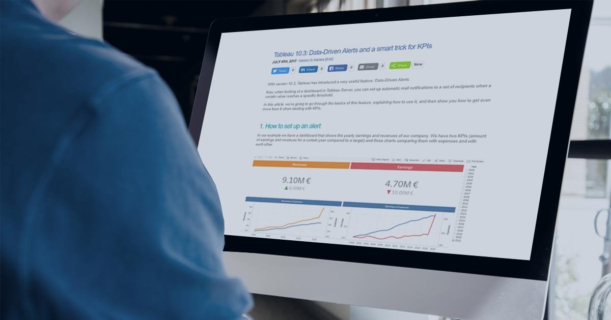
1. How to set up an alert
In our example we have a dashboard that shows the yearly earnings and revenues of our company. We have two KPIs (amount of earnings and revenues for a certain year compared to a target) and three charts comparing them with expenses and with each other.
 |
Figure 1: Dashboard example |
To set up the alert on one of the measures shown, all we have to do is click on one of the axes (without applying any filters or actions) and then click on Alert. We will be able to set up our alert and save it in the pop-up window.
 |
Figure 2: Alert creation |
The various options for the condition are:
| • | Above or equal to |
| • | Above |
| • | Below or equal to> |
| • | Below |
| • | Equal to |
The frequency can be set as:
| • | Once – the first time it’s true |
| • | As frequently as possible |
| • | Hourly at most |
| • | Daily at most |
| • | Weekly at most |
In the example shown, we’re going to set up an alert on the Earnings measure, and we want to receive an email as soon as the value reaches €5M. Once saved, the alert becomes active. If you want to see the status of all the alerts when browsing a site, click on Tasks (if you have permission), and then on Alerts. You will see a list of all the active alerts, with name, view, owner, recipients, email frequency, last check time, and last alert time. You can also edit or delete them by clicking on “…”. You can set up more alerts on the same view or dashboard, and even on the same measure or axis. Just remember that you must do it on the original dashboard, with no filters or actions applied (otherwise Tableau will give you an error).
 |
Figure 3: Alerts management pane |
2. A smart trick for KPI´s
Alerts are a really good new feature and work pretty well. In the previous example, you get an email as soon as your earnings reach €5M. There is, however, one major restriction: alerts can only be set up by clicking on a continuous axis. This means that we can’t use them on our beloved KPIs, as they usually only show a number and maybe a few indicators. In our example, the KPIs show the value of the earnings and the revenues. To set up an alert on them, we could click on any of the axes below, and even set one up on revenues. But what if there is no axis in the dashboard for the measure that we want to track? Don’t worry, we’ve got a neat trick to show you.
We’re going to add a third measure, a calculated field that shows the ratio between the earnings and the revenues, that we can call Quality.
 |
Figure 4: Dashboard example with new KPI |
How can we add an alert on it? It has no axis, but we can modify it and “cheat?” Tableau while still showing our KPI. We can edit the sheet like this:
| • | Create a dummy calculated field that simply has value 1 |
| • | Drag it to the sheet, alongside your quality measure |
| • | Set the visualization as a bar chart and use the double axis feature |
| • | Fix the axis of the dummy field to go from 0 to 1, so that it always shows a full bar |
| • | Do the same with the second axis, synchronizing the two axes |
| • | Clean the two axes, removing text and ticks. Leave some text on the second one to indicate where to click to set up the alert |
| • | Set the size as maximum and the colours the same as the background, in order to “hide” the bars |
| • | Drag your quality field to the dummy text box, and align it in the middle |
Done! Your sheet will now look like this (we added some extra fancy text to it, but you don’t need to):
 |
Figure 5: New KPI sheet |
Drag your new sheet to the dashboard, then upload it to Tableau Server and click on “Click for Alert”. You can now set up an alert on your custom KPI!
 |
Figure 6: Alert creation on new KPI with no axis |
Conclusion
Data-Driven Alerts are a very powerful new feature that users had been asking for quite a long time, allowing the tracking of the most important measures in the easiest possible way (by receiving a notification in your business email box) without having to repeatedly check the dashboard! This should save you a significant amount of time… Yes, the axis chart restriction is a bit of an inconvenience, but this can be overcome with the trick shown above. We are also sure that Tableau will improve it even more in future versions.