25 May 2020 How to apply Cohort Analysis in Tableau using COVID-19 data
The worldwide spread of COVID-19 has increased interest in data visualizations, a useful way to understand trends; we’ve seen how helpful they are when dealing with such a fast-moving virus, and they can help raise awareness too.
There are many factors (political, demographical, geographical, etc.) that play a key role in how COVID-19 affects different countries, complicating the analyses. A clear visualization is the easiest way to a get a sense of the differences between countries.
Cohort Analysis is a useful approach to analysing long-term trends and understanding the seasonality and lifecycle of data. This article explains what Cohort Analysis is, and how to implement it to build visualizations in Tableau.
The collected dataset for this post is provided by the Johns Hopkins University, which is tracking the number of aggregated confirmed cases and deaths at country level. Checking data progress is easier thanks to the daily updates, helping to observe how the virus is spreading around the globe.
1. What is Cohort Analysis?
A cohort is a data subset which shares common characteristics for a specified period – so rather than looking at the complete set of data, it breaks it into related groups. It is handy for detecting trend changes easily and for studying the outcomes associated within the subset.
The connected data should consist of a time-based list of events whose behaviour will be analysed. The first point to consider is how to define the cohort; if it is not represented as a dimension in the data, it is necessary to create calculated fields or sets.
2. Model our data for Cohort Analysis
First, we need to evaluate what the point of the analysis is. The spread of the virus worldwide has occurred at different moments in time, beginning in China, then moving to Europe and finally to America. Comparing countries becomes tricky, and so it is necessary to define a common characteristic to overlap the well-known growth curves of reported positive cases.
The goal of this article is to come up with a solution to overlap these curves and to help explain the evolution of the coronavirus in different countries, in terms of the number of days since a specific number of positive cases was reached.
2.1. Explore Our Dataset
A first look at our data shows that we are already provided with the metrics for the analysis: the number of cases. The dataset provides two different case types: Confirmed and Deaths.
However, the cohort is not represented as a dimension and the date field included in the dataset is not suitable to define the cohort; it is therefore necessary to create some calculated fields to deal with this.
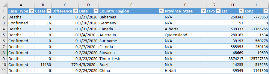
Figure 1: Global Covid-19 Dataset provided by Johns Hopkins University
2.2. Define the Cohorts
We need to consider some key parameters to build the cohort:
- The attribute that defines the cohort: the number of days since the Nth case was reached in the country.
- Cohort size: the time interval over which to define the cohort, in this case days.
- Period: like the example used in this blog, the cohort behaviour will be analysed for as long as the epidemic lasts.
- Key metrics for analysis: number of reported cases and deaths due to Covid-19.
The steps to perform this analysis in Tableau are as follows:
Step 1. First, let’s create a parameter to define the starting number of cases. This number is just used to limit the starting date point and as a threshold. Go to a sheet in Tableau Desktop and right-click on the Parameters area > Create Parameter, then follow the setup in Figure 2:
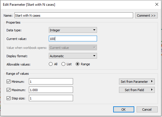
Figure 2: Create Parameter
Step 2. After that, create a calculated field to obtain the daily number of confirmed cases for each country using level of detail expressions for the specified dimensions (see Figure 3). These types of calculation are especially useful to run queries involving many dimensions at the data source level, instead of just bringing all the data to the Tableau interface.
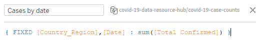
Figure 3: Edit Relationship set-up
Step 3. The next step is to create another calculated field to determine the date on which the number of cases in each country exceeded the threshold determined by the parameter from Step 1. In our case, the first day with more than 100 registered cases (parameter Start Date with N cases is set to 100). To complete this step, we need two different calculations: as in the previous step, level of detail expressions will be used to compute the appropriate aggregation per country.
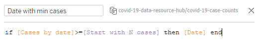
Figure 4: Calculated field: number of daily cases
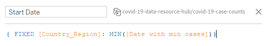
Figure 5: Calculated field: starting date per country
Step 4. The last step is to calculate the relative day for the metrics in the analysis within the cohort. For this analysis, this is the number of days that passed with respect to the virus starting date in the country.
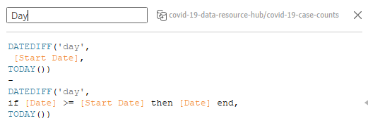
Figure 6: Calculated field: date dimension for the cohort
2.3. Build Visualizations
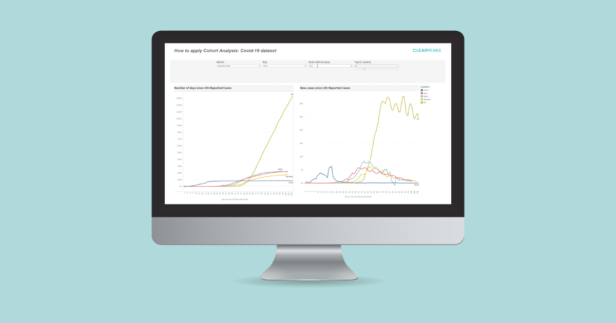
We have managed to overlap the growth curves using Cohort Analysis: this facilitates the comparison between countries with different starting points under a common dimension. Figure 7 shows the result of applying Cohort Analysis over the daily number of reported cases for the top 5 most affected countries.

Figure 7: Result of applying Cohort Analysis over daily reported cases
The shape of the curve is one of the most important elements to consider when predicting the effects of the epidemic, and it helps us to understand the stages of its progression. The area under the left curve in Figure 7 shows the cumulative number of cases throughout the outbreak after the 100th confirmed case, with stars representing national lockdowns.
In the early days of the spread, the curves evolve in a similar way. However, from approximately the third week onwards, we can see which countries experienced continued rapid growth, as is the case of the United States. European countries continued with a growth tendency and slowly started to flatten out around day 50; on the other hand, we find that China already had a flatter curve since day 30 – starting lockdown before any other country helped to flatten the curve.
The right curve in Figure 7 shows the daily incidence of cases. For all global data sources on the pandemic, the way in which cases are reported daily has an impact on the visualization figures. To overcome this, it was helpful to view the three-day rolling average of the daily figures. Daily figures show an increasing trend for the first four weeks in European countries; not having lockdown restrictions in the United States has resulted in a larger growth period of new cases, starting to register a cyclical decreasing tendency after the fifth week since the 100th reported case was first tracked.
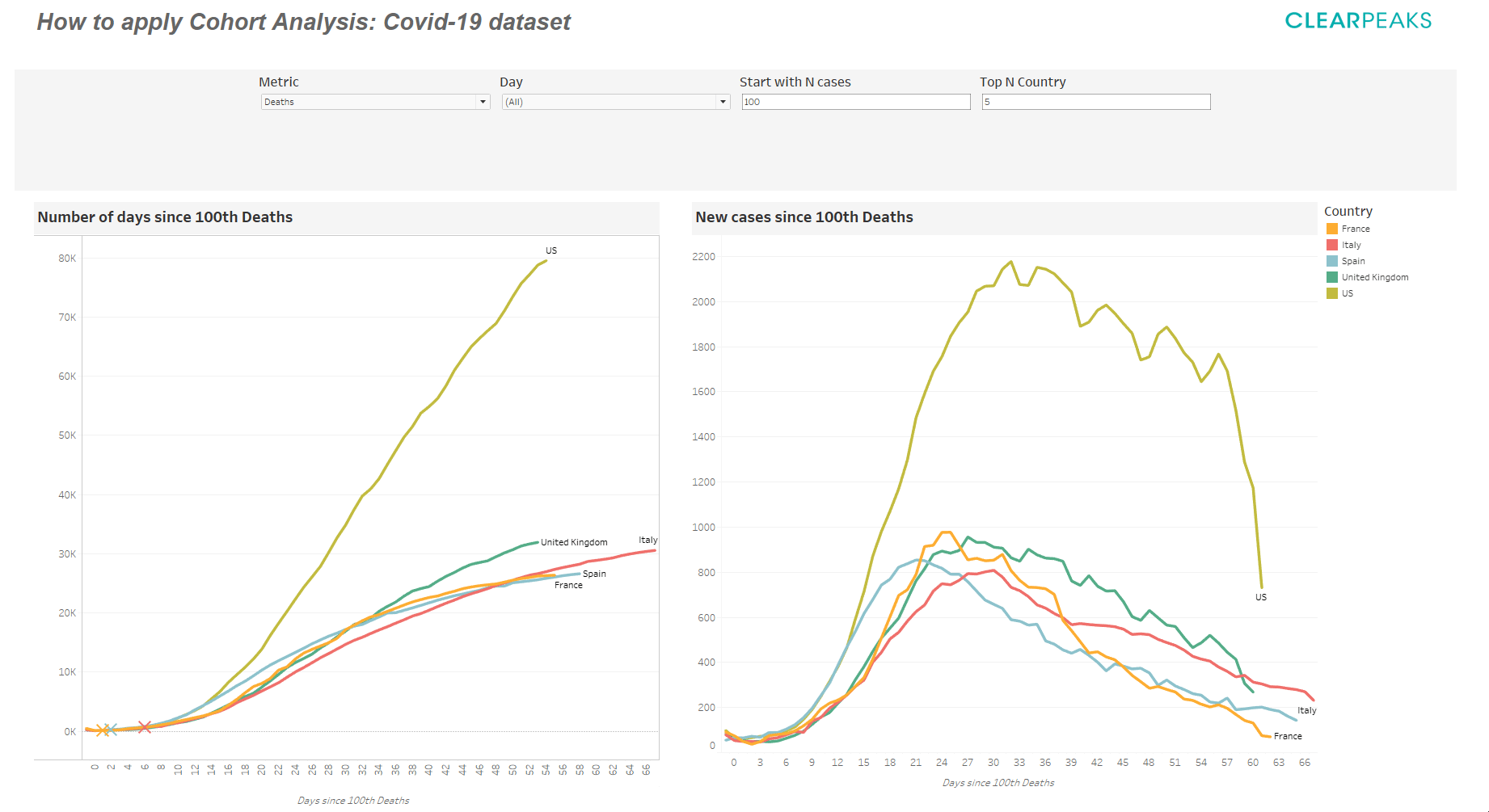
Figure 8: Result of applying Cohort Analysis over daily deaths
Figure 8 presents the cumulative and daily number of confirmed deaths; considering the right curve, the slope is decisive in determining the speed at which the increase in the number of deaths occurs. For instance, deaths in Europe were almost double with respect to the United States during the first month.
Conclusion
Although Cohort Analysis may require some time to look through the metrics, the result could be really useful for understanding the trend and seasonality of our data. It allows us to identify key differences in behaviour within the established cohort.
Commonly used to compare a company’s user retention and engagement, we proved that it is also helpful to understand the risks and respond appropriately to the effects of COVID-19 through data visualization.
At ClearPeaks we’re viz experts, and if you’d like to learn more about Cohort Analysis and see a positive impact on your business, don’t hesitate to contact us.