21 Feb 2024 Integrating Python and Power BI for Advanced Data Analysis
Python is a very useful programming language for data analysis purposes, data science and machine learning. With Python, you can import, transform, analyse, and visualise data from various sources in different formats. It also boasts multiple libraries with advanced functions and algorithms for data processing.
Microsoft Power BI is an interactive data analysis and visualisation tool used for BI (business intelligence). With Power BI, you can quickly and easily connect to, model, explore, and share data, as well as create personalised, interactive visual reports that offer valuable insights about your business.
Python integration with Power BI is limited to two main functionalities: data integration and analysis, so Python can only be used in Power BI for sourcing data and creating custom visualisations.
In this article, we will show you how to:
- Install and configure the Python and Power BI environment.
- Use Python to import and transform data in Power BI.
- Create custom visualisations using Seaborn and Matplotlib in Power BI.
- Use Pandas to handle datasets in Power BI.
- Reuse your existing Python source code in Power BI.
- Understand the limitations of using Python in Power BI.
- Use Kaggle, an open databank.
Advantages of Integrating Python into Power BI
- You can import data from various sources and formats, such as files, databases, APIs, or web scraping.
- The data can be transformed and cleansed easily before loading into Power BI.
- It’s a great way to perform an ETL without using external applications.
- Python can be used to create custom visuals and graphics.
- It provides libraries that simplify the implementation of data analysis, machine learning, and predictive models.
- The code can easily be reused and customised.
Limitations of Python – Power BI Integration
- Python integration requires specific versions of applications and libraries compatible with Power BI.
- Only a limited number of libraries are compatible with Power BI. (Please consult this Microsoft page for a comprehensive list of compatible Python libraries).
- Python scripts may contain code that impacts performance or introduces malicious code into Power BI.
- Python visuals cannot be fully modified and customised through Power BI. Instead, modifications must be made directly in the code, requiring programming proficiency.
Installing and Configuring the Power BI and Python Environment
To follow the guidelines presented in this article, you will need Windows 10 or a later version. Other operating systems (OS) are not supported, so to work with a system like macOS or Linux, you will need to use a virtual machine running Windows; please refer to this link.
Install Microsoft Power BI Desktop
Microsoft Power BI is a free application that you can install in three different ways:
Method 1: Classic installation method
1. Download Microsoft Power BI from the following link.
Figure 1: Microsoft Power BI Setup.
2. Choose the version according to your OS (typically 64 bits):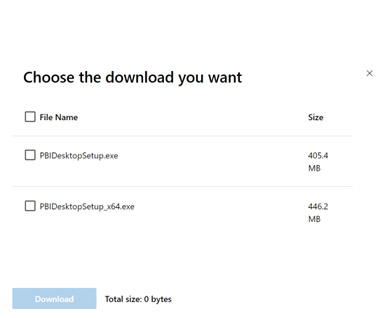
Figure 2: Choose the architecture version.
3. Follow the installation instructions until you’re done.
Figure 3: Power BI Setup Wizard.
4. Once installed, launch Microsoft Power BI for the first time.
Method 2: Install from Microsoft Store
1. Go to Microsoft Store.
2. Search for Microsoft Power BI (or just click on this link).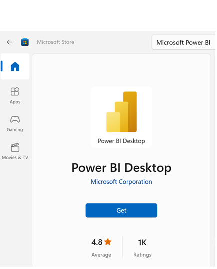
Figure 4: Microsoft Power BI Setup from Microsoft Store.
3. Click on Get.
Method 3: Install Power BI using Winget
1. Press Win+S, then search for CMD; run as administrator.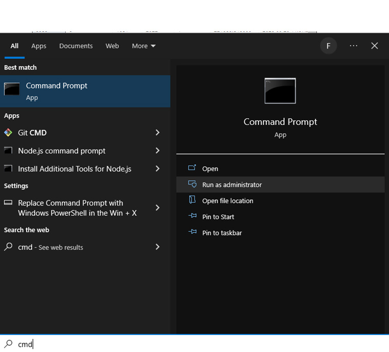
Figure 5: Installation via the command console with Winget.
2. Run the following command line to install Microsoft Power BI:
winget install -e --id Microsoft.PowerBI
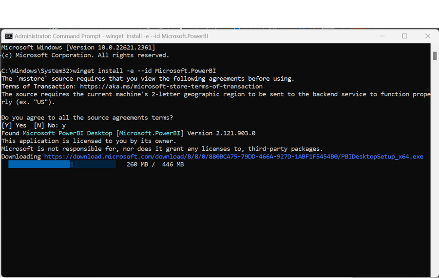
Figure 6: Command line installation process.
3. The installation will start automatically: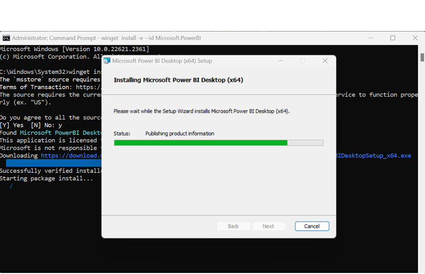
Figure 7: Command line installation process GUI Wizard.
4. Once the process has finished you can open the application.
Python Installation
1. Go to the official Python website and download the latest compatible version.
2. Click on Install Now after selecting the Add python.exe to PATH option: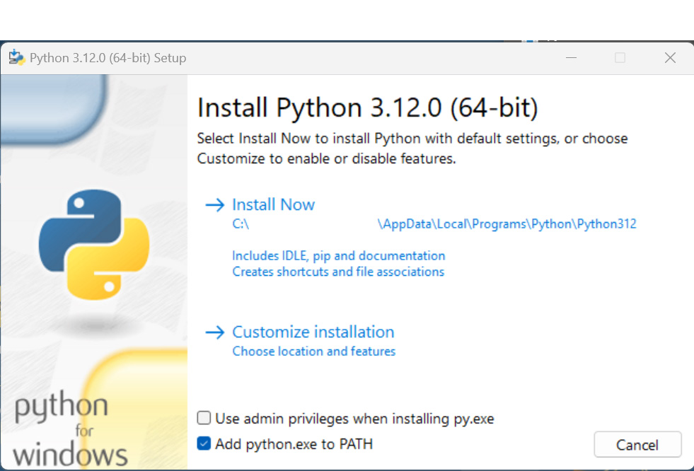
Figure 8: Python installation wizard.
3. Once the process has finished, Python is installed.
Install VS Code Editor
1. Go to the official Visual Studio Code website and download the latest version.
2. Install VS Code.
Note: Use the editor you feel most comfortable with; you can even use online editors like Google Colab or Jupyter.
Install Python Libraries
Some libraries* are necessary for the development of today’s demo:
- Pandas: to analyse and manage data.
- Matplotlib: to create static graphics.
- Seaborn: to create statistical graphics.
- NumPy: for numeric calculations.
- SciPy: for mathematics, science, and engineering.
- Response: to get data from web APIs.
- JSON: to manage and import JSON files into Pandas.
- Flatten-JSON: to flatten nested JSON files.
- Pandasql: to trigger SQL statements using Pandas DataFrames as source.
- Kaggle: an API to connect to Kaggle open database.
*Please refer to this Microsoft page to check all the compatible Python libraries.
The easiest way to install is to open a terminal and execute the following:
pip install pandas
pip install matplotlib
pip install seaborn
pip install numpy
pip install scipy
pip install response
pip install flatten-json
pip install pandasql
pip install kaggle
Configure Power BI
Desktop for Python
To enable Python in Power BI, you first need to follow these steps:
1. Open Power BI Desktop.
2. Select File > Options and settings > Options: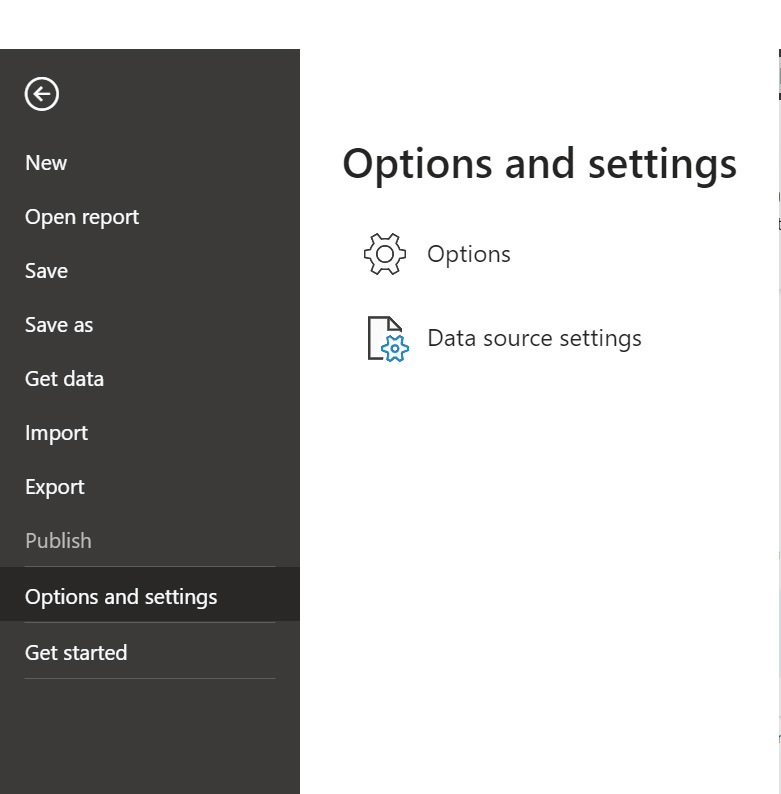
Figure 9: Power BI Options and settings.
3. Select Python scripting: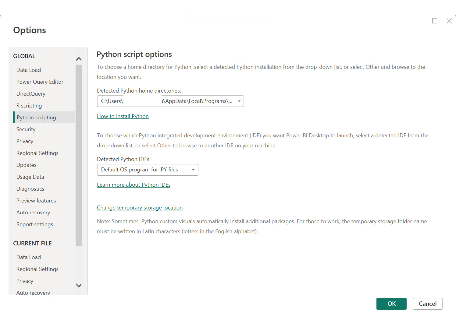
Figure 10: Python Setup binaries location.
4. Configure the Python path – the latest versions of Power BI will automatically detect it. If not, execute the following command in the command line terminal to get the correct path:
python -c "import sys; print(sys.executable)"
5. Press OK to confirm.
Use Case Scenarios
We’ll look at three examples of getting data from different sources:
- Importing a CSV file from Kaggle.
- Accessing data through a JSON source via RapidAPI.
- Using a sample dataset from the Seaborn library.
Importing a CSV File from Kaggle
We will visualise data for movies and TV shows from Netflix, Disney+, and Amazon, sourced from Kaggle, in Power BI. We’ll use Python as both the data loader and the provider for certain graphics, through the Python API. Please follow these instructions to install and configure the API.
First, let’s create the ETL layer.
1. Create a new notebook in VS Code or your editor; this is for testing before importing into Power BI.
2. Import all libraries:
#Import libraries
import kaggle
import pandas as pd
import numpy as np
import matplotlib.pyplot as plt
import seaborn as sns
import scipy.stats as sc
import math
from statistics import mode
import warnings
warnings.filterwarnings('ignore')
3. Authenticate and connect to Kaggle through the API:
kaggle.api.authenticate()
4. Download the data from Kaggle:
#Set variables for Datasets
disney_ds = "shivamb/disney-movies-and-tv-shows"
netflix_ds = "shivamb/netflix-shows"
amazon_ds = "shivamb/amazon-prime-movies-and-tv-shows"

#Download into a temporary folder
kaggle.api.dataset_download_files(disney_ds, path='data', unzip=True)
kaggle.api.dataset_download_files(netflix_ds, path='data', unzip=True)
kaggle.api.dataset_download_files(amazon_ds, path='data', unzip=True)
5. Load the data from the downloaded files into Pandas:
#Read from files
disney = pd.read_csv("data/disney_plus_titles.csv")
netflix = pd.read_csv("data/netflix_titles.csv")
amazon = pd.read_csv("data/amazon_prime_titles.csv")
6. Concatenate the three datasets into one:
#Add platform column to identify dataset source
netflix['platform']='netflix'
amazon['platform']='amazon'
disney['platform']= 'disney'

df=pd.concat([netflix,amazon,disney],ignore_index=True)
df['date_added'] = df['date_added'].str.strip()
df['date_added']= pd.to_datetime(df['date_added'], format='%B %d, %Y')

movies_ntf=netflix[netflix['type']=='Movie']
movies_pie_ntf = movies_ntf.groupby('country').size().rename_axis('Country').reset_index(name='Count')
movies_top5_ntf = movies_pie_ntf.sort_values(by='Count',ascending=False).head(5)

movies_amz=amazon[amazon['type']=='Movie']
movies_pie_amz = movies_amz.groupby('country').size().rename_axis('Country').reset_index(name='Count')
movies_top5_amz = movies_pie_amz.sort_values(by='Count',ascending=False).head(5)
movies_top5_amz['Country'] = movies_top5_amz['Country'].str.replace('United Kingdom, United States','UK, USA')

movies_dis=disney[disney['type']=='Movie']
movies_pie_dis = movies_dis.groupby('country').size().rename_axis('Country').reset_index(name='Count')
movies_top5_dis = movies_pie_dis.sort_values(by='Count',ascending=False).head(5)
7. Clean the data:
#Remove Nulls
df['country'].fillna(df['country'].mode()[0],inplace=True)
df['director'].fillna('Unknown',inplace=True)
df['cast'].fillna('Unknown',inplace=True)
mean_date_added = df['date_added'].mean()
df['date_added']=df['date_added'].fillna(mean_date_added)

df=df.dropna()
8. Import the last procedure as a data source in Power BI:
- Open Power BI.
- Select Get Data and choose Python script then Connect:
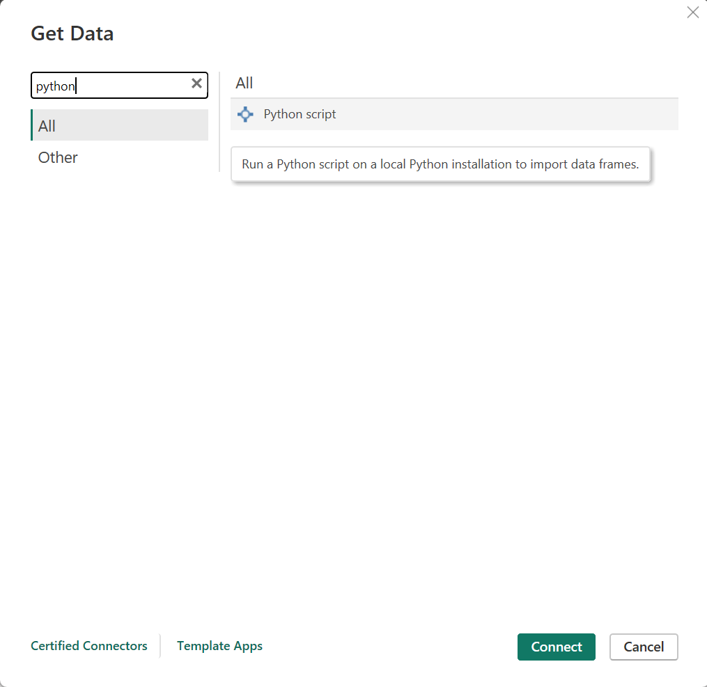
Figure 11: Import data through Python script.
- Paste all the previously specified code into the Python prompt (steps 2 to 7):
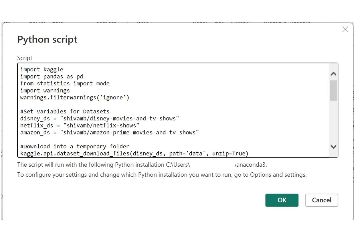
Figure 12: Microsoft Power BI Python script prompt.
- Select the dataframe; you can use all the available tables and transform the data as needed.
- On completion, the data source will have been successfully imported into Power BI.
9. Create a visual in Power BI using Python
- Go to Report view and select Python visual:
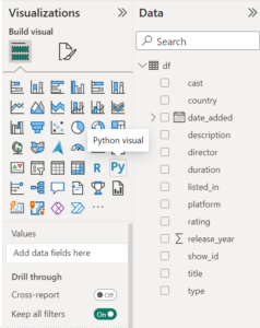
Figure 13: Select Python visual.
- Select all table columns from the right-hand side, as Power BI needs to know all columns for aggregation based on the selection made in the script:
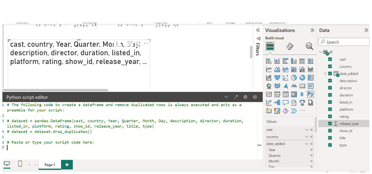
Figure 14: Prompt to apply Python custom visual.
- Paste the following code into the script editor and run it to create the visual:
#Import libaries
import numpy as np
import pandas as pd
import seaborn as sns
import matplotlib.pyplot as plt


sns.set_style('whitegrid') #Set style of graphic
sns.set_context('notebook') #Set context style

#Generate a bar graphic counting the number of movies and TV shows per platform
g=sns.catplot(x='platform',kind='count',data=dataset,col='type',height=7,palette='PuRd',aspect=1)
g.set_xticklabels(rotation=90)
g.set(xlabel='',ylabel='Count of each Platform')
g.fig.suptitle('Number of movies and shows per type and platform',y=1.03)
g.set_titles('{col_name}s')
plt.show()
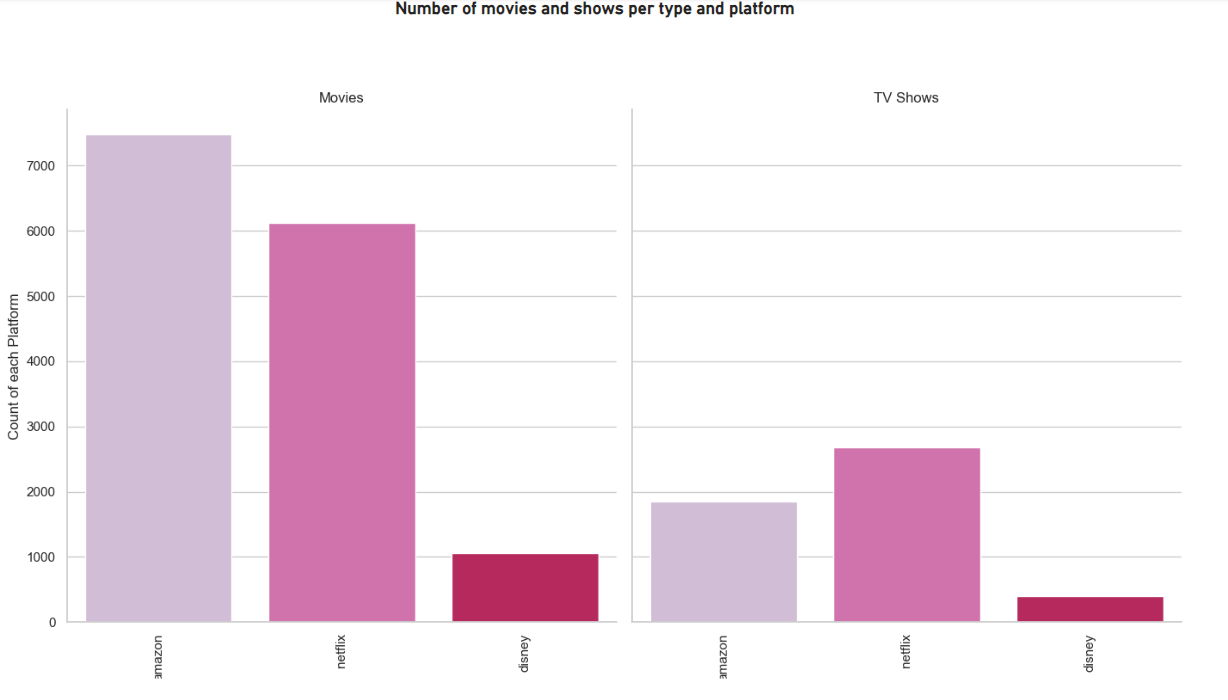
Figure 15: Python custom visual sample 1.
- Now let’s create another visual using Python: follow the previous steps, and insert the code below:
#Create graphic to obtain the amount of movies produced by country (top 10) - Netflix
import matplotlib.pyplot as plt
import numpy as np

from matplotlib.patches import ConnectionPatch
import seaborn as sns

movies_top5_ntf = dataset
values = movies_top5_ntf.Count
labels = movies_top5_ntf.Country

color = ['#E50914']

plt.figure(figsize=(6,6))
_, texts, autotexts = plt.pie(values, labels=labels,
        labeldistance=1.08,
        wedgeprops = { 'linewidth' : 1, 'edgecolor' : 'white' }, colors=color
        ,autopct='%0.0f%%');
plt.setp(texts, **{'color':'#E50914', 'weight':'normal', 'fontsize':9})
plt.setp(autotexts, **{'color':'white', 'weight':'bold', 'fontsize':9})
plt.title("Top 5 Movies produced by Country - Netflix", size=15)
plt.show();a
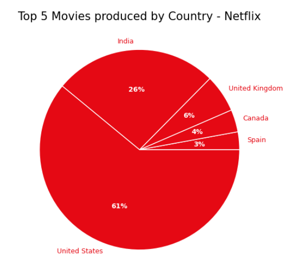
Figure 16: Python custom visual sample 2.
#Create graphic to obtain the amount of movies produced by country (top 10) - Amazon
import matplotlib.pyplot as plt
import numpy as np

from matplotlib.patches import ConnectionPatch
import seaborn as sns

movies_top5_amz = dataset
values = movies_top5_amz.Count
labels = movies_top5_amz.Country

color = ['#FF9900']

plt.figure(figsize=(6,6))
_, texts, autotexts = plt.pie(values, labels=labels,
        labeldistance=1.08,
        wedgeprops = { 'linewidth' : 1, 'edgecolor' : 'white' }, colors=color
        ,autopct='%0.0f%%');
plt.setp(texts, **{'color':'#FF9900', 'weight':'normal', 'fontsize':9})
plt.setp(autotexts, **{'color':'black', 'weight':'bold', 'fontsize':9})
plt.title("Top 5 Movies produced by Country - Amazon", size=15)
plt.show();
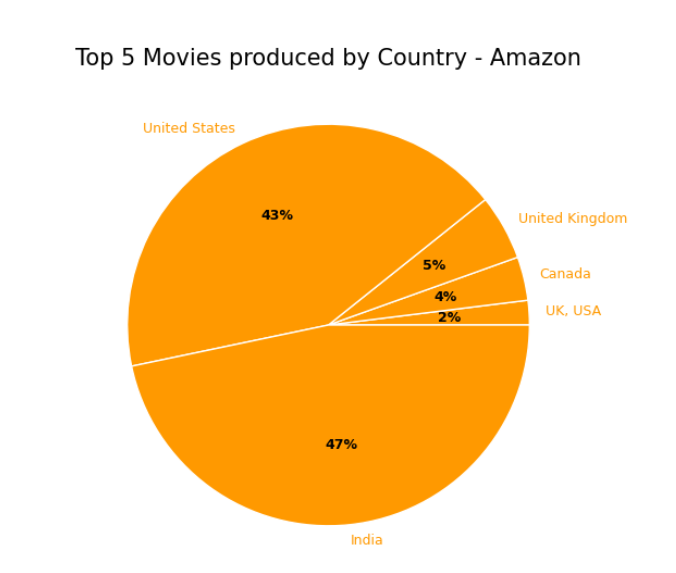
Figure 17: Python custom visual sample 3.
Finally, let’s make some graphs using the native Power BI visuals:
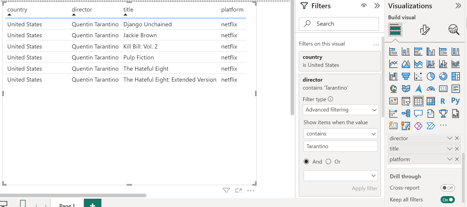
Figure 18: Power BI List visual.
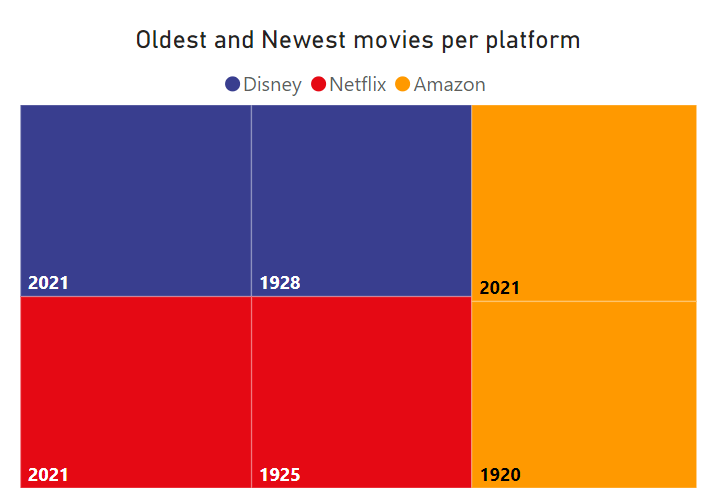
Figure 19: Power BI TreeMap visual.
Using A JSON Source from a Specific API
Now let’s look at hotels in different cities, and as an example see how to display information from booking.com, sourced via RapidAPI, in Power BI. We’ll use Python to fetch the data through a REST API response (you’ll need a RapidAPI subscription for access to the data) and also to load the data and to generate some visualisations.
First, let’s create the ETL layer.
1. Create a new notebook in VS Code or your editor, for testing before importing into Power BI.
2. Import all libraries:
#Import libraries
import pandas as pd
import requests
import json
from flatten_json import flatten
import string
import time
alphabet = string.ascii_letters + string.punctuation + string.whitespace

headers = {
	"X-RapidAPI-Key": "Your_private_API_KEY_after_subscribe_to_rapidapi",
	"X-RapidAPI-Host": "booking-com13.p.rapidapi.com"
}
3. Download data from the API; we are going to use the following parameters to get the data:
#URL to connect API
url = "https://booking-com13.p.rapidapi.com/stays/properties/list-v2"

#List of parameters based on the criteria
parameters = [{"location":"Paris, Ile de France, France","checkin_date":"2023-12-20","checkout_date":"2024-01-02","language_code":"en-us","sort_by":"PriceLowestFirst","property_rating":"5star","meals":"BreakfastIncluded"}
              ,{"location":"Amsterdam, Noord-Holland, Netherlands","checkin_date":"2023-12-20","checkout_date":"2024-01-02","language_code":"en-us","sort_by":"PriceLowestFirst","property_rating":"5star","meals":"BreakfastIncluded"}
              ,{"location":"Budapest, Pest, Hungary","checkin_date":"2023-12-20","checkout_date":"2024-01-02","language_code":"en-us","sort_by":"PriceLowestFirst","property_rating":"5star","meals":"BreakfastIncluded"}
              ,{"location":"London, Greater London, United Kingdom","checkin_date":"2023-12-20","checkout_date":"2024-01-02","language_code":"en-us","sort_by":"PriceLowestFirst","property_rating":"5star","meals":"BreakfastIncluded"}
              ,{"location":"Berlin, Berlin Federal State, Germany","checkin_date":"2023-12-20","checkout_date":"2024-01-02","language_code":"en-us","sort_by":"PriceLowestFirst","property_rating":"5star","meals":"BreakfastIncluded"}
              ,{"location":"Vienna, Vienna (state), Austria","checkin_date":"2023-12-20","checkout_date":"2024-01-02","language_code":"en-us","sort_by":"PriceLowestFirst","property_rating":"5star","meals":"BreakfastIncluded"}
              ,{"location":"Oslo, Oslo County, Norway","checkin_date":"2023-12-20","checkout_date":"2024-01-02","language_code":"en-us","sort_by":"PriceLowestFirst","property_rating":"5star","meals":"BreakfastIncluded"}
              ,{"location":"Stockholm, Stockholm county, Sweden","checkin_date":"2023-12-20","checkout_date":"2024-01-02","language_code":"en-us","sort_by":"PriceLowestFirst","property_rating":"5star","meals":"BreakfastIncluded"}
              ,{"location":"Zürich, Canton of Zurich, Switzerland","checkin_date":"2023-12-20","checkout_date":"2024-01-02","language_code":"en-us","sort_by":"PriceLowestFirst","property_rating":"5star","meals":"BreakfastIncluded"}
              ,{"location":"Milan, Lombardy, Italy","checkin_date":"2023-12-20","checkout_date":"2024-01-02","language_code":"en-us","sort_by":"PriceLowestFirst","property_rating":"5star","meals":"BreakfastIncluded"}
              ,{"location":"Prague, Czech Republic","checkin_date":"2023-12-20","checkout_date":"2024-01-02","language_code":"en-us","sort_by":"PriceLowestFirst","property_rating":"5star","meals":"BreakfastIncluded"}
              ,{"location":"Brussels, Brussels Region, Belgium","checkin_date":"2023-12-20","checkout_date":"2024-01-02","language_code":"en-us","sort_by":"PriceLowestFirst","property_rating":"5star","meals":"BreakfastIncluded"}
]

#Get and cleanup data
fact_hotels = pd.DataFrame()

    for parameter in parameters:
    	#Split the parameters
    	loc = parameter["location"]
    	country = loc.split(",")[-1].strip()
    	city = loc.split(",")[0].strip()
    	chkin_dt = parameter["checkin_date"]
    	chkout_dt = parameter["checkout_date"]
    	lng_cod = parameter["language_code"]
    	sort = parameter["sort_by"]
    	rating = parameter["property_rating"]
meals = parameter["meals"]    querystring={"location":loc,"checkin_date":chkin_dt,"checkout_date":chkout_dt,"language_code":lng_cod,"sort_by":sort,"property_rating":rating,"meals":meals}
#Get the data from API
    	response = requests.get(url, headers=headers, params=querystring)
    	d_input = json.loads(response.text)
    	ls_input = d_input['data']
    	dic_input = [flatten(i) for i in ls_input]
    	df = pd.DataFrame(dic_input)
    	df['country_desc'] = country
    	df = df.rename(columns={'basicPropertyData_location_address': 'address','basicPropertyData_location_city': 'city','basicPropertyData_location_countryCode': 'countrycode'
                            ,'basicPropertyData_reviews_totalScore': 'totalscore','basicPropertyData_reviews_totalScoreTextTag_translation': 'totscore_tag' ,'basicPropertyData_starRating_value': 'star_rating'
                            ,'blocks_0_blockId_roomId': 'roomid','blocks_0_finalPrice_amount': 'finalprice','blocks_0_finalPrice_currency': 'currency','blocks_0_freeCancellationUntil': 'freecanceluntil'
                            ,'blocks_0_originalPrice_amount': 'originalprice','blocks_0_originalPrice_currency': 'originalcurrency','displayName_text': 'hotel_name','location_mainDistance': 'maindistance'
                            ,'location_publicTransportDistanceDescription': 'publictransport','matchingUnitConfigurations_unitConfigurations_0_name': 'unitconfig','policies_showFreeCancellation': 'freecancel'
                            ,'policies_showNoPrepayment': 'prepayment','priceDisplayInfoIrene_displayPrice_amountPerStay_amount': 'price_dis','priceDisplayInfoIrene_displayPrice_amountPerStay_amountRounded': 'pricedis_rnd'
                            ,'priceDisplayInfoIrene_displayPrice_amountPerStay_amountUnformatted': 'pricedis','priceDisplayInfoIrene_displayPrice_amountPerStay_currency': 'pricedis_cur'
                            ,'priceDisplayInfoIrene_excludedCharges_excludeChargesAggregated_amountPerStay_amount': 'price_day_dis','priceDisplayInfoIrene_excludedCharges_excludeChargesAggregated_amountPerStay_amountRounded': 'price_day_dis_rnd'
                            ,'priceDisplayInfoIrene_excludedCharges_excludeChargesAggregated_amountPerStay_amountUnformatted': 'price_day','priceDisplayInfoIrene_excludedCharges_excludeChargesAggregated_amountPerStay_currency': 'price_day_cur'
                            ,'propertySustainability_tier_type': 'status','blocks_0_onlyXLeftMessage_translation': 'availability'})
df_1 = df[['hotel_name','address','city','countrycode','country_desc','totalscore','totscore_tag','star_rating','roomid','finalprice','currency','freecanceluntil','originalprice'
               ,'originalcurrency','maindistance','publictransport','unitconfig','freecancel','prepayment','price_dis','pricedis_rnd' ,'pricedis','pricedis_cur','price_day_dis'
               ,'price_day_dis_rnd','price_day','price_day_cur','status']]
    	fact_hotels = pd.concat([fact_hotels,df_1],ignore_index=True)

time.sleep(2)
Cities: Paris, Amsterdam, Budapest, London, Berlin, Vienna, Oslo, Stockholm, Zurich, Milan, Prague, Brussels.
Check-in date: 20/12/2023
Check-out date: 02/01/2024
Rating: 5 stars
Meals: Breakfast Included
Language Code: en-US
Currency Code: USD
4. Clean the data:
fact_hotels['city'] = fact_hotels['city'].str.replace(r'Greater London', 'London')
fact_hotels['city'] = fact_hotels['city'].str.replace(r', Shoreditch', '')
fact_hotels['city'] = fact_hotels['city'].str.replace(r' kommune', '')
fact_hotels['city'] = fact_hotels['city'].str.replace(r'Milano', 'Milan')
fact_hotels['city'] = fact_hotels['city'].str.replace(r'Wien', 'Vienna')
fact_hotels['city'] = fact_hotels['city'].str.replace(r'Praha', 'Prague')
fact_hotels['city'] = fact_hotels['city'].str.replace(r' 1', '')
fact_hotels['finalprice'] = fact_hotels['finalprice'].astype(float).fillna(0).round(2)
fact_hotels['originalprice'] = fact_hotels['originalprice'].astype(float).fillna(0).round(2)
5. Create a new dataset for a specific graphic; we’ll use an SQL statement:
from pandasql import sqldf

pysqldf = lambda q: sqldf(q, globals())

q = """SELECT (city || ' (' || currency || '/' || originalcurrency || ')') as city  ,avg(finalprice/1000) as finalprice,avg(originalprice/1000) as originalprice,
       max(finalprice/1000) as higher_price,min(finalprice/1000) as lower_price
       FROM fact_hotels
       GROUP BY city;"""

hotels_comp = pysqldf(q)

hotels_comp['finalprice'] = hotels_comp['finalprice'].astype(float).fillna(0).round(2)
hotels_comp['originalprice'] = hotels_comp['originalprice'].astype(float).fillna(0).round(2)
hotels_comp['higher_price'] = hotels_comp['higher_price'].astype(float).fillna(0).round(2)
hotels_comp['lower_price'] = hotels_comp['lower_price'].astype(float).fillna(0).round(2)
6. Import the output of the last procedure as a data source into Power BI:
- Open Power BI.
- Select Get Data and choose Python script and Connect:
Figure 20: Import data through Python script.
- Paste the previously indicated code into the Python prompt (steps 2 to 3):
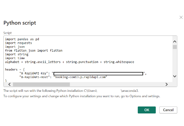
Figure 21: Microsoft Power BI Python script prompt.
- Select fact_hotels and proceed to transform the data.
- On completion, the data source will have been imported into Power BI.
7. Create a visual in Power BI using Python
- Go to Report view and select Python visual:

Figure 22: Select Python visual.
- Select all the table columns from the right, as Power BI needs to identify all columns to be aggregated by the selection in the script:
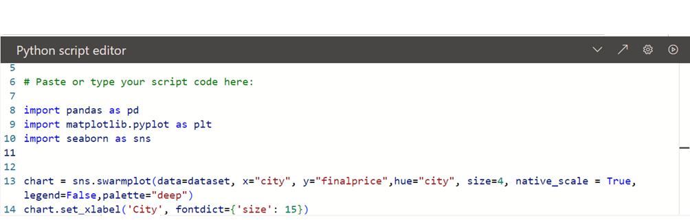
Figure 23: Prompt to apply Python custom visual.
- Paste the following code into the script prompt and run it to generate the visual:
#Import libraries – Shows all hotels by price/city
import pandas as pd
import matplotlib.pyplot as plt
import seaborn as sns

#Uncomment in PowerBI
fact_hotels = dataset
fact_hotels['finalprice'] = fact_hotels['finalprice'].astype(float).fillna(0).round(2)
fact_hotels['originalprice'] = fact_hotels['originalprice'].astype(float).fillna(0).round(2)

chart = sns.swarmplot(data=fact_hotels, x="city", y="finalprice",hue="city", size=6, native_scale = True,palette="deep")
chart.set_xlabel('City', fontdict={'size': 15})
chart.set(xticklabels=[])
chart.set_ylabel('Final Price in US$', fontdict={'size': 15})
chart.legend(bbox_to_anchor=(1, 1), ncol=1)
ylabels = ['{:,.0f}'.format(y) + '$' for y in chart.get_yticks()]
chart.set_yticklabels(ylabels)
plt.show()
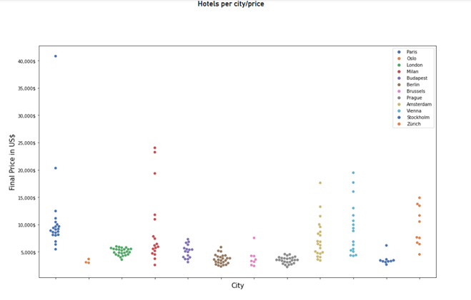
Figure 24: Python custom visual sample 1 (Swarmplot).
- Let’s create another using Python: follow the previous steps, and insert this code:
##Hotels Score/Status per City
import pandas as pd
import matplotlib.pyplot as plt
import seaborn as sns

chart = sns.violinplot(data=dataset, y="totalscore", x="city", hue="status", size=7,palette="Set3")
chart.set_xlabel('', fontdict={'size': 15})
chart.set_ylabel('Score', fontdict={'size': 15})


plt.show()

Figure 25: Python custom visual sample 2 (Violinplot)
- Let’s do one last custom graphic, but this time we’ll use the Matplotlib library instead of Seaborn:
import pandas as pd
import matplotlib.pyplot as plt
import numpy as np

category_names = ['Average in US$', 'Average in Local Currency','Higher Price','Lower Price']
results = hotels_comp.set_index('city').T.to_dict('list')


def comparator_prices(results, category_names):
    labels = list(results.keys())
    data = np.array(list(results.values()))
    data_cum = data.cumsum(axis=1)
    category_colors = plt.colormaps['RdYlGn'](
        np.linspace(0.30, 0.95, data.shape[1]))

    fig, ax = plt.subplots(figsize=(14, 9))
    ax.invert_yaxis()
    ax.xaxis.set_visible(False)
    ax.set_xlim(0, np.sum(data, axis=1).max())

    for i, (colname, color) in enumerate(zip(category_names, category_colors)):
        widths = data[:, i]
        starts = data_cum[:, i] - widths
        rects = ax.barh(labels, widths, left=starts, height=0.8,
                        label=colname, color=color)

        r, g, b, _ = color
        text_color = 'white' if r * g * b < 0.5 else 'darkgrey'
        ax.bar_label(rects, label_type='center', color=text_color)
    ax.legend(ncols=len(category_names), bbox_to_anchor=(0, 1),
              loc='lower left', fontsize='small')

    return fig, ax


comparator_prices(results, category_names)
plt.show()
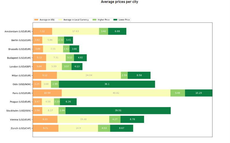
Figure 26: Python custom visual sample 3 (Barh – Matplotlib)
Using A Sample Dataset from the Seaborn Library
When using a Seaborn sample dataset:
1. Follow the previous steps, opening Get Data, then Python script
2. Import the following datasets using Seaborn with this code:
#Seaborn sample datasets
import pandas as pd
import matplotlib.pyplot as plt
import seaborn as sns

titanic = sns.load_dataset("titanic")
penguins = sns.load_dataset("penguins")
tips = sns.load_dataset("tips")
glue = sns.load_dataset("glue").pivot(index="Model", columns="Task", values="Score")
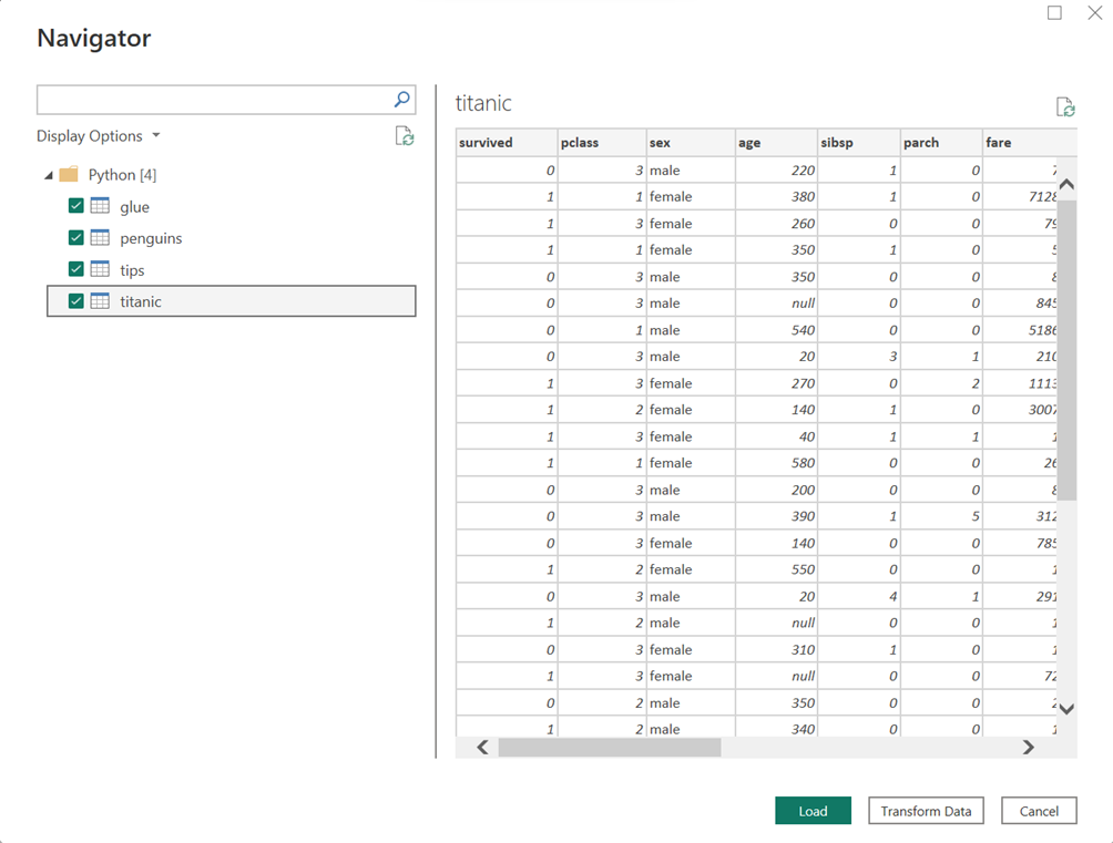
Figure 27: Sample datasets.
3. Generate some sample visualisations from Seaborn in Power BI, selecting Python visual.
4. Select the penguins dataset and set all the columns.
5. Insert the following code to generate the visuals:
#Seaborn sample
import pandas as pd
import matplotlib.pyplot as plt
import seaborn as sns

chart = sns.jointplot(data=penguins, x="bill_length_mm", y="bill_depth_mm", hue="species", kind="kde",size=7,palette="dark")

plt.show()
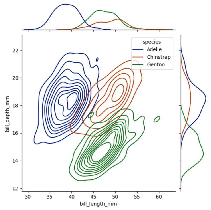
Figure 28: Sample Jointplot.
#Seaborn sample
import pandas as pd
import matplotlib.pyplot as plt
import seaborn as sns

#Uncomment in PowerBi
#titanic = dataset

sns.catplot(data=titanic, x="age", y="class", hue="sex", kind="boxen", palette="crest")

plt.show()
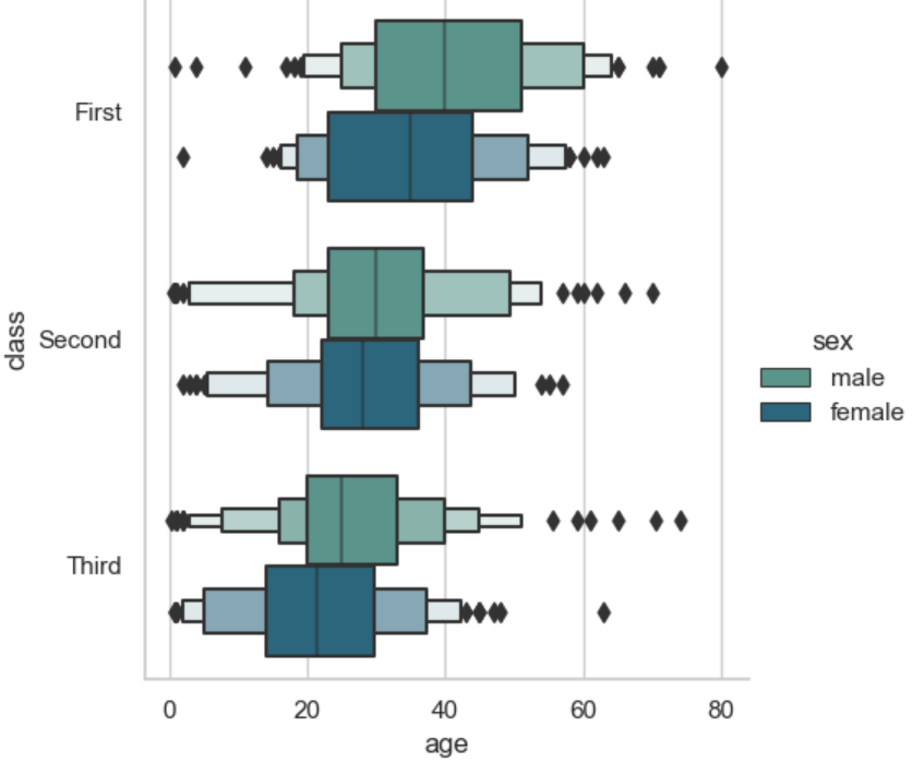
Figure 29: Sample Catplot (Boxen).
#Seaborn sample
import pandas as pd
import matplotlib.pyplot as plt
import seaborn as sns

tips = dataset

sns.stripplot(
    data=tips, x="total_bill", y="day", hue="time",
    jitter=False, s=20, marker="D", linewidth=1, alpha=.1,palette="dark"
)

plt.show()
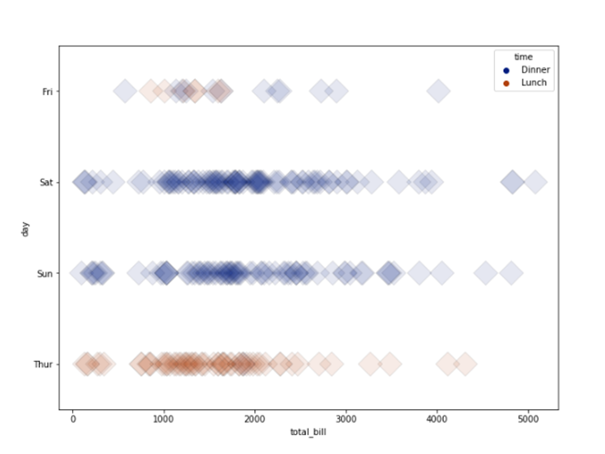
Figure 30: Sample Stripplot.
#Seaborn sample
import pandas as pd
import matplotlib.pyplot as plt
import seaborn as sns

#Uncomment in PowerBi
#glue = dataset

sns.heatmap(glue, annot=True, fmt=".1f", cmap=sns.cubehelix_palette(as_cmap=True))
plt.show()
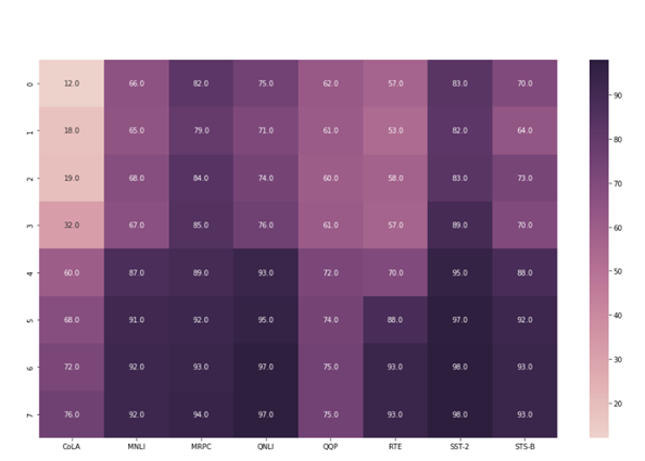
Figure 31: Sample Heatmap.
Conclusion
The integration of Python with Power BI creates a powerful platform for complex data operations, including data extraction, transformation, visualisation, and storage. This combination offers several advantages but also comes with certain limitations. While Power BI supports a variety of data connectors and native visualisations for seamless interaction with data sources, the scope for Python-based visualisations within Power BI is primarily through libraries like Matplotlib and Seaborn.
Nevertheless, the integration of Python with Power BI allows users to combine Python’s programming strength with Power BI’s intuitive analytics. While Python is accessible for beginners, achieving mastery, particularly in data science and complex visualisations, demands deeper knowledge and experience – so get in touch with the experts here at ClearPeaks. Whether it’s about using Python and Power BI effectively, or how to progress on your data analytics journey, we’re here to help!