18 Dec 2020 Introducing Tableau 2020.4
Tableau 2020.4 is now here, with a complete set of new features and many improvements to the ones we already know. In this article we will present all of them and explain in more detail those we found to be the most interesting and useful.
1. Tableau 2020.4 new features
Let’s start by taking a look at what’s new and improved in each of the Tableau ecosystem tools.
Tableau Desktop
- Multiple marks layer support for maps.
- Redshift spatial support.
- Predictive modelling functions improvements.
- Date axis extension.
- Block comments calculations.
- Dynamic parameter improvements.
- Salesforce Connector API update.
- Salesforce Datorama Connector.
- Snowflake OAuth improvements.
Tableau Catalog
- Tableau Catalog and Metrics integration.
- Data quality warning in Metrics.
- Merge duplicate external assets.
Tableau Prep
- Tableau Prep Builder in the browser.
- Spatial data support.
Tableau Server/Online
- Web authoring enhancements.
- Custom views tab.
- Ask Data improvements.
- Offline map support for Tableau Server.
- Resource Monitoring Tool for Tableau Server on Linux.
- Tableau Server Management (TSM) improvements.
- Azure Key Vault for Tableau Server.
- Analytics Extensions for Tableau Online.
Tableau Mobile
- Tableau Mobile for BlackBerry Dynamics (Android).
- Tableau Mobile for Intune (Android).
2. Key Features
Now that we have a general view of what’s new, let’s look in more detail at some of the features that we consider the most interesting: prediction modelling function improvements, date axis extension and advances in Ask Data.
3. Predicting modelling function improvements
In the previous release, Tableau included predictive modelling functions as a native table calculation for the first time. However, these functions had several limitations and that is why, in Tableau 2020.4, we can choose between two new models in predictive modelling functions: regularized linear regression and Gaussian process regression, as an addition to the simple linear regression which was the default value.
To see this new feature in action we will create a linear regression function to predict the amount from closed opportunities over time, using the opportunity close date and the opportunity type as predictors.
We create a new calculated field with the prediction function. We will first use the default linear regression model which we can specify as “model = linear”, or simply leave this parameter blank, as it is the default value.
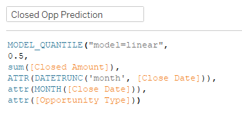
Figure 1: Prediction function using simple linear regression.
Now, we will visualize the results of the prediction function against the actual Closed Amount metric.
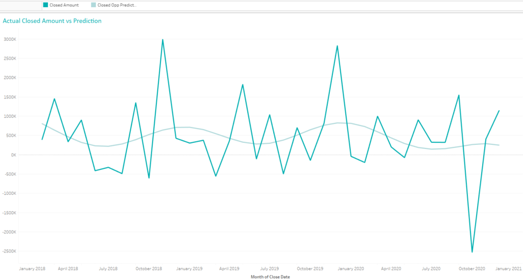
Figure 2: Actual vs predicted values for closed opportunities amount.
As we can see, the model does not adjust properly to the metric, but with the new Tableau 2020.4 statistical regression model selection we can improve our results. We just need to include the option “model=rl” or “model=gp” for regularized liner regression or Gaussian process regression, respectively, in our calculation. Let’s see how our results look if we use the latter.
First, we change the calculation to include the new model.
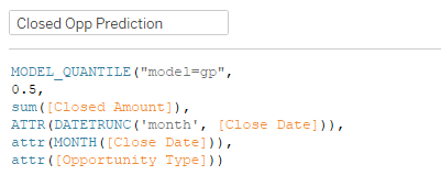
Figure 3: Prediction function using Gaussian process regression.
And now, let’s visualize the new prediction:
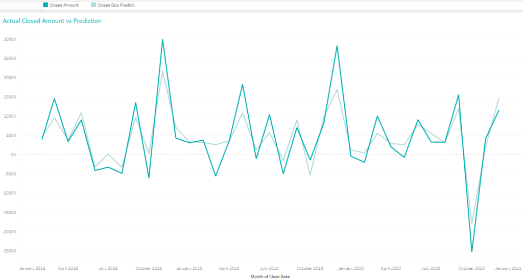
Figure 4: Actual vs predicted values for closed opportunities amount.
As you can see, using Gaussian process regression we have achieved a more accurate model.
4. Date axis extension
With the prediction function we just created we could predict our future income from closed opportunities, but what’s the point of being able to make this kind of prediction if we cannot visualize it? That’s where another of the new Tableau 2020.4 features comes to our help!
Tableau 2020.4 now incorporates the ability to extend the date axis beyond the range of the underlying data source, which will increase the power of predicting modelling functions or table calculations.
Let’s see how this new feature works.
In the previous section, we created a predictor for the Closed Amount metric, but we weren’t able to visualize the predictions, as we can only see values until December 2020, which is the data we have in our database.
To solve this, using the new date axis extension, we click on our date and select the option “Show future values”. We can choose from different options like weeks, months, one year or even a custom period. Let’s try a couple of them and see how they work.
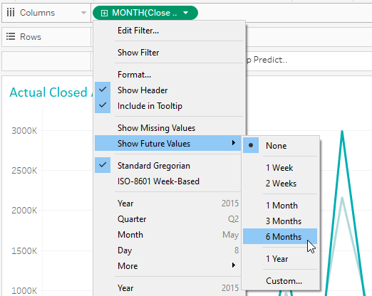
Figure 5: Different options for “Show future values”.
If, for instance, we select the 6 months option, we will see how the date axis now incorporates the new dates, with a forecast of what will be our amount from closed opportunities.
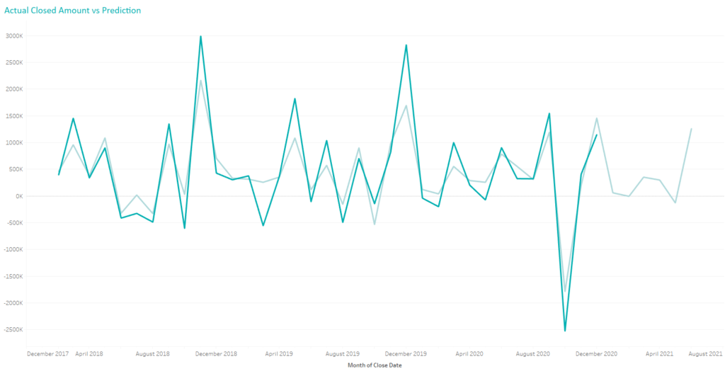
Figure 6: Prediction results for 6 months in the future.
Now, instead of selecting a fixed period of time, let’s try the Custom option. Here we can choose a custom period, for example weeks. As we change the values, we can see how the axis is showing the new dates.
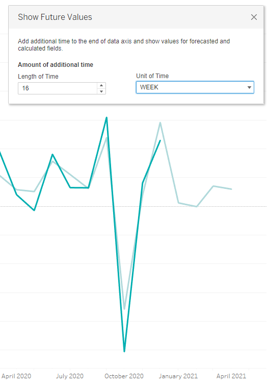
Figure 7: Custom selection for “Show future values”.
5. Ask Data improvements
Tableau 2020.4 incorporates several new features for improving our experience when working with Ask Data, both for Tableau Server and Online. These improvements are:
- New date refinement widget to change the bounds of any time series.
- Stacked bar chart as a new option to visualize results.
- Ability to edit data role synonyms directly on the definition page.
- Admin views of Ask Data usage at site level.
Let’s look at an example of how, with this new version of Tableau, we can easily change the date range for our results.
We have used Ask Data to ask Tableau to return “the count of Orders by Region and Order Date year with Order Date between 2018 and 2020” and got as an answer the chart below.
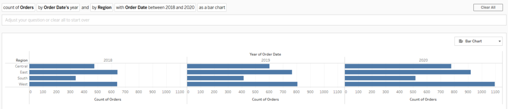
Figure 8: Results from Ask Data.
We have now the possibility to change the date bounds for the result. We simply click on the Date part of our question and a menu like the one below will be shown, where we can choose our desired date range. We will immediately see how the results change accordingly.
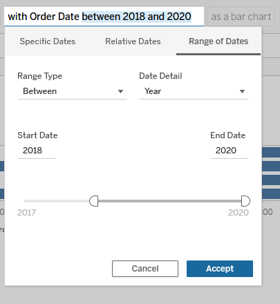
Figure 9: New Ask Data menu for date range selection.
Conclusion
As we have seen, this new Tableau release includes a bunch of new and improved features, all of them pretty interesting and useful, especially those related to improving work with dates and predicting functions, furthering Tableau capabilities for predictive analytics.
We are experts in Tableau, and familiar with its latest features and constantly working on enhanced visualizations. If you are looking for more information about the new release or the many ways in which we can help you and your business, do not hesitate to contact us!