26 Oct 2023 Power BI: Enhancing the Line Chart Visualisation
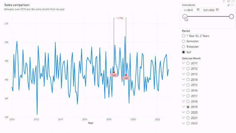
Power BI is a great tool when it comes to visualising our data, and its versatility allows for a wealth of creativity. In this article, we are going to explain how to make a dynamic line chart with an incorporated evolution indicator by leveraging the native line and tapping into its full potential. We’ll configure dynamic measures and use error bars to get visualisations like this:
Implementation – First Steps
In this example, we are going to use a fictional dataset of sales made from 2010 to 2022 by five different sellers in a company.
The first step in creating this visualisation is to load our tables into our Power BI Desktop report. We are going to load our “Data” table (which includes the sale date, the sale amount, and the seller’s name), create two calendar tables (“Selected Month” and “Date Range”), and a “Period” table too. To make this last table, we must select “Enter Data” in the “Home” ribbon and enter the periods we want. In our example we’ve added four periods: 1 Year vs. 2 Years, YoY, Semester, and Trimester. These periods will allow us to select which dates we want to compare later; we won’t create any relation between these tables.
Now we create three slicers as follows:
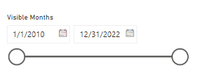
- First up, the “Visible months” slicer. In “Slicer settings > Options” set it as “Between” and use the “Date” field from the “Date Range” table, not from any hierarchy:

- Secondly, the “Period” slicer. In “Slicer settings > Options” choose “Vertical list” and enable the “Single select” option. We will use the field we created in the “Period” table for this slicer:

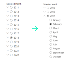
- The third slicer is “Selected Month”; it’s also a “Vertical list” with “Single select” like the previous one. Here we’ll use the “Date” hierarchy field from the “Selected months” table, only selecting “Year” and “Month” from this hierarchy. By doing so, we will get a slicer with all the years and a dropdown to show the months of these years like this:


Measures
Now we can move on to creating the measures to use in our visualisation. The key DAX functions are:
- SELECTEDVALUE(<ColumnName> [, <AlternateResult>]): This fetches the singular value of a column, but only when it’s been filtered to one distinct value.
- DATEDIFF(<Date1>, <Date2>, <Interval>): This returns the difference between Date2 and Date1, expressed in the “MONTH” interval in our example.
Let’s walk through setting up the visualisation for a YoY perspective. By using the SELECTEDVALUE() function inside an IF() function, we can switch between calculations based on the selected period.
We must create a line to represent the sales for each month (the blue line in the GIF above), two markers that move over this line (the red dots above), a horizontal grey line over the blue line, two vertical grey lines that go from the markers to the horizontal grey line, and a card that shows the evolution from one marker to another.
First, we create two measures to make the date range dynamic, from the “Date Range” table:
Max Shown Date = MAXX('Date Range', 'Date Range'[Date])
Min Shown Date = MINX('Date Range', 'Date Range'[Date])
Then we design a measure to act as a “marker” on the line graph. This marker must always be on the selected month and year of the “Selected month” slicer. The measure must be:
Max Date Sum =
IF(
    SELECTEDVALUE('Period'[Name])="1 Year Vs. 2 Years",
    BLANK(),
    CALCULATE(
        SUM(Data[Sales]),
        DATEDIFF(Data[Date], MAXX('Selected Month', 'Selected Month'[Date]), MONTH)=0
    )
)
The first thing to highlight in this measure is that if the selected value of the “Period” table is “1 Year Vs. 2 Years”, the outcome is Blank. This is because we need the error bar to span from the upper horizontal line right down to the lower one (as depicted in the image above). For other periods, it only has to go from the marker to the top horizontal line. In these cases, we will calculate the sum of sales (as shown by the blue line) but restrict the month and year of these sales to those selected in the “Selected Month” table. Essentially, the marker is just another line that is exclusively defined by the selected month and year.
The other marker follows the same logic:
Last Year Sum =
IF(
    SELECTEDVALUE('Period'[Name])="YoY"
    ||
    (
    SELECTEDVALUE('Period'[Name])="1 Year Vs. 2 Years"
    &&
    YEAR(MAXX('Selected Month','Selected Month'[Date]))<>2011
    ),
    CALCULATE(
        SUM(Data[Sales]),
        DATEDIFF(Data[Date], MAXX('Selected Month', 'Selected Month'[Date]), MONTH)=12
    ),
    BLANK()
)
Here we set the DATEDIFF() function to 12, because this marker is essentially a line that only has values for one year before the selected month. Following this logic, for the “Semester” period we would need another measure setting the DATEDIFF() function to 6, 3 for the “Trimester” period, and 24 for the “1 Year Vs. 2 Years” period (in this case, the “Last Year Sum” measure would also be visible).
Now we can make the horizontal top line. First, we must add a calculated column to our “Data” table to summarise it:
MonthYear = CONCATENATE(MONTH(Data[Date]), CONCATENATE(" ", YEAR(Data[Date])))
The measure for the line will be:
Y_line =

Var _table=
SUMMARIZE(
    ALL(Data),
    Data[MonthYear],
    "SumSales",
    SUM(Data[Sales])
)

Return
IF(
    SELECTEDVALUE('Period'[Name])="YoY"
    ||
    (
    SELECTEDVALUE('Period'[Name])="1 Year Vs. 2 Years"
    &&
    YEAR(MAXX('Selected Month','Selected Month'[Date]))<>2011
    ),
    CALCULATE(
        (MAXX(_table, [SumSales])+20)*DIVIDE(AVERAGE(Data[Sales]), AVERAGE(Data[Sales])),
        DATEDIFF(Data[Date], MAXX('Selected Month', 'Selected Month'[Date]), MONTH)<=12, DATEDIFF(Data[Date], MAXX('Selected Month', 'Selected Month'[Date]), MONTH)>=0
    ),
    IF(
        SELECTEDVALUE('Period'[Name])="Semester",
        CALCULATE(
            (MAXX(_table, [SumSales])+20)*
            DIVIDE(AVERAGE(Data[Sales]), AVERAGE(Data[Sales])),
            DATEDIFF(Data[Date], MAXX('Selected Month', 'Selected Month'[Date]), MONTH)<=6, DATEDIFF(Data[Date], MAXX('Selected Month', 'Selected Month'[Date]), MONTH)>=0
        ),
        IF(
            SELECTEDVALUE('Period'[Name])="Trimester",
            CALCULATE(
                (MAXX(_table, [SumSales])+20)*
                DIVIDE(AVERAGE(Data[Sales]), AVERAGE(Data[Sales])),
                DATEDIFF(Data[Date], MAXX('Selected Month', 'Selected Month'[Date]),
                MONTH)<=3, DATEDIFF(Data[Date], MAXX('Selected Month', 'Selected Month'[Date]), MONTH)>=0
            )
        )
    )
)
For this measure we create a table variable (_table) to summarise our original “Data” table by the newly created MonthYear calculated column and by the sum of sales for each MonthYear. Our aim is to ensure the top horizontal line doesn’t intersect the sales line; it should go from one marker to another. We calculate
(MAXX(_table, [SumSales])+20)
to position the horizontal line over the sales line, and then multiply it by
DIVIDE(AVERAGE(Data[Sales]), AVERAGE(Data[Sales]))
enabling us to apply the restrictions below.
So now we restrict the dates as necessary. In our case the DATEDIFF() function has to be greater than or equal to zero months, and less than or equal to twelve months. Now the Divide function will return one for months within this interval and Blank() for the others, thus ensuring the horizontal top line will only go from one marker to the other.
Finally, we establish the measures that will be used to show this evolution. Effectively, we need a measure to act as a marker on the horizontal line:
Card =

VAR Year=
CALCULATE(
    ([Y_line]+4)*DIVIDE(AVERAGE(Data[Sales]), AVERAGE(Data[Sales])),
    DATEDIFF(Data[Date], MAXX('Selected Month', 'Selected Month'[Date]), MONTH)=6
)

VAR Semester=
CALCULATE(
    ([Y_line]+4)*DIVIDE(AVERAGE(Data[Sales]), AVERAGE(Data[Sales])),
    DATEDIFF(Data[Date], MAXX('Selected Month', 'Selected Month'[Date]), MONTH)=3
)

VAR Trimester=
CALCULATE(
    ([Y_line]+4)*DIVIDE(AVERAGE(Data[Sales]), AVERAGE(Data[Sales])),
    DATEDIFF(Data[Date], MAXX('Selected Month', 'Selected Month'[Date]), MONTH)=2
)

RETURN
IF(
    SELECTEDVALUE('Period'[Name])="YoY"
    ||
    (
    SELECTEDVALUE('Period'[Name])="1 Year Vs. 2 Years"
    &&
    YEAR(MAXX('Selected Month','Selected Month'[Date]))<>2011
    ),
    Year,
    IF(
        SELECTEDVALUE('Period'[Name])="Semester",
        Semester,
        IF(
            SELECTEDVALUE('Period'[Name])="Trimester",
            Trimester
        )
    )
)
On selecting the “YoY” period and applying this measure to the line graph, a single marker will appear just over the middle of the top horizontal line. Let´s set its colour to match the background of our visualisation (white) and use a data label to show the sales variation from one year to another. This variation must be calculated dynamically, so we set up the following measure:
%Evolution =

VAR Year=
DIVIDE(
CALCULATE(SUM(Data[Sales]), ALL(Data), DATEDIFF(Data[Date], MAXX('Selected Month', 'Selected Month'[Date]), MONTH)=0)
-CALCULATE(SUM(Data[Sales]), ALL(Data), DATEDIFF(Data[Date], MAXX('Selected Month', 'Selected Month'[Date]), MONTH)=12),
CALCULATE(SUM(Data[Sales]), ALL(Data), DATEDIFF(Data[Date], MAXX('Selected Month', 'Selected Month'[Date]), MONTH)=12),
0
)

VAR Semester=
DIVIDE(
CALCULATE(SUM(Data[Sales]), ALL(Data), DATEDIFF(Data[Date], MAXX('Selected Month', 'Selected Month'[Date]), MONTH)=0)
-CALCULATE(SUM(Data[Sales]), ALL(Data), DATEDIFF(Data[Date], MAXX('Selected Month', 'Selected Month'[Date]), MONTH)=6),
CALCULATE(SUM(Data[Sales]), ALL(Data), DATEDIFF(Data[Date], MAXX('Selected Month', 'Selected Month'[Date]), MONTH)=6),
0
)

VAR Trimester=
DIVIDE(
CALCULATE(SUM(Data[Sales]), ALL(Data), DATEDIFF(Data[Date], MAXX('Selected Month', 'Selected Month'[Date]), MONTH)=0)
-CALCULATE(SUM(Data[Sales]), ALL(Data), DATEDIFF(Data[Date], MAXX('Selected Month', 'Selected Month'[Date]), MONTH)=3),
CALCULATE(SUM(Data[Sales]), ALL(Data), DATEDIFF(Data[Date], MAXX('Selected Month', 'Selected Month'[Date]), MONTH)=3),
0
)

Return
IF(
    SELECTEDVALUE('Period'[Name])="YOY"
    ||
    SELECTEDVALUE('Period'[Name])="1 Year Vs. 2 Years",
    Year,
    IF(
        SELECTEDVALUE('Period'[Name])="Semester",
        Semester,
        IF(
            SELECTEDVALUE('Period'[Name])="Trimester",
            Trimester
        )
    )
)
Final Settings
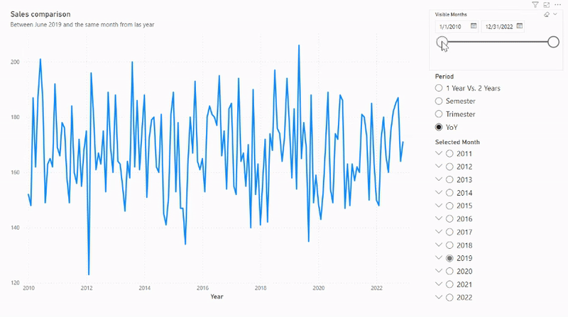
Now that we’ve taken all these preliminary steps, we can start to build our visualisation. Begin by selecting the line chart visualisation and then incorporate the “Date Hierarchy” field from the “Data” table into the X-Axis (excluding Quarters from this field). Then use the sum of the “Sales” field from the same table for the Y-Axis. After drilling down to the month level, you’ll be presented with a straightforward visualisation depicting the monthly sales sum.
Then, in the “Format visual” pane, in the X-axis ribbon, apply the “Min Shown Date” measure for conditional formatting of the minimum range, and the “Max Shown Date” measure for the maximum range. This ensures that our “Visible Months” slicer is operative, and we will be able to select the dates we want to show in our visualisation:
Now we add the “Max Date Sum”, “Last Year Sum” and “Y_Line” to the Y-axis. Then head to the “Format visual” pane, and in the “Lines” ribbon choose the colours for these three measures. At the same time, set the “Stroke width” of our “Y_line” to 1px. After this, go to the “Data labels” ribbon, activate it for the “Max Date Sum” and the “Last Year Sum” measures, and customise it as you wish.
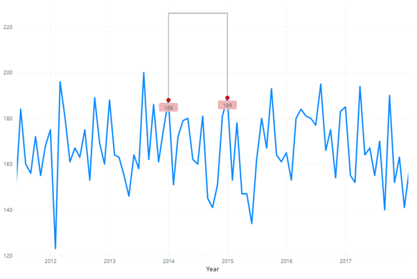
Then go to the “Analytics” pane and select the “Error bars” ribbon to create an error bar for the “Max Date Sum” and the “Last Year Sum” measures, where the lower bound will be the measure itself and the upper bound will be the “Y_line” measure. Ensure these error bars align with the “Y_line” style. We should now have something like this:
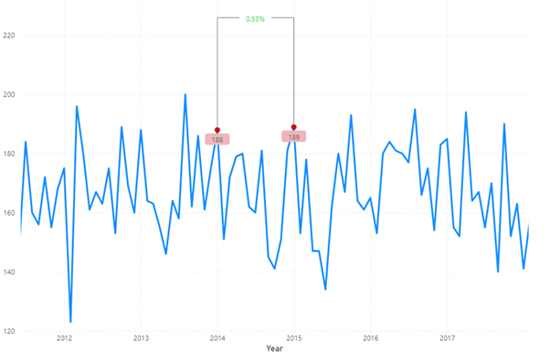
Finally, incorporate the “Card” measure to the Y-axis of the “Build visual” pane. In the “Format visual” pane, set its colour to match the background (white in our example); activate its background and check that its colour also matches the visualisation’s background. Inside this ribbon, there’s another ribbon called “Values”. Here we activate the “Custom label” option and introduce the “%Evolution” measure. Apply conditional formatting for the colour, red for negative and green if not. The result should look something like this:
Following these steps will produce a fully functional dynamic line chart with an integrated YoY period evolution indicator. The logic is the same for other periods, with the SELECTEDVALUE() function integrated into the measures to facilitate period selection.
To further enhance the visualisation, consider adding features like tooltips. In our demonstration, we’ve incorporated a tooltip that displays a list of sales by each seller for the selected month and year. Alternatively, you can introduce a dynamic title that changes based on the chosen month in the “Selected month” slicer.
Conclusion
Data visualisations aim to convey as much information as possible without overwhelming the viewer. The visualisation we have just explored adds another layer to the conventional line chart, enriching the original content. Moreover, it encourages dashboard users to engage interactively, guaranteeing a deeper understanding of the data.
Lastly, we should highlight the versatility of this visualisation: any time series suitable for a line chart can adopt this logic. By doing so, an additional calculation can be seamlessly integrated into the visualisation. The possibilities are endless!
Such advanced visualisations take our reports to the next level, and we will keep exploring new ways to use Power BI’s full potential in future blog posts. If you are interested in learning more or seeing what Power BI can do for your organisation, don’t hesitate to contact us and we’ll be happy to help.