24 Aug 2022 Powerful Charts in Mobile Apps
Mobile apps are popular everywhere, even in enterprise environments. Here at ClearPeaks we are well aware of this, so we develop BI applications with rich, interactive charts using Flutter and Syncfusion.
In this article we will explain how we have developed an app for delivering business intelligence using these technologies; but first let’s see what Flutter and Syncfusion are, and what they offer us.
What is Flutter?
Flutter is an open-source cross-platform framework developed by Google that allows us to create applications easily using the Dart programming language. It is used to develop applications natively for Android (Google) and iOS (Apple), and there’s also the option to build for web browsers and desktop.
Advantages:
- Native-like performance, both in Android and iOS.
- A single source code.
- Quick and easy development, thanks to features like hot reload and hot restart.
- Includes an extensive widget catalogue (graphical elements) that reassemble native iOS and Android components.
- Good integration with popular IDEs like Visual Studio Code, IntelliJ and Android Studio.
If you want to know more about the Flutter framework and how it works, you can find more information in our previous blog post.
What is Syncfusion?
Syncfusion is a data visualisation library, which includes more than 1,700 components and frameworks for major platforms.
A very important part of Syncfusion is that it offers extensive documentation on its use on different platforms, as well as an open forum for all users and a knowledge base where you can find examples for projects; it also has online demos.
What can we do with Syncfusion?
The availability of components varies depending on the platform.
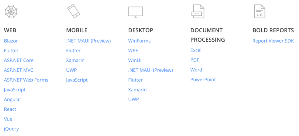
Syncfusion libraries for Flutter include multiple tools like data grids, PDF viewer, Calendar, Date Range Picker, Signature Pad, Sliders, and document processing libraries.
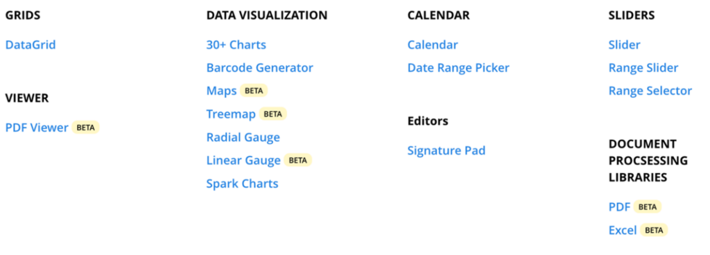
For data visualisation, Syncfusion provides a whole load of interesting components:
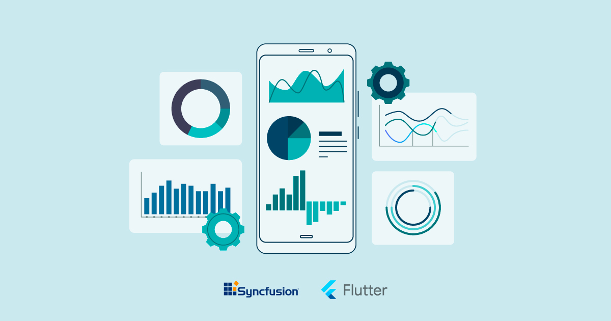
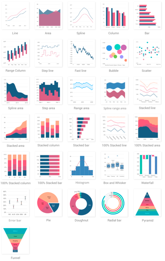
- Charts, a rich gallery of 30+ types of visualisation. We can find a number of chart types as shown below. Each chart is easily configurable and customisable via various built-in parameters.
- Barcode Generator is a widget used to generate and display data 1D (one-dimensional, like Code128, EAN8, etc.) and 2D (two-dimensional, like QR code, Data Matrix barcodes, etc.).
- Maps widget allows us to create beautiful, interactive and customisable maps. We can use a GeoJSON to render a map of the world or a particular country to display statistical information, anywhere!
- Treemap is a widget to display a hierarchical structure through an arrangement of rectangles, each of which represents a branch of a tree diagram.
- Radial Gauge widget allows us to analyse the progress of a target through a circular arc with an indicator, like speedometers, temperature monitors, dashboards, gauges, multiaxis watches, clocks, activity meters, compasses, etc.
- Linear Gauge is like Radial Gauge, but displays data on a linear scale either horizontally or vertically and with one or more indicators. We can create widgets such as thermometers, rulers, progress bars, and water trackers.
- Spark Charts widget is a tiny graphic, often used to present the general shape of data in a simple way, embedded inside a grid cell or inline with a text. It supports four different types of Spark charts: line, area, win-loss, and bar.
Syncfusion is a commercial package, but you can use this package for free if you get the Syncfusion Community licence, offering free access to all the Syncfusion products for individual developers and small businesses.
Why Syncfusion?
Why is Syncfusion better than the others, what extra value does it bring?
- Syncfusion provides very powerful functionality with a wide range of components and features.
- It is very flexible and adaptable to different scenarios.
- They provide online documentation for their many components and the important classes in these components.
- A Community version is available for free and the other licensing models are reasonably priced.
- The library does not have many external dependencies.

Our Implementation
Requirements:
We needed to create an application to display data about oil and gas extraction. The requirements were as follows:
- Display the data through various charts.
- Possibility of filtering the data by years.
- Charts have to be interactive.
- Ability to switch between light and dark themes.
- Availability for Android and iOS.
Solution:
As we mentioned before, our solution implements Flutter and Syncfusion technology.
With the app, we can display data through different charts, and they can be filtered through several parameters to reduce the range of visible data.
We used Syncfusion for the different charts and the user interaction that the client wanted.
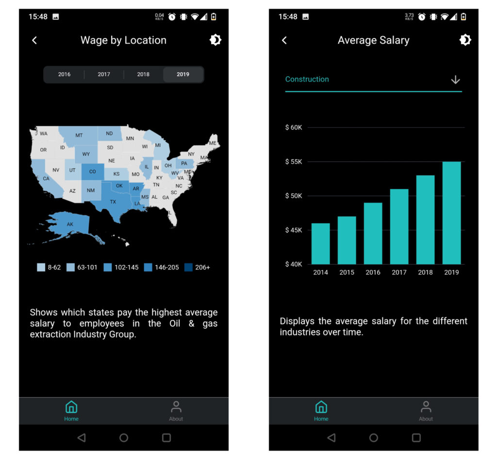
Here we can see a map chart and a column chart, each of them with a filter for the data shown in the graph and a description below to understand the data.
In the map chart we can see that we have included a legend, in order to better identify the average salary in each state.
As we can see in the screenshots, the charts include tooltips that are visible when tapping on the different chart segments; the tooltips are completely customisable.
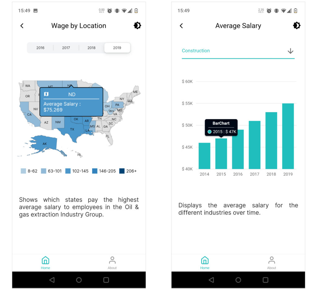
As you can see, we have added a button to switch between light and dark themes to help with the visualisation of the data.
Conclusion
As we have seen, Syncfusion and Flutter offer a wide variety of tools with which we can improve the user experience both visually with Syncfusion charts, and the speed and design with Flutter.
At ClearPeaks we always work with the best technologies in order to meet our customers’ specific needs. If you want to know more about Flutter or Syncfusion, and how they can help your business, please contact us and we’ll be happy to help.