17 Sep 2020 Tableau Metrics
One of the recent versions of Tableau comes with a great feature called Metrics, a new content type that offers a simple way to monitor your most important key performance indicators (KPIs). In this blog article, we will explore Metrics and the different possibilities offered.
1. Main characteristics of Tableau Metrics
Metrics are a streamlined, efficient way to stay on top of your KPIs, personalizable and fully integrated with Tableau’s data and analytics platform and optimized for Tableau Mobile so you can stay ahead on the go!
Metrics show the value of a measure for a period of time: a day, week, month, quarter or year depending on the granularity of the date dimension. They show the difference of that value compared with the previous period and what percentage that is.
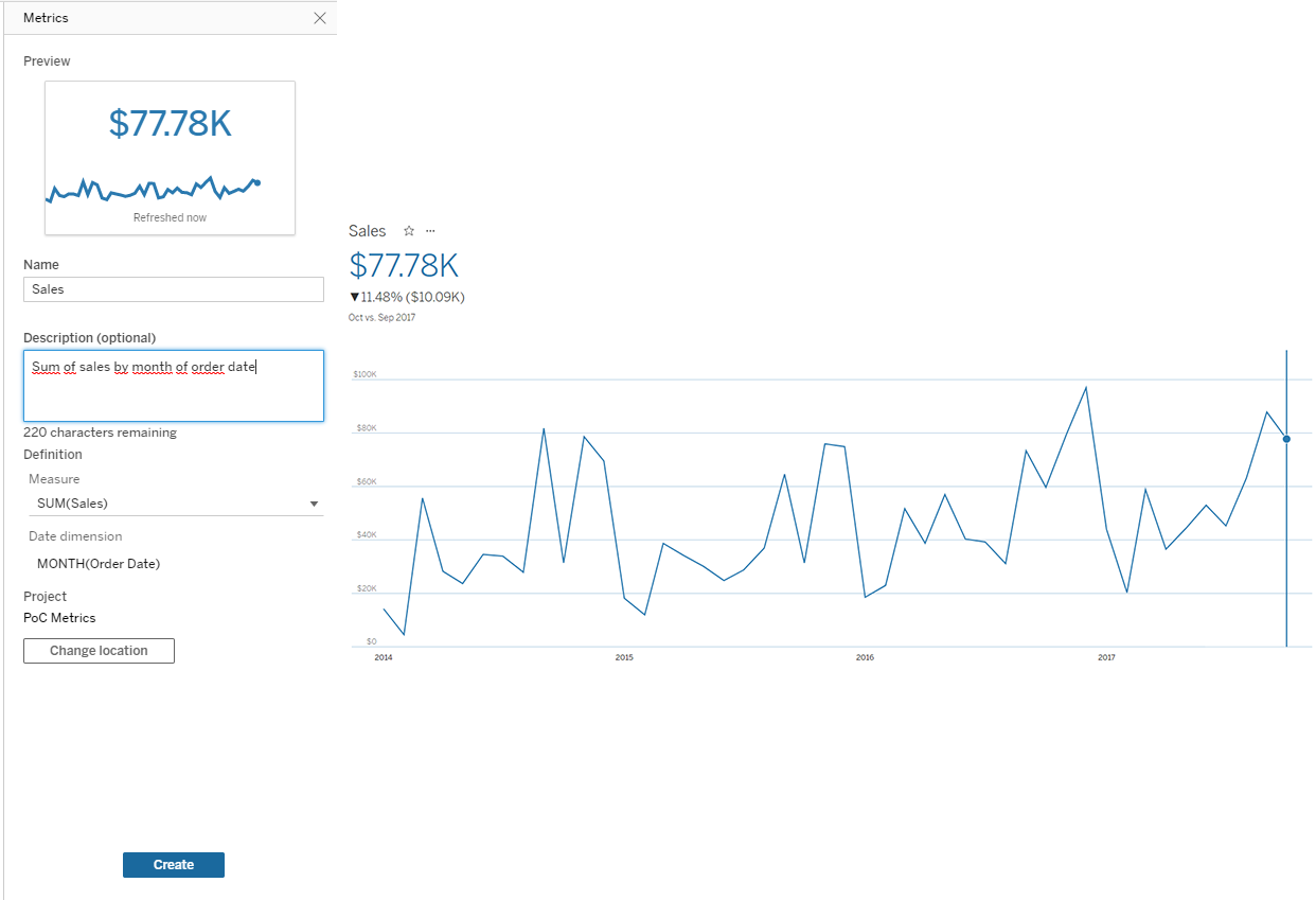
For example, if we created a metric for the sales of a company with the order date and we had $87.867 for September and $77.777 for October, we would see $77.777 (value), ↓$10.090 (difference) and ↓11,48% (difference in percentage terms); it also includes a graph to visualize the value of the measure through time.
To create Metrics we need a published workbook; just click on the Metrics button on top of the dashboard and select a mark in the visualization and choose the measure and date dimension. We can leave out the date dimension but then we will only get the value of the measure.
2. Demo
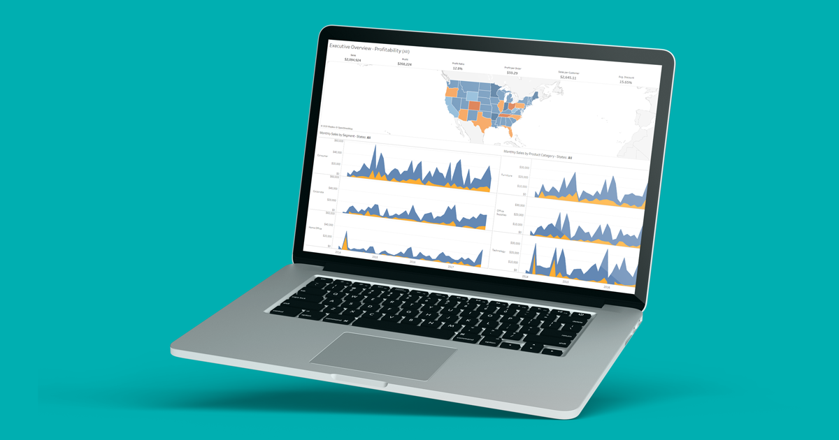
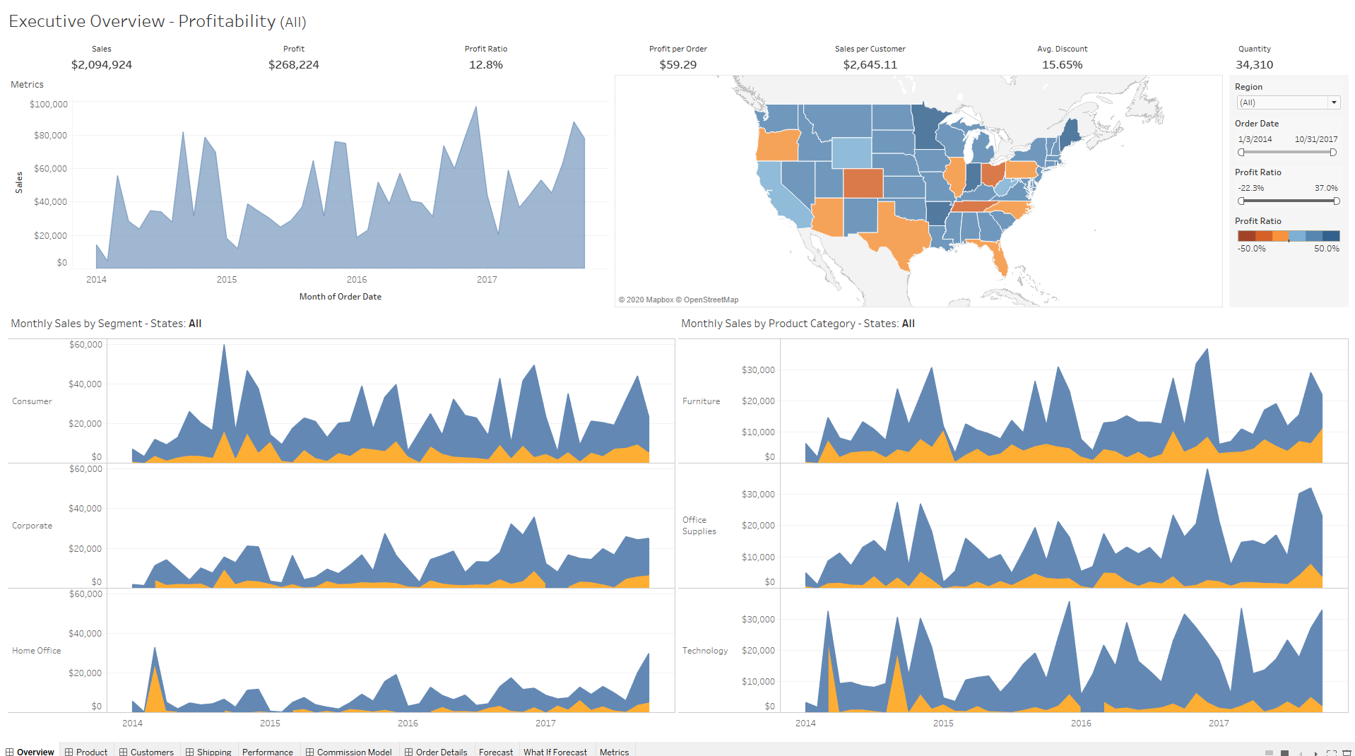
For this demo we will use the dashboard from the Super Sample Superstore workbook, included in every Tableau installation.
As you can see, at the top of the dashboard there are several important KPIs; we are going to create metrics with each of them with the order date as the date dimension. This will enable the users to see the evolution through time of each of these KPIs.
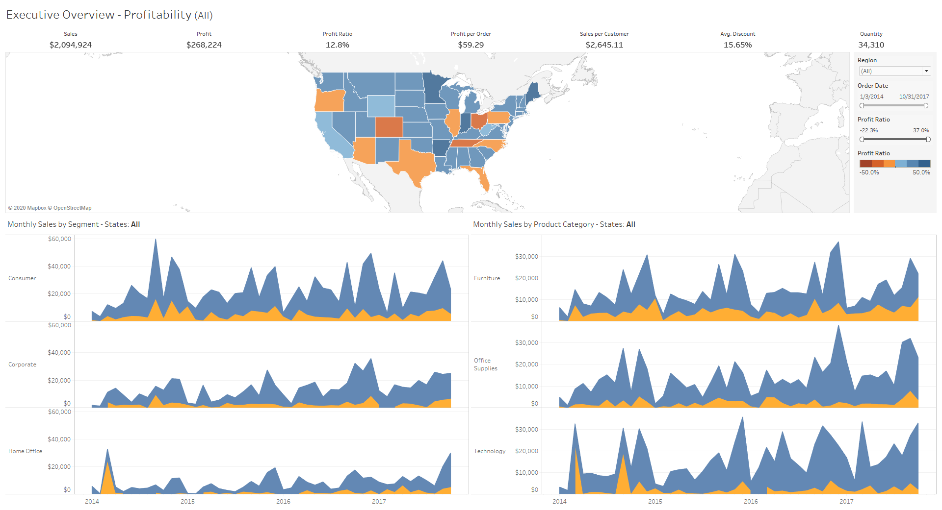
If we were to select the KPIs as they are in the workbook, we would not have a date dimension so we would not be able to create the metrics we want – we would get this:
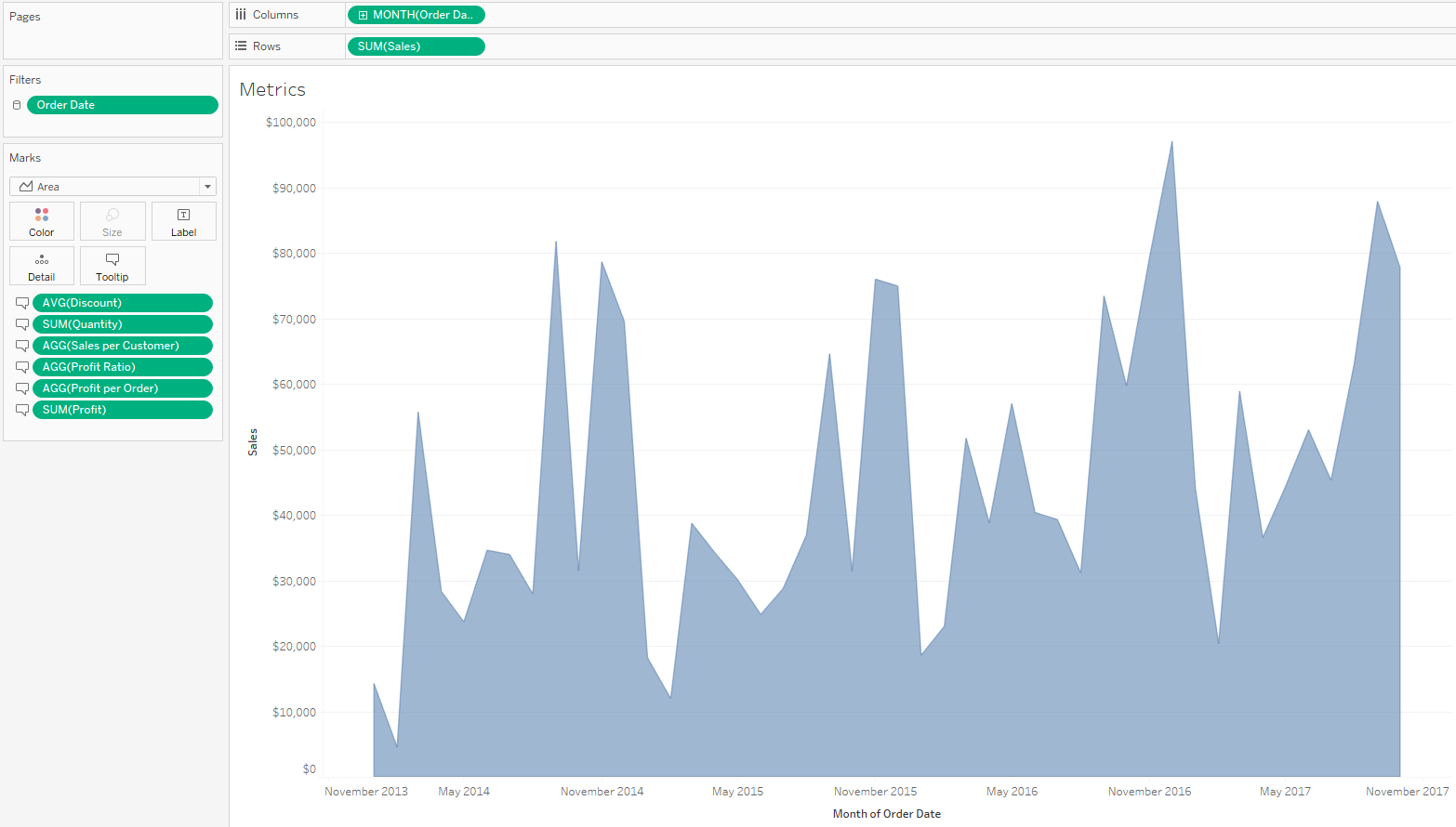
What we have to do is create another view, which we will name “Metrics”, including the order date and all the metrics we want. We have decided to do it like this but there are many other ways.
Then we add it to the main dashboard and publish the workbook.
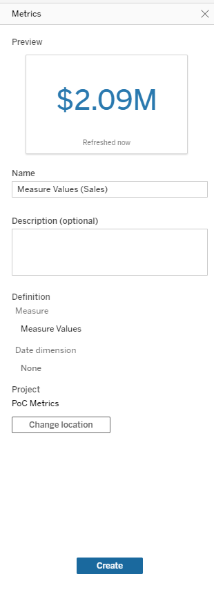
Having done this, we can now create the metrics by clicking on the new visualization and changing the measure to the KPI we want. For example, for sales:
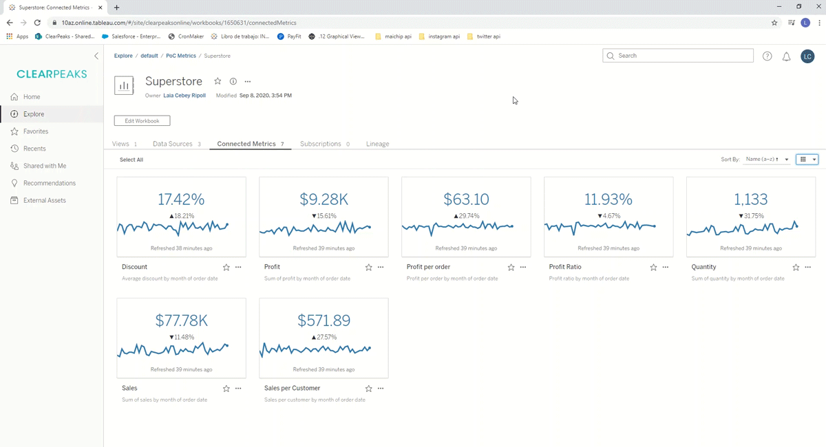
Once the 7 metrics have been created, we either keep the dashboard as it is or change the width of the “Metrics” view to 1 so that it looks like the original and publish the workbook again. In the next two sections we will see how the metrics are visualized in Tableau Server, Tableau Online and Tableau Mobile.
2.1. Tableau Online and Tableau Server
In this video you will see how metrics are shown in Tableau Online and Tableau Server and how you can interact with them.
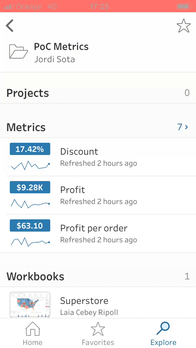
2.2. Tableau Mobile
Tableau’s mobile version is where the metrics are the most useful and customizable. As shown in the following video, you can change the main view to show the value, the difference (compared to the selected period) or what percentage that difference is. In the metric itself we can adjust the dates in the graph, the comparison and choose if we want to see the comparison line or not.
Conclusion
This new feature is very interesting because it adds a super fast way to show important KPIs. The mobile version is especially useful since it offers a lot of options to customize the metrics and they are very easy to read (which can be a challenge with a smaller screen).
At Clearpeaks we are experts in Tableau, familiar with its latest features and constantly working on enhanced visualizations. If you need more information about Tableau or about the many ways in which we can help you and your business, do not hesitate to contact us!