03 Nov 2016 Unleash the power of R to forecast data from your OLAP Cubes with Tableau
Introduction
R is a programming language and software environment for statistical computing, the leading tool amongst statisticians, data miners and data scientists for performing sophisticated statistical analysis, data discovery and predictive analytics on any set of data, such as linear/non-linear modelling, classification, clustering, time-series analysis and so on.
R offers a wealth of functions and, as an open source project, its capabilities are constantly enhanced and extended through user-created packages; this is why it is so popular and just keeps growing.
In this article, we will see how R can be connected to Tableau to perform highly-customizable forecasting of your data from OLAP Cubes. Your users will benefit without the need for an advanced coding background, and visualize the results in the Tableau charts that they like the most, with the help of just a few neat tricks.
1. Forecasting with Tableau
Tableau already comes with a forecasting feature; it uses a technique known as exponential smoothing which tries to find a regular pattern in the measures that can be continued into the future.
To access this feature, simply drag a date and a measure to your sheet and right-click on the canvas. In this example, we are using Tableau’s Superstore sample dataset.

Figure 1: Tableau’s Superstore sample dataset.
Select Forecast ➜ Show Forecast, and the estimated line will appear. As you can see in the picture below, it’s very simple. What Tableau did was basically a linear regression to a straight line; it also shows the confidence interval. Right-click on the canvas again to access the Forecast Options, and an options pane will pop up.

Figure 2: Forecast Options
In the options pane (below, 1), you can set a few parameters, such as forecast length, aggregation type, and you can change or remove the confidence intervals (called prediction intervals) and adjust the forecast model: it can be automatic, automatic without seasonality, or custom. If you choose custom, you will be able to select the type of Trend and Season: None, Additive or Multiplicative.

Figure 3: Forecast Options, Summary and Models
By right-clicking again and selecting Describe Forecast, you will be shown a pane that gives you additional forecast information. You can see this in 2 and 3.
2. Why use R instead?
What we have described so far is basically everything that Tableau can offer when it comes to forecasting. It works pretty well, but it’s not really customizable and, above all, it doesn’t work with OLAP Cubes!
OLAP Cubes have many advantages, but unfortunately, Tableau doesn’t allow us to do all the things we can do with a “traditional” data source, and forecasting is one of these (you can find a list of other OLAP-related limits here.
Luckily for us, Tableau is such a great tool that, despite not being able to perform forecasting on cubes, it offers us an even more powerful alternative: a smooth integration with R.
3. Integrating R in Tableau
There are 4 functions that allow Tableau to communicate with R: SCRIPT_REAL, SCRIPT_STR, SCRIPT_INT, SCRIPT_BOOL. They only differ in the return type, as suggested by their names.
They work very simply, and take at least 2 parameters. The first one is an actual R script; it is pure R code that is passed on to the R engine to be executed, and that will return the last element that is called. From the second argument, the values that are passed on are specified. In the script, you will refer to them as .arg1, .arg2, and so on, depending on the order in which they are declared.
R will take these values, interpret them as vectors (R basically only works with vectors and their derivatives), and return a vector of data that Tableau can use just like any other calculated field.
4. Connecting R to Tableau
In order to communicate, R and Tableau must be connected, and this is really easy to do:
1. Download R from here or R Studio from here, and install it
2. From the R console, download the Rserve package and run it:
install.packages(“Rserve”); library(Rserve); Rserve(); |
3. In Tableau, select Help ➜ Setting and Performance ➜ Manage External Service Connections
4. Enter a server name or an IP (in the same machine, use localhost or 127.0.0.1) and select port 6311
5. Test the connection by clicking on the “Test Connection” button, and press OK if you get a positive message
You can also automatize the start of Rserve by creating an Rscript with the code mentioned in point 2 (without repeating the installation), save it as a .R file, and call it from a .bat file with “start Rscript myRserveScript.R”. You’ll find it pretty useful, especially in a server environment, because you can schedule its execution when the machine starts via the Task Scheduler, or by copying a shortcut to %AppData%\Microsoft\Windows\Start Menu\Programs\Startup (in Windows).
After Rserve has started and Tableau is successfully connected, you can start using the 4 Script_* functions to exploit R’s power.
5. Forecasting in R
To perform forecasting in R, you have to download a user-made package called “forecast”.
To do so, simply write install.packages(“forecast”) in your R console, and call it by writing library(forecast) any time you need it.
It offers various types of fully-customizable forecast methods, like Arima, naïve, drift, Exponential Smoothing (ETS), Seasonal-Trend decomposition by Loess (STL) and so on, seasonable or not, with a number of different parameters.
For more details about the package, check the author’s slides, the help package pdf , or each function’s help page by writing ?func_name in the console (ex: ?stlf).
6. Use case
In our use case, we will take a series of monthly measures from the last 3 years and forecast them with different frequency/period combinations. We will use the function called stlf, which, without getting bogged down in details, gives us more freedom when playing with periods and frequencies whilst still providing a solid result.
In the picture below, you can see our data, from January 2014 to October 2016.

Figure 4: Data, from January 2014 to October 2016.
We dragged our date dimension (Year Number Month Number) to the column field, and put our desired measure in the row field. The trend is not regular, but we can see how the line has a few peaks and generally tends to grow.
7. Writing the R scripts
Let’s see how to write the R scripts that perform the forecast.
Firstly, we need to know what values we will be passing: we have our measure (for R to accept it, it must be aggregated, but coming from the Cube it already is, and if not, the ATTR function can be called on to help) and the two integer parameters (create them in Tableau) for the number of periods to be forecasted and for the frequency of the season.
Let’s use them in this order, calling them ForecastMeasure, ForecastPeriods and Freq. The calculated field should initially look something like this:
SCRIPT_REAL("
data <- .arg1;
nulls <- length(data[is.na(data)]);
data <- data[!is.na(data)];
freq <- .arg3[1];
periods <- .arg2[1];
",
[Forecast Measure],[ForecastPeriods],[Freq]
)
|
In the first argument, we have already set up the R variables that collect the values to pass to the script (this is not mandatory, but just to keep the code cleaner). Remember that R works with vectors: notice how the first one (data) takes the entire .arg1, because we actually want the whole array of measures, while the parameters (simple integers) need to taken from the first value of a 1-sized array. We then filter this vector to remove eventual null values, and we save the number of those in a variable called nulls (we will need it later).
We now perform the forecasting. Add the following lines to the script:
library(forecast); time <- ts(data,frequency=freq); fcast <- stlf(time, h=periods); |
The first line simply calls the forecast library; we then create a time series object, by passing the measure and the frequency parameter (for more customizable details, check the resources already mentioned). Finally, we produce our forecasting result, by feeding the stlf function with the time series object and the periods parameter.
Out forecast is ready. If we use the same data and we execute the script in R, the console will look like this:

The interesting columns are Forecast, Lo80, Hi80, Lo95, Hi95. The first one contains the actual forecasted value. There are 12 because we used parameter = 12 (freq = 12, too). The others are the confidence interval (the limits can be changed when calling the function).
Now let’s complete our script. There is one thing we need to remember: Tableau expects to receive the same number of measures that it sent, so we append our forecasted array to the original one, properly shifted, along with rep(NaN, nulls), an array of nulls (we know how many there are because we saved them). Add these lines to the script:
n <- length(data); result <- append(data[(periods+1):n],fcast$mean); result <- append(result,rep(NaN,nulls)); result |
The result that we want is fcast$mean, which corresponds to the column called “Forecast” in the R matrix that we saw. We append it along with eventual null values to the segment of original data that starts from the position number period+1, in order to get an array of the original size (note: by doing this, we won’t visualize the first period elements).
That’s it! Your new calculated field should look like the one below. Drag it to the row field, and you get your forecast.
SCRIPT_REAL("
data <- .arg1;
nulls <- length(data[is.na(data)]);
data <- data[!is.na(data)];
freq <- .arg3[1];
periods <- .arg2[1];

library(forecast);
time <- ts(data,frequency=freq);
fcast <- stlf(time, h=periods);
n <- length(data);
result <- append(data[(periods+1):n],fcast$mean);
result <- append(result,rep(NaN,nulls));
result",
[Forecast Measure],[ForecastPeriods],[Freq]
)
|

Figure 5: Complete R script and result
8. Shifting time measures
Now, we start getting the first issues. Tableau received a vector from R the same size as the one that we passed it, so each date-measure value is substitued for the new one, coming from the calculated field. The problem is that the date hasn’t changed!
Normally, this could be fixed by creating a new calculated date with the help of the DATEADD function, but as we can’t add a dimension in cubes, we have to overcome this issue by getting dimension value as a measure with an MDX formula, and then applying DATEADD to it.
Create a new calculated member, and set it as:
[Cube_name].[Dimension_name].MemberValue |
Then create a calculate field like this:
DATE(DATEADD('month',[ForecastPeriods],DATE([YearNumberMonthNumber])))
|
Where [YearNumberMonthNumber] is (for example) the name of your newly calculated member. This will get you a measure with the date shifted accordingly to the forecasted period that you selected.

Figure 6: Tableau’s Error
Drag this new field on top of the original date column and… your chart will crash!
Why? You’ve just created a new shifted date for every original date value, and basically your data is now “split” into “columns” of 1 value, 1 for each shifted month, and R will receive them 1 by 1 instead of getting an entire vector to process. This explains the error that says “series is not periodic or has less than two periods”, because what R is actually seeing is a series of indipendent 1-sized vectors.
To fix this, there’s a simple but neat trick: add your original data field to “Detail”, so that it is available in the sheet, and edit your calculated forecast field like this.
 Figure 7: Table Calculation – Forecast (Months)
This will make Tableau process the calculated field at the correct level, and help R see the received data in the correct way, thus producing the desired result.
That’s it! You’ve just forecasted your OLAP cube!

Figure 8: OLAP cube forecasted
9. Adding confidence intervals
You can also add confidence intervals to improve your visualization: just create two more metrics, copying the one you created for the forecast, and change fcast$mean to fcast$lower[,1], fcast$lower[,2], fcast$upper[,1], or fcast$upper[,2], depending on the limit that you want to show (remember that the defaults are 80 and 95, but these are editable in the R function).
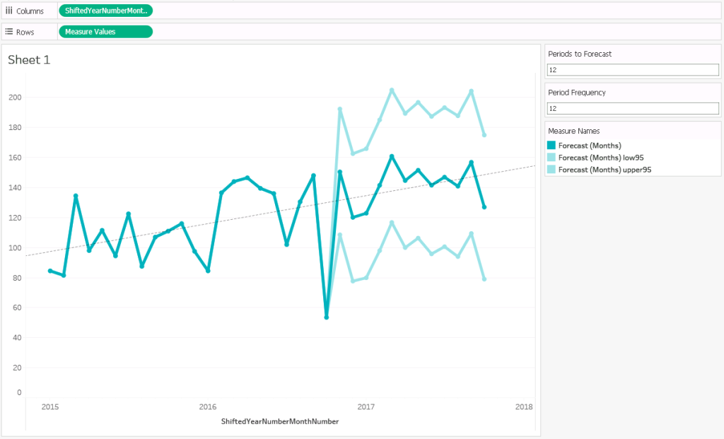
In the picture below you can see the forecast with the 95% bounds (fcast$upper[,2] and fcast$lower[,2]) , and the trend line (calculated by Tableau).

Figure 9: Forecast final visualization
10. Conclusions
In this guide we have shown how R can help you build great forecast charts for your OLAP Cube data, but this isn’t the only benefit: we got a much higher degree of customization, and overcame the limitations of Tableau when it comes to defining parameters, methods or entire algorithms.
Once Tableau can connect to R, its potential is virtually unlimited, and it can enhance your charts in an infinity of ways: from any source (not necessarily OLAP Cubes), or with any goal, just send the data to R and let it do the job, whatever it is! Forecasting, clustering, classification, or anything else with an R package written for it – you could even write one yourself! Then visualize the result in Tableau, and adjust the look and feel of your dashboard with the powerful features that you love.
Click here if you would know more about Advanced Analytics and everything it can offer you!