27 Apr 2020 Power BI: ArcGIS Maps
Some weeks ago, we published the blog article “Power BI: Mapbox integration”, explaining how the “Mapbox for Power BI” tool compellingly represents multiple levels of different data on a map.
In this article we will be looking at the capabilities of another geographic information system: ArcGIS. Since 2006, ArcGIS has partnered with Power BI to include ArcGIS Maps as a feature to provide enhanced mapping capabilities.
1. Power BI default maps
Power BI has a limited map feature. It can show locations by latitude and longitude fields, and it has the option to make the symbols bigger or smaller depending on a certain value. In the example below we can see a map of Barcelona, showing accidents filtered by a month; we have dragged the numerical value of victims in every accident to the Size field to show those with more victims.
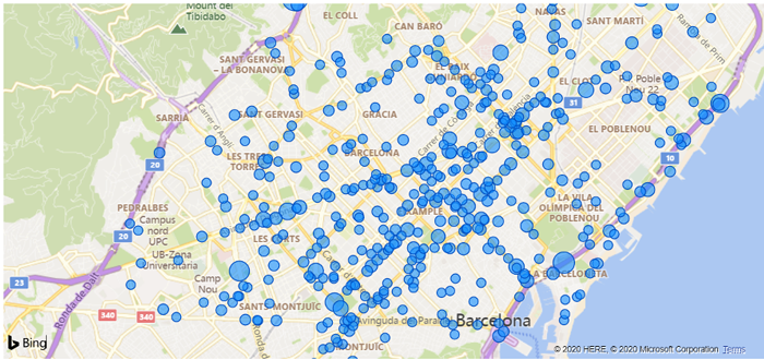
Figure 1: Power BI default map displaying victims in accidents by their location
2. ArcGIS maps
ArcGIS maps include more options than the default maps in Power BI: apart from the Size field these maps contain a Colour field and different themes to represent data, like a heat map or a clustering map. In addition, ArcGIS maps offer the possibility to add a reference layer.
2.1. Size Map
Like the original Power BI maps, ArcGIS maps include the Size field in order to see bigger or lower numeric values in a more visual way. There is no difference between this type of map and the Power BI map, but below you can see an example of this feature. ArcGIS include a legend to show what each dimension means; the size of the symbol represents the number of victims.
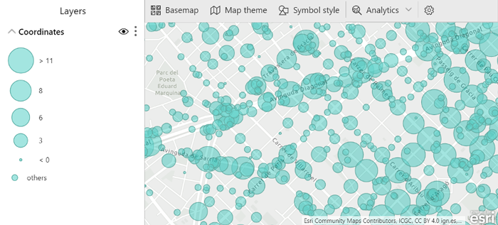
Figure 2: ArcGIS Size map displaying victims in accidents by their location
2.2. Colour Map
Another field that can be filled to have more geographical information is the Colour field. It can be used for numerical values like the Size field, or it can be used for categorial values. A colour ramp can help to identify low-to-high numerical values like the number of victims.
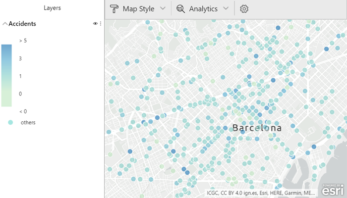
Figure 3: ArcGIS Colour map displaying victims in accidents by their location
For categorical values it is often better to use different colours. The following image shows a different colour depending on the time the accident happened (morning, afternoon or night).
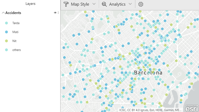
Figure 4: ArcGIS Colour map displaying accidents by time of day and location
2.3. Size and Colour Map
Both Size and Colour can be used in the same map, handily allowing the user to show a numerical value and a categorical value. Size will depend on the numerical value, and different colours will represent each category.
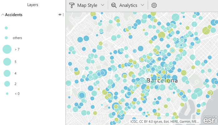
Figure 5: ArcGIS Size and Colour map displaying victims in accidents by time of day and location
2.4. Heat Map
Another map theme available to users in ArcGIS is the heat map. With this type of map, you can visualize the density of points. When there are many points on the map close together or overlapping, it can be a useful tool, making it easier to distinguish between locations.
The following image represents the density of victims in accidents.
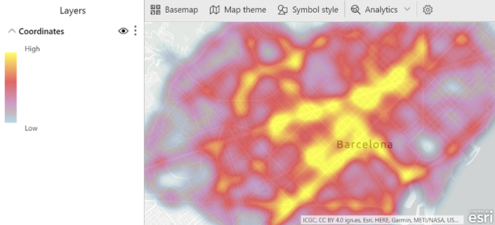
Figure 6: ArcGIS Heat map displaying locations with more victims in accidents
2.5. Clustering Map
Like heat maps, clustering maps are useful when there are hundreds of points shown all at once, or when they overlap, making it difficult to visually extract meaningful information.
Clustering maps group locations within a certain distance into one symbol. The distance between points can be edited by the user depending on the map or specific needs. On screen, more points are aggregated into fewer groups if you zoom out, and points are divided into more groups if you zoom in.
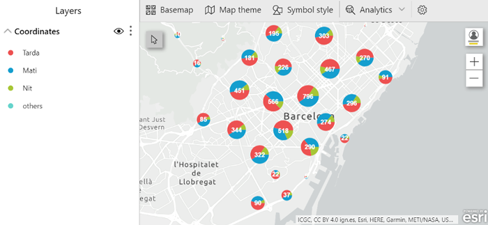
Figure 7: ArcGIS Clustering map displaying victims in accidents by time of day and location
2.6. Reference layers
ArcGIS Maps work with geographic data through layers. These layers are collections of data that are used to create maps to provide context, offering more information about areas surrounding the locations on your map.
There are different types of layers.
- Data layer: created from your data; in this article the data layer represents accidents in Barcelona.
- Reference layer: service layers added from ArcGIS that provide context to the data. There are a lot of reference layers that you can use: search for them using key words. In the image below, the reference layer displays the neighbourhoods of Barcelona.
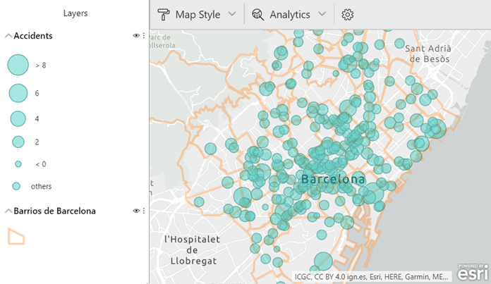
Figure 8: Accidents in Barcelona using a reference layer of Barcelona neighbourhoods
- Reference layers allow you to filter the data selecting only one location from the layer. In the example above you can select one neighbourhood and the map will only show the accidents in that area.
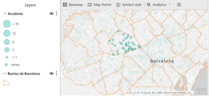
Figure 9: Accidents in Barcelona filtered by one neighbourhood
- The drive-time layer gives you information about distance, defining an area on the map within a specific distance from a location.
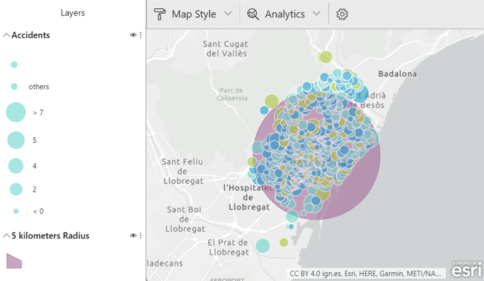
Figure 10: Area of 5 km from a specific point located at the centre of Barcelona
3. Comparison with Mapbox
Mapbox and ArcGIS are tools that offer similar visualization options, like, for example, the clustering map.
The main difference between ArcGIS and Mapbox is the Mapbox Studio tool that allows the user to manage his geospatial data and design custom map styles and regions; with this tool it is possible to create a region for each neighbourhood in Barcelona and customize them.
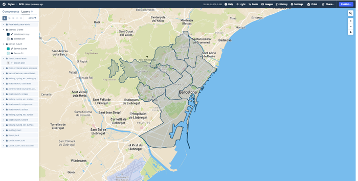
Figure 11: Customizing a map of Barcelona neighbourhoods with Mapbox Studio
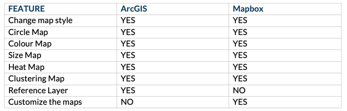
The free version of Mapbox for Power BI features maps as circles by colour and size, the heat map, and clustering. It also allows the user to change the map style. The matrix below shows the features included in the free versions of ArcGIS and Mapbox. We can see that these versions are both very similar and very practical for visualizing geographic data, even though they are free.
Conclusion
Power BI default maps are fine if the user only wants to show the locations of the data, but if they want to go deeper and view more information related to locations these maps are not the solution.
Both Mapbox and ArcGIS maps offer the features that you may need; both allow the data to be displayed better, with no overlaping of points, separating each category into colours and adding reference layers and custom maps to add context to the data.
If you’d like to find out how maps can help your business, please get in touch!